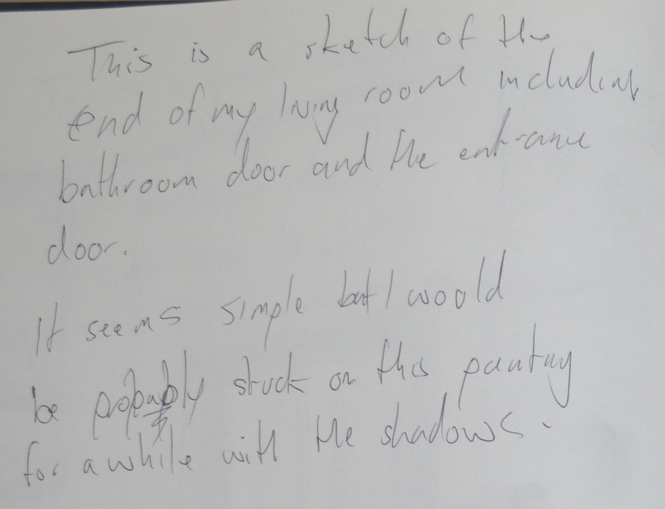
Tag Archives: oca painting 1

Looking at Faces 6 – Conveying Character

Oil pastel 2 high tonal

Oil pastel 2 high tonal

The character that I wanted to show for this exercise was a grinning or smiling self portrait, the closest I had come to a smile until now was a small quick portrait that I did in my small sketchbook that I lost a few months ago. Luckily I took a picture of it (left). Yet, even in this picture you can see that it was pretty difficult to crack a smile and it’s only really a half smile, it’s the eyes in the picture that adds the character to it as I have left more white in the eyes to make them look bulging.


Charcoal on Acrylic

Charcoal on Acrylic

So in this exercise I attempted to capture some character again drawing myself in the mirror which I wasn’t that successful at.

Even though I liked the first study, charcoal on acrylic, a great deal I did look really grumpy, like a sad ‘Yellow Bastard’ the character from Sin City. I really like the effect that drawing with charcoal over the Yellow Ochre acrylic created but I don’t think I will ever again draw myself with glasses on as they add 20 years to me plus they are very difficult to paint.


Cracking a Smile in Crylic

Cracking a Smile in Crylic

In the next study I think actually did manage to crack a smile but working that fast I also managed to make myself look 20 years older.

Knowing I could smile better than this I decided to take a series of photos and browsed through them to see which ones I could use as a basis for this exercise, as I thought working from a photo would probably be my best bet.


Blocking In

Blocking In

In one of the photos the smile was almost  a grin as I was really forcing it, I found this very appealing and wanted to over-accentuate this. 

Firstly, I painted a background of Raw Umber and then thick brushstrokes of Raw Umber and White with both a flat and pointed paint brush to build up the shape of the face and shoulders. Then when it started coming together I painted around the shape of my face and shoulders with mix of raw Umber and black. Leaving the square to the right in the original tone. This was wear the moonlight came into the bedroom through the curtains but I wasn’t sure I would paint them in yet. In fact I could have actually left it here because it looked quite good as it did in all the stages of this painting.


Adding Detail

Adding Detail

From here I worked on the eyes, painting them in in a blue-turquoise colour. Almost the complimentary colour of the Raw Umber and white mix. Adding the eye detail made me look a bit more sinister and so I decided to carry on although I wasn’t sure where I was heading at this stage.


Painting in the Curtains

Painting in the Curtains

After building up the light and shadow on the face and creating quite strong tones I decided to paint in the curtains in a white/turquoise mix keeping to the complimentary colours and this worked really well. I wasn’t sure whether to keep it as it was here with a bit of an unfinished look as it did look quite well but with a weakness for finishing a painting I continued to paint in the chest and shoulders.


Finishing the Painting

Finishing the Painting

This was where the OCD kicked in. With  the turquoise curtains behind me to the right and turquoise on the tattoo on my right (left) arm I felt like there needed to be something on the left to balance it up.

Frida Kahlo had her monkeys and I had geckos scurrying around everywhere reminding me everyday for 16 years that I was far away from home, so what better than to paint one of these little buggers perched on my shoulder with the same here to here grin.


I looked for photos of Tokay Geckos on an image search and found one in the perfect pose. Tokay geckos here are usually turquoise and red and so I found a gecko in the right pose to go onto my shoulder and changed the colours and added the right amount of shadow.

The gecko on the shoulder added more character to the painting and actually looked like it could have been sitting there while I was painting or at least taking the photo.

finished painting

finished painting

My thoughts on this project

Second Attempt at Self Portrait

Self Portrait

Self portrait

I feel I let myself down here. Although the second attempt at the self portrait turned out, I think, really well, I really need a lot more practice at this. My hopes were to create a self portrait at an angle and then eventually add props such as an easel, paint brush, etc. In the end I ended up painting the way I felt comfortable when I should have been pushing myself more and doing more experimenting.


12 - Adding More Shadow and Complimentary Colour

Head and Shoulders Portrait

Head and Shoulders Portrait

I do like this and I continued to experiment through the exercise with the things that I had learnt through the course, especially with use of colour.

I think the background could have been better, maybe more natural with cloud formations or even a lighter colour such as cream to make the tones more subtle.


17 Finished Painting

Creating Mood and Atmosphere

Creating Mood and Atmosphere

I was very spontaneous with this painting but to me it just looks too organised. I think this all comes back round to my weakness of wanting to create a finished piece. This is an habit that I really have to break.


Final Thoughts

The painting that I am most happy with here is the final piece in this last exercise, I really do think it is my best painting so far. Although I worked from a photo kit captured how I felt while I was painting it rather than how I looked in the photo, if that makes sense,

Looking at Faces 4 – Research Point – Portraits Conveying Mood and Atmosphere

Brief for this Research Point:

Go on the internet and find some portraits that convey a distinctive mood or atmosphere rather than simply a physical likeness. Look at Picasso’s blue paintings with their mood of surreal sadness or the dark earth colours of van Gogh’s early paintings of peasants seated around a fire in their poor, meager surroundings. Look at the strong tonal contrast in Rembrandt’s portraits and the formidably restricted palette with which he seemed to convey the very essence of a person’s mood and personality. By contrast, consider the gaiety or the disturbing, nightmarish quality of the portraits and figure paintings of the Fauve painters and the German Expressionists.

Felix Nussbaum

felix nussbaum | Felix Nussbaum, Fear (Self-Portrait with his Niece Marianne), 1941

Felix Nussbaum, Fear (Self-Portrait with his Niece Marianne), 1941

During Self Portrait Drawing 1 I discovered an artist called Felix Nussbaum a German artist whose works portrayed life in the Nazi death camps and life as Jew in Europe during WWII. In 1944 he was sent to Auschwitz where he was murdered by the Nazis age 39.

You don’t need to know the story of Felix’s life to understand the trauma that he and his family went through, he manages to portray this through his portraits and self portraits.

in Fear 1941, a painting of Felix with his Niece Marianna the very convincing facial expressions made more so by his hand cradling his nieces face but what really makes the painting is how he uses the strong contrast of blue and orange.

Felix Nussbaum - Prisoner 1940

Felix Nussbaum – Prisoner 1940


His painting of a Prisoner 1940 he uses a different way of creating mood, the models pose. He has clearly studied people in moments of sadness and despair. If this was a painting of a farmer on a tractor driving through a field using the same background and foreground the atmosphere would be hard to read with this palette.


Vincent van Gogh

Van Gogh Peasant Woman with Dark BonnetUsing similar earth colours but with a lot darker tones van Gogh has managed to depict real sadness in his peasant paintings.

It’s not the colours alone that has captured the mood in these paintings though. Looking at the woman’s face (left) you know that she led a hard life and she hasn’t and couldn’t hide this while posing for the artist who has captured everything. Here van Gogh uses heavy shadows on the face to capture her age and weathered look. I really like the way he has used the light dots on the yes to depict light reflecting off almost tearful eyes.


Vincent van Gogh - Head of a peasant

Vincent van Gogh – Head of a peasant

He uses the same heavy shadows in the ‘Head of a Peasant (right). Here he uses the dark earth tones to portray worn, unwashed clothes. This together with a scruffy unwashed face and helpless expression lets us know exactly what kind of life the sitter has. We wouldn’t need to know who the sitter was or the name of the painting to feel this.


Vincent van Gogh - The Potato Eaters

Vincent van Gogh – The Potato Eaters

Looking at ‘the Potato Eaters’ you wonder how long they sat there. He captures not just the mood and atmosphere but the moment.

The first impression I got when I saw this painting was a family sharing a moment of happiness in an otherwise miserable life. Highlighted by the glow coming from the dinner table sounded by the darker tones and tatty surroundings.


Pablo Picasso

Pablo Picasso, The Old Guitarist, 1903

Pablo Picasso, The Old Guitarist, 1903

When beginning this research point I wanted to avoid Picasso’s The Old Guitarist. It seemed like it was the first painting From his Blue Period that everyone flocked to but after examining other paintings of this period I kept coming back to this and for one good reason.

The reason I kept returning to this painting is that it is probably one of the best examples of how he has used other lighter colours to describe the old man’s skin colour and features. Looking on different screens and devices I saw different colours, maybe yellow, some pink as well as green. I presume these lighter colours were applied last over the top of the blue which still shows through keeping the melancholy atmosphere.


Pablo Picasso The Old Beggar

Pablo Picasso The Old Beggar

This technique can also be seen here in ‘The Old Beggar’. Here the lighter colours on the face, hands and feet are more prominent allowing us to see the pale complexions of the subjects over the top of the blue.


Otto Dix

Otto Dix the Nun

Otto Dix the Nun

In ‘The Nun’ Otto Dix as used long brushstrokes of lighter paint over darker colours to depict the creases in the nuns forehead and heavy patches of red over the top of its complimentary colour green helps to accentuate the bags under her eyes giving her a tortured and extremely sad expression.


Rembrandt

Rembrandt van Rijn Apostle Peter in Prison 1631

Rembrandt van Rijn Apostle Peter in Prison 1631

While looking through Rembrandt’s paintings I came across the following painting. ‘Apostle Peter in Prison’ 1631 is a brilliant example of how the artist uses strong contrast to create mood and atmosphere in his paintings. The artist has used lighter colours in the centre of the painting to highlight the apostles face and front depicting sunlight shining through a window in a dark prison cell. The mood here is a very lonely one.


Fauvism and Matisse

For me it was very hard to look at most Fauve painters; figurative or portrait paintings and feel something from them, yes the colours are bright nut often enough I feel that the artist is painting a pretty serious pose in gay colours experimenting for themselves rather than for the viewer.

Matisse Gypsy

Matisse Gypsy

In the painting ‘The Gypsy’  though, the colours are doing their job or at least the job that we expect that strong contrast of colours to do, although the expression on the gypsy’s face adds to the happy mood.

Looking at Faces 2 – Self Portrait


Existing Studies

I have spent the last few months drawing a self portrait every chance I got using my phone’s camera as a mirror and sometimes working from a photo. I even started one project where I got the students to draw a self portrait and I would draw one next to it to give me a little push, unfortunately I lost the sketch book but did manage to take some photos.

I’m lucky to still have some sketches in other sketch books, all of which are very quick sketches using different mediums. Although they do not all look like me there is a reoccurring resemblance.

This exercise

The brief for this exercise: Make a self portrait of just your head and shoulders. You can choose to work with either natural light but natural light is best. Set up your equipment so that you can see yourself and your work surface clearly. Make sure that your face is lit from one side with the other side in shadow. Any additional light that you need should not shine into your face.

Choose a light, dark or mid-toned fabric background if you can fasten it behind you. Try out the effects of each and assess which of them gives the greatest interest in terms of tonal contrast or visual impact.

I set up a backdrop of an orange monk cloth that I draped over my largest drawing board and propped it up behind me on the sofa with a small round mirror. They only portable mirror I have out in front of me on a small coffee table. I closed the bathroom door and closed the curtain on the Juliet balcony so the only light that was entering the room was coming through the kitchen door.

1st Drawing Charcoal

1st Drawing Charcoal

2nd Drawing OilPastel

2nd Drawing OilPastel

3rd Drawing Oil Pastel in the Bathroom

3rd Drawing Oil Pastel in the Bathroom

I completed the first drawing in charcoal with my glasses on. I was trying to smile while drawing it and I think I managed to capture some of that. Unfortunately I didn’t capture any likeness of me whatsoever apart from maybe an ear, the shape of the head and maybe an eyebrow. All the studies I had done were so far not paying off.


In the second drawing in oil pastel I managed to capture a bit more likeness and some of the smile I was cracking was even there although the eyes didn’t show this. Focusing on the mouth I could draw a smirk but when I drew the eyes my expression went serious again.

The orange backdrop was working though, it created a nice effect and I though I could continue with this but I needed a larger mirror. I was just too far away from the subject to be able to focus. I’ve been wearing my glasses so often lately that even tho I’m longsighted my eyes aren’t focusing right without them and I didn’t want to paint myself with them on.

I put a blue polo shirt on which gave a bit of contrast to the orange backdrop which I now taped to the bathroom door behind me. This drawing was a lot better than the first two but t did take a lot longer to complete and by the time I had finished my eyes were very blur. I wasn’t sure how I would cope painting myself in the bathroom or for any length of time without my glasses on for that matter but I was going to have a go.

1 Drawing with Paint on multi-Coloured was background

Drawing with Paint on multi-Coloured was background

I prepared the support with two different semi-transparent washes from opposite corners and let them bleed into each other. Once it was dry I painted the outline of my face head and shoulders in a dilute yellow ochre.


2 Building up Layers of Paint

2 Building up Layers of Paint

Then my idea was to paint the lightest tones and work darker. This is probably where I started to go wrong, thinking about it now it may have been better to start with the darkest colours and then build up the lightest colours on top rather than the other way round.

I had drawn the primary sketches during the daytime but for the painting I was painting at night with two light sources. The light in the shower as the one above the sink luckily was not working and a bendy lamp shining through the door on one half of my face.


3 Looking Old and Already Hating it

3 Looking Old and Already Hating it

I moved on to the background to build up the colour there to give me some idea to how the painting would look. It was at this stage that I started to get annoyed with myself. The painting started to look like me but it just wasn’t me, this wasn’t my style and I really did not want to continue with it. The orange background didn’t help.

The photo of the painting right, was about where I left it for the first day and I hated it. I wasn’t use to painting myself from that angle. I usually attempted self portraits from the front and not having a clear all round vision I found it difficult to get it right.

Giving up Point

Giving up Point

After painting, repainting and eventually messing up and painting a silly pair of glasses on it, I gave up, it was time to start a fresh.The painting right is now on the back of the new painting.


Fresh attempt at a Self Portrait

Remembering a self portrait that I had success with in the earlier drawing course I sat in  the bedroom looking at the mirror on the wardrobe door, switched on the light and pointed it at the side of my face. It was easy to imagine my face as a painting as the light highlighted some really nice shapes and it wasn’t too dark that I couldn’t see the right side of my face.

Preparation

I prepared the back of the existing self portrait with a layer of burnt umber mixed with black and then once that had dried went over it again with another layer of Payne’s grey, shaved my head and waited to start the painting the next night.

Second Attempt at Self Portrait

Second Attempt at Self Portrait

This time I decided to work with the board on my knee rather than on the easel as I didn’t want it to cast any unwanted shadows plus it was easier as I could move it around freely which was great for working on the details of the eyes. I’m not to worried about getting the details or shape of the face wrong but I’ve found that if you get the eyes wrong people automatically say it doesn’t look like you.

I worked in various mixes of white and Payne’s grey rather than colour and this low level light I would have probably only used one or two colours anyway but it was quite dark and the board was dark so I needed to be able to see what I was painting so these two mixed together where ideal.

I used one brush a small flat brush and painted as if I was drawing starting on the left side of my face painting in the darker tones and then slowly building up the lighter tones. Once the right hand side of the face was complete from the neck to the crown I started on the right hand side by painting in the background with Payne’s grey and just a tiny pit of white modelling the light around my head to for the shape of my face and head then painted in the subtle highlights to form the shadows on my face and ear.  The problem was the bedroom was too dark to see the slight difference in the shade of paint so I had to turn the big light on from time to time so that I could see what I was doing.

I managed to finish most of the painting in one sitting and with the main shapes and features painted I could work on some details in natural light the next day which allowed me to see any details that didn’t look right, these were easily be corrected by reshaping.

Overall thoughts on this exercise

I feel that I let myself down giving up on a painting which I had never done before but sometimes you have to start a fresh. I realise that the first painting may have had more character if completed with imperfections but I am really happy with the final painting and how I chose to complete it. I think impatience got the better of me here, being too impatient to mix paint and to deal with what seamed to be ever changing detail working at an awkward angle.

Thoughts on final piece

The length of the head is slightly long but this is from working with the board on my knee. The painting shows a real likeness but is let down by having little or no character. On a positive note this is the first time I have completed a painting with full brushstrokes rather than the scrumbling technique that I seem to keep reverting to in previous paintings.

Observing the Human Figure 3 – Tonal Figure Study

The brief: In this exercise you will concentrate on conveying form by exploring tonal  values. Set up your model’s pose with a light source casting clear shadows and highlights. If you use directional lamps you may need more than one to combat the problem of hard outlines around shadows. For a tonal study it’s best to work in natural light.

Due to the times I work and the days, all seven of them could only do this exercise in the night time. So to try and combat the hard outlines as it instructed in the brief I left all the lights on. Including the bathroom which adjoins the living room.

Preparation

Before starting this exercise I cut two almost square sheets of thick card the shape of the card influenced the poses in the following sketches and the final piece as I wanted to fill as much of the surface of each one up as possible. I painted one of the pieces of card with an opaque coat of Burnt Umber and the other with naples grey.

Tonal Sketches

1st Tonal Study

1st Tonal Study

The first tonal sketch was very week, I had drawn better tonal studies in the first figure drawing exercise, Drawing the Human Figure. A week first drawing is getting to be a habit with me, it .takes a couple of drawings for me and the model to relax. Everything is in proportion though so it seems like I am improving as I go along.


2nd Tonal Study

2nd Tonal Study

The second sketch also in charcoal was much better, although there are hard outlines in places, particularly under the thigh. Again proportions are good and a lot of the tones are really nice but looking back on this pose as with all the poses I could have draped cloth over her or even a towel as I had secured the only sheet of cloth I had as a backdrop to stop the light reflecting off the white wall.

The second pose was drawn quicker and smoother than the first pose, the speed was down to the position of the model. Giving her her I-phone took her mind off any aching for the duration of the drawing. I think.

3rd Tonal Study in Pencil

3rd Tonal Study in Pencil

One of my deepest regrets so far of this course is overlooking the potential of this third tonal study in pencil. The angle, proportions, muscle tone and features were all spot on. There were hard outlines on the legs and arms but I could have overcome this in the final painting. Instead I opted for two different poses to turn into paintings.


3rd Tonal Study

4th Tonal Study in Charcoal

This next pose like the previous drawing in pencil was influenced by the painting by the Painting ‘Curled Nude on a stool’ by Euan Uglow that was shown as an example in this section of the course material, which I really liked and being flexible I know she would be able to hold this pose as long as I needed to draw it.

In this pose I included the chair and some background, The course material said a tonal figure in space. Did I go to far. Again, as with the first two poses I drew this in charcoal which was easy to blend to remove any hard outlines, but there are still some hard outlines on shoulders, beneath  the elbow and on the hip but there were heavy shadows here. I decided to take this one further and work from this sketch for a painting as I wanted to see how painting from the charcoal sketch would turn out.

First Painting

Drawing with a light mix on Burnt Umber

Drawing with a light mix on Burnt Umber

Working from the charcoal sketch I began to draw the figure and build up tone with a lighter mix of white and burnt umber to attempt to build up the tone on the painting. At this point I realised it was not going to be a pure tonal painting and was already planning the next painting.


Painting Almost finished

Using mixtures of Burnt Umber, white and black I began to imitate the charcoal study while trying to do away with any hard outlines some of which I chose to paint in at first probably down to insecurity. What I should have done was just slowly continue to build up the tone from the mid-tones something that I would do in the next painting.


9 - 1st Painting Painted from Charcoal Study

9 – 1st Painting Painted from Charcoal Study

I am happy with the final painting but as an experiment rather than as a tonal study. There are some very hard outlines which were almost unavoidable due to the darkness of the shadows and trying to get rid of these which I did try but wasn’t satisfied with the results.


1 Drawing in Pencil

Drawing in Pencil – Drawing the human figure

This was a sketch for the Drawing the human figure exercise of one pose that I was particularly happy with and wanted to come back to for this exercise as I thought it would be really great for a tonal painting for this exercise. The one problem was proportions were slightly out and I had no girlfriend around or a photo of this pose for reference so I would be working solely from this sketch and using knowledge that I acquired in the drawing course such as central axis and that the head fits into the body roughly about 3 and a half times from the crown of the head to the bottom on a seated figure.


I started this painting trying to picture Edgar Degas’s nudes in my mind’s eye but not using any particular one as a reference.


Tonal Study - Finished Painting

Tonal Study – Finished Painting

Working on the board I prepared with the mix of Naples Grey I used a very light mix of Naples Grey and Burnt Umber to paint in the figure starting at the crown of the head then working down to the bottom and then back up the leg and finally painting n the arms knees feet and face. I like to have the shape of the face completed to some degree so that I can use the entire head as a reference for the measurement of the rest of the body.

Once I was happy with the shape and proportions I began to build up the tone in the neck shoulders and back as well as the tops of the arms this gave me an idea of the tones and mixes of paint I would be using. A certain ratio of these two paints can look ginger and that was something I wanted to avoid.

The soft tones were quite difficult to achieve and it take quite a while to complete, slowly layering the paint using more of a scrumbling technique than anything else with a small detail brush.

I was reluctant to add in the shadow as I was worried it would look like she was having a pee so I really had to play with that, and I did mess up. This resulted in me painting the whole floor in a dark mix of the two paints and then going over that with the Naples Grey and shaping the shadow from there hence the floor looking a different tone.

My thoughts on the final painting

There differences between the painting and the primary sketch such as the length of the neck, length of the arms and also a longer more curved back but I think I don’t think anything looks out of proportion. However, this was a tonal exercise and I think I did well with the tones in the final painting. There are some parts that look flat but overall I think it works well.

My Thoughts on this Exercise

Although I am very happy with the finished piece I could have gone about the whole exercise differently using  cloth draped over the figure and maybe other props. It would have also probably have been nice to do some standing poses especially from the back as she does have some nice back muscles but I can come back to this.

Further Tonal Studies

I have been invited by my girlfriend to her yoga classes to do some studies there but so far I haven’t had the time but this did inspire me to look on the internet for some interesting naked yoga poses.

4th Tonal study

Tonal Study in Oil Pastel

This drawing was originally going to be a linear study in oil pastel but then realized the potential of the colours I was using and so I went onto smudge the colours together with very interesting results.


7th Tonal Study

2nd Tonal Study in Oil pastel

I wanted to do more experimenting with these colours and chose another interesting pose to try to create what I had done the result was slightly different but still very interesting.


Life Drawing

The following drawings were of models on the life drawing site Pixelovely.com.

5th Tnal Study Life Drawing

2 Minute Sketch in Conte

6th Tonal Study Life Drawing

2 Minute Sketch in Conte


8th Tonal Study Life Drawing

10 Minute Sketch in Conte

This sketch is really starting to grow on me, being an Egon Schiele fan it does remind me of some of the scrawny sketchy figures in his paintings.

Observing the Human Figure 2 – Linear Figure Studies

I began this exercise with my watercolour field set, XL sketchbook and a medium sized tank watercolour brush (if that’s what you call them). I have used this brush for sketching quite a while now and I am really comfortable with it.

For the first few studies I sat down with my model as I messed up a lot in the drawing 1 course due to being sat on a high chair which made her head look bigger in the drawings.

1 - Watercolour with Backround

1 – Watercolour with Backround

1 - Watercolour with Background Notes

1 – Watercolour with Background Notes

Drawing the background of the above study wasn’t planned, it just happened. Once I had drawn the figure I decided to add some shadow and then with not wanting to waste paper I took the chance to draw the background which worked out quite well as it contained everything that I had been painting so far in this course,

The drawing of the figure itself was not brilliant, the light came from different light sources such as a lamp, the kitchen and the bathroom so I found it quite difficult to depict the shadows using line. The figure is in proportion but the eye does get lost in a confusion of lines in the legs and arms.  The face bares no resemblance, although it does look Asian.

I started to experiment with drips here but soon stopped it was a nice clean drawing and it was a shape to ruin it.

2 - Second Watercolour Sketch

2 – Second Watercolour Sketch

2 - Second Watercolour Sketch Notes

2 – Second Watercolour Sketch Notes


For the second watercolour study I sat at the front of the model  with her in another comfortable position, one leg behind her with the other in front and her right hand gripping her ankle. As with the first study I painted the lines with a lighter colour first and then went over the outline with black. This time I only painted in simple shadows rather than a complex background. The body is in proportion but I was unable to depict the foreshortening on her right arm especially from her elbow to her hand which looks straight and therefor to short.

3 - Third Watercolour Sketch

3 – Third Watercolour Sketch

3 - Third Watercolour Sketch Notes

3 – Third Watercolour Sketch Notes


The third sketch was my favourite, it was a standing pose and I sat on a low chair to draw her so she was taller than me so as not to depict her as a midget (she is only five foot). The piece gave man idea to maybe do a piece with several poses my the same model on a long support wearing these simple clothes that made her look quite cute and I think I managed to capture that in this drawing with her knees and feet together. At this stage I planned to do a larger painting from this in acrylic but I don’t have a great track record of enlarging smaller studies freehand.

4 - Fourth Watercolour Sketch

4 – Fourth Watercolour Sketch

6 - Sixth Watercolour Sketch

6 – Sixth Watercolour Sketch


5 - Fifth atercolour Sketch

5 – Fifth atercolour Sketch

The next three went brilliant especially the fourth which made her look like a witch the body on all three however were in proportion and I even coped alright with the foreshortening on the reclining poses, something that I do manage to have a problem with most of the time when drawing from life.

One thing that I am happy with is that in all the watercolour studies so far I have managed to get the models legs looking quite nice and in linear figure studies from what i can see so far, that really helps.


7 - Experimenting with Lino Ballpoit

7 – Experimenting with Lino Ballpoint

9 - Linear Study in Ballpoint

9 – Linear Study in Ballpoint

8 - More Ballpoint Sketches

8 – More Ballpoint Sketches


From there I decided to experiment with line in a completely different way with ballpoint inspired by an earlier sketch that I did in the style of Alberto Giacometti  In these  4 drawings I decided to build up the three dimensional form of the figure by using a spiraling/squirkling technique.

The first drawing was fine but was  too tight for my liking so I worked on another three, none to perfection although I can see that with a bit of practise this would be a really effective technique but could it be used with a painting medium?

9 - Linear Study in Ballpoint

9 – Linear Study in Ballpoint

I wanted to find out if I could recreate the earlier standing pose on a larger scale and still keep the feminine qualities that I depicted in the watercolour skretch. I began by painting a piece of card with a semi-opaque wash of light blue then once it was dry used a more opaque mix of the same blue to draw the outline before painting over it again with black then I depicted the light and shade with Mouse Grey and Burnt Umber. The result wasn’t brilliant as I messed up on the face and there was  more length in the body but it wasn’t that bad either.


11 - Acrylic Linear Study - Messing Up

11 – Acrylic Linear Study – Messing Up

This next study was painted on a semi-opaque wash of Yellow Ochre. I thought it would be a really simple pose but when I came to paint the outline, this time in Burnt Umber I messed up really badly. I thought I would be able to correct it by painting over the messed up lines with the same colour as the base coat but messed up even more as the top layer was opaque. I probably shouldn’t have stopped there but by this time I was totally put off this pose but I will try it again in the next exercise, Tonal study.


The final piece for this exercise was a linear study painted from the watercolour drawing in the previous exercise Drawing the Human Figure. I used the Mouse Grey again to paint the outline onto a semi-opaque wash of Burnt Umber which gave the board a wood grain look. I wasn’t sure what I was going to do next but then imagined a darker line over the top of the light grey and so went with that. The result was that the painting had an almost tiger feel to it, I included some shadow but it looks like she has peed herself.

13 - Going over LInes in a Darker Paint

13 – Going over LInes in a Darker Paint

12 - Axcrylic Linear Study on Transparent Wash

12 – Axcrylic Linear Study on Transparent Wash

Observing the Human Figure 1 – Drawing the Human Figure

The brief for this exercise was to:

Set my model in a comfortable position, sitting or lying down making sure there is sufficient light both on the subject and the working surface. 

The Head length is generally 1/7 of the full length of a standing figure, this can be used to measure proportions…Look at the shapes or outlines surrounding the figure which will help to locate the figure in space. 

Use any drawing medium to mark out the principle shapes in your sketchbook…Make several sketches, working quickly each time and adjusting measurements as you progress…Move around the figure trying out different angles.

1 Drawing in Pencil

1 Drawing in Pencil

Throughout the Drawing figures part of the Drawing 1 Course I took advantage of the fact that my girlfriend is a yoga teacher and it was no different in this exercise. Asking her to hold positions that were quite difficult so there were often breaks mid drawing.

The first pose in pencil wasn’t the easiest for me or the model but it was an extremely quick drawing. This was down to being able to draw large parts of the figure in one continuous line such as the head back bottom under the thigh. It was also a very easy pose to position in my sketchbook.


2 Drawing in Charcoal

2 Drawing in Charcoal

The second drawing was in charcoal and was a seated pose so it gave my model a break for a few minutes. Working with this medium it didn’t take long to get the drawing anatomically correct but then again I have had a lot of practise drawing the same model.

The benefit of this pose is being able to use the shapes within the figure to get the measurements right. The face bares no resemblance at all but I’m not too bothered at this stage it was the outline and negative space that I was concentrating on.


4 Drawing in Ballpoint Pen

3 Drawing in Ballpoint Pen

The third pose in ballpoint pen was inspired by Gustav Klimt’s Goldfish which is probably one of my favourite Klimt paintings. Again this was quite a quick pose but quite awkward so we had to take a break mid pose. It is a nice pose to sketch but probably one I would not choose to paint due to the length of time it would take in a very uncomfortable position.

The back muscles look nice especially the prominent muscles at either side of the spine are wonderful to draw but the bottom is not defined this is due to my girlfriend, like most Thais, not having a prominent bottom.


3 Continuous Outline Drawing

4 Continuous Outline Drawing

On the next drawing I decided to do the same pose but this time I decided to draw the outline with one continuous line. The benefit or practising to draw with one continuous line is that when it comes to drawing with paint on a canvas or other support I will hopefully be making less corrections.

Drawing in pencil this time I managed to give her what she wished for, a large bum.


5 Drawing in Oil Pastel

5 Drawing in Oil Pastel

The next pose was probably the most difficult for her too hold so I did the drawing in stages. My chosen medium for this drawing was oil pastel. I drew the outline very quickly with a neutral colour and did my best to mark out folds of skin and shadow before taking a break. This allowed me to build up colour and tone without having to look at the model all the time and she wasn’t having to stay long in the position for the second sitting while I corrected  some outlines.

Parts of the drawing do look incorrect and she looks fatter in the drawing than she actually is but rather than keep working on it I decided to move on to the next.

6 Back to Pencil

6 Back to Pencil

The next pose was a lot nicer and even though it looks quite technical was very easy to draw with the actual figure taking me not much more than a couple of minutes to draw. This time I decided. to add the chair and some background.


7 Another Drawing in Oil Pastel

7 Another Drawing in Oil Pastel

From there I went back to the oil pastel with a pose that was also very quick and easy to draw this time from the front with the model slightly more upright. As I was drawing from the front, the shapes on the left and right arm and leg were almost symmetrical which saved some time so I managed to add a bit of colour and tone without having to take a break.

I really like this pose due as her breasts and shoulders have a really nice shape, I will probably come back to paint something similar later.


8 Watercolour Sketch

8 Watercolour Sketch

I chose to do the next drawing in watercolour in my mixed media sketchbook with a similar pose to the second drawing in charcoal but this time with the head turned towards the wall so I didn’t have to mess around with facial features, It’s really easy to draw on a small scale in watercolour  and it helped drawing in charcoal first as I was already got used to drawing the shapes involve with this pose.


On the whole I think I did quite well on this exercise and tried out different drawing mediums rather than just charcoal. I know I was told to focus on outline but I wanted to a bit further.

Queen Sirikit Gallery – Best Art Thesis 2015

The Queen’s Gallery has continuously taken a role in providing an opportunity for young artists to exhibit their works. Year 2015 marks the 7th year that The Queen’s Gallery presents “The Best Art Thesis Exhibition” displaying the best thesis works of arts that are well selected by professors and instructors from renowned art institute. With the total of 121 art pieces including sculptures and paintings, each institution had selected 2 outstanding works of arts from master degree students and 3 outstanding works of arts from bachelor degree students who have been developing skills and identities throughout their college years, in order to publicize their talents, to open their visions and to offer experiences in terms of becoming professional artists.

The Exhibition

(unfortunately the photos for this exhibition were left in my tablet that I recently forgot in a Taxi, the driver of which would not answer his phone)

I was very fortunate to visit the gallery at a time when they were exhibiting over 121 of the best art students’ art thesis of 2015 and it was very inspiring. Learning painting myself now, I could see how the students had employed the techniques and the mediums that they had explored in their art degrees.

Pen and Sepia Ink

Pen and Sepia Ink

There were sections for watercolour, acrylic, oil, mixed meda and sculptor, the paintings in all sections were very impressive and looked very, very professional. In the mixed media section there were even paintings painted in rubber sap from the rubber tree which was a sepia colour. This inspired the self portrait to the left in pen and sepia ink.


Even though the beautiful photos of the paintings that I took were lost in my tablet in the taxi I was lucky to make the following sketch of one of the paintings at the exhibition and note the artists inspiration for the painting.

Sketch of a painting at the Best in Thesis 2015

Sketch of a painting at the Best in Thesis 2015

Apart from the watercolour paintings that were mostly of flowers and plants the paintings in other mediums were of some really interesting subjects, but my favourite paintings were by students from king Mongkut’s university of technology that were mostly of industrial subjects such as miners and foundry workers as well as surrealist paintings with characters made up of wires and nuts and bolts.

All-in-all it was a very inspiring exhibition just a crying shame that the photos were lost. All I could find on line were photos of the following paintings.


Kannikar Permkittikul - In Room

Kannikar Permkittikul – In Room

Nidtaya Sornpo - Beauty of Women

Nidtaya Sornpo – Beauty of Women

Somsak Junto - Untitled 2015

Somsak Junto – Untitled 2015


Assignment 1 – Tutor Report for Assignment 1

Tutor report

Overall Comments

You have worked hard throughout this first assignment, demonstrating a confident understanding of the possibilities of paint. Your exercises as well as your final piece are competent and show a good understanding of the use of glazing and colour mixing.

Your learning log is honest and reflective though you do need to increase the level of analysis, particularly in relation to other artists work.

Assessment potential (after Assignment 1)

You may want to get credit for your hard work and achievements with the OCA by formally submitting your work for assessment at the end of the module. More and more people are taking the idea of lifelong learning seriously by submitting their work for assessment but it is entirely up to you. We are just as keen to support you whether you study for pleasure or to gain qualifications. Please consider whether you want to put your work forward for assessment and let me know your decision when you submit Assignment 2. I can then give you feedback on how well your work meets the assessment requirements.

Feedback on assignment

Demonstration of technical and Visual Skills, Quality of Outcome, Demonstration of Creativity

I will comment on some of your exercises and then your final piece.

Getting to know your brushes

Getting to Know Your Brushes 2 - A Landscape from Memory 2

Getting to Know Your Brushes 2 – A Landscape from Memory

I can see you are already developing and improving your understanding of different types of brushes and the marks they make as you work through these simple exercises. Your first attempt at a landscape from memory combines small, repeated mark making with broader brush strokes. This works particularly well where you layer opaque colour over  transparent glazes. The results are a little crude in places but that is partly the nature of the exercise. The second attempt has a more naturalistic feel and the trees are clumped together more authentically with subtle sense of movement amongst the branches. The repeated pattern of brushmarks used to describe grasses in the foreground is not entirely convincing. Be wary of generalising as this can make an image look stylised. Having said that

Getting to Know Your Brushes 3 - Painting Fruit

Getting to Know Your Brushes 3 – Painting Fruit

you are painting from memory and this type of mark making is more likely to happen when not observing detail directly.

The pineapple is well executed. Here you achieve a surface texture which contrasts well with the bold, angular leaves. The confident shadow beneath the fruit works well as does the more subtle, grey shadow against the wall.


Applying paint without brushes

Here you experiment with a good range of materials and techniques and produce a series of interesting and playful pieces. I particularly like the effects of using a toothbrush and painting knife.

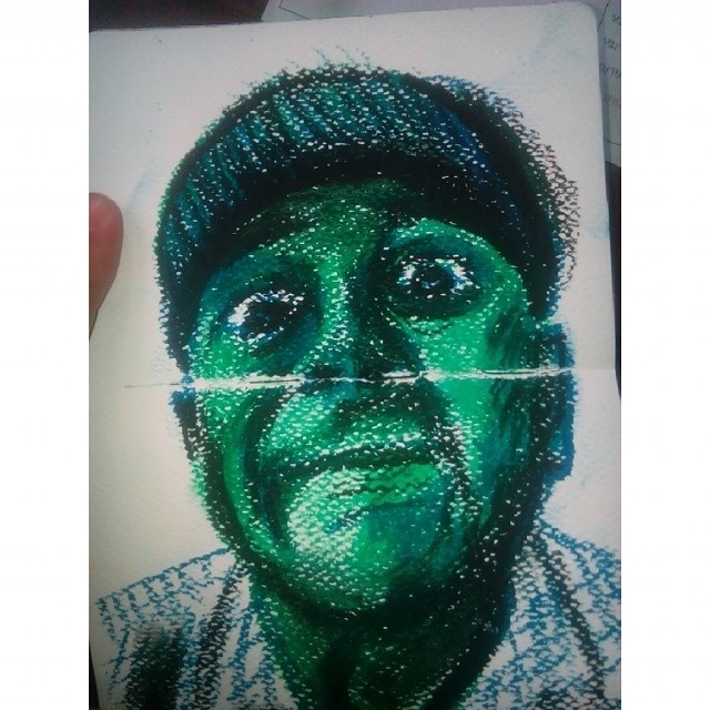
Painting with pastels

2 - A Simple Drawing with Soft Pastels

A Simple Drawing with Soft Pastels

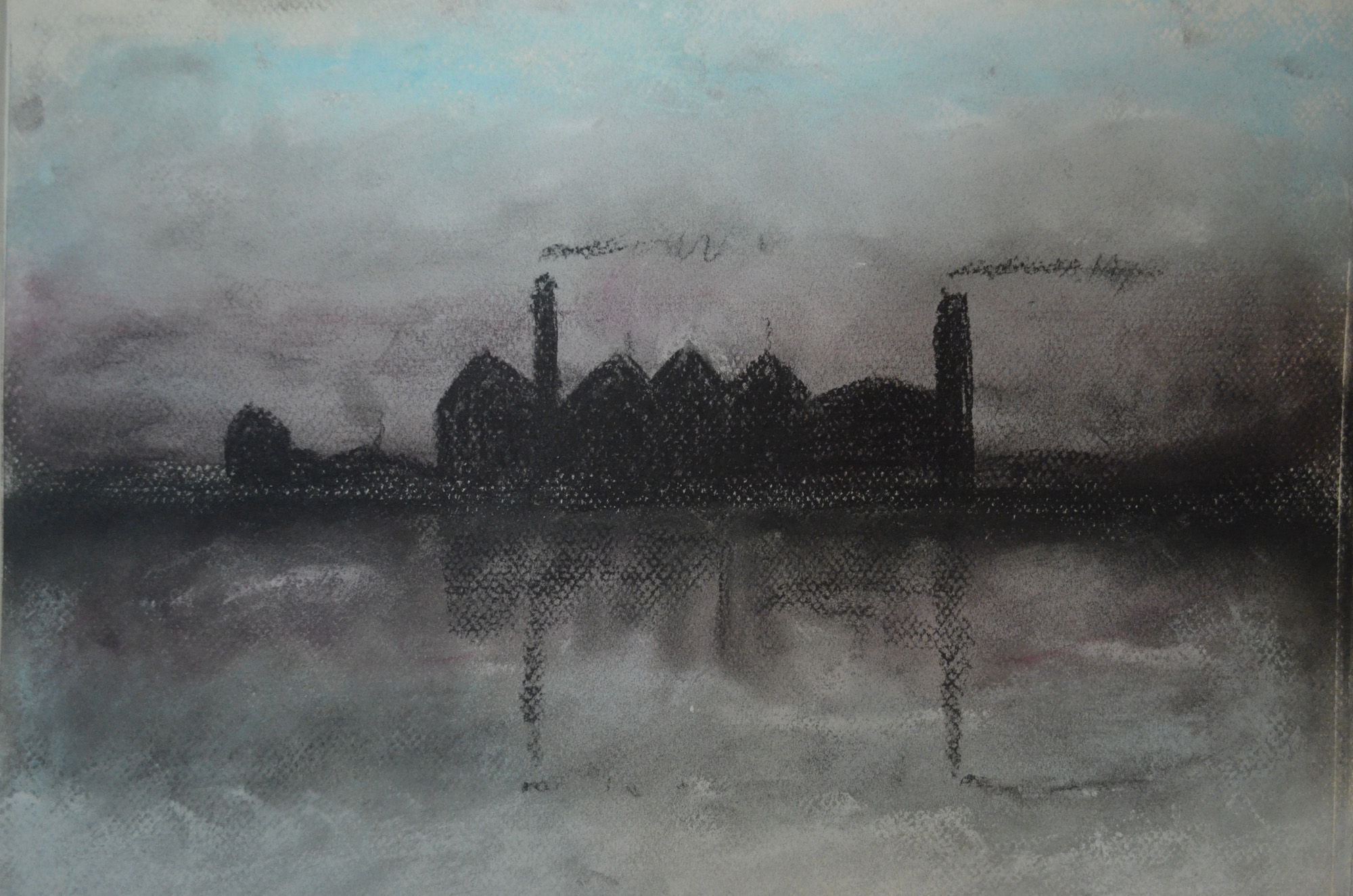
Pastels can be difficult to manipulate without overworking so I think you were right to keep it simple with your dark urban landscape, where you have created a sombre atmosphere and avoided detail.

You have also managed to achieve sensitive results with oil pastel which is partly due to your decision to add solvent. This has softened edges and prevented the build up of pastel which can easily happen.You have managed to achieve a degree of luminosity where you describe the skin and have been careful not to over emphasise the facial features.
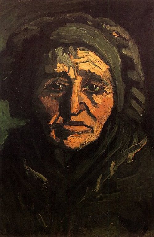
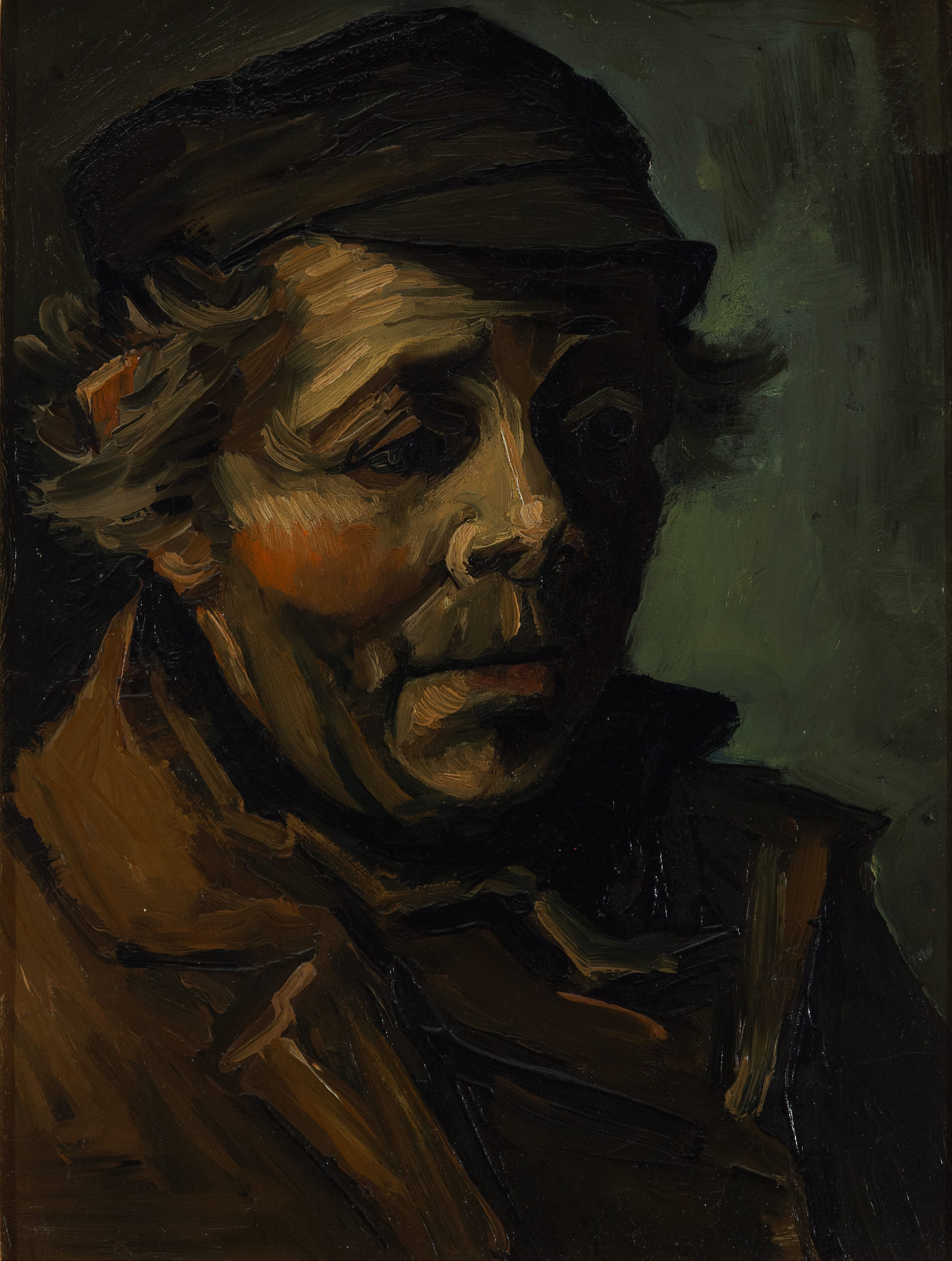
Monochrome studies

2 - Dark Branches over ight Grey GroundYou would probably have achieved better results if you had used an observational drawing from life or even a photograph you had taken yourself. This would have meant you had really looked and had some personal connection with it, whereas here the subject is rather stylised and unconvincing. Online images can of course be useful for research but a generic image of a winter tree is not going to inspire great paintings. However, I do realise this is a simple exercise about positive and negative space and you are right to note that these two techniques could be effective if both are combined in a painting.

Unfortunately here there are no winter trees in Thailand as the trees are green all year round. It’s for exercises like this that I wish I was in England.

Overlaying washes/ tonally graded wash

All of your washes are well executed and demonstrate a confident ability to control the application of fluid layers of paint.

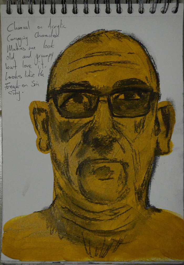
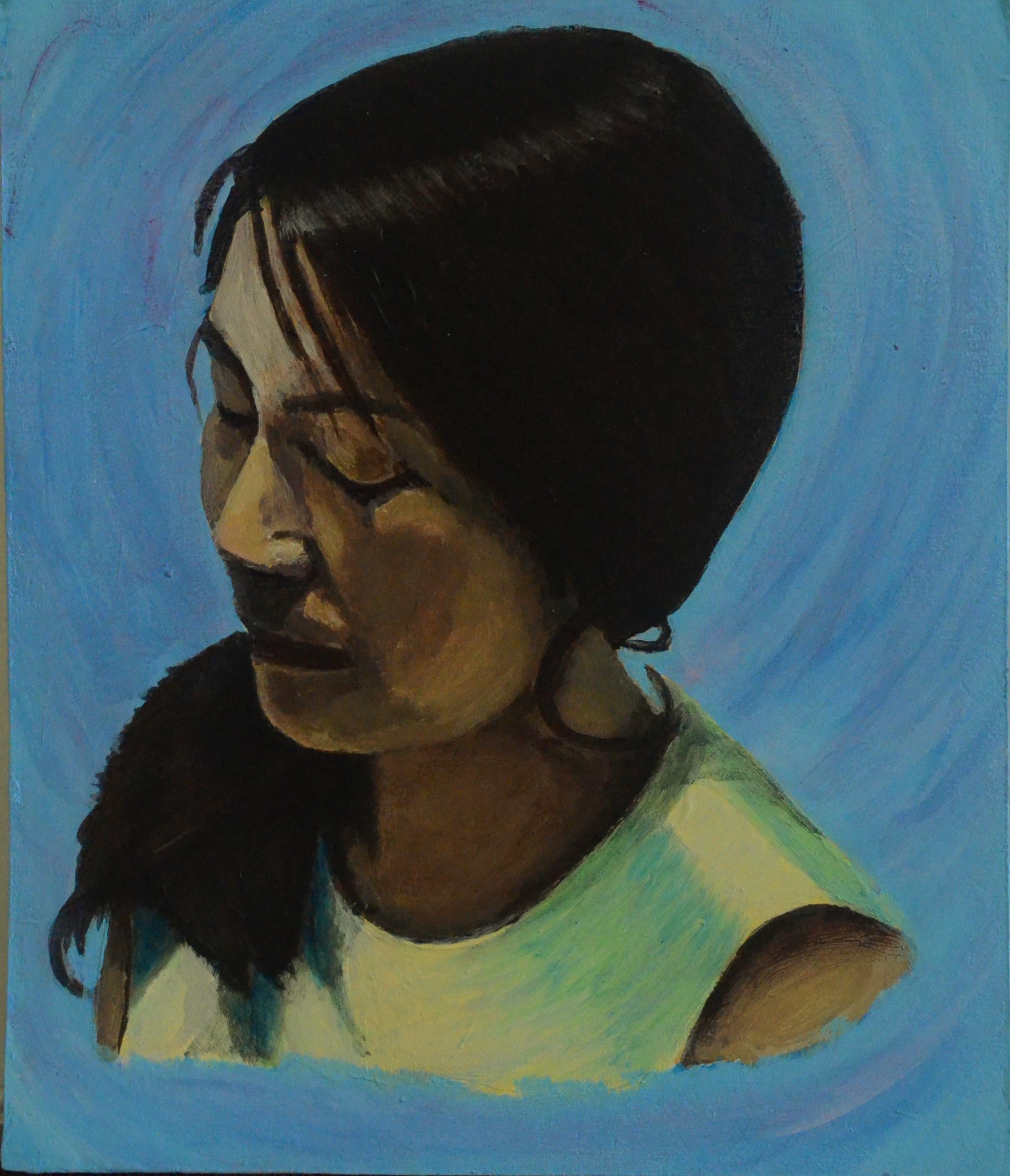
Tonal study on light ground

Tonal Study on a White Ground

Tonal Study on a White Ground

Here you successfully depict a good range of tones from light to dark, avoiding harsh contrasts and keeping your subtle grey/green palette fresh and clean. This suggests you didn’t labour over this piece though you have included the right amount of detail to give the objects presence.The subtle reflections across the table work well, as does the texture of the apple. You are thoughtfully employing a range of techniques that you have experimented with in previous exercises. I don’t agree with your comment that the dilute yellow ochre ground was a mistake as this has added warmth and depth. The results may have been rather cold and less interesting if you had started with a grey wash. However, I would suggest you avoid mixing colour with titanium white as it is very opaque and overpowering. Add the more transparent zinc white instead as this allows colour to retain a degree of vibrancy, even when tinted quite significantly.

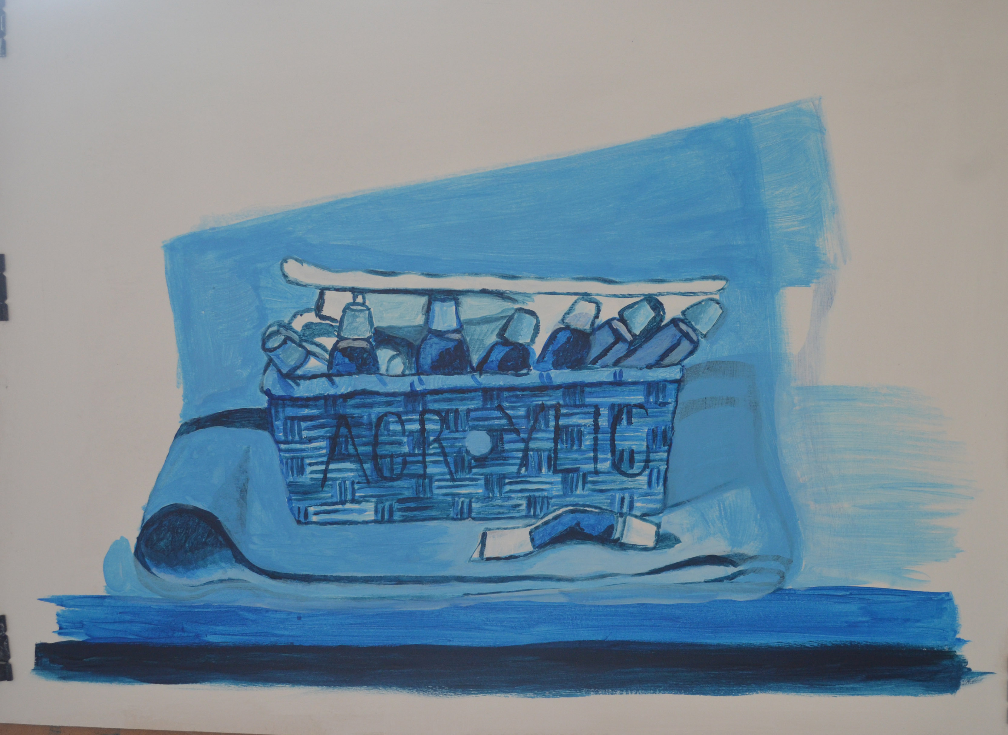
All the art supplies here in Bangkok only supply Titanium white, this led me to believe that you could only get Titanium white in Acrylics. For now I shall try tone it down until I purchase some on the internet.


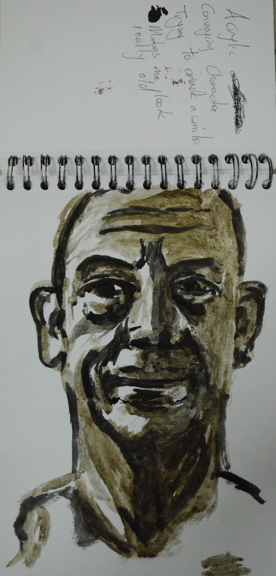
Tonal study on dark ground

Finished Study on dark Ground

Finished Study on dark Ground

Another successful study. Again, the light and shadow across the table are well rendered though the white highlights across the vase and bottle lid should have been softened slightly and made one or two tones darker. The composition is a more satisfying arrangement than the previous piece though I do prefer the paler study with the more sensitive handling of paint.  It is good that you decided to try a slightly different approach for both pieces and the results are confident.
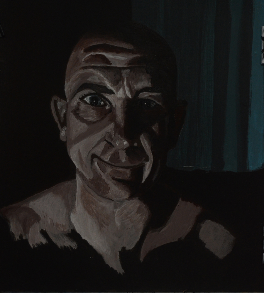
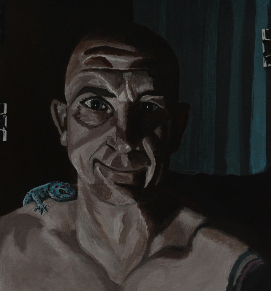
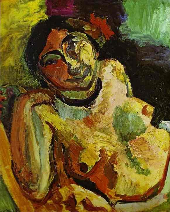
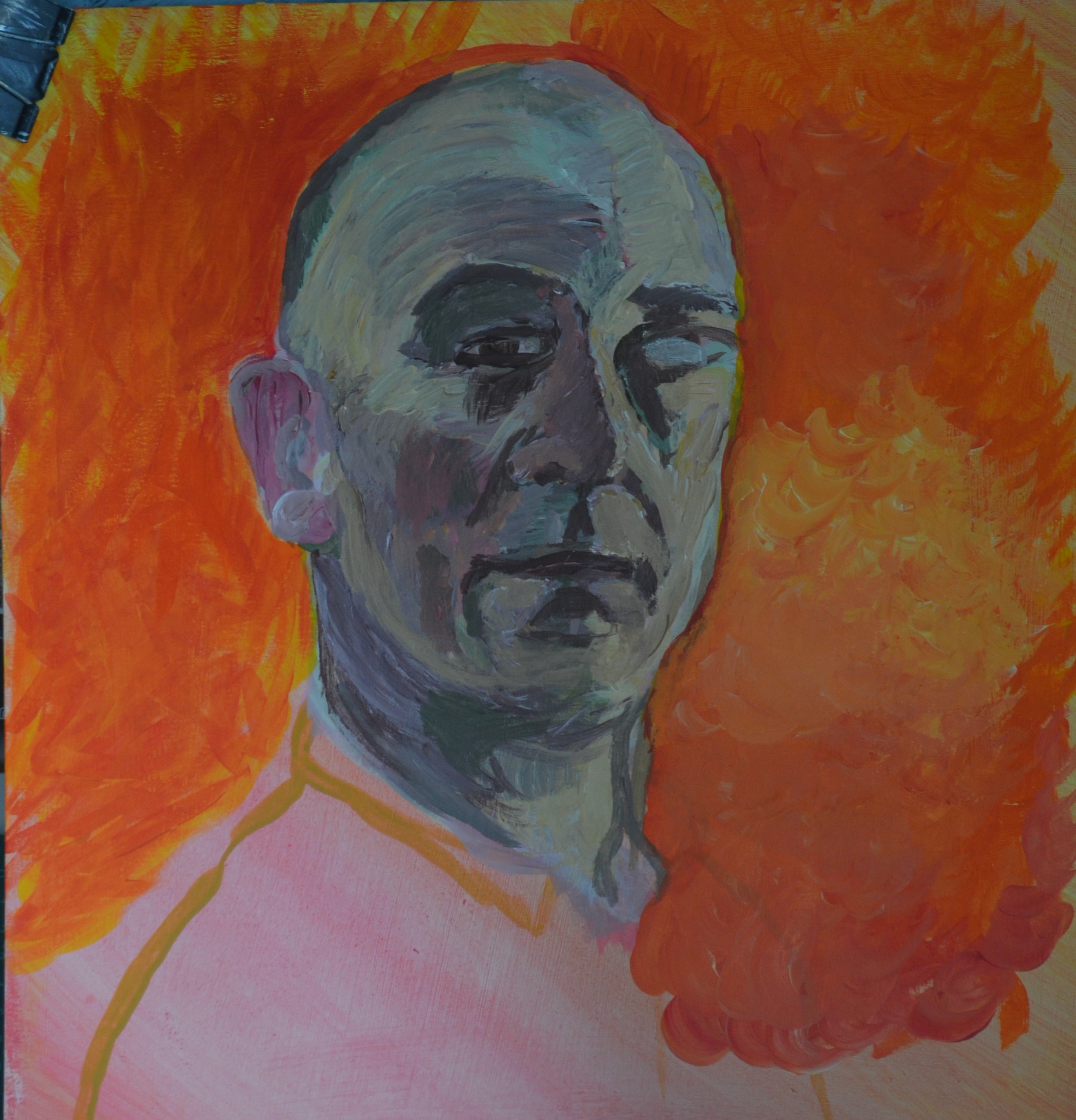
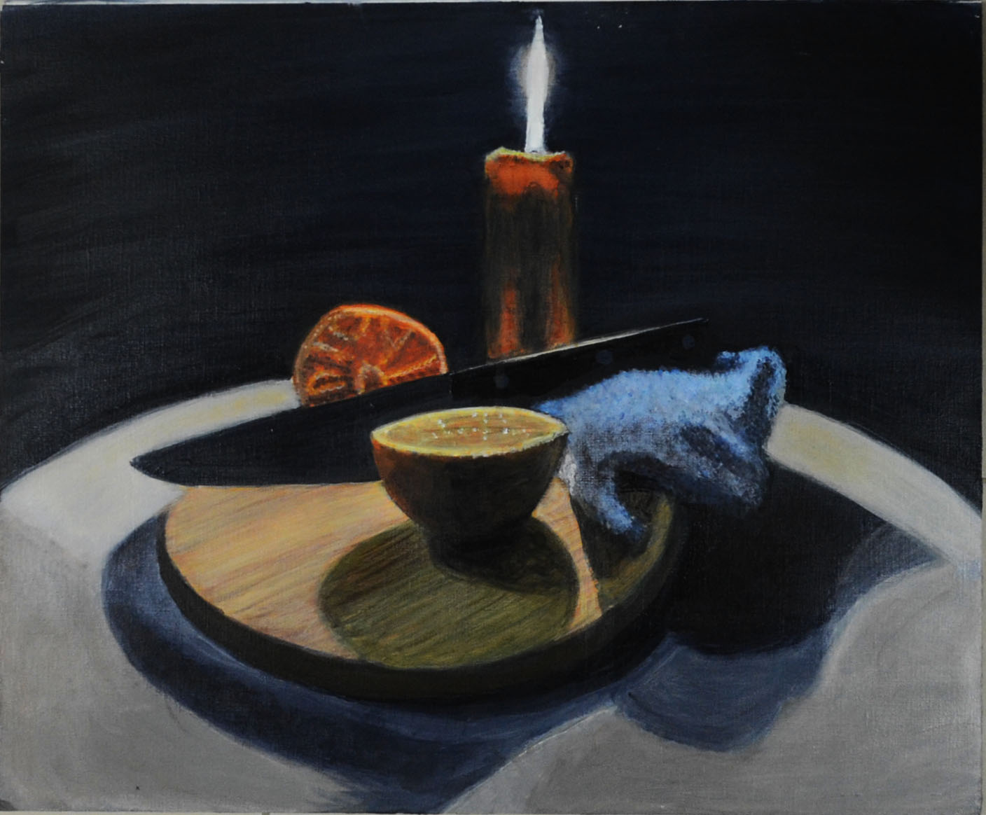
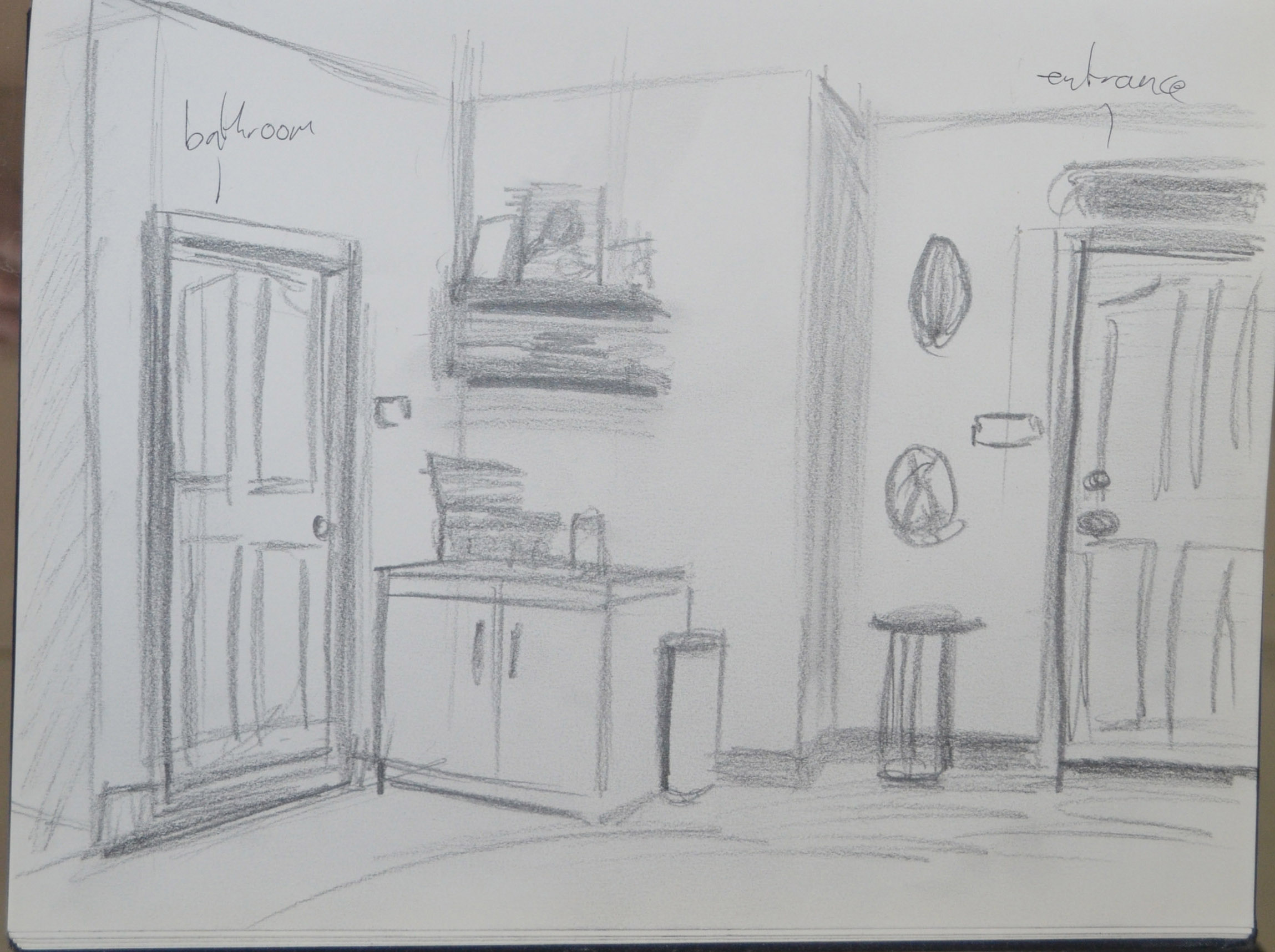
 

Final piece

Final Piece for Assignment 1

Final Piece for Assignment 1

You have prepared well for this final piece, making charcoal and oil pastel sketches to help you arrive at a pleasing composition.

The results are well balanced with a good combination of texture and mark making. There needs to be more shadow where the knife meets the chopping board, this looks a little flat but elsewhere, bold, unusual shapes of shadows add visual interest. I agree with your decision to add a glaze of burnt umber at the end. This adds depth and the blue background looked too obvious next to the orange. Complimentary colours clearly work well together but I think it is best to avoid relying on them in painting and instead use colour more imaginatively.
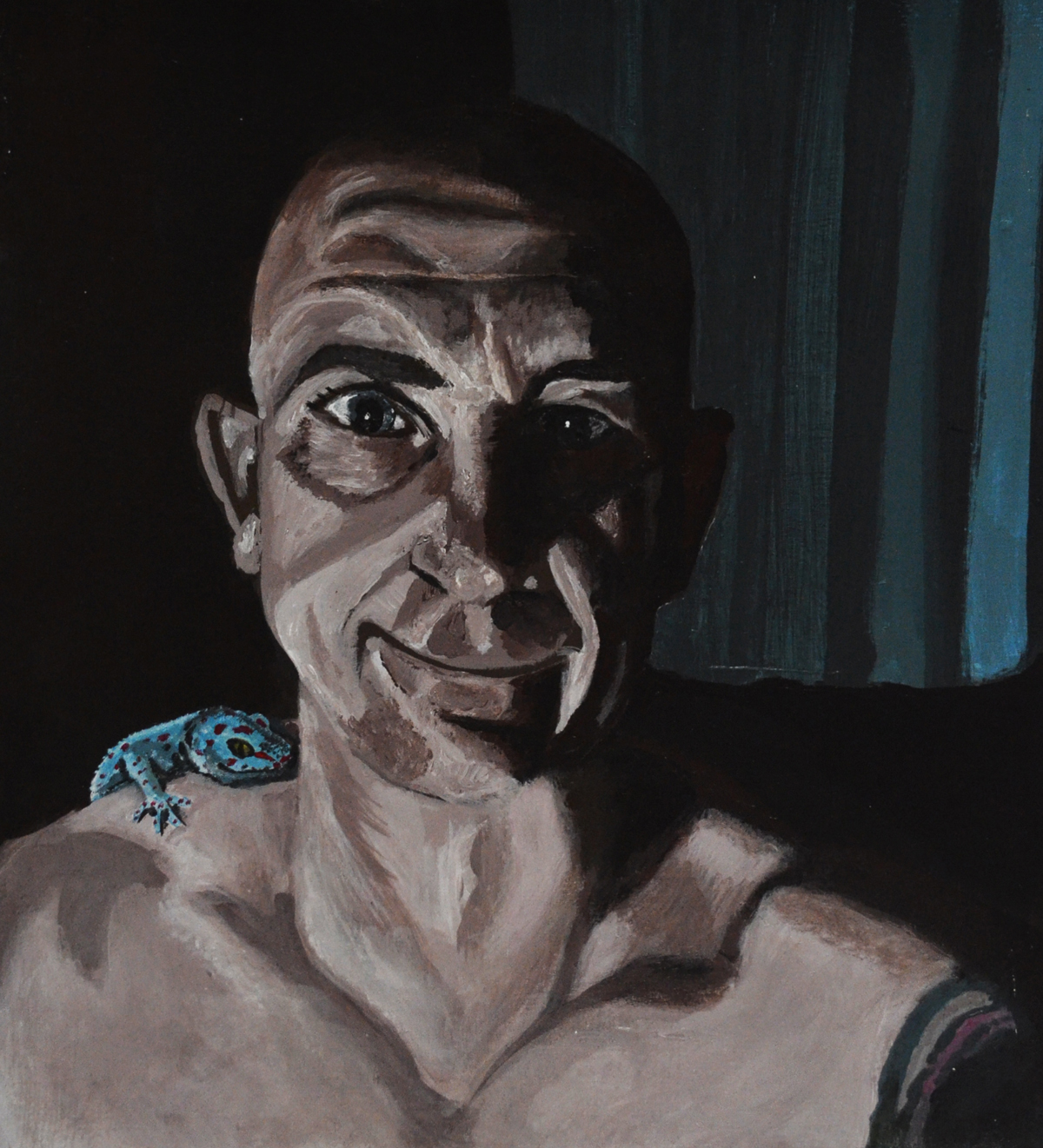
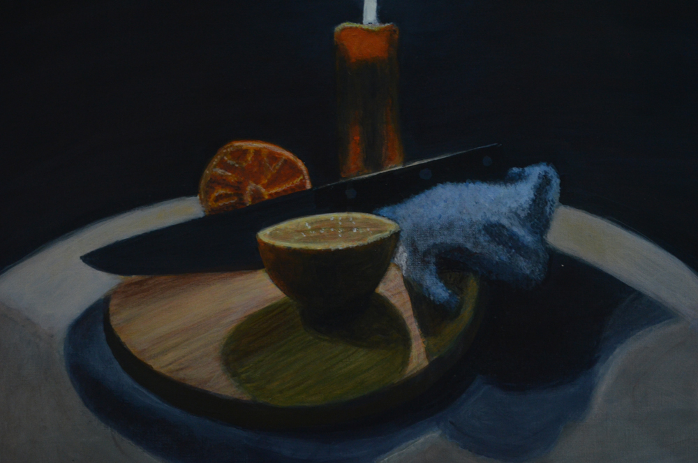
shadows added

shadows added

Looking at the half way point image there are one or two qualities here that have got lost in the final piece. You were right to want to tone down the colour and I appreciate your interest in adding dramatic lighting but there is some overworking. For instance, the cut orange behind the knife at it’s earlier stage does have a vibrancy and an economy of mark making that works well. The same applies to the candle.

I added shadows to where the edge of the knife meets the chopping board and I am very happy with the result. It now actually looks real.

Overall, you have completed a successful final piece that is the result of careful planning and a methodical approach  – building up layers of colour and combining techniques you have explored in the previous exercises. You will be encouraged to experiment more as you continue working through the course and I would like to see more inventive compositions but this is a very good start.
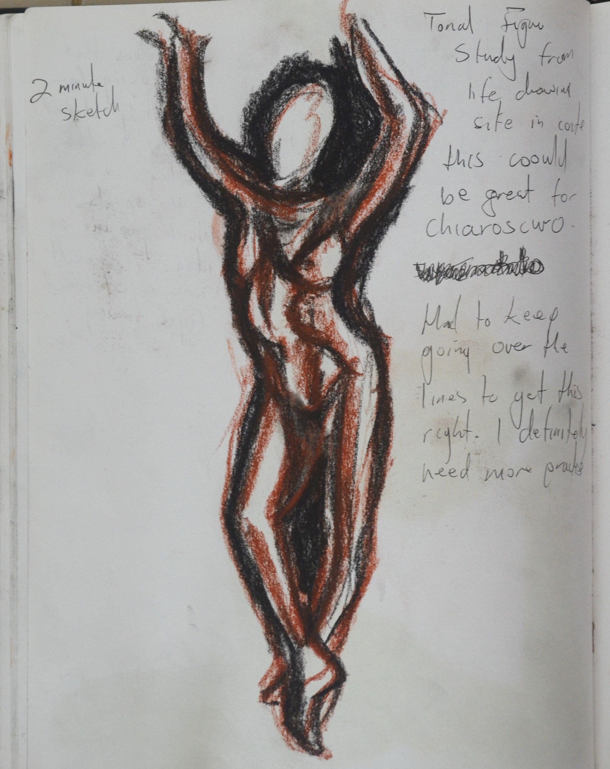
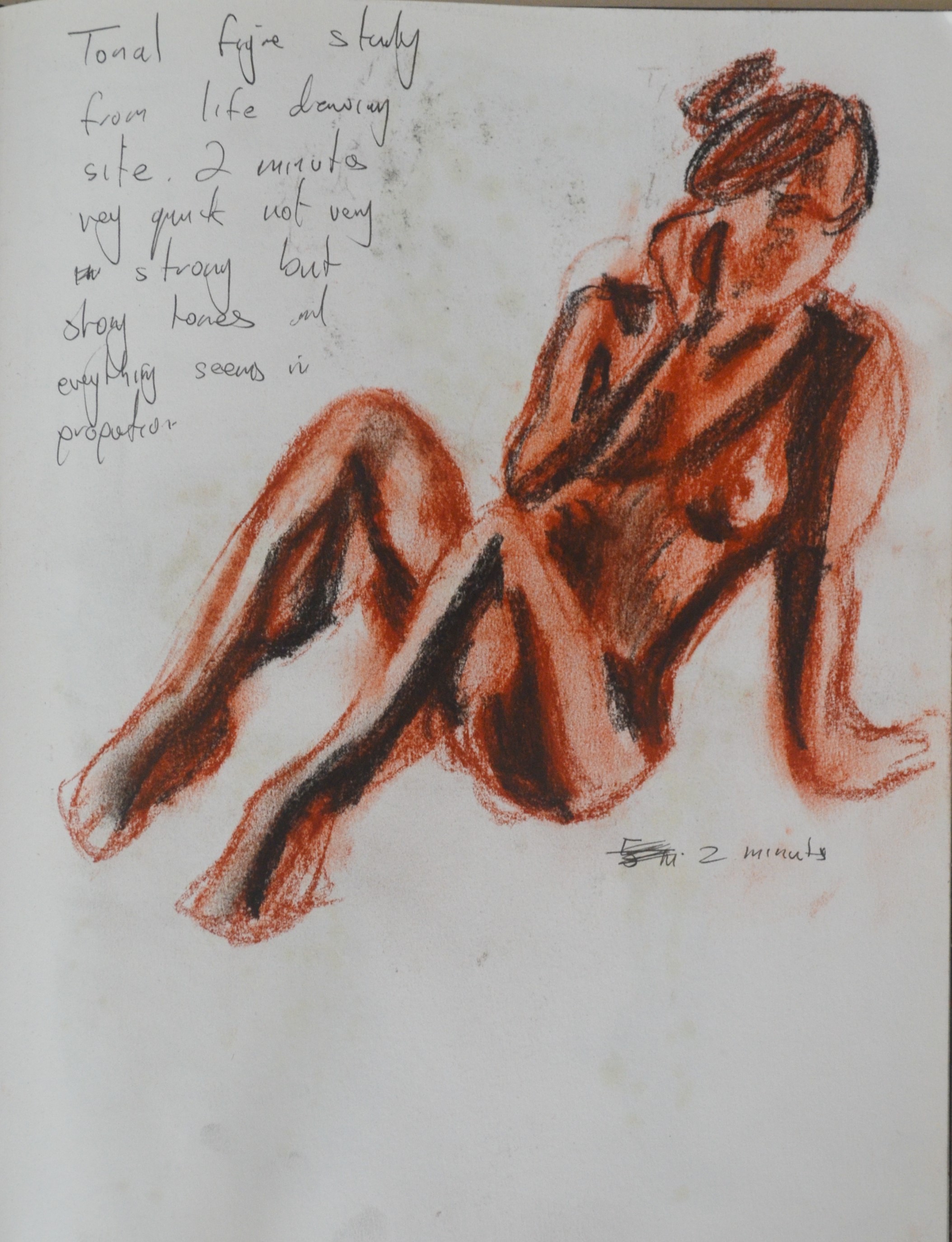
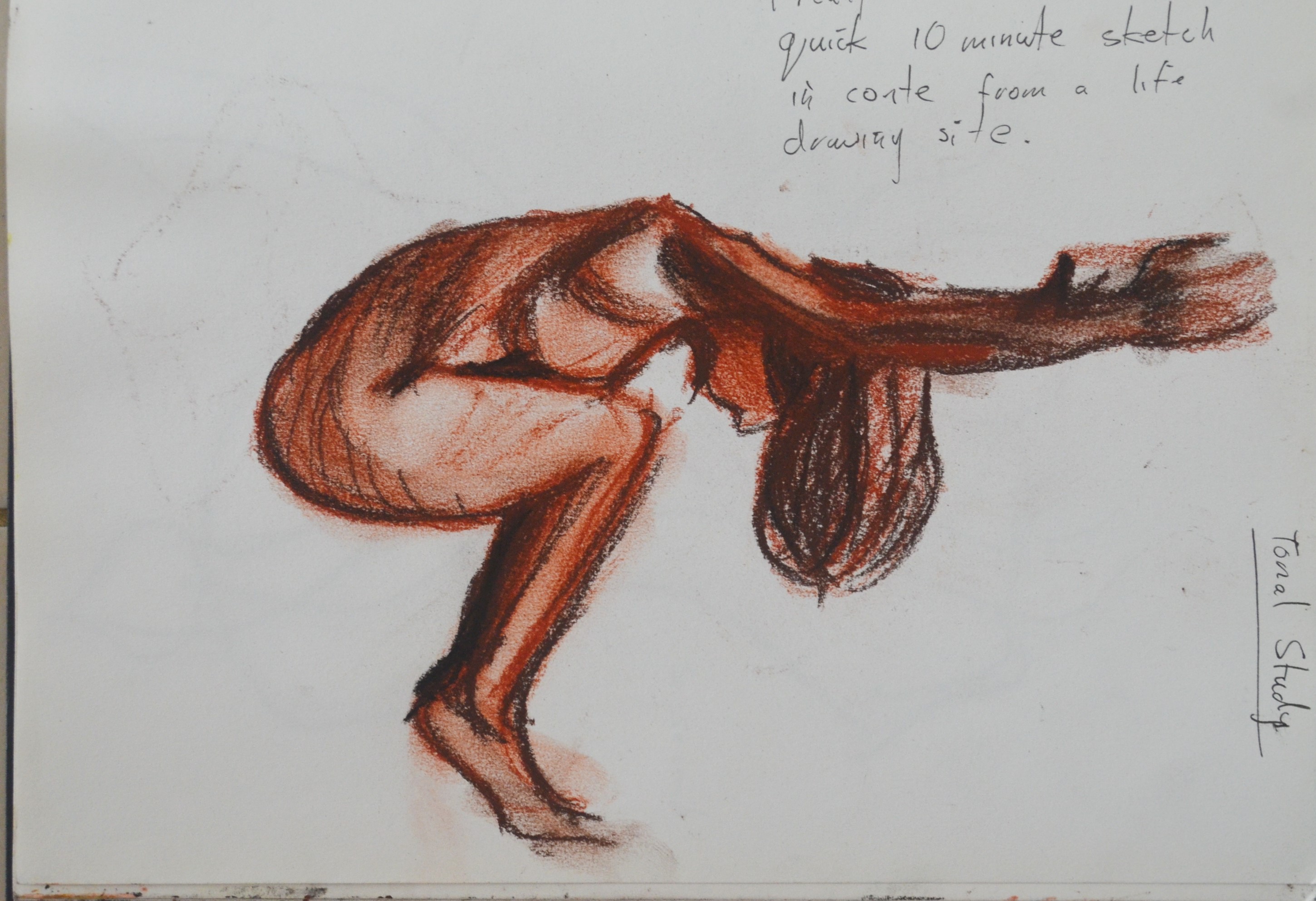
Sketchbooks

Demonstration of technical and Visual Skills, Demonstration of Creativity

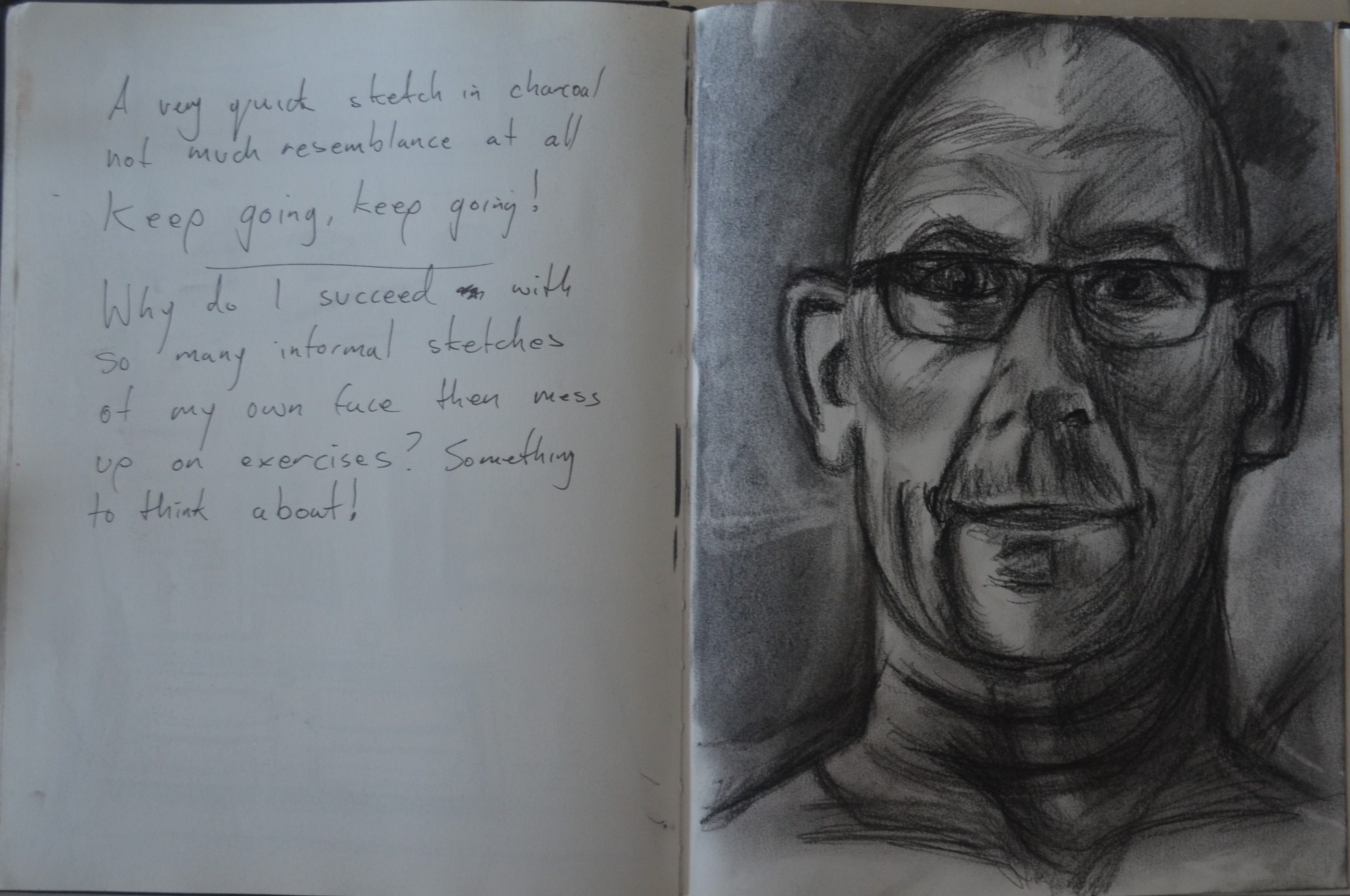
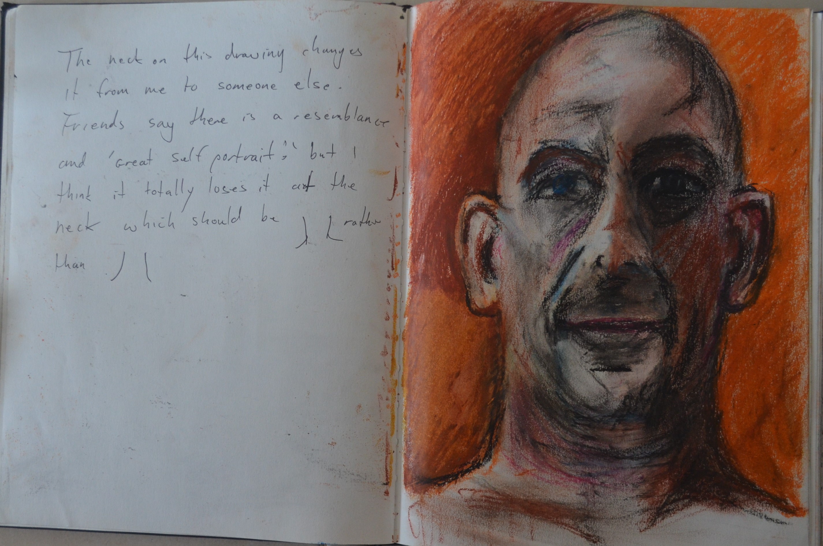
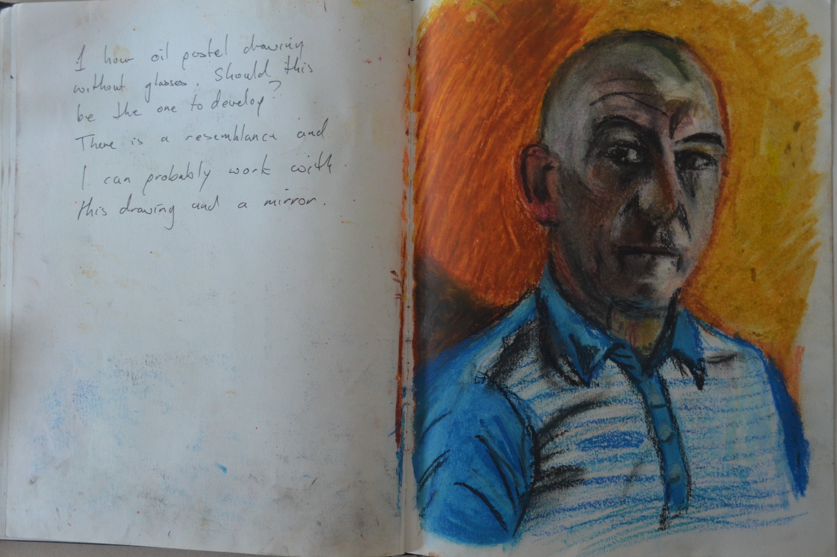
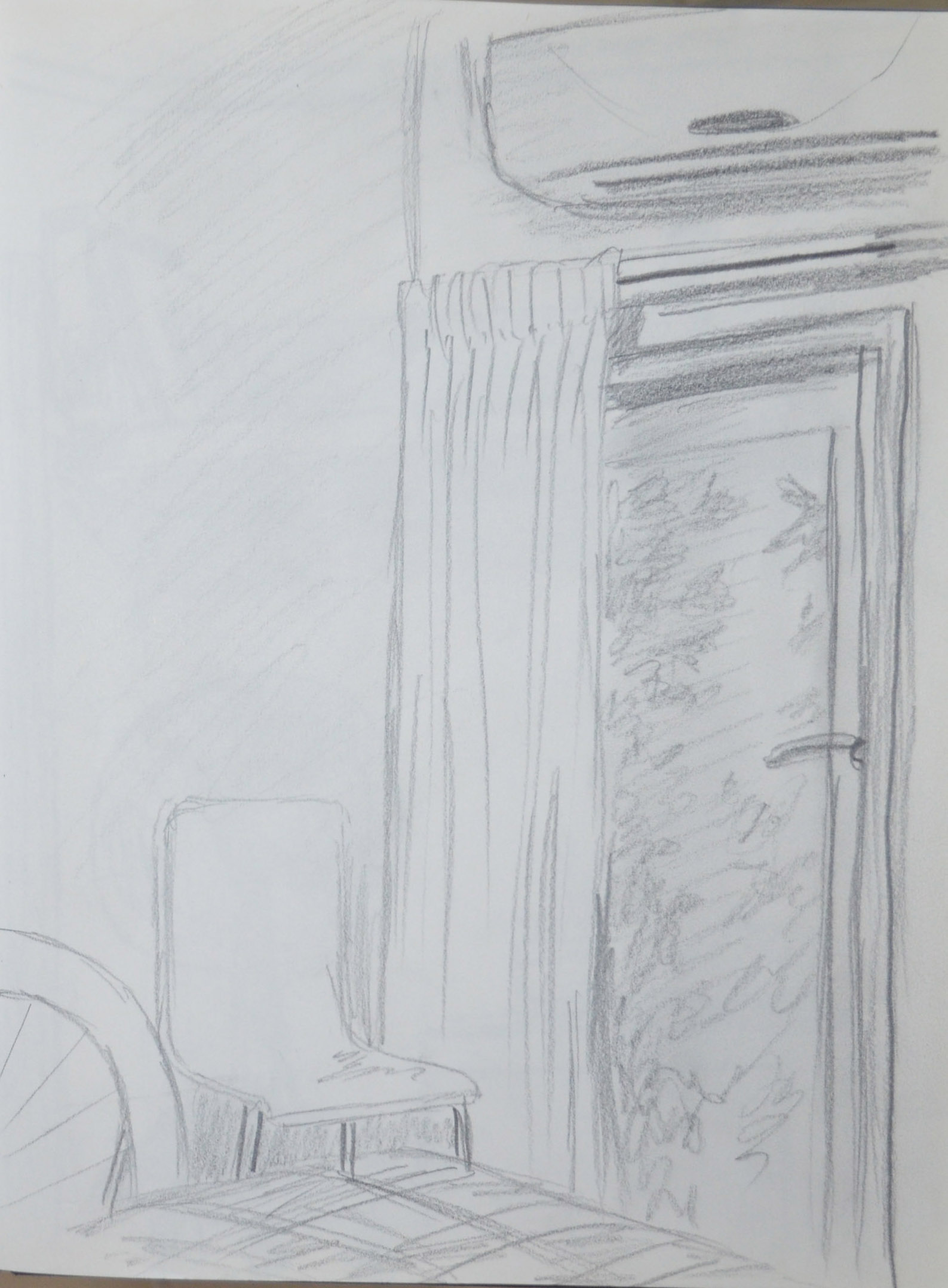
I have only seen a few pages from your sketchbook so don’t know how extensively you are using it. You seem to favour charcoal which you use with confidence but get into the habit of making quick sketches in watercolour, ink and acrylic. This will help build your confidence as well as your observational skills. And don’t be afraid to stray from the course material and sketch anything that inspires you. Sketchbooks are personal and a good place try things out and make mistakes.

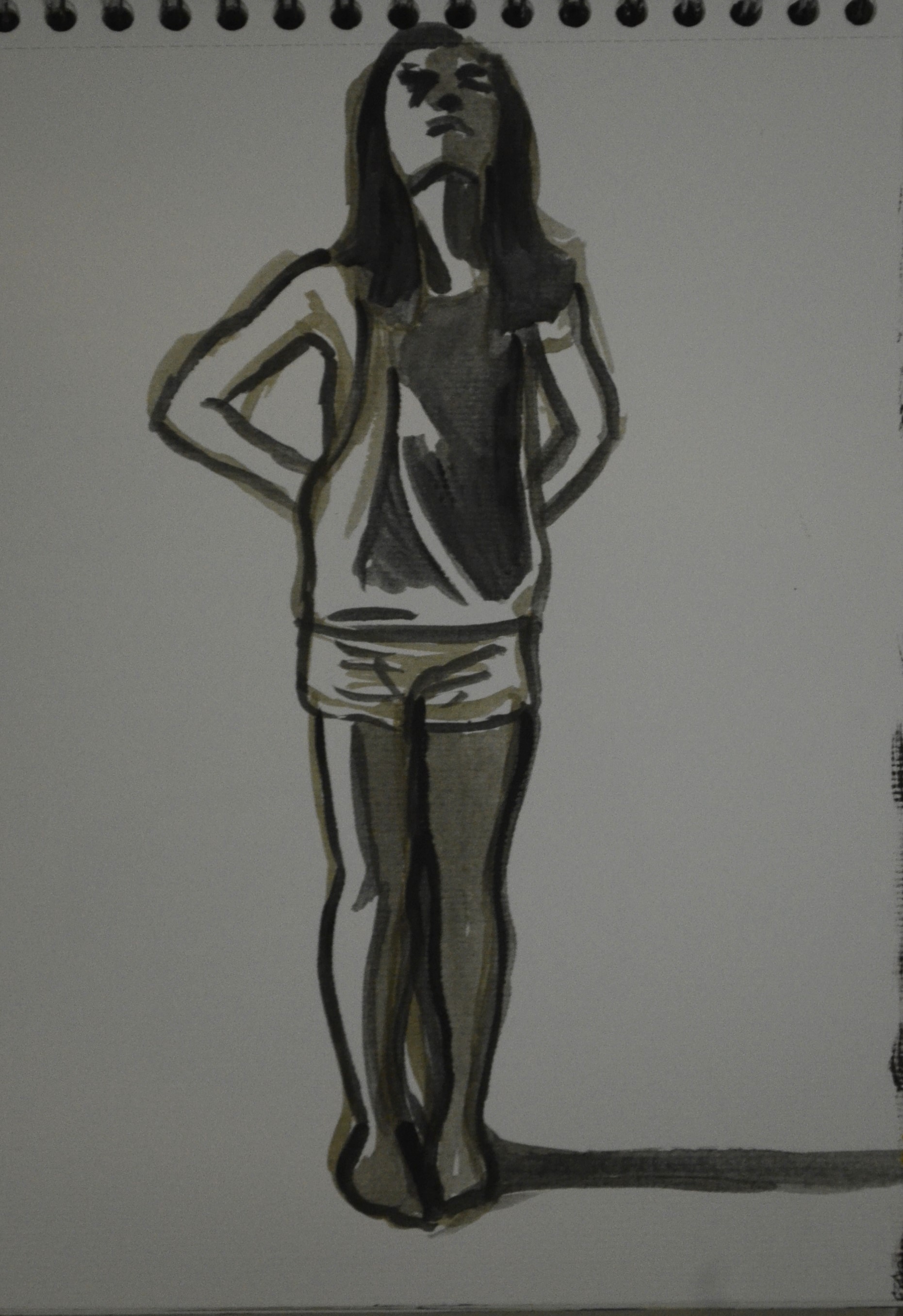
I have started to use my sketchbooks a lot more now. I kept a small sketchbook that I started a small project in . This sketchbook  was kept for quick self portraits and to spur me on I got kids at school to draw their self portraits in it with a choice of mediums and I drew my own self portrait next to them in the same medium. Sometimes the result of this was a collaboration like the page below. Unfortunately I left it in a taxi with my tablet and the taxi driver refused to answer the phone so I never got it back. Time to start again. Luckily I did take photographs with my phone.

self portrait on kids drawing 2

self portrait on kids drawing 2

Learning Logs or Blogs/Critical essays

Context

You are reflecting on your own development with honesty and evaluating the outcome of the various project exercises and considering how best to improve. Your approach to making work is conscientious and thoughtful. You should aim to increase the level of analysis, particularly in relation to the work of other artists and you are adding too much biographical information. I don’t need to read about the life of Rothko but I am interested in how you respond to his work and what you can learn from looking at it.

Suggested reading/viewing

Context

Look at the tree paintings of Elizabeth Magill. She combines an interesting range of techniques to evoke a slightly otherworldly sense of landscape. It is her use of transparent glazes beneath twisted tree forms that you might find interesting. Gillian Carnegie paints beautiful, tonal still life paintings that have a contemporary edge. Look at her flower paintings and the way her limited palette emphasizes form and tone. If you haven’t already, it might be worth investing in the book ‘vitamin P, perspectives in painting’ as it’s an extremely good survey of contemporary artists working with paint.

Also look at the work of Peter Doig and the still life paintings of Luc Tuymans, Morandi, Cezanne and Bonnard.

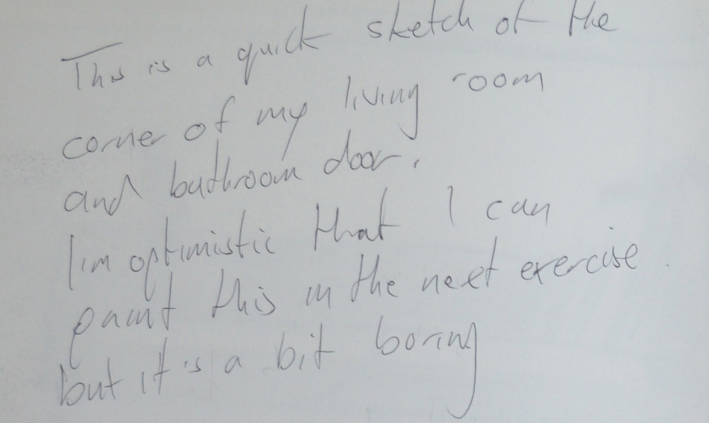
Pointers for the next assignment

Here you will have the opportunity to explore the possibilities of colour in more detail. You are already showing a good awareness of colour mixing and you will benefit from taking this further with this project. Try to resist the temptation to tighten up but allow yourself to be ambitious with the exercises, experimenting with a range of styles and processes. Also explore more unconventional compositions. As I’ve already mentioned, get into the habit of making quick colour studies in your sketchbook and avoid the use of titanium white.


Assignment 2 – Demonstration of Colour, Tone, Composition and Technique

9 Finished Painting in Acrylic on Board

Finished Painting in Acrylic on Board

Brief for the assignment 

Your painting for this assignment should demonstrate your understanding of colour, tone, composition and the development of your technique in your chosen medium.

Set up a still life in the corner of a room or table. Alternatively, you may want to develop one of the sketches or exercises that you have done in this part of the course.

Choose your painting medium and decide on the format and scale of your painting. Work on treated paper, card or canvas (at least A3) in either portrait or landscape format. Choose the background colour that you will use.

Draw the main shapes with a brush paying particular attention to:

  • your viewpoint
  • the direction of the light source
  • highlights and shadow (tone)
  • the relationship between objects and the background
  • the mood you wish to convey

My Subject

1 - Original Sketch from Drawing in Paint

1 – Original Sketch from Drawing in Paint

I wanted to develop an earlier sketch, which I did note in an earlier exercise. The sketch was of the basket in which I keep my acrylics and the tubes of paint inside. In that particular sketch I had used line, I wasn’t sure I would use it in the finished painting but it was definitely something to think about.

There was a problem with developing this sketch though and that was I had drawn it in the day I had drawn shadows but I wasn’t particularly paying much attention to the light source direction and so I thought it may be wise to start a fresh but using the same subject.

Colour Studies and Development

3 - Rough Study Influenced by Glenn Brown

3 – Rough Study Influenced by Glenn Brown

I wanted to demonstrate my understanding of most of what I had learnt through this part of the course in this piece so this time I decided to paint some of the surroundings as well for perspective set up the subject again on the monks cloth and set several more random items at the side of it that I could consider putting in the assignment piece which included a glue-stick, a small striped box and the remote control for the air-conditioning.

Glenn Brown - Ride with the Devil Sympathy for the Poor

Glenn Brown  Ride with the Devil, Sympathy for the Poor

The weave of the basket gave me an idea, I had been looking through vitamin P2 and came across work by the artist Glenn Brown and liked the way he seemed to use layers of thick paint to give his paintings texture and sense of three dimension and thought that this could be something that might work in my assignment piece.

After my not so brilliant attempt at a colour study influenced by the artist (see figure 3) I realized that it was probably not an ideal technique for acrylic paint which is what I would be using for this assignment.

Grey City 2 - Ziga Kariz

Grey City 2 – Ziga Kariz

Another painting that really caught my eye was Grey City 2 by Ziga Kariz, not really because of the style of his painting but because of his choice of colour blue, I wasn’t sure if I had really been successful in what the brief of the Still life with colour used to evoke mood exercise and this was probably a chance to have another go at that at least in a study if not the final piece.

4 - Study Inflenced by Ziga Kariz Grey City 2

4 – Study Inflenced by Ziga Kariz Grey City 2

This led to my next drawing in watercolour in my mixed media sketchbook over two pages something I hadn’t yet tried out. The drawing was really rough and didn’t take me long to complete but what I did learn from it was that firstly, I would use be using mainly blue as ‘blue’ was the mood I wanted to depict in my painting. I saw the tubes of paint inside the basket as being trapped inside the basket and the tube in front as escaping but not yet free and that is what I wanted to put across.

Secondly I wanted to make use of line, I really thought that outline would be something worth experimenting with in this painting and the original drawing and the first two studies told me to stick with it.

6 - Acrylic Paint Colours Closest to Watercolours

6 – Acrylic Paint Colours Closest to Watercolours

The water colour study in my sketchbook was painted with a field set and only had one blue so I squeezed several blues out from watercolour tubes and painted squares of each colour. I tried to stick to colours as close to the Grey City painting as I like the mood they portrayed. The colours I thought I would be using at this stage were Ultramarine (which I ticked in the image on the right), mineral blue (not sure if they had this in acrylic colour) and Prussian blue (which is directly under ultramarine in the photo).


5 - Watercolour Developed From Sketchbook Study

5 – Watercolour Developed From Sketchbook Study

With the colours identified I went on to see how these colours would look in a painting by doing another watercolour study on A3 paper with the chosen hues. The result was that I tried ultramarine in a small part of the painting but then decided not to use it and to omit from the final piece.

At this stage I still wasn’t sure whether I would be including the other items from the still life composition in the final painting.

Working on the Final Painting

Materials used:

  • A1 Card
  • Acrylic Paint, Ivory Black, Titanium white, Primary Blue, Prussian Blue
  • Brushes, a range of brushes in different sizes both synthetic and hogs bristle
  • Medium Acrylic Gel

I chose to do the final painting on board as I had plenty of it left from backing my wwork for my Drawing 1 course formal assessment. In the last watercolour study I left a white border which I really liked plus there was a lot of white showing through from the background which helped depict the light reflecting off the paint tops and the basket and so unlike my last assignment and previous paintings for this one I decided to use a white background and so treated the card with gezzo and then a coat of white.

7 - Drawing in Paint

7 – Drawing in Paint

When it came to painting in acrylic there was no mineral blue but primary blue mixed with a certain amount of white had the same hue, so that wasn’t a problem. I began the painting by drawing the main shapes with a dilute mix of primary blue. There were plenty of errors and I would soon find that the position of the tubes of paint  (and they were positioned, not just thrown in) made them unconvincing as tubes of paint so I had to think of how I would make their forms more visible.

8 Developing the Background

8 – Developing background and contents

On the second day I painted over the basket and this time repainted the basket with paint mixed with a medium gel, this helped to depict the texture of the woven basket.  Then I began to experiment by painting duplicates of the upright bottle in the centre to see if it improved the look of the contents on the inside of the basket. It made it worse, this time the contents looked to organised, to artificial and too overcrowded.

I continued to work on the cloth, shelf and basket so I could see the whole picture this helped me to decide on how to tackle the contents of the basket.

Contrary to what my colour studies told me I used more primary blue than any other colour. I found that by using a neutral primary blue and white mix and then going over it with white on a try brush using a scrumbling technique gave me better tones than using different colour mixes, it also ensured that I could get the exact colour that I wanted from the blue and white. I could then use layers of primary or Prussian blue for the darker areas where needed such as on the folds of the cloth.

Working on the contents of the basket again I decided that it was best to paint just a few of the upright tubes with the others laying down in the background. I painted the darker shapes first with a mix of primary and Prussian blue and then then highlighted with lighter mixes using white this gave me the outlines.

I could now see that the painting was developing into something completely different to what I had planned and I really liked the way it was coming along. The paint tubes gave the painting an almost three dimensional cartoon feel, with soft but bold shapes and so I carried on with this continuing the same kind of technique with the cloth. I then added more light to the folds of the cloth to make the folds look bolder the result of which reminded me of the hills in Grant Wood’s paintings.

Still Life with Remote Control

Still Life with Remote Control

I then painted in the tube of paint to the right and the remote control but then decided to paint it out. The reasons for me doing this were one that I could not get the perspective of the remote control right and two I saw no point painting the glue-stick and box on the other side so the best way to level out the still life was to remove everything other than the main subjects.


9 Finished Painting in Acrylic on Board

Finished Painting in Acrylic on Board

Lastly I worked on the shadows to the right of the subjects and for me this was the most difficult part. The reason for this was that in the painting I had exaggerated the light in order to give me bolder forms as well as to emphasize the mood of the painting. In the actual still life the shadows were quite short and fell just past the tube of paint to the right of the cloth but because I had  ‘stretched’ the light to the right of the basket I wanted to stick this by making the shadows longer as I did with my final piece for Assignment 5 for Drawing 1 where I found that  accentuating the shadows  made the mood stronger.

I painted the shadows with a mix of primary blue and black applied in thin glazes with a flat brush and shaped the shadow on the back wall so that it would depict the light being blocked out by both the cloth and the basket in a continuous shape. I think I managed to pull it off but I don’t know if it will be convincing to viewers as it is to me.

Things I like about the finished painting

It’s different to anything I have done before. I have never made use of line in a painting or drawing before and I like the way it turned out. It didn’t turn out as I expected but I was experimenting throughout the assignment from initial studies to the final piece, not just with line but also with colour and form. I feel that I have managed to evoke the mood that I intended to and the white boarder adds to this.

Things that I am not sure about

I am still in two minds to whether I should crop the painting as maybe I zoomed out a bit two much. If i had zoomed in more and painted the basket bigger like in the original sketch I could have spent more time on the detail and the subjects would probably look a lot looser. I’m still not sure whether there is enough shadow on the painting.


Drawing and Painting Interiors 2 – Quick Sketches Around the House

Look around an interior space that you know well and spend time in – your kitchen, study, shed, greenhouse or garage would be all good subjects. You’re not looking for interesting objects to arrange as you did for the still life exercises, you’re finding an area to draw and paint as it is. Don’t spend more than an hour on this exercise.

Because my apartment is basically only two rooms with  not many interesting angles to draw I did this exercise in two parts. The first part was in the work place where I wasn’t looking to make sketches to develop but simply practise sketching with pen and watercolour in my new Folio A5 mixed media sketchbook (which I found a lot nicer than Moleskine)and to develop my interior drawing skils. I made three of these sketches that took about 25-30 minutes each, two at the ECC language centre where I work in the evenings and 1 at school where I chose to draw the teacher as well as she refused to move.

The ECC perspective on the ecc sketches were perfect but the perspective on the school office drawing was well out, the wlls were quite plain in colour but I tried to depict the perspective by the pen line along the wall, unfortunately I got that wrong and it couldn’t be edited.

1 - Pen and Watercolour Sketch at ECC

1 – Pen and Watercolour Sketch at ECC

2 - Pen and watercolour Sketch at School

2 – Pen and watercolour Sketch at School

3 - Pen and Watercolour Sketch of ECC Corridor

3 – Pen and Watercolour Sketch of ECC Corridor

The second part of this exercise I did at home in my apartment starting in  the bedroom drawing the door to the balcony from the bed. On this first drawing I made my usual mistake of making the drawing too large and therefore only drawing a fraction of what i could see.


4 - 1st Pencil Sketch in my Apartment

4 – 1st Pencil Sketch in my Apartment

5 - 1st Pencil Sketch Notes

5 – 1st Pencil Sketch Notes

6 - 2nd Pencil Sketch in my Apartment - Notes

6 – 2nd Pencil Sketch in my Apartment – Notes

The second drawing was much better and I quite would have been  good sketch to be developed, unfortunately painting in the bedroom would be very messy as there isn’t enough room to swing a cat.

6 - 2nd Pencil Sketch in my Apartment

6 – 2nd Pencil Sketch in my Apartment

From there I went on to draw part of my living room, this I drew from a laying a seated position on my sofa which is where I usually view all my apartment from. The perspective was ok to say it was quite a quick drawing but I didn’t really fancy painting as it would have been a bit too technical for me at this stage with all the molded doors.

7 - 3rd Pencil Sketch in my Apartment

7 – 3rd Pencil Sketch in my Apartment

8 - 3rd Pencil Sketch in my Apartment - Notes

8 – 3rd Pencil Sketch in my Apartment – Notes

9 - 4th Pencil Sketch in my Apartment

9 – 4th Pencil Sketch in my Apartment

The next sketch was of just part of the apartment, the bathroom door, the perspective was well out but it at this stage I thought it was the best sketch to develop into a painting for the nest exercise.

10 - 4th Pencil Sketch Notes

10 – 4th Pencil Sketch Notes

11 - 5th Sketch

11 – 5th Sketch

The last sketch was of the corner of my apartment with the fan this would make a great painting later on but at this stage again too technical.