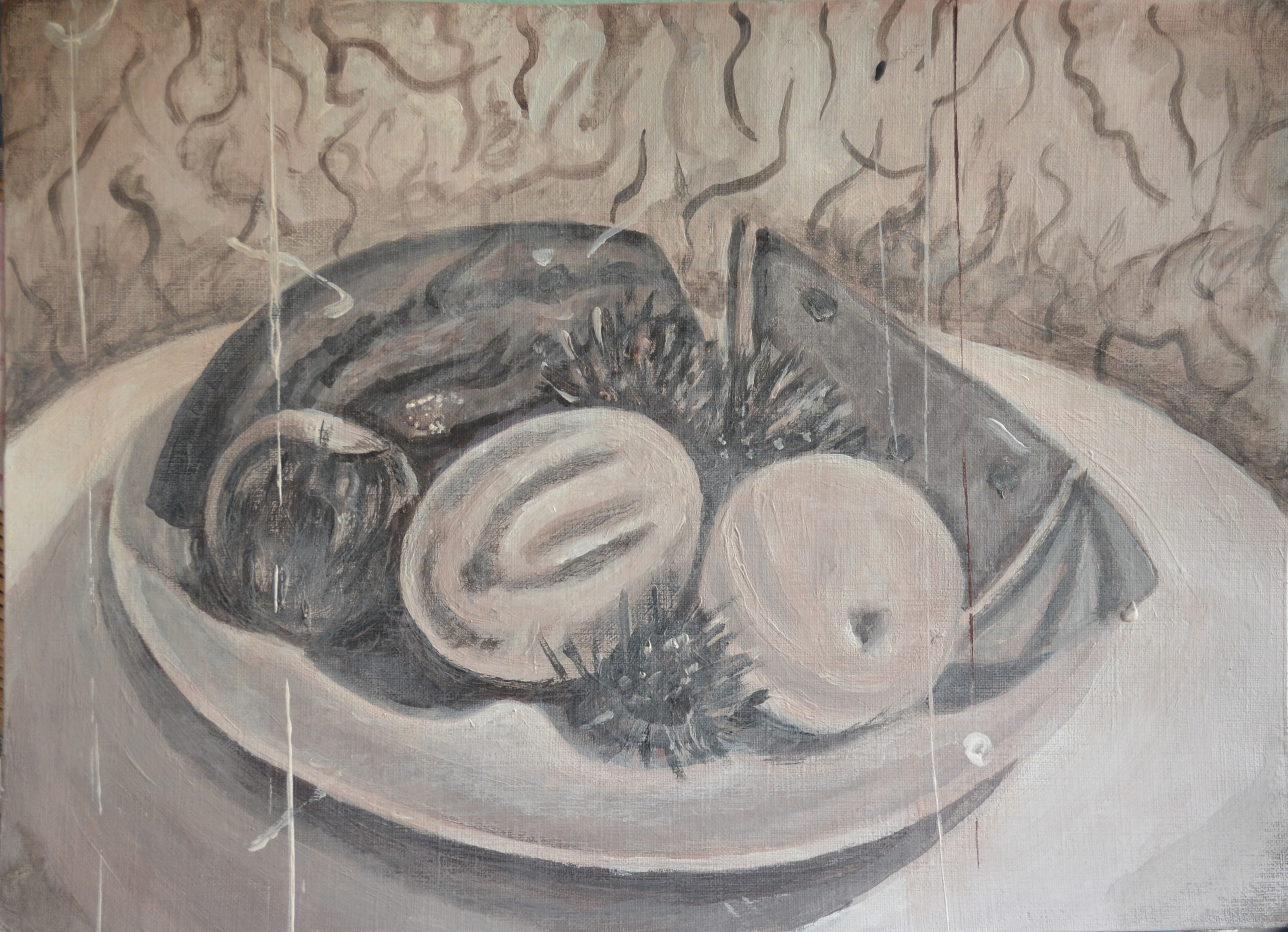
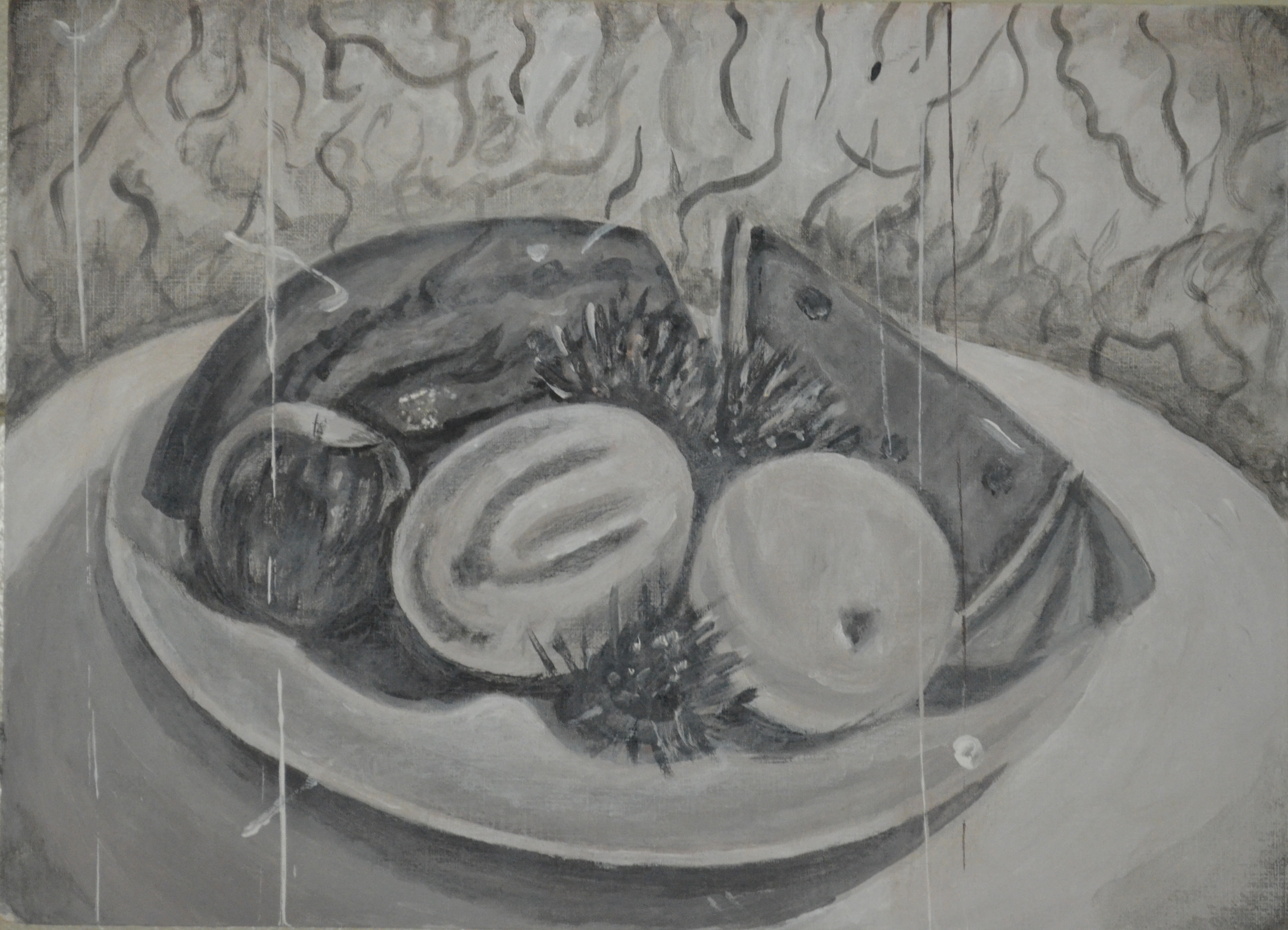
Finished Piece in Sepia
For this exercise paint your still life in any way that you choose. Make decisions an advance about the range of colours that you will use. You are aiming to create a mood or atmosphere in your use of colour and handling paint.
The idea for this exercise started with the last study in complimentary colours. Experimenting with the background made the painting look quite creepy and looking at it I couldn’t help thinking of a Tim Burton movies so with that in mind I tried to build on that for this exercise hoping to evoke a sinister mood to the painting.
For some reason I couldn’t imagine this still life in any other colour but Sepia and so I edited a photo of the previous still life in Photoshop so that I could try and work out for myself, without looking on Google which colours would make Sepia.
It wasn’t as easy as I thought, I could see a lot of different hues in the Sepia photo and so I decided to experiment with some colours, these were:
- White + Payne’s Grey + Rose
- White + Payne’s Grey + Yellow Ochre
- White + Payne’s Grey + Orange
- White + Payne’s Grey + Copper
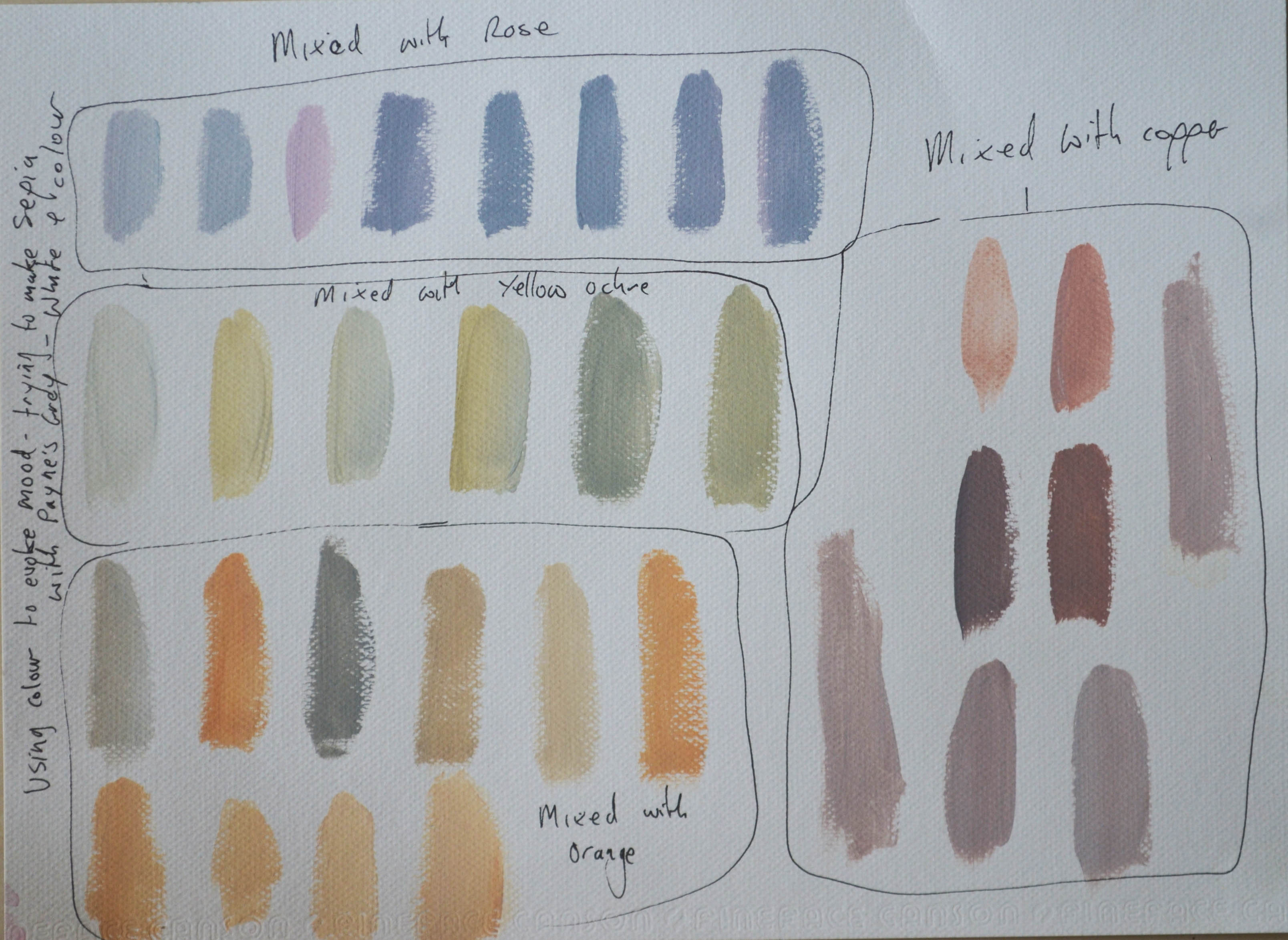
1 Finding Sepia
Of all the colours the copper mix looked best and so I decided to start the still life composition to see how well the colours looked together. I used the same big brush technique as in the previous exercise barring the spines of the rambutan. Eve though the three colours looked great together in my experiment they didn’t look that great on paper the Payne’s gray looked too blueish and it was obvious it needed swapping for black. I was also going through the copper at an alarming rate as it was only a small tube then I realised that the copper was very similar to Burnt Umber and so I swapped again.

2 Still Life in Sepia
The finished piece looked great, you could see it was a Sepia painting but it didn’t look how I expected it to, I asked my girlfriend how she felt when she looked at it and her reply was ‘sad and cold’ these weren’t the moods I were going for but at least the painting was getting some kind of emotional reaction.
At this stage I thought it wouldn’t hurt to experiment further and so I kept experimenting hoping to find the result I had been hoping for. I began by making a very thin mix of Burnt Sienna and white and applied it over the top of the painting with a scrumbling technique to try and give the painting an aged look.
I then applied made a light mix and a dark mix of the same colours then run the edges of a another sheet of paper through them and and then applied the paint to the painting in very thin vertical lines to give it an old movie flicker effect then added a few more white specs and flicks with a thin detail brush.
3 Still ife in Sepia – Trying to be Sinister
I’m not sure what mood this painting evokes but if nothing else it does look like the scene from an old movie or a cine-cam clip from an horror movie or at least I hope it does.
I am satisfied with the way this painting turned out , the photo above doesn’t do it justice there is actually a lot more colour to it,. I Think that this style would really suit a portrait and so I hope to put it to use a bit later on in this course.
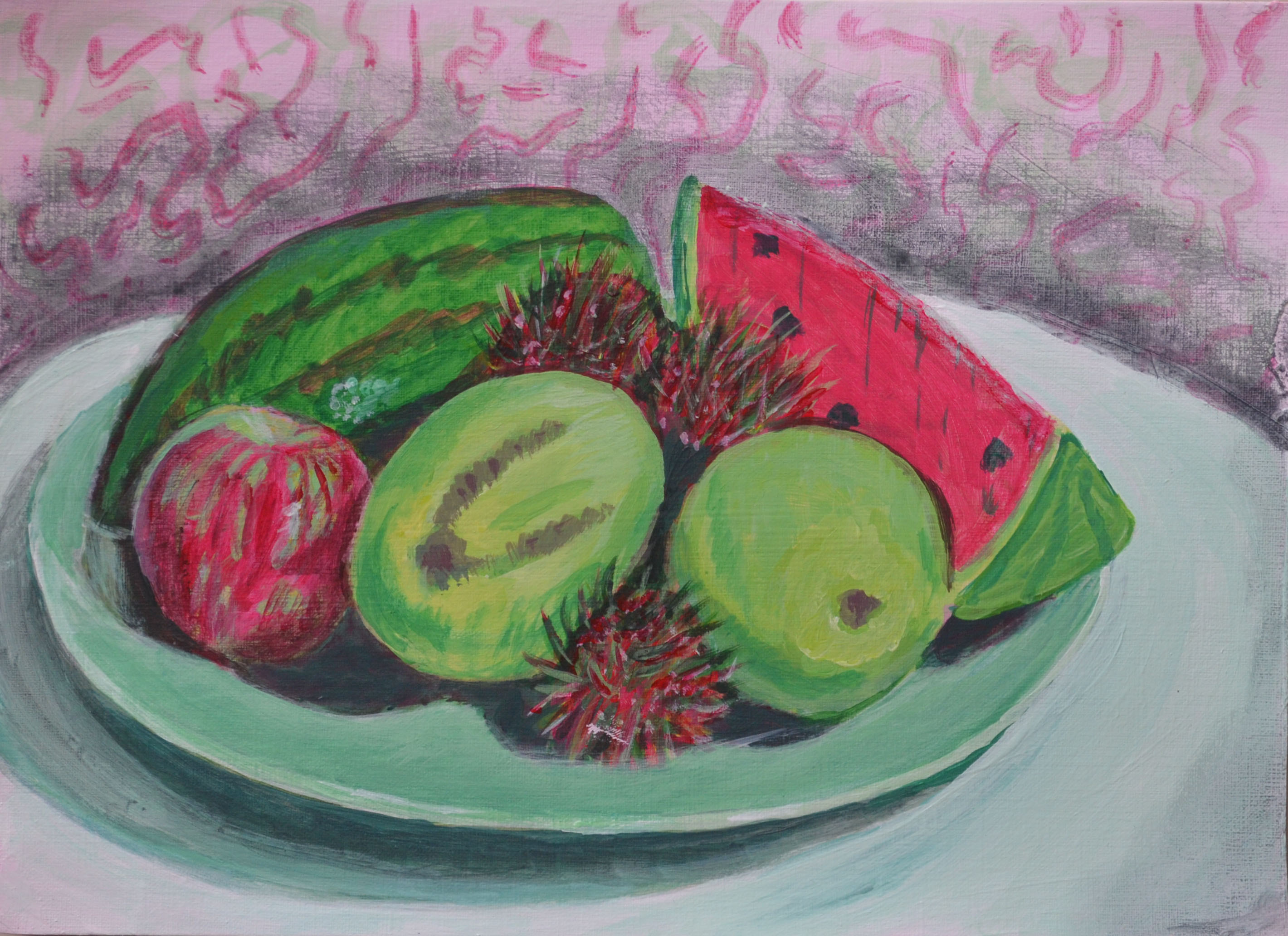
Still Life with Complimentary Colours
Colour used to evoke mood
Looking at the paintings side by side the composition is almost identical but the effects that I have created in both are completely different. In the first study, Still Life with Complimentary colours the subjects are very three dimensional but yet due to the limited palette of two complimentary colours the subjects look to have an over-exaggerated sense of form as if they are made from Plasticine, the background seems to emphasize this.
In this last exercise my intention was to build on the qualities that already existed in the previous painting and to try and evoke mood by realizing what I imagined the finished painting to be like. The effects used in this new painting were very different, unlike the first study in this last study I managed to create a sense of distance, like the composition is in the background and the movie clip lines/flicker effects are in the foreground. I think going over the painting with the mix of white and burnt Sienna with the scrumbling technique I mentioned earlier to tone down the composition and then painting definite horizontal lines over the top created this distance effect. It probably doesn’t look as sinister as what I expected with the still life but I can imagine this effect would work really well with a Sepia self portrait or scary doll on a trike.