Living in Bangkok it is very hard to find any rural landscape to draw or paint for this exercise but luckily enough it was a very busy month socially and within the space of a few weeks I had travelled to the seaside town of Pattaya and Koh Lan (Coral Island) to my girlfriend’s home town of Chiang Khong, just across the Meekong from Laos. This helped me get in quite a few studies of both rural and urban studies in a matter of days.
Urban Sketches
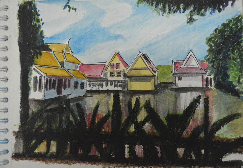
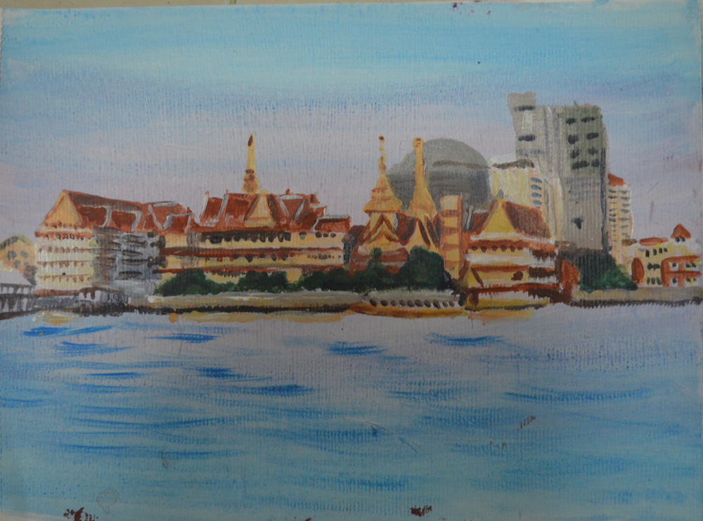
Chao Phraya River Bangkok

Wet on Wet Water Soluble Pencils
This is one of my favourite sketches of a hard landscape to date and it was a very different style for me. I made the sketch with wet water soluble pencils in a side to side motion on wet paper. The problem though was that I did not capture enough information to turn into a painting and another trip to the spot was needed before I could consider this for a painting.
Pattaya Pier

Watercolour Pattaya Pier
This watercolour sketch was drawn from a photo that I took arriving at pattaya from Koh lan on the ferry. Although it is quite a week sketch there are parts of it that really stand out, mainly the ripples on the water and the sky.
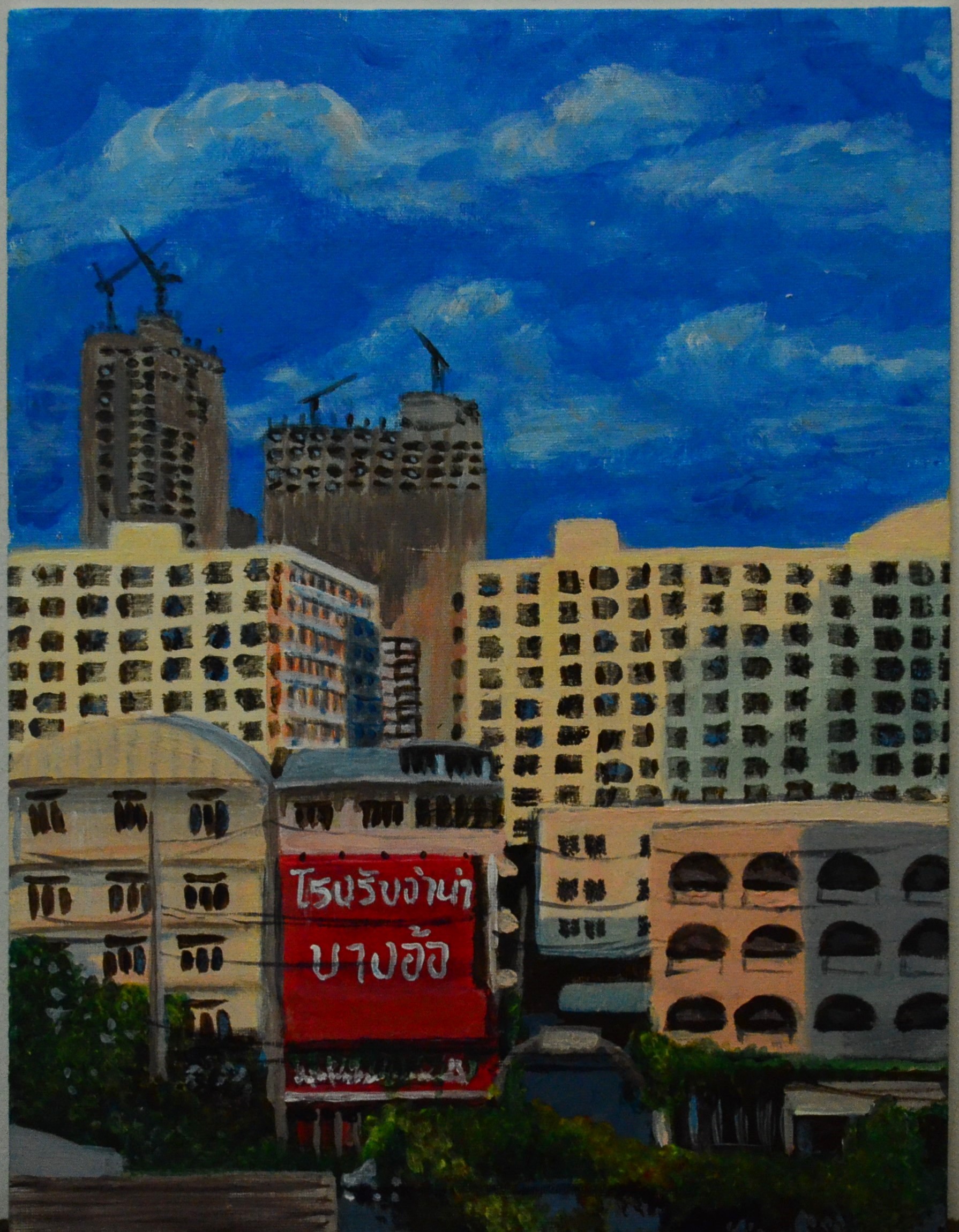
Cranes on the Chaophraya

Watercolour Cranes on the Chaophraya
There is some pretty interesting construction going on at my side of Bangkok at the moment that needs documenting. I passed these cranes on the way to work every day for about three months and eventually managed to get the day off so that I could draw them. This sketch had all the information needed to be developed into a painting but at this stage I’m not sure if I would be able to depict the water using acrylics
Emporium Park – Sukhumvit

Fig.1 – Watercolour Sketch Sukumvit Park

Fig. 2 – Watercolour Sketch – Sukhumvit Park
I wouldn’t have thought about going here as I live at the other side of the city but my girlfriend landed a private yoga class in the park and so it was a great opportunity to do a bit of sketching after I had helped her take photos of the Yoga class.
I did a lot of the sketching in the park and then finished them off at home and over did it with the water which looks too muddy. The water in the park is very discoloured but should have more reflection on the surface in the sun.

Watercolour Sketch – Sukhumvit Park
The third sketch was a little better and I actually thought about using it for the coming linear perspective exercise. It was also great practie for mark making for the leaves of the trees.
The Temple at Rama VII Bridge
Acryic Sketch of Temple and River
This sketch was a very fast sketch in acrylic of a temple by Rama VII bridge that sits on the Chaophraya river, the UFO type building in the background is the Nonthaburi campus of some Technology university. I thought it was a good contrast of old and new buildings. I sketched the buildings very quickly over a wash of blue and red which gave me the colour of the sky and those colours reflected on the water.
The water however was the only thing that stopped me developing this further in acrylic as again i’m not sure if I would do a good job of it an acrylics I think I may have to look into techniques for painting water.
Silhouette of a Local Temple

Silhouette of a Local Temple
On the way home from painting the last sketch I took a photo of this temple on my side of the river which come out as a silhouette. It was a bit too easy to paint but it did give me some practice painting the sunset which I painted in watercolour before drawing in the buildings with a Pentel Brush pen.
Chao Phraya River – Khrung Thon Bridge
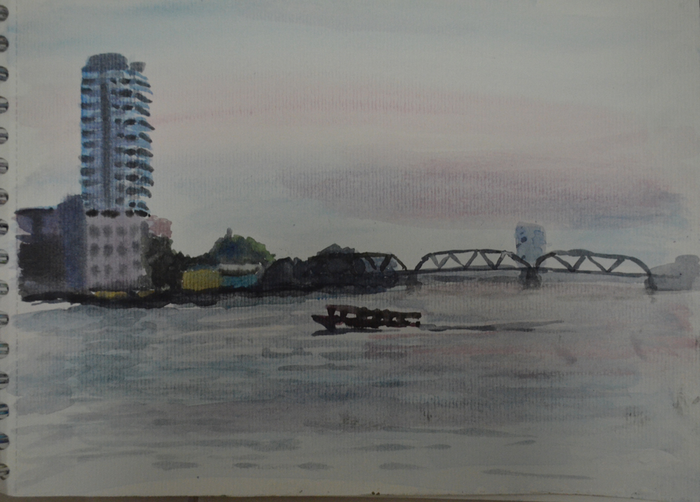
Watercolour Study Chaophraya
I took another trip back to the place where I completed the first sketch in watersoluble pencils. This time I wanted to capture more detail that I could maybe use in a final painting. Unlike the other sketches in watercolour I wanted this one to have more fluidity to it and so this time I used a wet on wet technique. It was my first time using this technique but I think it worked quite well. The only thing that didn’t really work was the boat.
Rural Landscape
Chiang Khong, Chiang Rai

Fig 1. The laos Bank of the Meekong River
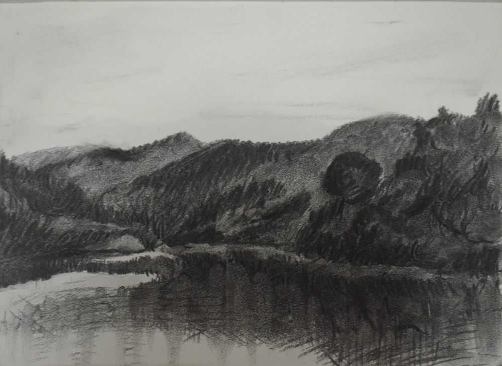
Charcoal Study of a lake
The next sketches were part of a series of sketches I drew in charcoal in Chiang Rai while visiting my girlfriend’s home.
Fig 1. is a sketch of the banks of the Meekong river which I really liked as there were many layers to it with the trees and mountains in the background and the river in the foreground.
Fig 2. is a sketch of a small resevoir at the back of the girlfriend’s house. This was drawn at sunrise which I couldn’t really get over in charcoal. Being the most appealing of these sketches to be developed as a painting I took a photo of the scene so I could use the information from that for the colours I needed to use for the final painting. I just hoped that I could manage to paint the water as easy as it was to draw it in charcoal. Could I use a similar technique in paint?
The Final Painting – Soft Landscape

Final Painting after 1 Sitting
Once back in Bangkok I began the final painting in the comfort of my air-conditioned apartment. Firstly I prepared the support the support with a wash of pink and blue that met in the middle this gave me a blue to work on for the sky and pink for the reflection of the illuminated clouds on the water. Then I begun to paint the clouds using a scumbling technique.
In fact I used the same technique but with different thicknesses of paint for most of the first part of the painting which I did in one sitting using only the the primary colours, red, yellow and blue plus white, mostly layering them on top of each other or mixing them on the canvas rather than mixing on the palette, applying the paint with a medium filbert.

Finished Painting 12 x 16 inch
When it came to the water I had no idea how to go about depicting the reflection on the ripples of water and tried several different techniques until I thought it would be a good idea to take a look at Monet’s Water Lily paintings. In one of his paintings, Water Lilies and Reed he seemed to use small horizontal strokes, this helped me a lot and I finally got it right, applying the paint in small strokes with a small detail brush.
Thoughts on Final painting
I really like the final painting for a number of reasons. Overall I’m quite proud with it as it was the first time I had painted using only the primary colours.
Composition
I originally chose the composition because even though this was a simple composition it was very soft with several focal points that would draw the viewer in such as the sky, the water and the flow of water between the mountains. I wasn’t sure I could do a good job painting these areas but I am very happy with the results.