
Brief for this Research Point:
Go on the internet and find some portraits that convey a distinctive mood or atmosphere rather than simply a physical likeness. Look at Picasso’s blue paintings with their mood of surreal sadness or the dark earth colours of van Gogh’s early paintings of peasants seated around a fire in their poor, meager surroundings. Look at the strong tonal contrast in Rembrandt’s portraits and the formidably restricted palette with which he seemed to convey the very essence of a person’s mood and personality. By contrast, consider the gaiety or the disturbing, nightmarish quality of the portraits and figure paintings of the Fauve painters and the German Expressionists.
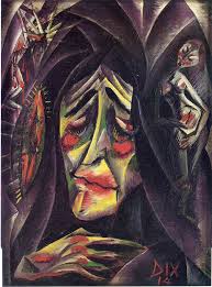
Felix Nussbaum
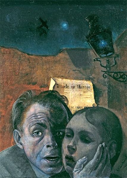
Felix Nussbaum, Fear (Self-Portrait with his Niece Marianne), 1941
During Self Portrait Drawing 1 I discovered an artist called Felix Nussbaum a German artist whose works portrayed life in the Nazi death camps and life as Jew in Europe during WWII. In 1944 he was sent to Auschwitz where he was murdered by the Nazis age 39.
You don’t need to know the story of Felix’s life to understand the trauma that he and his family went through, he manages to portray this through his portraits and self portraits.
in Fear 1941, a painting of Felix with his Niece Marianna the very convincing facial expressions made more so by his hand cradling his nieces face but what really makes the painting is how he uses the strong contrast of blue and orange.

Felix Nussbaum – Prisoner 1940
His painting of a Prisoner 1940 he uses a different way of creating mood, the models pose. He has clearly studied people in moments of sadness and despair. If this was a painting of a farmer on a tractor driving through a field using the same background and foreground the atmosphere would be hard to read with this palette.
Vincent van Gogh
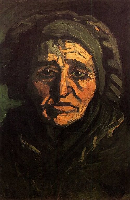 Using similar earth colours but with a lot darker tones van Gogh has managed to depict real sadness in his peasant paintings.
It’s not the colours alone that has captured the mood in these paintings though. Looking at the woman’s face (left) you know that she led a hard life and she hasn’t and couldn’t hide this while posing for the artist who has captured everything. Here van Gogh uses heavy shadows on the face to capture her age and weathered look. I really like the way he has used the light dots on the yes to depict light reflecting off almost tearful eyes.
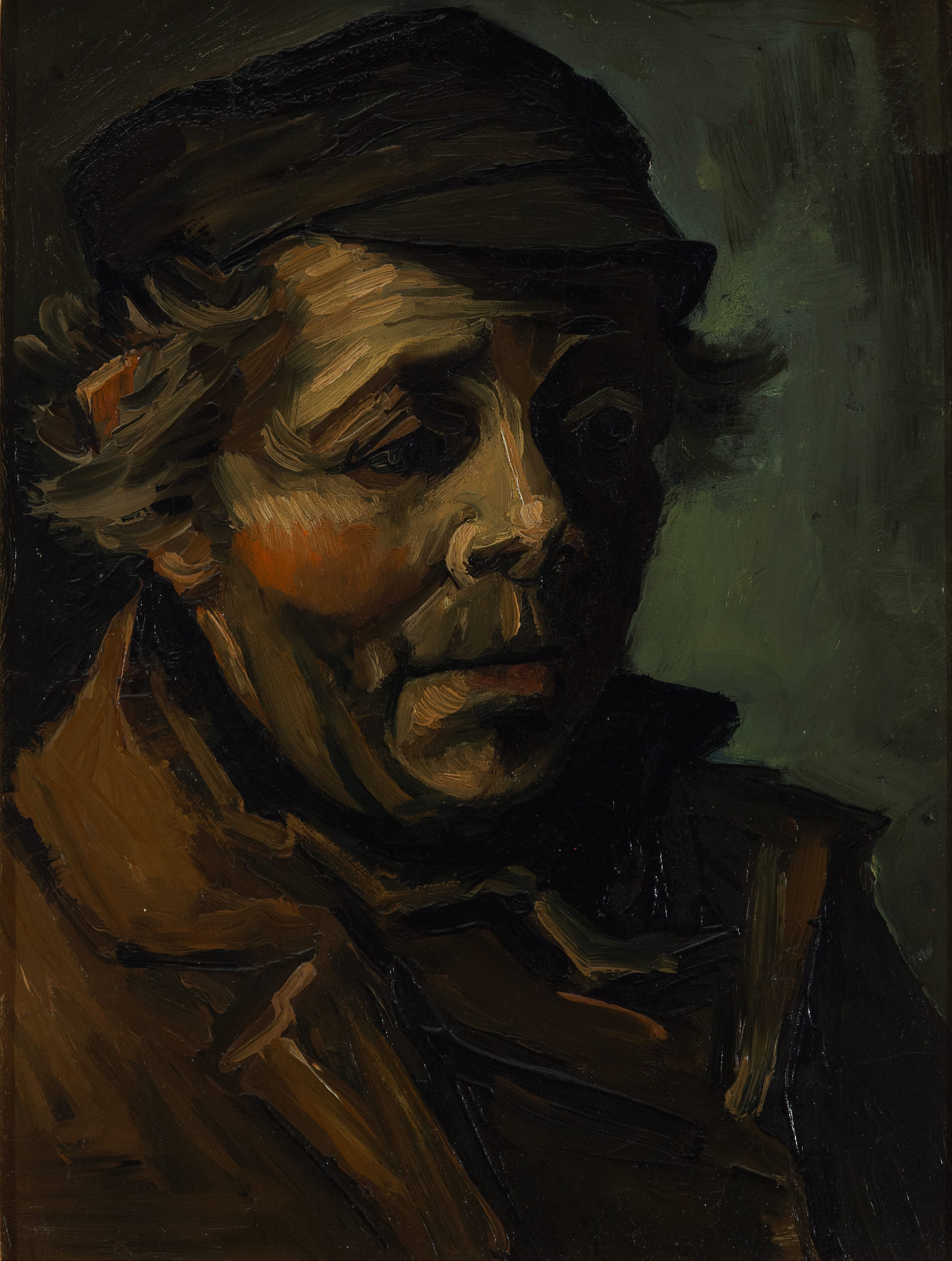
Vincent van Gogh – Head of a peasant
He uses the same heavy shadows in the ‘Head of a Peasant (right). Here he uses the dark earth tones to portray worn, unwashed clothes. This together with a scruffy unwashed face and helpless expression lets us know exactly what kind of life the sitter has. We wouldn’t need to know who the sitter was or the name of the painting to feel this.

Vincent van Gogh – The Potato Eaters
Looking at ‘the Potato Eaters’ you wonder how long they sat there. He captures not just the mood and atmosphere but the moment.
The first impression I got when I saw this painting was a family sharing a moment of happiness in an otherwise miserable life. Highlighted by the glow coming from the dinner table sounded by the darker tones and tatty surroundings.
Pablo Picasso

Pablo Picasso, The Old Guitarist, 1903
When beginning this research point I wanted to avoid Picasso’s The Old Guitarist. It seemed like it was the first painting From his Blue Period that everyone flocked to but after examining other paintings of this period I kept coming back to this and for one good reason.
The reason I kept returning to this painting is that it is probably one of the best examples of how he has used other lighter colours to describe the old man’s skin colour and features. Looking on different screens and devices I saw different colours, maybe yellow, some pink as well as green. I presume these lighter colours were applied last over the top of the blue which still shows through keeping the melancholy atmosphere.
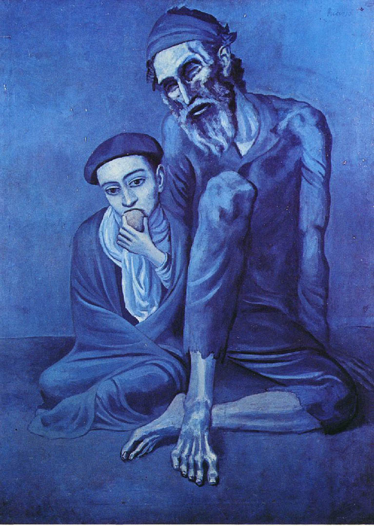
Pablo Picasso The Old Beggar
This technique can also be seen here in ‘The Old Beggar’. Here the lighter colours on the face, hands and feet are more prominent allowing us to see the pale complexions of the subjects over the top of the blue.
Otto Dix
Otto Dix the Nun
In ‘The Nun’ Otto Dix as used long brushstrokes of lighter paint over darker colours to depict the creases in the nuns forehead and heavy patches of red over the top of its complimentary colour green helps to accentuate the bags under her eyes giving her a tortured and extremely sad expression.
Rembrandt

Rembrandt van Rijn Apostle Peter in Prison 1631
While looking through Rembrandt’s paintings I came across the following painting. ‘Apostle Peter in Prison’ 1631 is a brilliant example of how the artist uses strong contrast to create mood and atmosphere in his paintings. The artist has used lighter colours in the centre of the painting to highlight the apostles face and front depicting sunlight shining through a window in a dark prison cell. The mood here is a very lonely one.
Fauvism and Matisse
For me it was very hard to look at most Fauve painters; figurative or portrait paintings and feel something from them, yes the colours are bright nut often enough I feel that the artist is painting a pretty serious pose in gay colours experimenting for themselves rather than for the viewer.
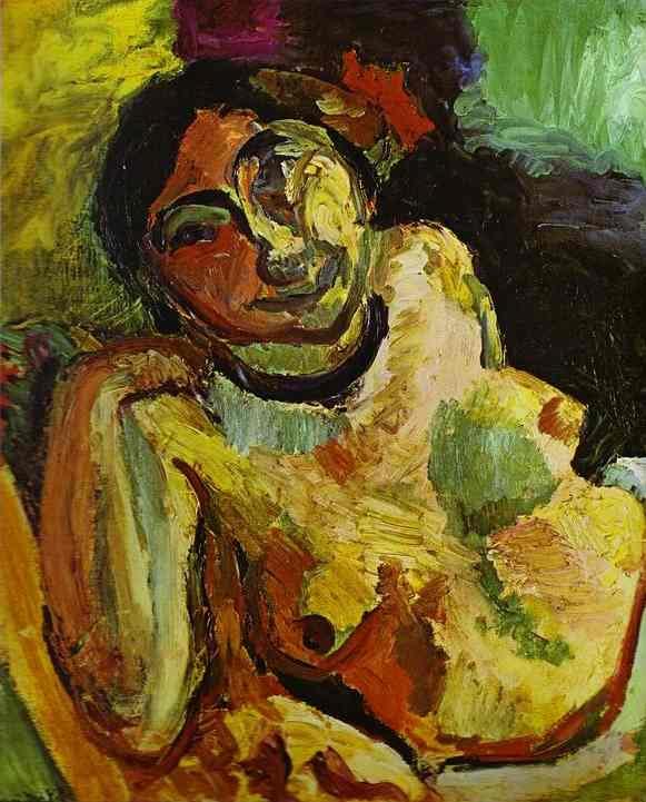
Matisse Gypsy
In the painting ‘The Gypsy’ though, the colours are doing their job or at least the job that we expect that strong contrast of colours to do, although the expression on the gypsy’s face adds to the happy mood.

Pingback: Assignment 3 – A Self Portrait – Research | Mark Smith OCA Painting 1 : The Practice of Painting