
Make a colour study of your still life using only a narrow range of colours. This will require great concentration and discipline in observation and interpretation. Make the most of using colour in an inventive way.
Still Life with Complimentary Colours
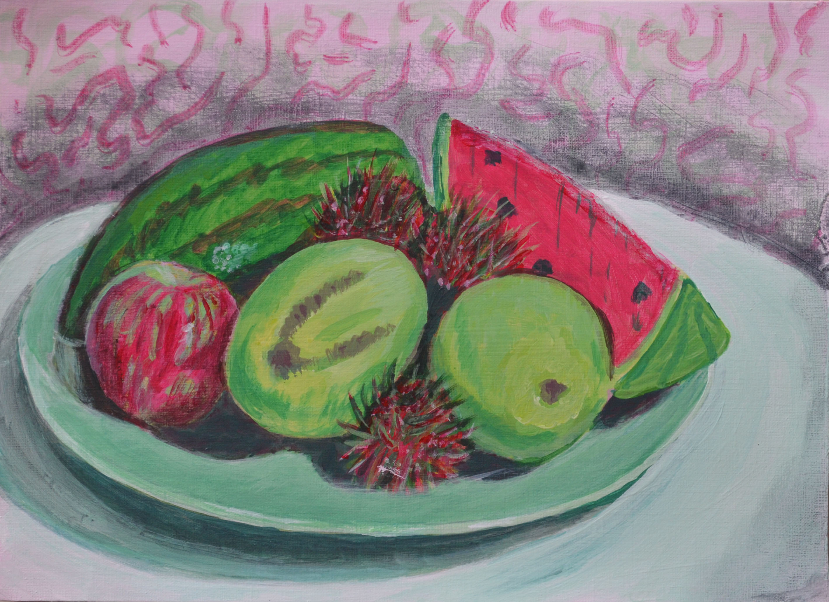
I should have probably used my Chromium green with primary red for this exercise but I decided to mix my own green from primary yellow and primary blue. Some would call that cheating as even though I did make a nice dark green out of the two colours some of the lighter tones looked blueish with others a yellowy green.
I could have been a bit more inventive with the subjects I used for the still life maybe choosing subjects of all different colours and I regret not doing that instead of choosing subjects of similar colour properties like I did but I still feel satisfied with the end result.
Materials used:
- Oil/Acrylic Paper 24 x 33 cm
- Acrylic Paint: Primary Yellow, Primary Blue and Primary Red
- Brushes: Small Filbert, Large Round and Large Flat
This was the first time using small sheets of paper although it was only a study I still intended to use it not only to develop my understanding of colour relationships but to further develop my brush skills and painting on a small scale I decided, would help me to do that.
I begun with a very light wash of green mixed with white followed by a very light wash of red. As the green was mixed with a lot of white and went on unevenly the red wash settled around it creating a prime coat of light red and green, which reminded me of rhubarb.
Chosen Subjects
- Mango x 2
- Rambutan (gno) x 3
- 2 slices of watermelon
- Red Apple
- Plate
Although the subjects I chose were mainly red and green there were other colours as well which were omitted by using only the complimentary colours these were, yellow, orange and light brown. For the grey details such as the bruising on the mangoes, the watermelon seeds and the dark stripes on the skin of the watermelon on the left of the plate I mixed the colours together and and allowed them to cancel each other out. This was also a technique I used for the darker parts of the rambutan, painting wet red over wet green to get the darker strands.
I also allowed the pigments to cancel each other out for the shadows although I made the result of this biased towards red in most places so that the green of the mango would really stand out.
Being Inventive
I find it hard to use my imagination when painting still lifes and to me there wasn’t really much I could do here to make this stand out all I know is that I was bored of using the same old round table with the plain backgrounds and so if I were try and get inventive wouldn’t this be the best place to start. I applied a light coat of white/red to the background with a scrumbling technique followed by fine drip like streaks then painted the shadows with a muddy green applied with the same scrumbling technique. It may not be genius but it makes the still life composition stand out,however it wouldn’t be until the next exercise Still Life with Colour used to Evoke Mood that the background would really come alive.
