

1 Exploring Contrasts
Choose any colour you like (colour A), then mix a series of several colours that are close to colour A on the spectrum. From there paint a series of small squares of colour A, surrounding it each time with one of the colours you’ve mixed.
Following the brief’s instructions I chose red as colour A and then made various mixes similar to colour A then used colour A to paint a series of small squares then surrounded the small squares with the other colours that I mixed. I noticed how the surrounding colours altered how the centre square of red looked, in some squares looking more orange-red and others looking darker and even brownish.
From there I made a series of several small squares in yellow and several mixes of different tones of violet which I surrounded the centre squares. Each of the mixes had different amounts of white in so that I could try and equal the tonal value of the yellow centre square. Which I think I managed to match with the mix in the bottom left of the above image.
Matching the tonal value by adding white seems to tone down the yellow centre square but with the darker mixes of violet surrounding the yellow it seems to look the brightest.
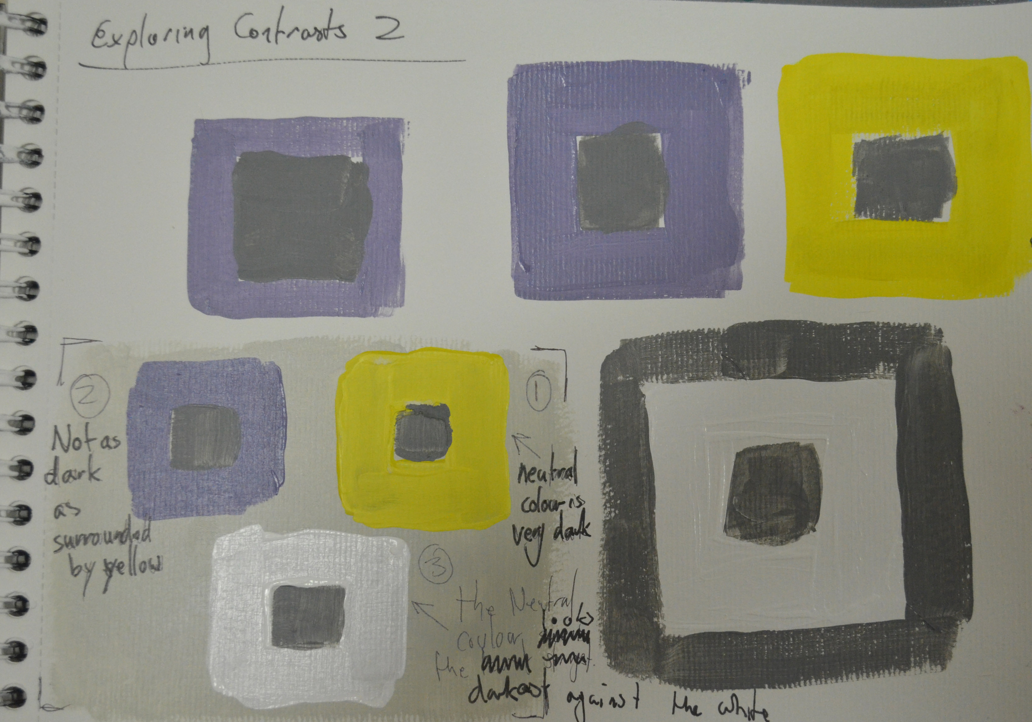
2 Exploring Contrasts with medium Grey Centre
Next I painted a square of violet leaving a space in the centre, next to it I did the same with yellow and underneath both of them I painted a white square, again leaving a space in the centre. From there I mixed a neutral grey and painted a small square of this colour in the centre of each.
Doing this I noticed that the neutral grey looked different with each of the surrounding colours. With the violet surround the grey looked the lightest then darker in the centre of the yellow surrounding square with the medium grey looking the darkest in the centre of the white square.
I was pushed for time with this project so I didn’t have much time to experiment further but I made a quick painting using some complimentary colours and a medium grey noticing how the tone of the grey altered against the different colours.

3 A Simple painting with Complimentary Colours
