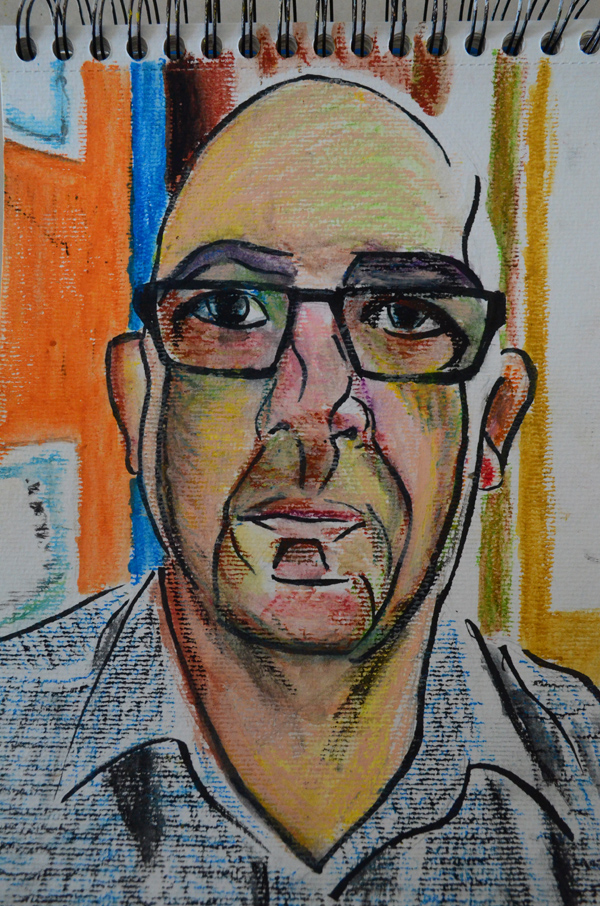
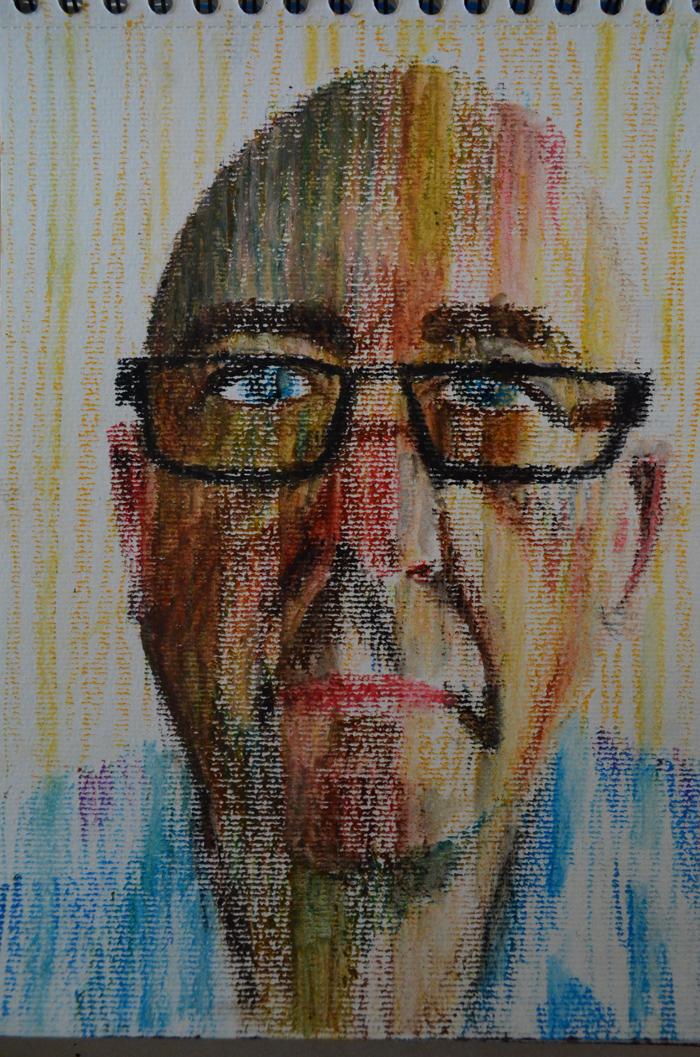
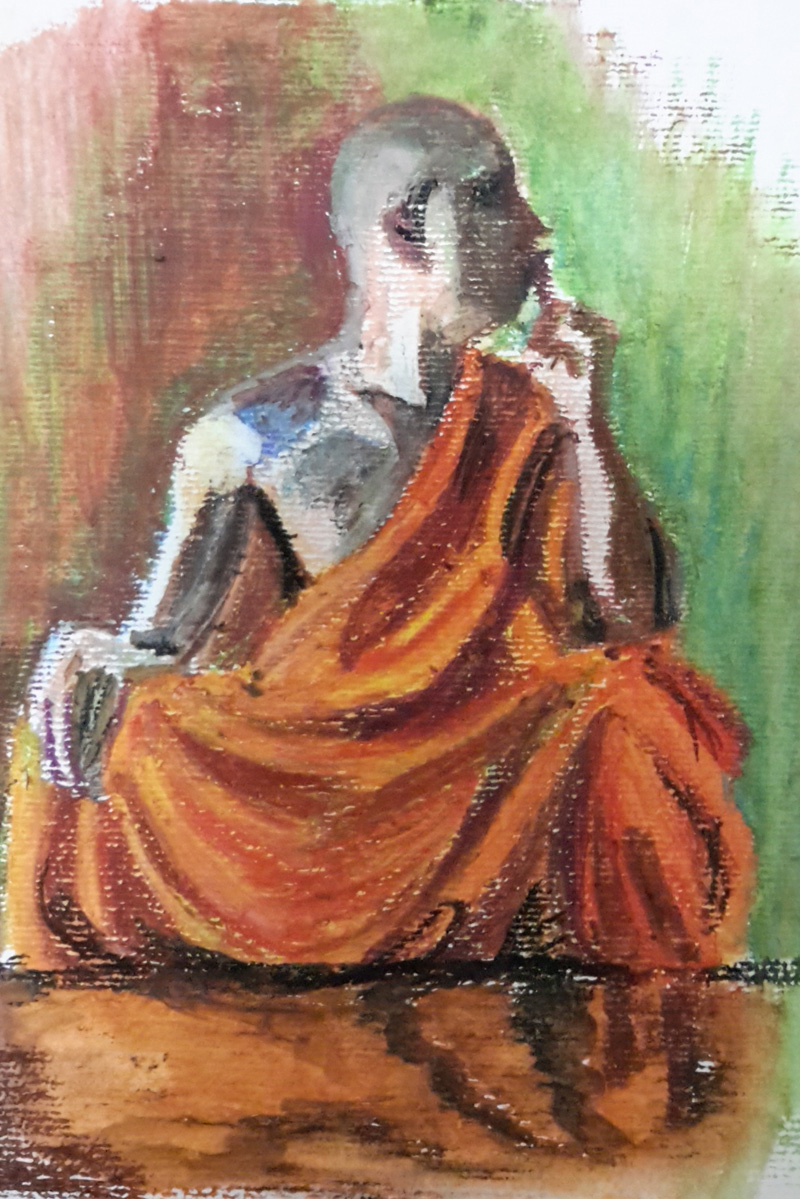
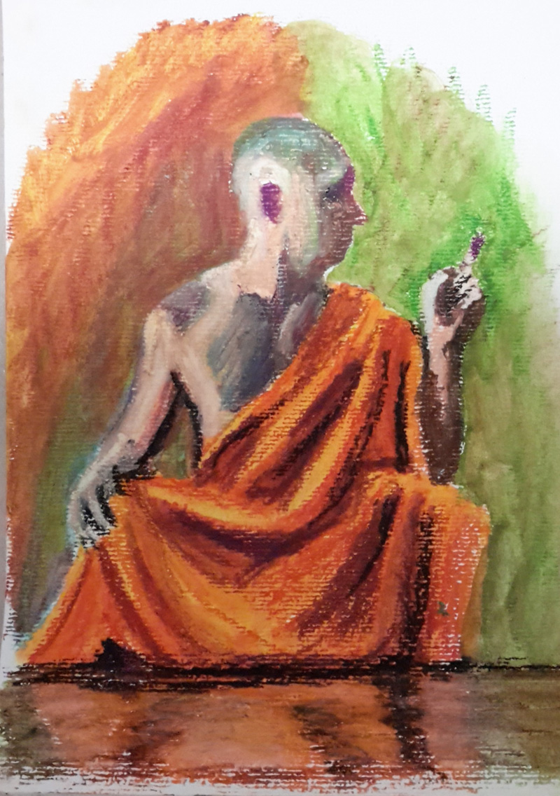
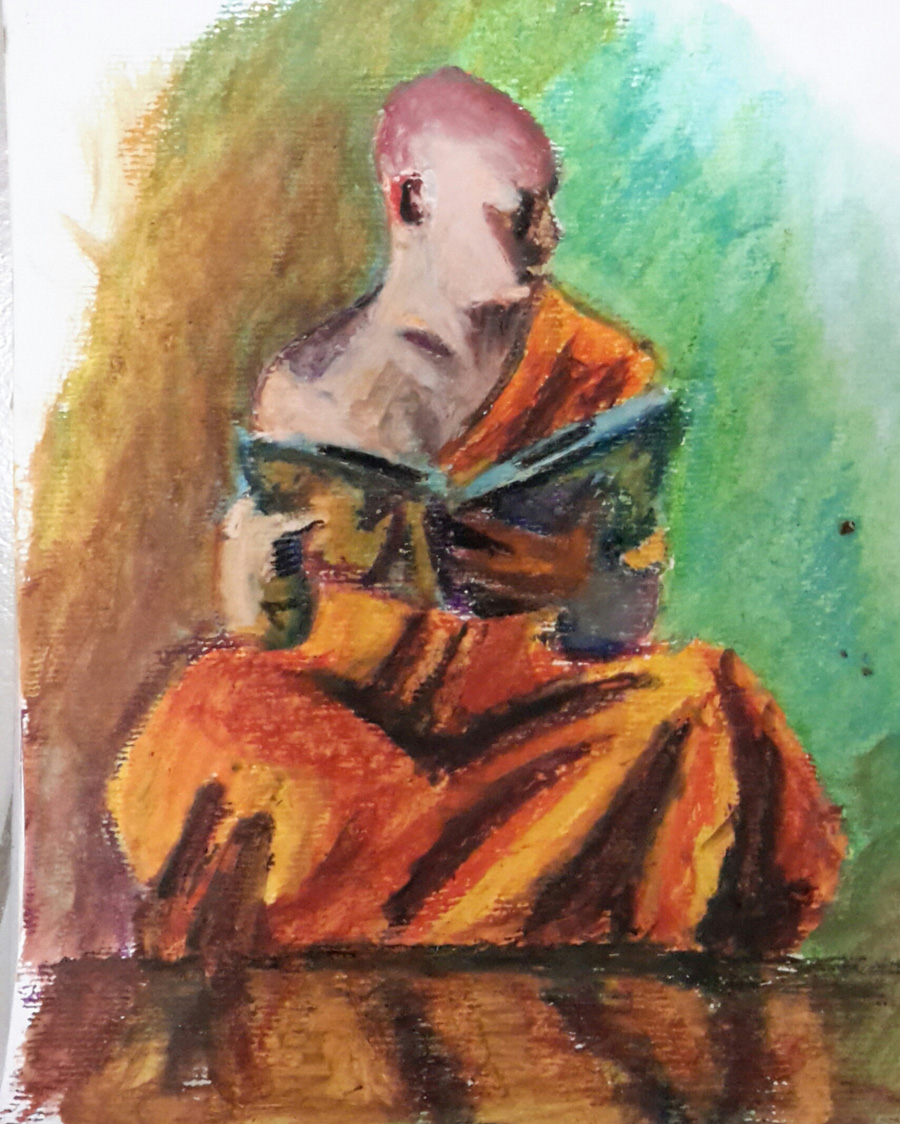
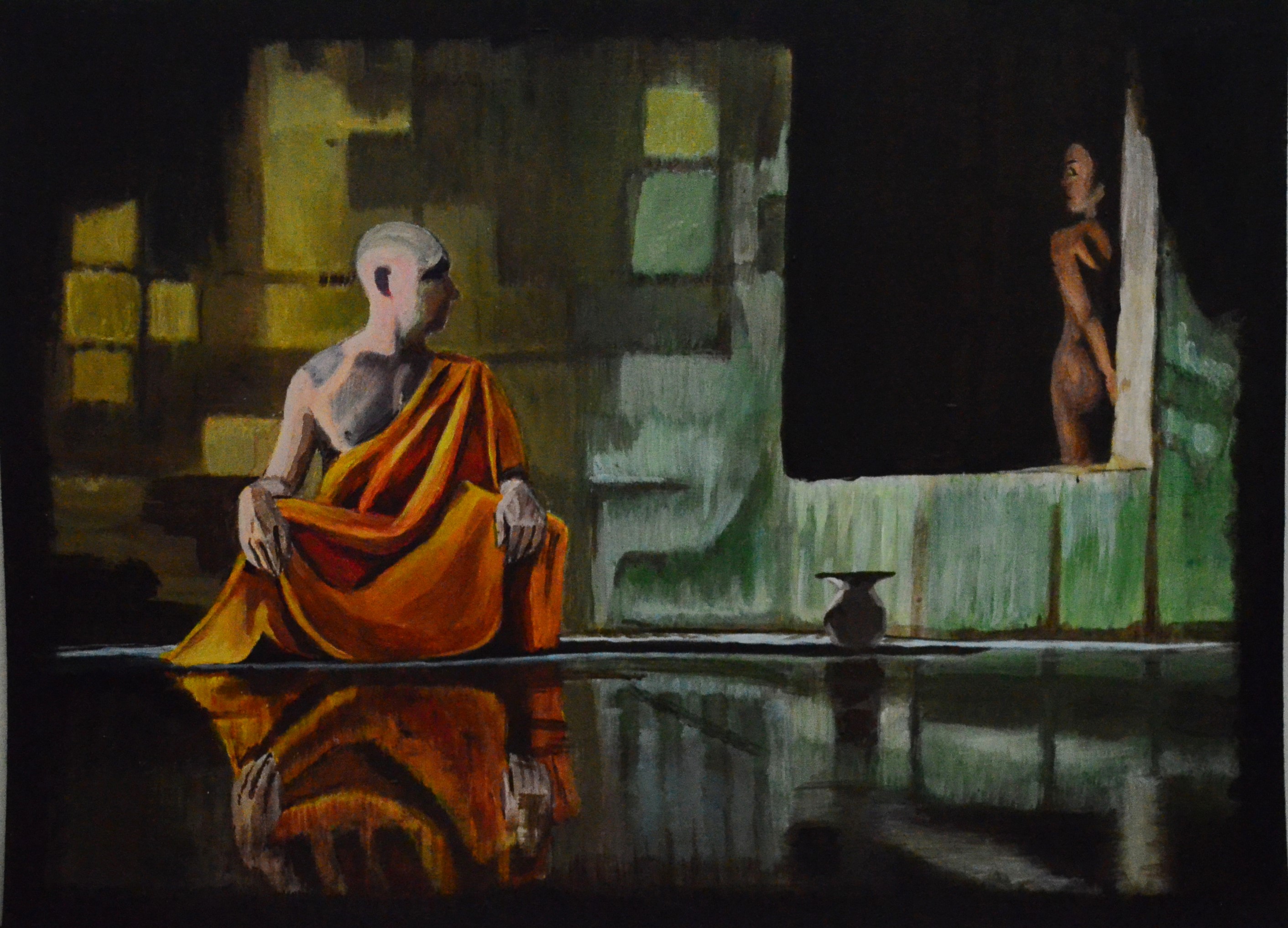
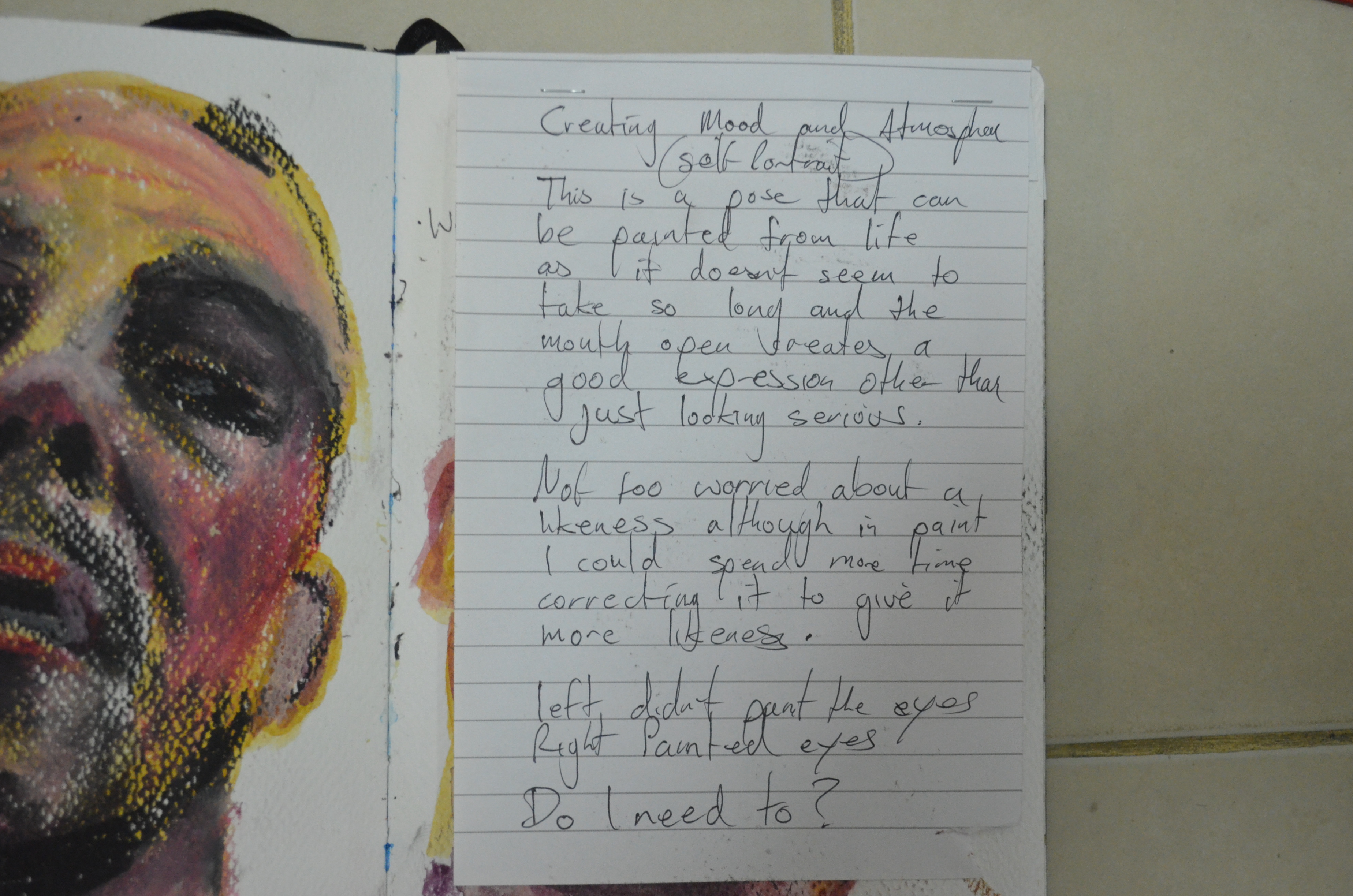
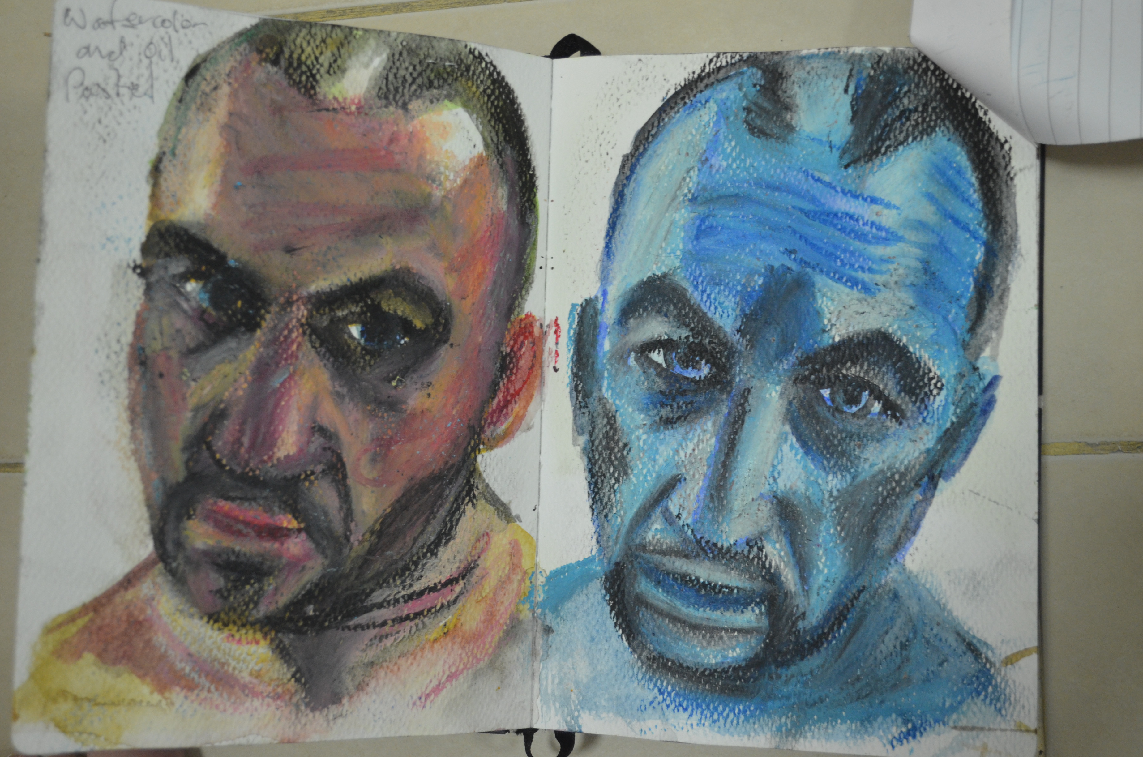
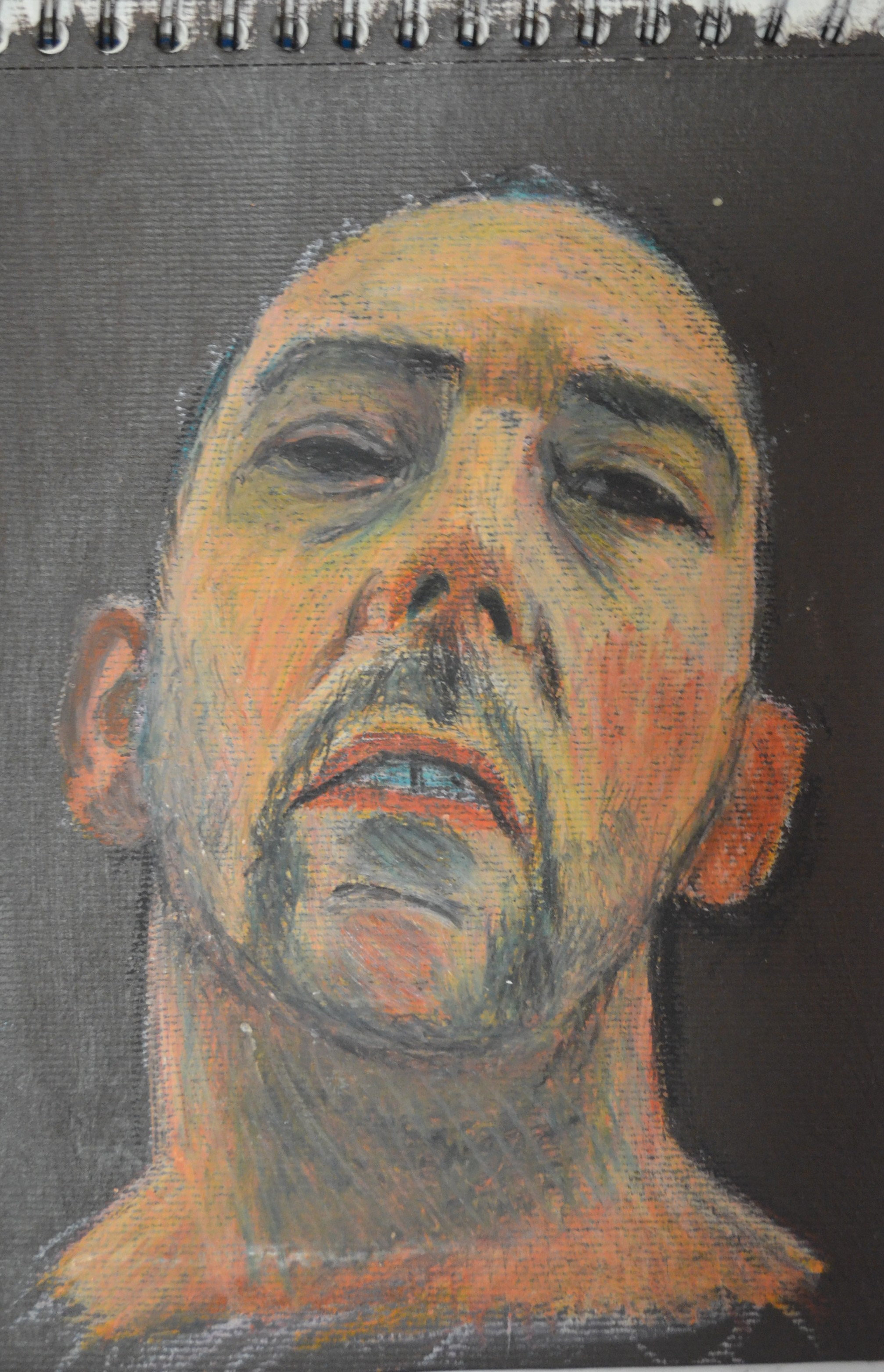
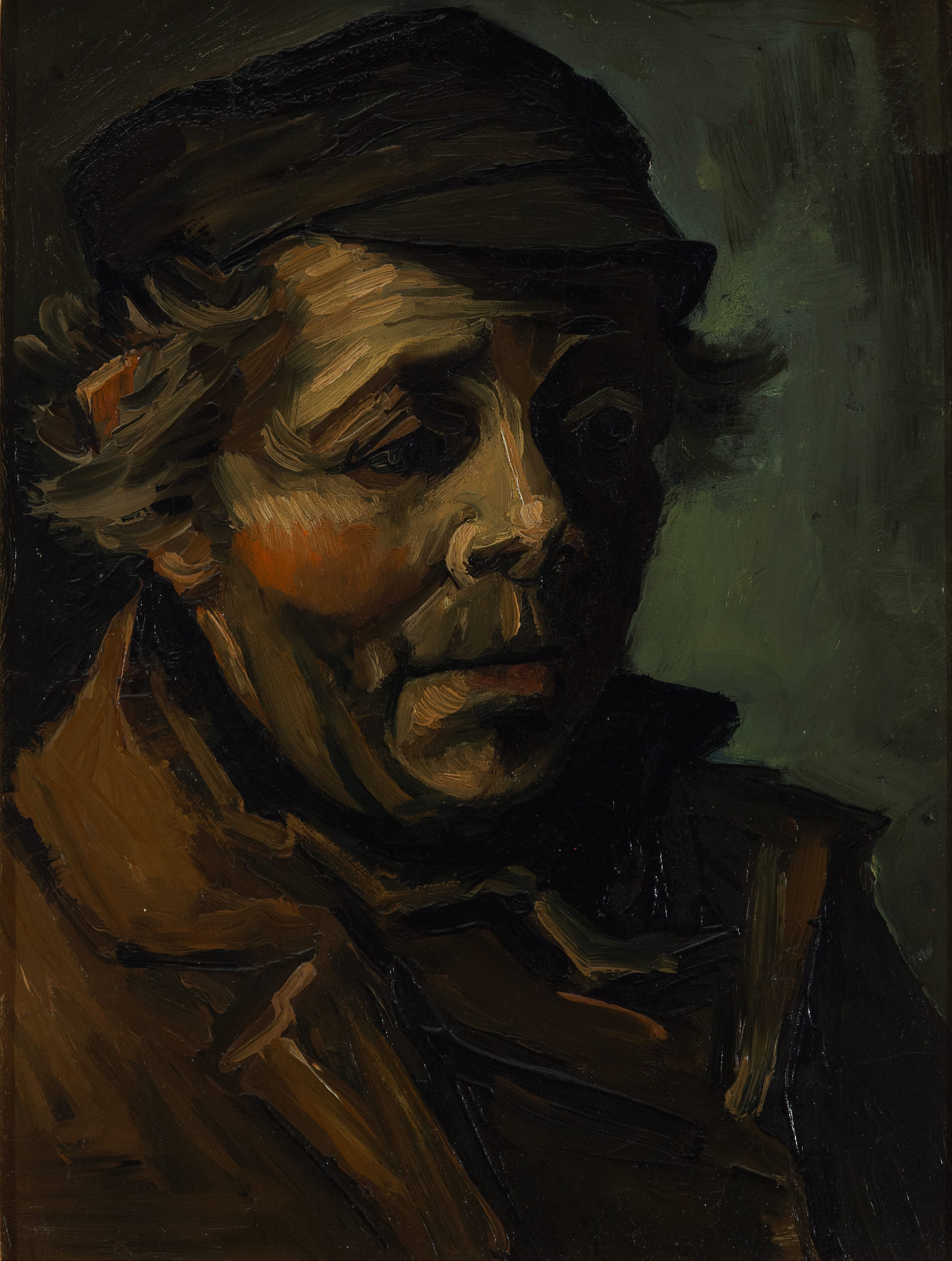
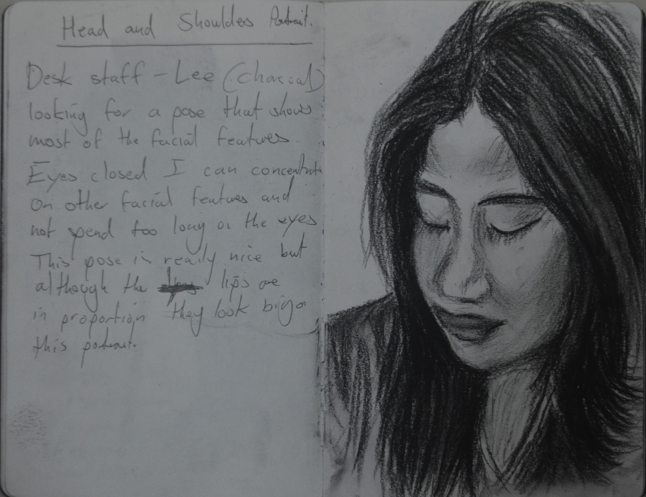
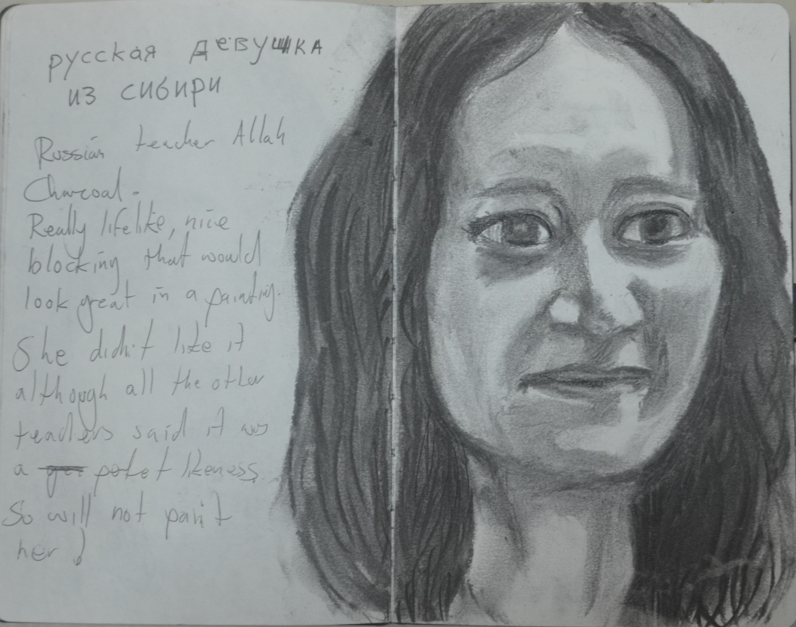
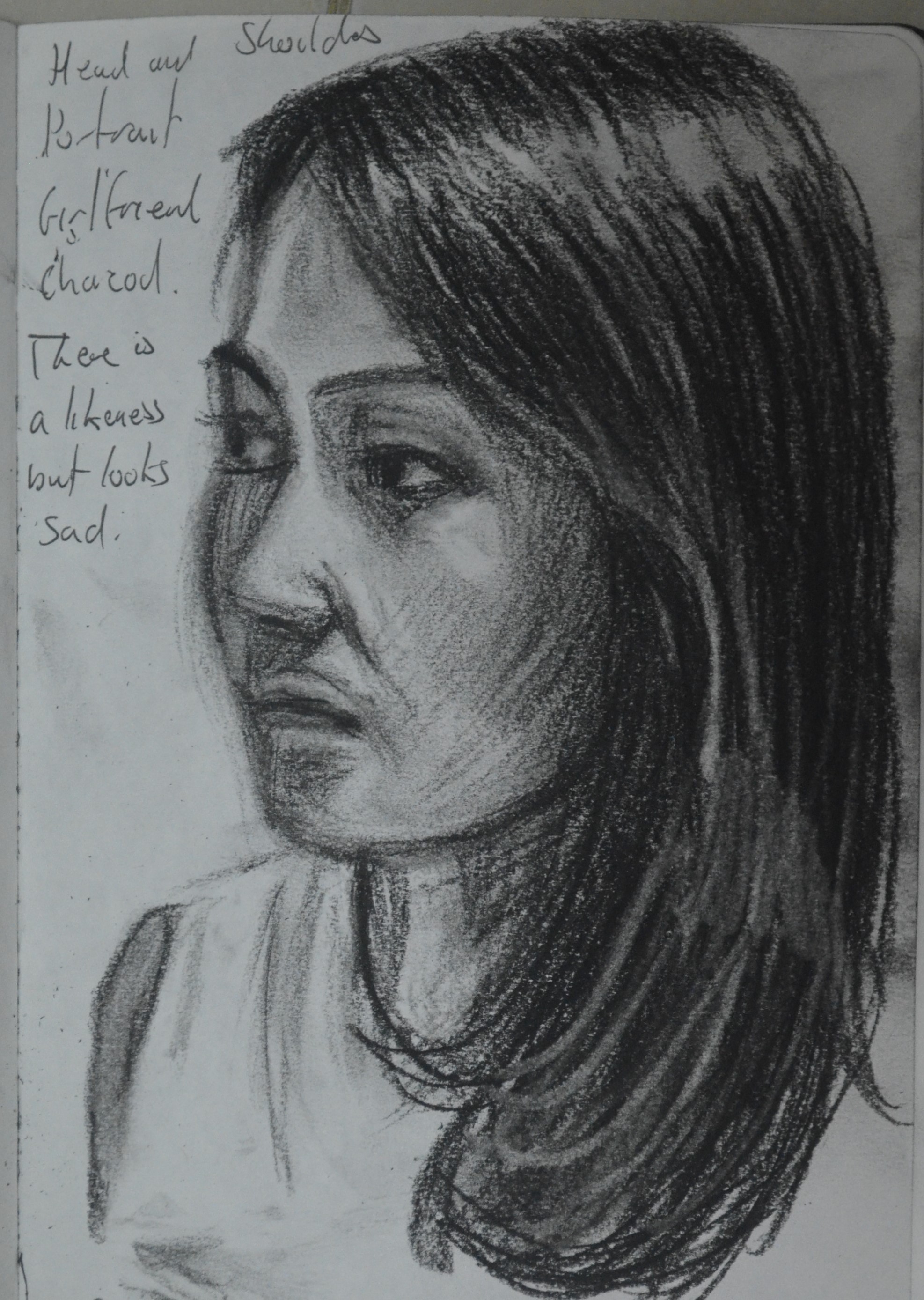
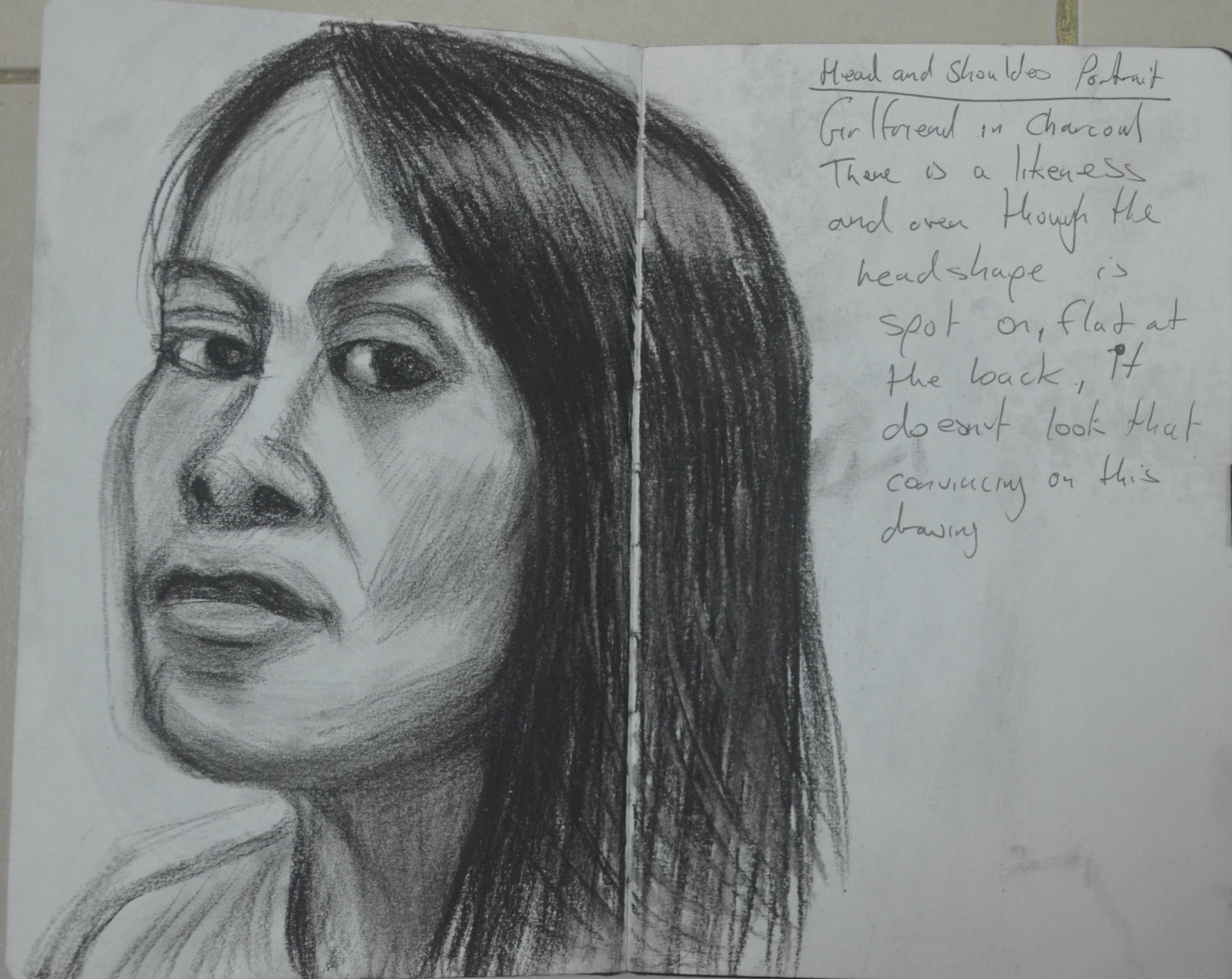
Study in Oil Pastels
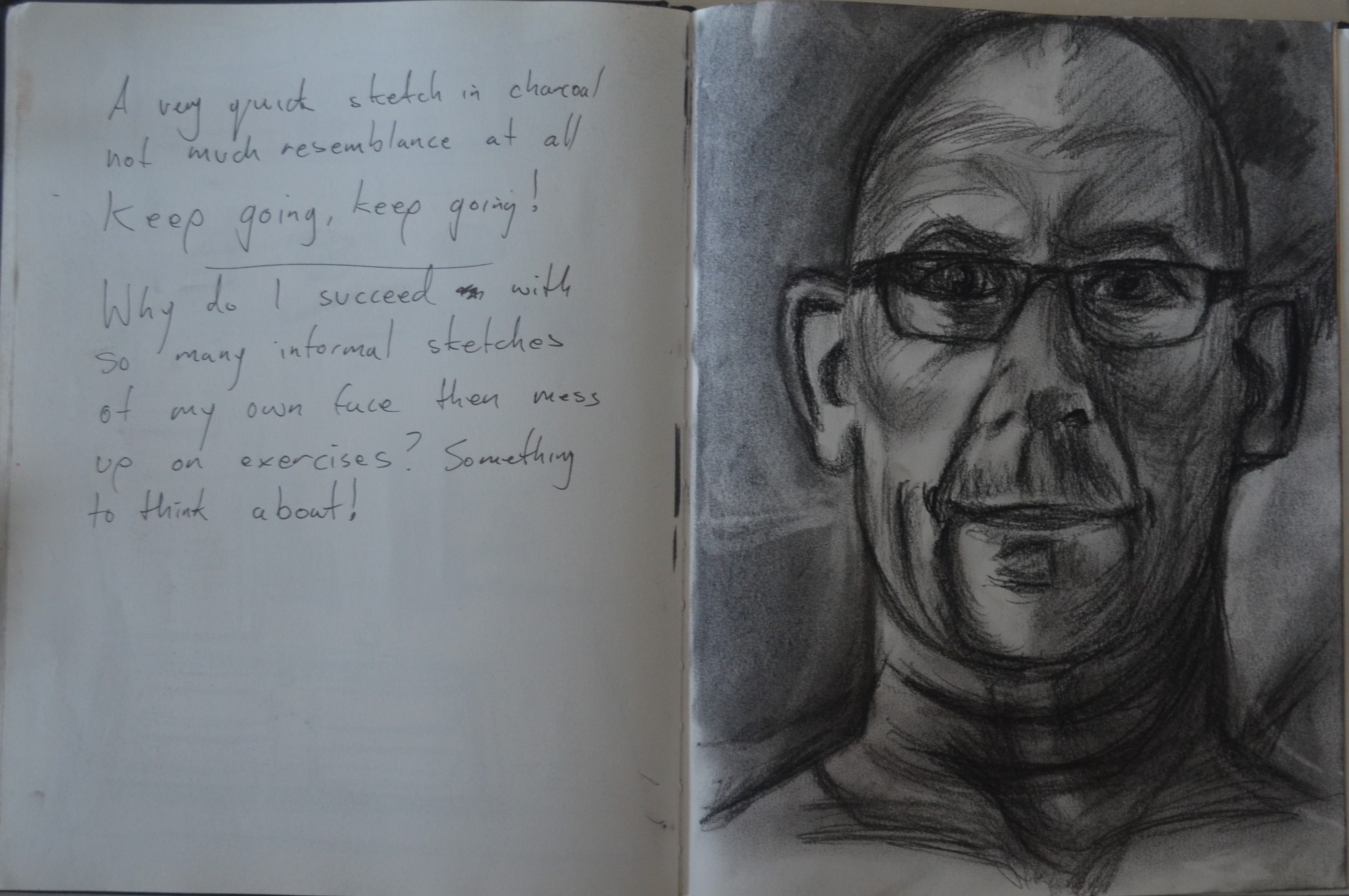
First Attempt
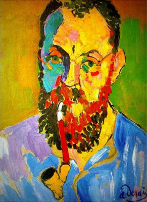
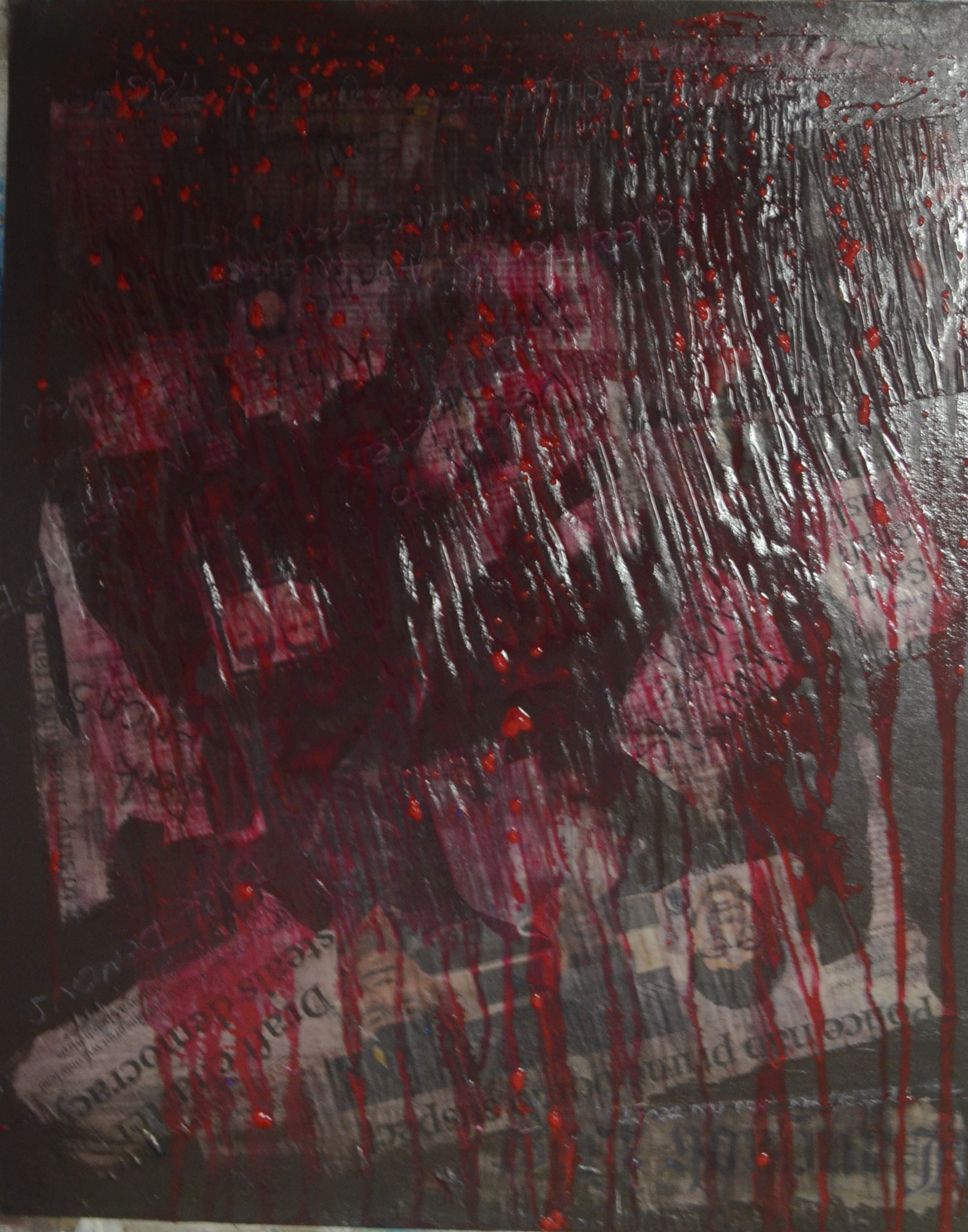
As I said in previous post, Assignment 3 – Research, I would attempt to reproduce a similar style to that of Nikos Gyftakis, the study I produced actually reminded me of the works of Genn Brown. I wasn’t sure of the techniques, either artist used to create their paintings. I thought about a couple of techniques but I wasn’t certain if they would, one was adding the paint in different hues to get the swirling effect and to keep going at it until I was satisfied, the other was to add different hues to the same wide brush adding the different colours at the same time to create the swirling effect, I chose the first technique. I now regret not researching the techniques that they used.


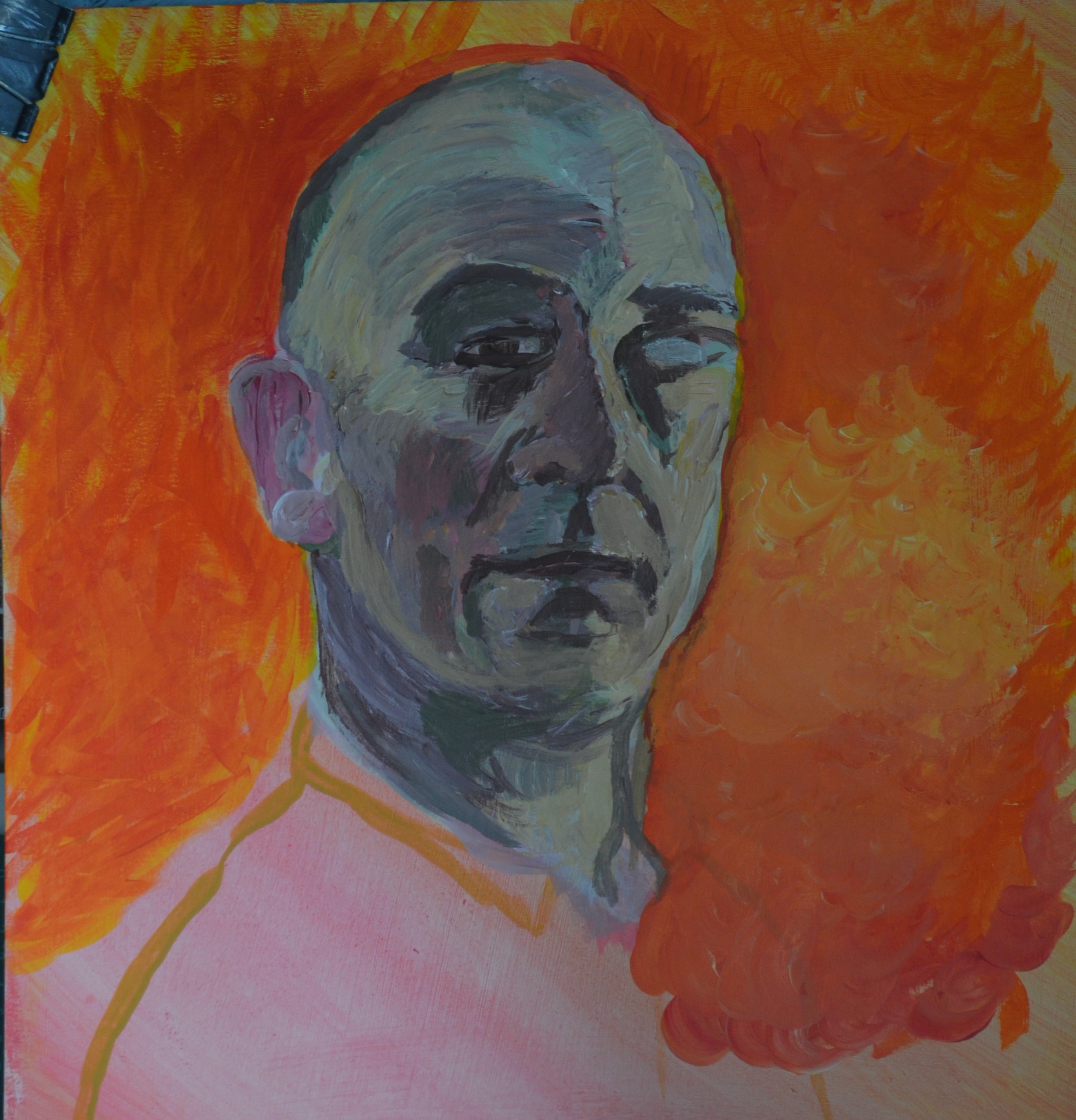
I worked from both the study and a photo, (reversed) that I took of myself at the time, I first drew the outline in paint and then blocked in the base colours as a reference, I then began to work on the face. I had bought a heavy gel medium, that I mixed in with the paint to which I added, retarder and flow aid to the water the problem was though the paint was still drying to quick so I couldn’t really work it on the canvas as much as I wanted to.
After an hour the painting wasn’t going as well as I expected and I sat staring at it for a about another hour picking faults with not only the technique I had decided to use but with everything about it, the pose was weak and there was really no kind of feeling to it. I wasn’t happy with the way things were going and I remembered what my replacement tutor at the end of my drawing course said, ‘If you’re nat happy with the drawing, change it!’. And so I did.
2nd Attempt – A new pose a different technique
I searched for videos on YouTube looking for clips of Francoise Neilly at work. I couldn’t find anything only videos by an Artist called Voka. Both artists had very similar finished pieces but Voka used brushes rather than knives and so to see the way he worked was very helpful. The thing with both artists though was that their paintings weren’t lifelike enough for me and the eyes and lips on Francoise Neilly’s painting’s were just too perfect.
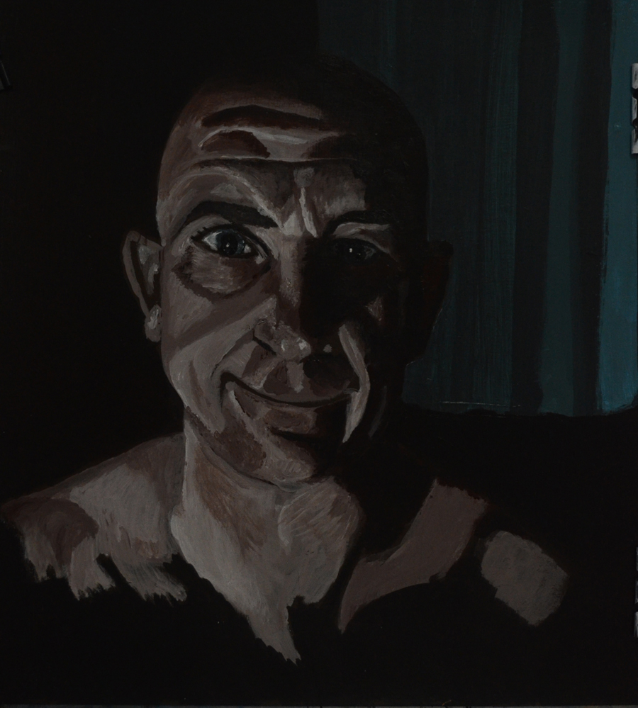
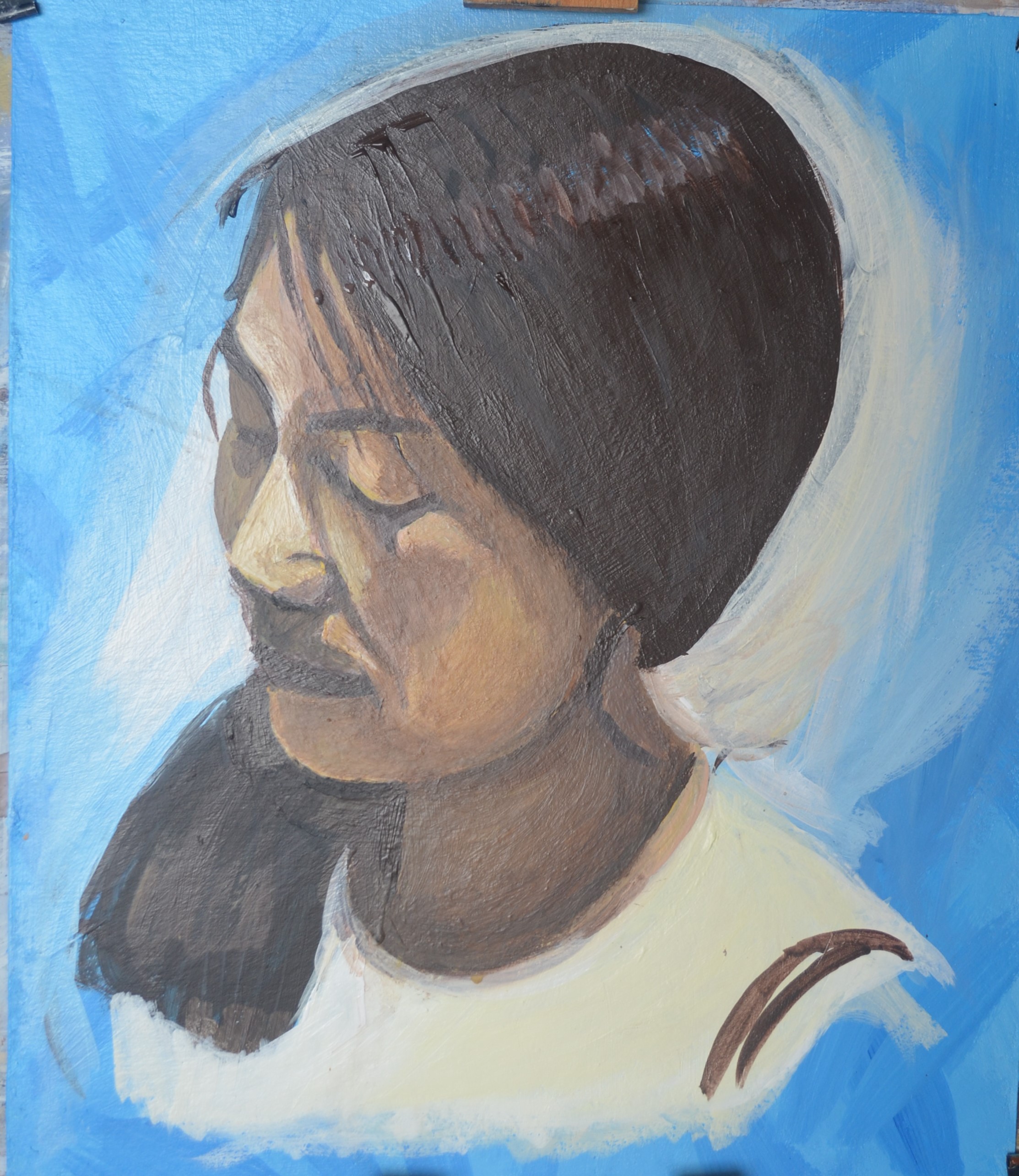
The old painting was too straight and too small so this time I wanted my head to be bigger so I could use a wide flat brush as well as a palette knife. I sat in front of the mirror in the bathroom with my camera on a tripod in the sink taking photos while checking to see if I could actually keep my head in the angle of the best photos as painting from life was better for this technique in the earlier stages.
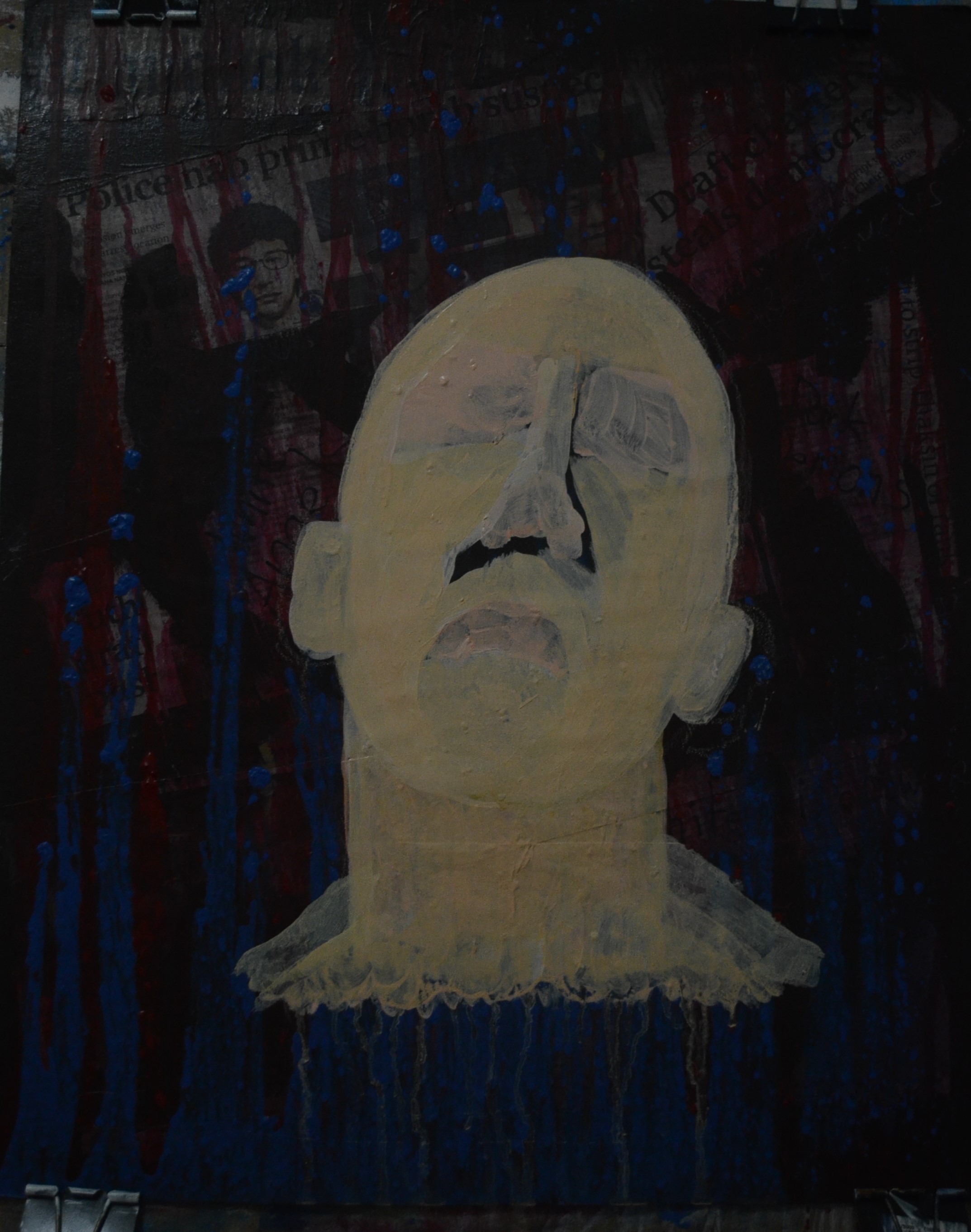
Too start with I needed to paint over the existing portrait so with thick mixes of black, blue and white mixed with a heavy gel I roughly painted in my hat, face and shoulders using both a knife as well as a number 22 flat brush loaded with paint. The knife was more difficult to use than I imagined so eventually I developed my own technique of picking the paint up on the underside of the knife and splatting the paint on the canvas.

Correcting the Pose
This stage took about 25 minutes and when I was satisfied that it was ‘something like’ I covered the rest of the previous portrait with yellow, just u til I could work out what kind of a background I would be doing for this portrait.


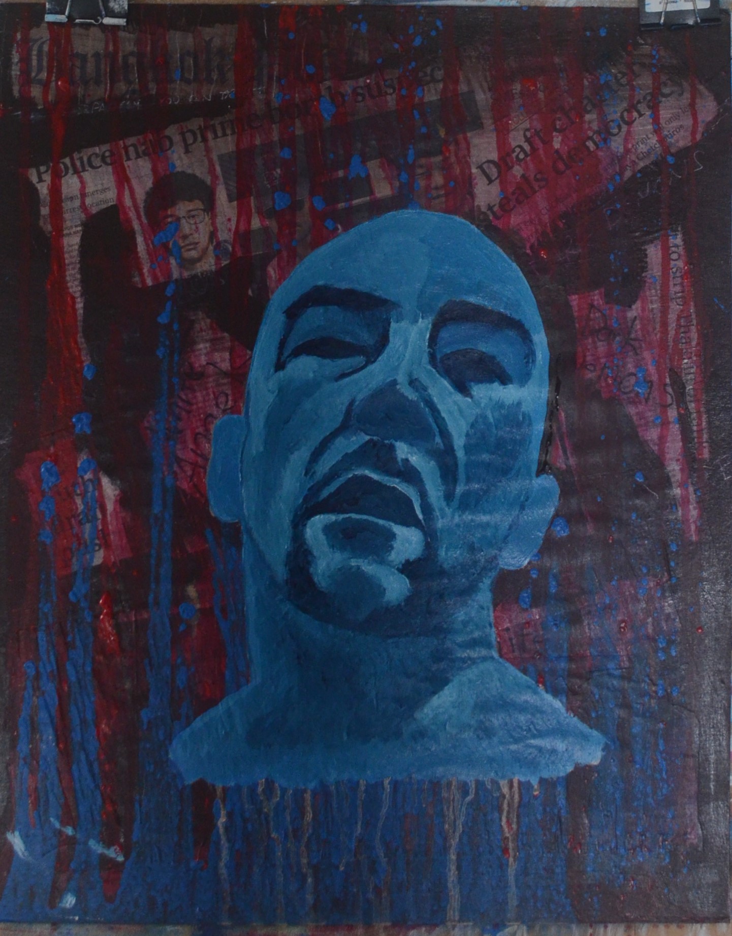
The following stages were basically a case of thickening the paint up as well as experimenting with the juxtaposing of colours, both primary and secondary as well as seeing how they looked along side skin tones.
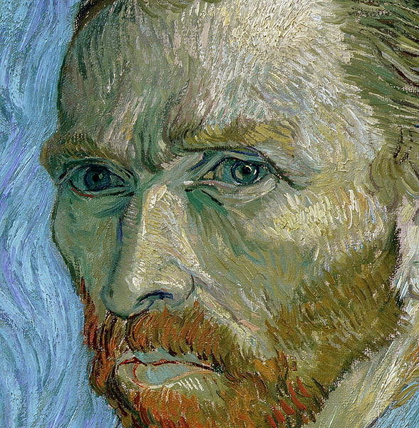
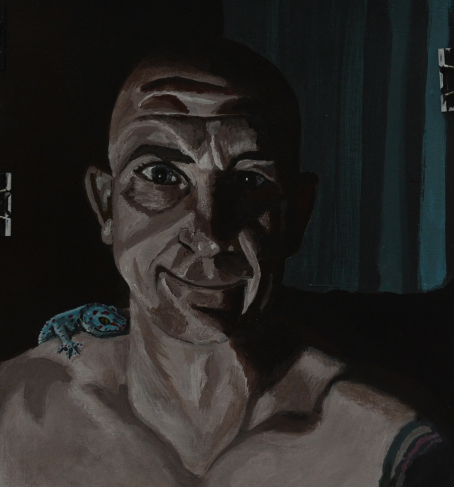
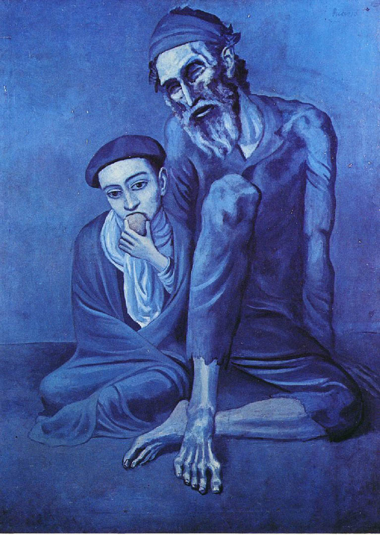
At this stage I stopped working from life and flipped a photo of a very similar pose that I could relate to so I didn’t stray too far from the source. I wasn’t satisfied with the colours I wanted to go a lot darker. The colours in the photos above reminded me of early 90s Shell-suit bottoms. I needed to go a lot darker and I found a great painting to use for a colour reference.

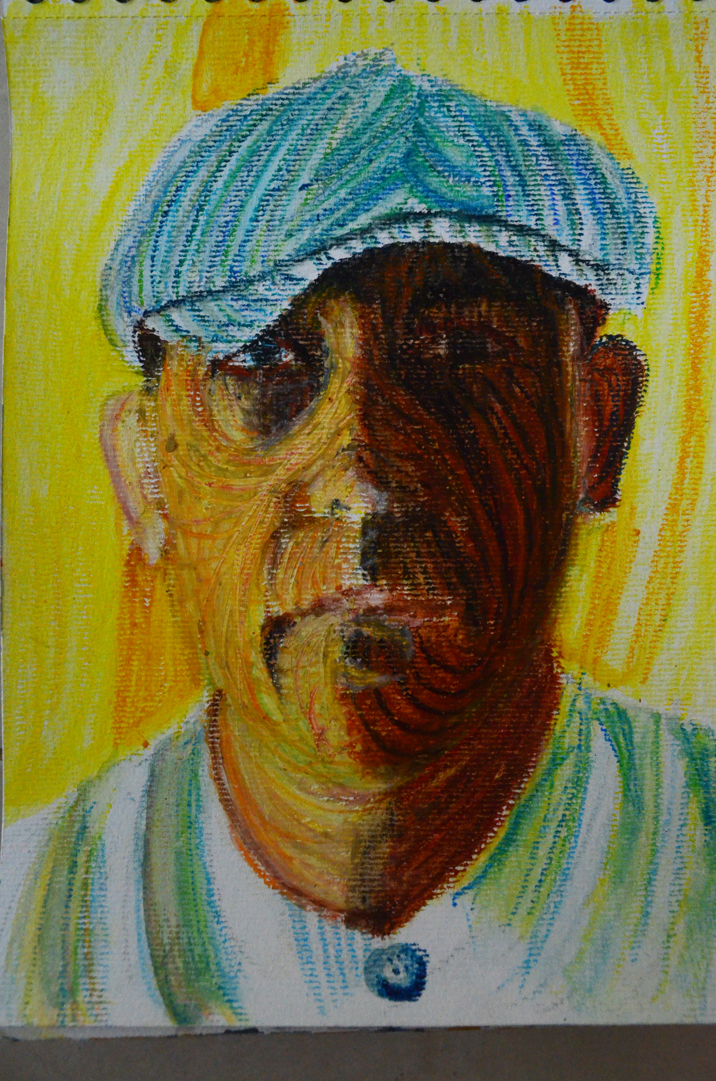
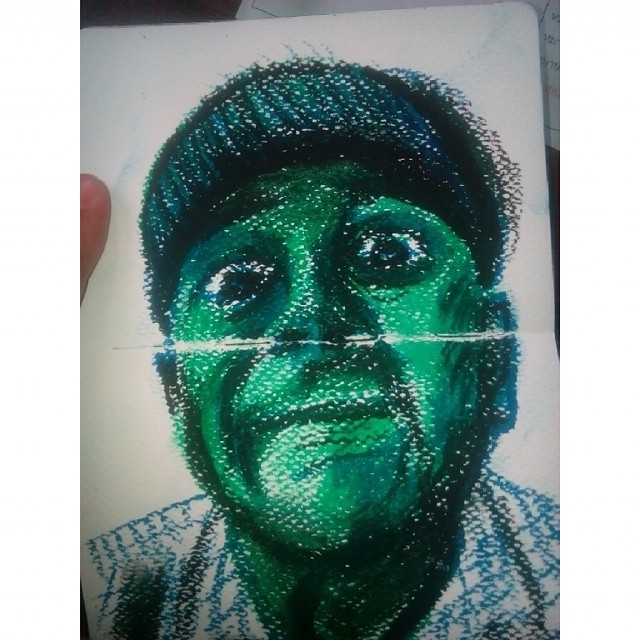
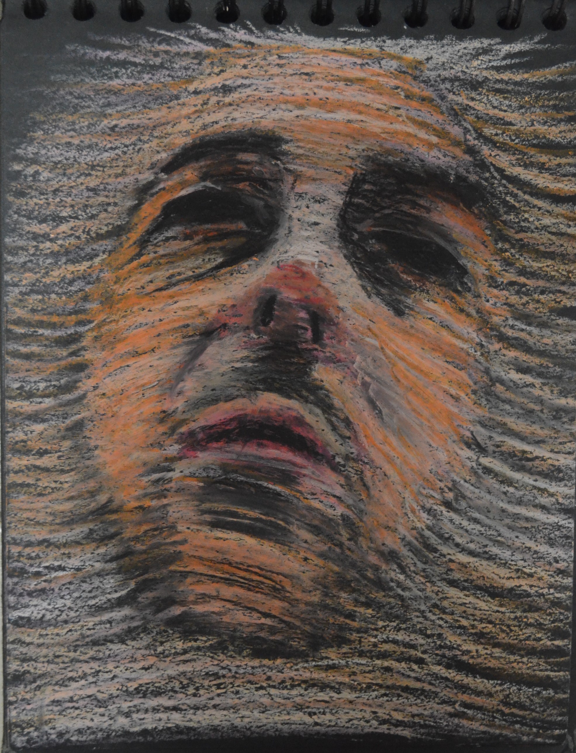
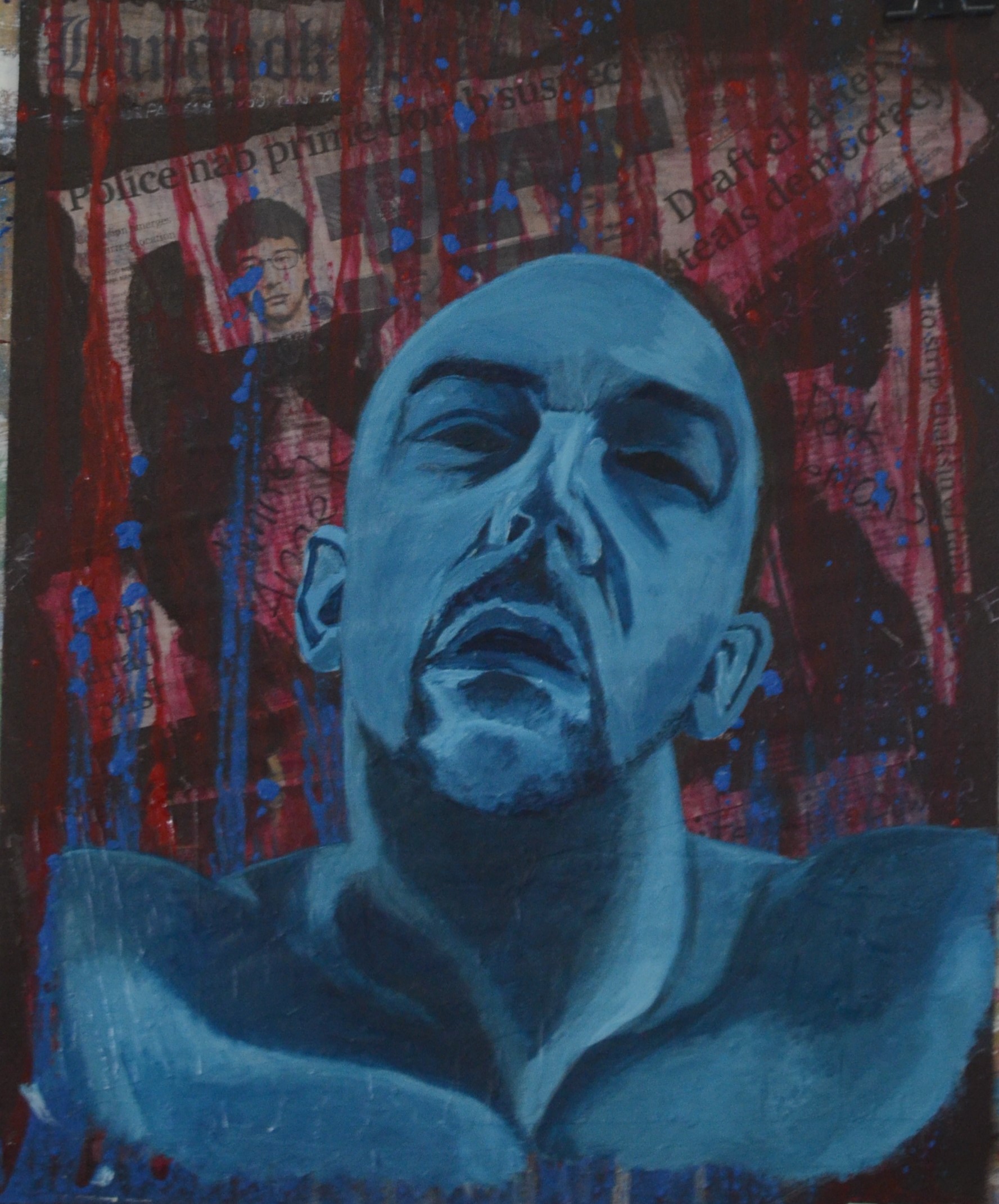
Study in Oil Pastels

70 % Complete
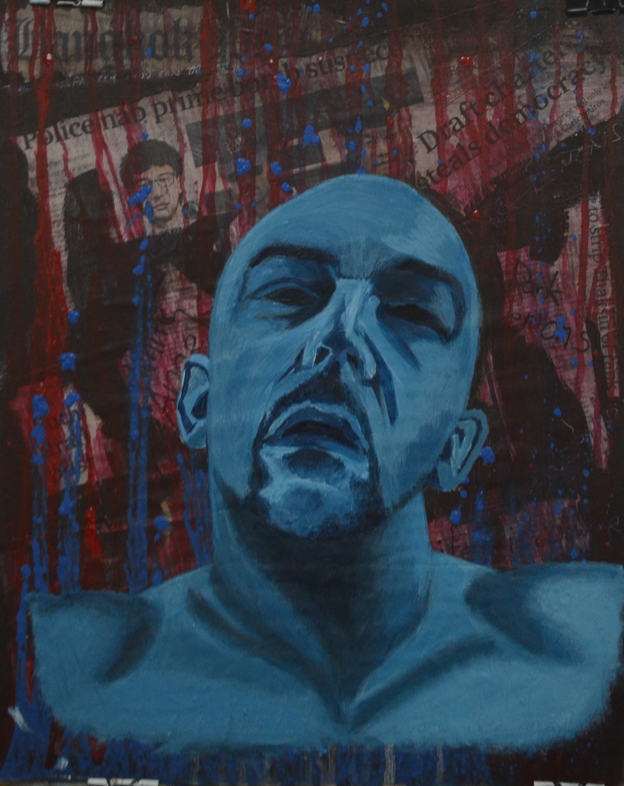
These two portraits are very different Neilly’s is very smooth while mine was very rough especially at this stage but what would help me is the colours she used under the peak of the hat.
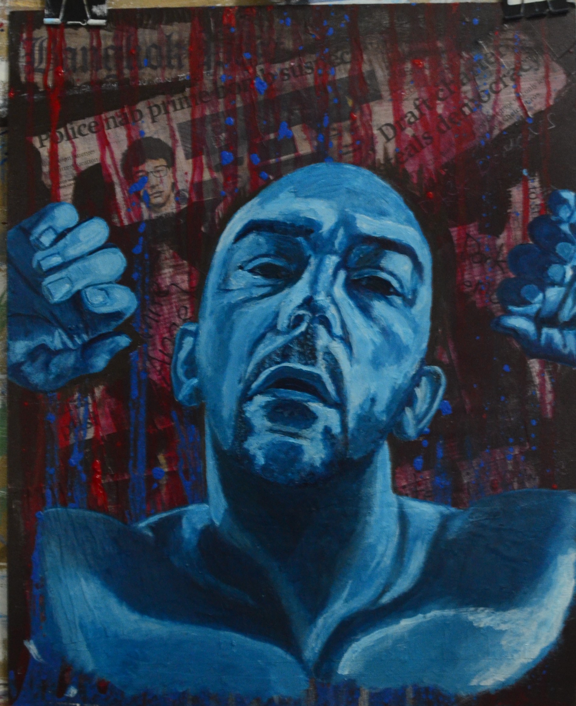
Day two and I was still messing around with colours I purchased an opaque red and gold but I still had to layer them on with a palette knife so that the paint below didn’t show through. I added the gold to the hat and face and on the right hand side of the face I painted a thin layer of red over the gold, hoping that this would create the illusion that that side of my face and hat was catching the light from somewhere.
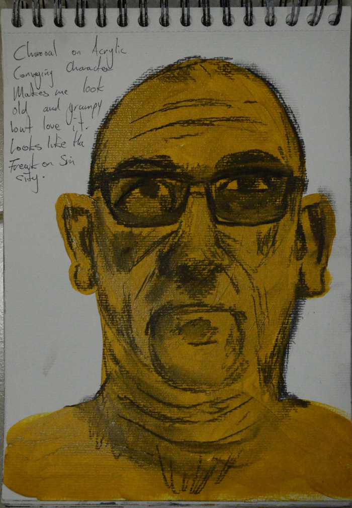
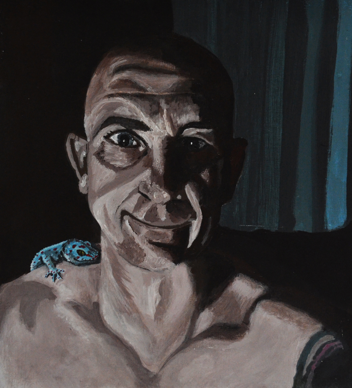
I painted the background in a dull medium grey which catches the light at certain angles so it does look like the light is shining in from the sides.
Conclusion
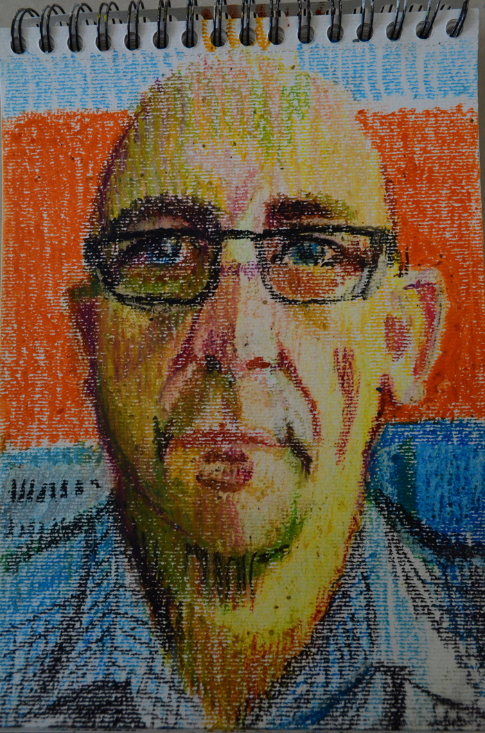
I am quite happy with the finished piece and have received some good feedback from workmates and friends. I am happy with the piece and that I was dared to try something different. The result was as I expected, a strong but unfinished piece and I’m sure that’s what the viewer would see.
Use of Colour
To me the colours do not take over the piece, the features are still strong and clear and the colours do their job accentuating the light, shade and features of the face.
Technique
I am quite happy with the technique that I used, the research helped and introduced me some really good techniques. I would really like to practice techniques that the other artists in my research used but I’m sure they will be time consuming and so I will have to set aside some time for that.
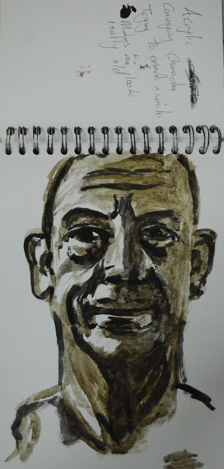
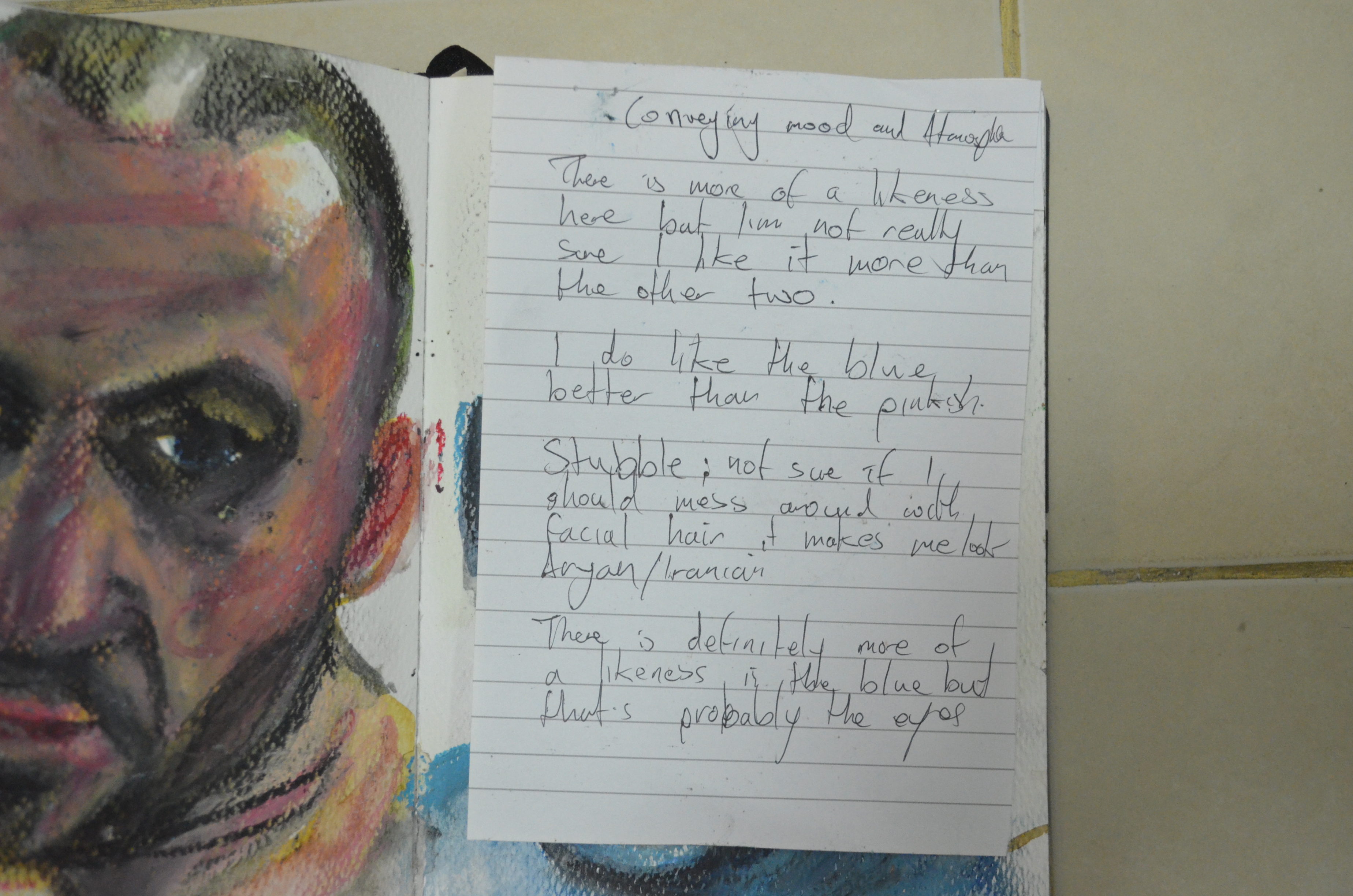
Conveying Character
There is character here and it’s pretty much the character I wanted to convey, a look of arrogance with the hat tilted to one side.
Mood and Atmosphere
I’m not sure what mood or atmosphere I have depicted here that will be left for the viewer to make up their own mind.
Choice of Background
I think I chose the background wisely with the colours that I used in the portrait, their may have been other options such as using the same technique with darker colours on the background and maybe depicting light coming in from the sides but I could have messed up the feel of the painting.

Finished Piece