Category Archives: Research Point

Looking Out 1 – Research Point

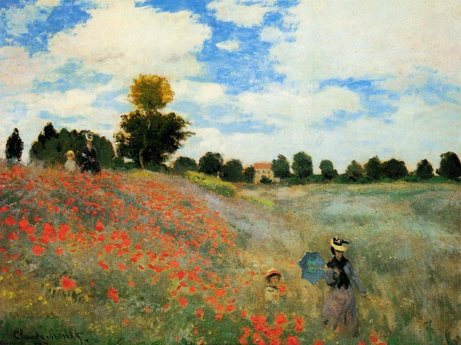
Do your own research point into the evolution of landscape painting from the 18th century to the present day. As well as the large oil paintings by artists such as Constable, look at how many artists (including Constable) have used oil sketches made on site as a means of recording the landscape for working up into larger paintings. Watercolour as also been a popular medium for English landscape painting.

18th Century Landscapes

1 Jan Griffier the Elder - A view of Greenwich from the River with many Boats

Jan Griffier the Elder – A view of Greenwich from the River with many Boats

You could see that landscape paintings were going to evolve quite quickly just by looking at the artists in the 18th century. The first early landscape I came across was by Jan Griffier the Elder above from the early 1700s. Here he probably pieced together several sketches to get the panoramic scene above in which he was telling a complete story of what was happening in Greenwhich. Perspective isn’t brilliant and buildings, although stacked with detail lack life. Figures seem to be a key part in bringing early landscapes to life.

2 Alessandro Magnasco - The Seashore

Jan Griffier the Elder – A view of Greenwich from the River with many Boats

Alessandro Magnasco or il Lissandrino, was an Italian late-Baroque painter and with other painters of this genre that I discovered seemed to add drama to their paintings with figures braving the stormy weather and violent clouds. The figures in his painting also add depth to the painting, painted on platforms in the foreground, middle-ground and background.

Joseph Wright of Derby - Landscape with Rainbow

Jan Griffier the Elder – A view of Greenwich from the River with many Boats

Towards the end of the 18th century figures were playing a less important role in landscape paintings. Although the rainbow in Joseph Wright of Derby’s painting above isn’t that lifelike (it may have been at the time) the rest of the painting is almost photo real  due to his use of light that lights up the middle-ground. This depiction of natural light advances towards the end of the 18th century and in to the 19th century.

19th Century Landscapes


1 Bidauld, Jean Joseph Xavier - The Park at Mortefontaine

Jan Griffier the Elder – A view of Greenwich from the River with many Boats

In The Park at Mortefontaine above by Bibauld, painted in the 1800s he portrays this sunlight perfectly with a clear natural sky, the sunlight reflecting off the trees and the reflection in the water.

John Constable - East Bergholt Church

John Constable – East Bergholt Church

It was here when I was investigating landscapes from the 1800s that I started to come across more sketchy paintings.  John Constable’s painting of the East Begholt Church above, is not one of the best examples of his work and his probably a study for one of his larger paintings but it is a great example of en plein air this you can tell by the thick, loose brushstrokes.

Albert Bierstadt - Farralones Islands, Pacific Ocean

Albert Bierstadt – Farralones Islands, Pacific Ocean


These rough and somewhat wild brushstrokes are great for painting outdoor natural objects that don’t require intricate details. In the painting above by German American artist Albert Bierstadt (of the Hudson River School) you can also see that it is en plein air by the roughness off the rocks in the foreground when enlarged. What I would have liked to know here though is which did he paint first? The blue of the background or the rocks in the foreground.


1875 Morisot Laundry

Berthe Morisot – Laundry 1875

Looking athe paintings of the late 19th century I came across my first impressionist landscape by an artist new to me called Berthe Morisot. Of all the paintings I researched so far it was the first painting that included an industrial landscape with chimney’s blowing smoke in the background. The painting depicts workers at a laundry hanging clothes out to dry. It’s the first, of what I would call, modern landscapes that I came across and it reminded me of LS Lowry’s paintings with the almost stick like figures and the grey-blue paint she uses for the factories and hills in the distance.

Vincent van Gogh - Starry Night - 1889

The Starry Night – Vincent van Gogh 1889

The Starry Night by Vincent van Gogh depicts the view from his bedroom at the asylum in Arles. The artist painted the Starry Night in the day time in his ground floor studio at the asylum, all though some believe it was painted from memory, Vincent painted the view no fewer than 21 times in different variations and so this was more from studies than from memory.

The 20th Century

George Bellows - Fern Woods -1913

Jan Griffier the Elder – A view of Greenwich from the River with many Boats

Entering the 20th century I came across this wonderful painting by American realist painter George Bellows in which you can see the individual brushstrokes that make up the bare branches of the tree. During the latter part of the 19th century and the early part of the 20th century artists seem to be doing more and more experimenting and not just concentrating on panoramic views anymore but concentrating on the beauty of smaller sections of the landscape.

Anita Ree - Dorfansicht -1920

Anita Ree – Dorfanischt – 1920

Things were also starting to wobble as people discovered more artistic freedom, not just to play around with natural forms but to find more ways of depicting the contrast of natural forms against made objects such as in Anita Clara Rée’s painting above.

Thomas Hart Benton - Chilmark Landscape

Thomas Hart Benton – Chilmark Landscape

American painter and muralist Thomas Hart Benton’s painting  ‘Chilmark Landscape’ above, also seems to have a certain wobbliness about it. However, from what I have seen from his other works, Benton as with Grant Wood seem to notice the natural patterns that occur in nature as well as well as the patterns that man’s impact on nature as created and exploit these in their landscape paintings.

Stone City, Iowa , 1930 oil on wood panel

Grant Wood – Stone City, Iowa, 1930, oil on wood panel

Grant wood along with Thomas Hart Benton was at the forefront of the Regionalist art movement in America. His paintings are notable for the lines of lollipop trees bending around exaggerated rolling hills with swooping roads making his landscapes some of the ‘softest’ ever. Unlike Lowry, who’s colours fade out to depict the distance, Wood keeps the same tones but uses the size of the trees, buildings and hills to depict the distance. This gives his paintings a cartoon feel to them.

1958 - Industrial Landscape - LS Lowry

LS Lowry – Industrial Landscape – 1958


Famous for his industrial landscapes and ‘matchstick men and matchstick cats and dogs’ L.S. lowry will be one artist who will be definitely having an influence on my work through this part of the course. Living in Bangkok, a sprawling metropolis of tall buildings I will hopefully be employing Lowry’s technique of using pale hues to depict buildings in the distance through the gaps in the skyline.

Watercolour

Gammelshausen, county Göppingen, Margret Hofheinz-Döring 1980s

Over the last few years a variety of watercolour painting technique’s have appeared, in the painting Gammelshausen, county Göppinge 1980s,  Margret Hofheinz – Döring has used watercolour as a drawing medium, sketching in much the same way as an illustrator.

Steve Greaves - All Saints Church, Darfield

Steve Greaves – All Saints Church, Darfield

Where as  Steve Greaves in his painting above ‘All Saints Church, Darfield’ has used it as both a drawing and a painting medium in a style that has become known as urban art.This style is unlike the paintings of ZL Feng from Shanghai below, where the artist has used watercolour in a more traditional way, although he has exploited the vivid colour of the medium and painted what I can only describe as some of the most beautiful watercolour landscape paintings I have ever seen.


Looking at Faces 4 – Research Point – Portraits Conveying Mood and Atmosphere

Brief for this Research Point:

Go on the internet and find some portraits that convey a distinctive mood or atmosphere rather than simply a physical likeness. Look at Picasso’s blue paintings with their mood of surreal sadness or the dark earth colours of van Gogh’s early paintings of peasants seated around a fire in their poor, meager surroundings. Look at the strong tonal contrast in Rembrandt’s portraits and the formidably restricted palette with which he seemed to convey the very essence of a person’s mood and personality. By contrast, consider the gaiety or the disturbing, nightmarish quality of the portraits and figure paintings of the Fauve painters and the German Expressionists.

Felix Nussbaum

felix nussbaum | Felix Nussbaum, Fear (Self-Portrait with his Niece Marianne), 1941

Felix Nussbaum, Fear (Self-Portrait with his Niece Marianne), 1941

During Self Portrait Drawing 1 I discovered an artist called Felix Nussbaum a German artist whose works portrayed life in the Nazi death camps and life as Jew in Europe during WWII. In 1944 he was sent to Auschwitz where he was murdered by the Nazis age 39.

You don’t need to know the story of Felix’s life to understand the trauma that he and his family went through, he manages to portray this through his portraits and self portraits.

in Fear 1941, a painting of Felix with his Niece Marianna the very convincing facial expressions made more so by his hand cradling his nieces face but what really makes the painting is how he uses the strong contrast of blue and orange.

Felix Nussbaum - Prisoner 1940

Felix Nussbaum – Prisoner 1940


His painting of a Prisoner 1940 he uses a different way of creating mood, the models pose. He has clearly studied people in moments of sadness and despair. If this was a painting of a farmer on a tractor driving through a field using the same background and foreground the atmosphere would be hard to read with this palette.


Vincent van Gogh

Van Gogh Peasant Woman with Dark BonnetUsing similar earth colours but with a lot darker tones van Gogh has managed to depict real sadness in his peasant paintings.

It’s not the colours alone that has captured the mood in these paintings though. Looking at the woman’s face (left) you know that she led a hard life and she hasn’t and couldn’t hide this while posing for the artist who has captured everything. Here van Gogh uses heavy shadows on the face to capture her age and weathered look. I really like the way he has used the light dots on the yes to depict light reflecting off almost tearful eyes.


Vincent van Gogh - Head of a peasant

Vincent van Gogh – Head of a peasant

He uses the same heavy shadows in the ‘Head of a Peasant (right). Here he uses the dark earth tones to portray worn, unwashed clothes. This together with a scruffy unwashed face and helpless expression lets us know exactly what kind of life the sitter has. We wouldn’t need to know who the sitter was or the name of the painting to feel this.


Vincent van Gogh - The Potato Eaters

Vincent van Gogh – The Potato Eaters

Looking at ‘the Potato Eaters’ you wonder how long they sat there. He captures not just the mood and atmosphere but the moment.

The first impression I got when I saw this painting was a family sharing a moment of happiness in an otherwise miserable life. Highlighted by the glow coming from the dinner table sounded by the darker tones and tatty surroundings.


Pablo Picasso

Pablo Picasso, The Old Guitarist, 1903

Pablo Picasso, The Old Guitarist, 1903

When beginning this research point I wanted to avoid Picasso’s The Old Guitarist. It seemed like it was the first painting From his Blue Period that everyone flocked to but after examining other paintings of this period I kept coming back to this and for one good reason.

The reason I kept returning to this painting is that it is probably one of the best examples of how he has used other lighter colours to describe the old man’s skin colour and features. Looking on different screens and devices I saw different colours, maybe yellow, some pink as well as green. I presume these lighter colours were applied last over the top of the blue which still shows through keeping the melancholy atmosphere.


Pablo Picasso The Old Beggar

Pablo Picasso The Old Beggar

This technique can also be seen here in ‘The Old Beggar’. Here the lighter colours on the face, hands and feet are more prominent allowing us to see the pale complexions of the subjects over the top of the blue.


Otto Dix

Otto Dix the Nun

Otto Dix the Nun

In ‘The Nun’ Otto Dix as used long brushstrokes of lighter paint over darker colours to depict the creases in the nuns forehead and heavy patches of red over the top of its complimentary colour green helps to accentuate the bags under her eyes giving her a tortured and extremely sad expression.


Rembrandt

Rembrandt van Rijn Apostle Peter in Prison 1631

Rembrandt van Rijn Apostle Peter in Prison 1631

While looking through Rembrandt’s paintings I came across the following painting. ‘Apostle Peter in Prison’ 1631 is a brilliant example of how the artist uses strong contrast to create mood and atmosphere in his paintings. The artist has used lighter colours in the centre of the painting to highlight the apostles face and front depicting sunlight shining through a window in a dark prison cell. The mood here is a very lonely one.


Fauvism and Matisse

For me it was very hard to look at most Fauve painters; figurative or portrait paintings and feel something from them, yes the colours are bright nut often enough I feel that the artist is painting a pretty serious pose in gay colours experimenting for themselves rather than for the viewer.

Matisse Gypsy

Matisse Gypsy

In the painting ‘The Gypsy’  though, the colours are doing their job or at least the job that we expect that strong contrast of colours to do, although the expression on the gypsy’s face adds to the happy mood.

Research Point 4: Still Life from the Dutch Golden Age to Contemporary Art

Part 1 of this Research Point

Look at the work of some of the 17th century Dutch still life and flower painters. Make notes on paintings that you especially admire and find out more about the techniques that were employed at this time. Research at least one painting that has iconographic significance.  Which of the objects depicted carry particular meaning and what was that meaning?

I started by searching for names of 17th century Dutch painters making a list of the names of artists whose work caught my eye, these included Jan Davidsz. de Heem, Jacob Gillig, Pieter Claesz and Evert Collier as well as Jan Weenix and Harmen Steenwyk. From there I went onto research the techniques used at that time so I could come back and examine the works of some of these painters in detail.

Techniques of the Dutch Masters

Unlike modern painters execute their paintings as a whole, working in a standing position so that they can step back to visualize the painting in its entirety, 17th century artists worked in a master studio to a fixed step by step method. They divided the workload into separate phases so that they could take care of the all important components individually. The compositions of the still life paintings of the 17th century were much more intricate than today and therefore the Dutch masters paid far more attention to detail and perspective and so a more technical process was needed, completing each painting in a piece by piece fashion once the drawing and lighting had been worked out at the underpainting stage.

The artists of 17th century Holland also had far less pigments on their palettes than today’s artists as their choice of pigments were far less, usually having to be hand ground at the beginning of each working day, in addition to this not all pigments were compatible with each other and so had to be used individually. Complex painting techniques such as glazing, underpainting and using varying paint consistencies and application methods helped them to compensate for the lack of pigments.

For the 17th century painter there were several stages to producing a painting, these were: inventing (drawing or sketching), dead-coloring (underpainting), working-up (finishing/application of colour) and retouching.

One notable technique that I found was for painting patterned lace, Rembrandt evolved a technique where he painted lightly in black over white to show the pattern but the other way, one which particularly appealed to me was to paint in white over black then scratch off the white with the end of the paintbrush to depict the pattern.

Paintings of the Dutch Masters

Examining the still life paintings of this era is different from anything I’ve looked at before as I have to remember that most of these were commissioned and so I have to look at iconography in the painting, floral compositions, backgrounds etc.

Jan Davidszoon de Heem

Jan Davisz de Heem Still Life with a glass and Oysters

Jan Davisz de Heem Still Life with a glass and Oysters

I looked at several paintings by Jan Davidsz. de Heem but the first one that caught my attention was Still Life with a Glass and Oysters. However, it wasn’t the oysters that caught my eye, it was the bunch of grapes, and glass.

According to the paper Symbols of Change in Dutch Golden Age Still Life Paintings by Ellen Siegel, grapes in Dutch Golden Age Paintiings (DGAP), grapes were a religious symbolism or symbolism of purity and can also be symbol of trade with Spain. Glassware was symbol of wealth or moderation. The large luxurious glass in this painting is obviously a symbol of wealth and so I would say that the grapes rather than a religious symbol in this piece were the latter, a symbol of trade. Oysters in DGAP symbolism were a symbol of natural aphrodisiac and temptation. So i am thinking that person who commissioned the artist to paint this piece enjoyed a luxurious lifestyle and maybe parties with this piece on display for all to see.

Jan Davisz de Heem Still Life of Flowers

Jan Davisz de Heem Still Life of Flowers

Although we just see floral paintings as beautiful paintings, something to brighten up the room, certain flowers in DGAP’s carried a lot of symbolism. In the painting on the right ‘Still Life with Flowers, there are several flowers that have hidden meanings. Tulips are a symbol of wealth and beauty, originating from Turkey this maybe why in most of the paintings I have looked at by Jan Davidsz. de Heem the tulips point east, the white rose which can be seen in the bottom left is a symbol of virginity while the three petal pansy in the bottom right was a symbol of the holy trinity. White carnations have become a symbol of love but when that started is unclear.

Could this painting have been commissioned for a merchant’s wife or girlfriend? Could this have been commissioned by the merchant himself? Are the flowers in the painting really symbolising these things or is it just a painting that has been commissioned to display the wealth of the owner as cuttings from his luscious garden?.

Pieter Claesz

Vanitas with Violin and Glass Ball Pieter Claesz

Vanitas with Violin and Glass Ball Pieter Claesz

The first ‘vanitas’ painting by Pieter Claesz  that caught my eye was ‘Vanitas with Violin and Glass Ball’, but is this really a commissioned painting or a painting that was kept in his studio  for clients to see as they walked in, there seems to be far too much iconography for one painting Why is the reflection of the artist seen in the painting? Could this be to show the level of work that he could accomplish for his clients or to be shown off by the person who commissioned the piece, that ‘Pieter Claez really did paint this piece’!

In GADP symbolism  a voilin was often the symbol of learning, knowledge or warning against sinful life . The skull is a reminder that life is short and a warning to put more emphasis on spiritual rather than earthly cares while a spilled glass may imply moderation or fleeting life. If a commissioned, piece could it imply that the owner is a man of knowledge, an educated person (hence the who quill and ink) who is not simply wasting away his short time on earth but using it the best he can?

Part 2 of this research point

Explore the development of still life through the 18th, 19th and 20th centuries, For example, look at traditional still subjects were dealt with in some early cubist paintings by Brque and Picassso. Investigate how some contemporary artists are interpreting this genre.

Still Life in the 19th Century

I looked at four still life artists from the 18th century these were Jean Siméon Chardin‎, Jan van Huijsum‎, Jean-Baptiste Oudry‎ and Jan Weenix. There were certain differences that I noticed and I have noted them here:

Jan van Huysum Vase of Flowers

Jan van Huysum Vase of Flowers

With floral paintings, 18th century artists were now showing more of the vase than before, I’m not sure whether the vase itself now began to symbolise something other than a luxury, The attention to detail was still there but the paintings began to lose there hyperreal look, maybe the artists of the 18th century were now beginning to look at the painting as a whole, colours were brighter, this could have been down to more pigments being available and if this is so then artists of the eighteenth century could have put less focus on the techniques of the 17th century. Stalks, stems and petals were more expressive, and now showed a life of their own.

Jean Baptiste Siméon Chardin Still Life with Bread

Jean Baptiste Siméon Chardin Still Life with Bread

More still lifes of this century were painted outdoors, with statues, dogs and dead game now showing off the owners wealth and social status. Artists such as Jean-Baptiste Oudry were now combined superb renderings of the textures of fur and feather with simple backgrounds, While Jean-Baptiste Chardin painted small and simple compositions of food and objects in a most subtle style that both built on the Dutch Golden Age masters, and was to be very influential on 19th-century compositions. Vanitas and religious symbols had now been dropped from commissioned works.

Still Life in the 19th Century

The Luncheon II Claude Monet

The Luncheon II Claude Monet

Artists in the 19th began to break the tradition of the dark background with Claude Monet being one of the first to do so, Moreover, technique and colour harmony began to play more important roles than subject matter. ‘The Luncheon II’ left is a perfect example of this.

Van Gogh made one of the main contributions to floral still life in the 19th century with is ‘Vase of Fifteen Sunflowers.’ But other notable paintings by van Gogh were his version of a ‘vanitas’ painting, ‘Still Life with Open Bible, Candle, and Book’ and ‘Still Life with a Drawing Board’.

Vincent van Gogh  - Still Life with a Drawing Board

Vincent van Gogh – Still Life with a Drawing Board

This was a self portrait in the form of a still life which was a composition of some of his personal items such as pipe, a letter from his brother as well as onions and an inspirational book presented on a table.

Still Life in the 20th Century

Paul Cezanne - Floral Still Life 1914

Paul Cezanne – Floral Still Life 1914

The first few decades of the 20th century produced a string of overlapping movements, gradually reaching total abstraction in the mid century. Paul Cézanne started to experiment with geometric spatial organization using still life to demonstrate elements of colour, line and form.

Cézanne’s experiments lead to the development of the cubist still live movement in the early 20th century. Cubists such as Pablo Picasso, Georges Braque, and Juan Gris deconstructed objects into pure geometrical forms and planes, their still life’s that often included musical instruments brought the genre to the forefront of artistic innovation for the first time.

Looking at Georges Braque’s ‘Still Life with a musical scroll’ below you can see that his still life composition includes many of the traditional still life subjects that have been present since the Dutch Golden Age of painting including musical instruments. grapes and other fruit.

Still Life with Music Scroll - Georges Braque

Still Life with Music Scroll – Georges Braque

Picasso - Still Life with Violin and Fruit

Picasso – Still Life with Violin and Fruit

Picasso’s Still life with violin and fruit, comprise of still life objects that are barely recogniseable as they merge into the background. This is an example of the synthetic cubist works which achieved goals almost opposite to those of traditional still life.

Still LIfe in Contemporary Art

Eliot Hodgkin Large Leaf 2 Tempera on Card

Eliot Hodgkin Large Leaf 2 Tempera on Card

Contemporary artists gain influence from past movements but they are also constantly developing there own interpretation of still life.

http://www1.umassd.edu/euro/2011papers/siegel.pdf

http://en.wikipedia.org/wiki/Dutch_Golden_Age_painting

http://www.essentialvermeer.com/technique/technique_overview.html#.VPMKkfmUfjs

http://www.metmuseum.org/toah/hd/nstl/hd_nstl.htm

http://global.britannica.com/EBchecked/topic/623056/vanitas

http://en.wikipedia.org/wiki/Still_life

Research Point 3 – Chevreul’s Colour Theories

The brief for this research point was to find out more about Chevreul’s colour theories. And make notes on how particular artists have used Chevreul’s theories to expand the possibilities of painting.

Law of simultaneous contrasts of colours

New to  Chevreul’s theories I began scanning the internet for more information, I came across a really interesting paper written by philosopher and art historian Georges Roque in which he describes Chevreul’s ‘law of simultaneous contrast of colours’ and how particular artist’s such as Delacroix, Claude Monet, Paul Signac and even van Gogh have used his theories.

Chevreul was appointed Director of the Dyeing department of Gobelins manufacture and after 4 years of colour research he wrote a memoir to be read at the Academy of Sciences about the influence two colours can have on each other when seen simultaneously. Due to lack of reliable colour plates his main book on the subject “On the law of simultaneous contrast of colours and on its applications to…”, was delayed 11 years and wasn’t published until 1839. Published with the book was a striking list of all the areas to which is law could be applied including tapestry, clothing, horticulture, stained glass windows as well as painting.

His research into the laws of simultaneous contrast came about when the weavers at Gobelins made a complaint against the dyers in the Department of Dyeing which Chevreul directed. The complaint was that they were not producing the required depth of colours in the black dyes. Chevreul realised that the fault lay not with chemistry but it was a problem of psychophysiology; the brains perception of colour when the black was seen next to other colours.

In the case where the eye sees at the same time two contiguous colours, they will appear as dissimilar as possible, both in their optical composition and in the strength of their colour.– M.-E. Chevreul.

Meaning in order to perceive two colours better, the brain has a tendancy to exaggerate differences. Chevreul’s law works for lightness as well as hues which can be seen in the next exercise Mixing Grey’s – anachromatic scale.

Chevreul’s law of contrast came together through his awareness of the existence of complimentary colours. If the brain exaggerated the two juxtaposed colours this meant they would be perceived to be  more different than they actually are with the brain adding to the juxtaposed hue a little of the complimentary colour to that hue and vice versa.

Neutralizing the complimenting effect

Chevreul was asked testify in a trial between a wallpaper manufacturer and a customer who complained that the grey pattern in the wallpaper grey looked reddish whilst the manufacturer claimed it was perfectly grey. Chevreul proved both to be right by isolating the grey, then to neutralize the complimenting effect he suggested adding a small part of the colour of the background to the grey.

Chevreul concluded that when the two hues that are juxtaposed together are complimentary such as a green and a red, the two complementary colours enhance each, the red will look redder and the green will look greener. This law was critical for painters who wished to predict the intensity and harmony of colours when  juxtaposed together.

Chevreul’s influence on artists

The only painters interested in Chevreul’s theories up until the 1880s were those looking to enhance their colour. Looking for a recipe to give more intensity to their colours, these artists ‘adopted accordingly what they called erroneously “the law of complementary colours”.’Georges Roque.

One of the first of these was Eugene Delacroix who made the following mnemonic which he would use would use for his painting.

Chromatic triangle of Eugène Delacroix, 1834,

Chromatic triangle of Eugène Delacroix, 1834,

A prime example of this is Delacroix’s ‘The Entry of the Crusaders into Constantinople. 1840 in which he used his colour triangle, structured by three pairs of complimentary colours and this can be especially seen in the flags, one of which is blue with orange motifs, another is yellow on a violet ground and the two on the ground on top of each other are of juxtaposed complimentary colours, red and green.

Eugene Delacroix , The Entry of the Crusaders into Constantinople. 1840. Oil on canvas

Eugene Delacroix , The Entry of the Crusaders into Constantinople. 1840. Oil on canvas

The influence Chevreul’s theories had on impressionist painter Pissaro could be seen in the way he framed his paintings, applying ‘the law of complementary colours’ at a 1877 exhibition by choosing white frames so that they did not interfere with the exact tonal values of the colours in his paintings. A few years later when he wanted to enhance the colours, he opted for slightly colouring the stretches with the complementary hue of the dominating colour in his paintings.

Monet claimed he was not one to ‘theorise’ in his paintings but in an interview hewas quoted as saying “primary colours look brightest when they are brought into contrast with their complementaries”, is awareness of the laws of simultaneous contrasts of colour can be seen in ‘Poppies at Argenteuil, 1873’ in which he took the opportunity to place spots of pure read against the more dominant green.

Claude Monet, Poppies at Argenteuil, 1873

Claude Monet, Poppies at Argenteuil, 1873

Unlike the impressionists who claimed they weren’t colour theorists the neo-impressionists from the 1880s onward realised how much of an important role colour science played in their paintings. Artist and theoretician of neo-impressionist movement, Paul Signac visited Chevreul in 1884, and in 1885 returned to visit Chevreul’s assistant at Goeblin’s, Emile David, who he is thought to have visited with George Seurat. as like other neo-impressionist painters who have acknowledged Chevreul, Seurat himself mentioned Chevreul amongst his sources.

Both Signac and Seurat As for Signac, ‘optical mixture’ where instead of being mixed on the pallete, dots of complementary colours are interposed directly on the canvas in order to applied the principle of frequently interposed small dots of complementary colours in order to increase
the luminance in their paintings, these dots of colour are meant to be fused by the eye when seen from a distance which produces a third colour, different from the
two juxtaposed hues.

Paul Signac, The Breakfast, 1886-87

Paul Signac, The Breakfast, 1886-87

Van Gogh got aquainted with ‘the theory of simultaneous contrast’ through art critic, Charles Blanc’s interpretation of Chevreul’s colour theories. He was so enthusiastic after reading Blanc that he copied out a passage of his book in a letter to his brother.

However because of van Gogh’s supposed madness, his use of colour in his paintings has been analysed by doctors rather than by art historians and he was diagnosed as having ‘xanthopsia’ or yellow vision due to his apparent overuse of yellow, but when his paintings are examined carefully the yellow never stands alone and his always along other colours usually against violet, it’s complimentary colour.

Vincent van Gogh, The Sower, 1888

Vincent van Gogh, The Sower, 1888


Vincent van Gogh, Vase with Irises against a Yellow background

Vincent van Gogh, Vase with Irises against a Yellow background

Click to access Chevreuls%20Law%20F1%20web%20good.pdf

Research Point 2 – Chiaroscuro

Caravaggio - John the Baptist

Caravaggio – John the Baptist

‘The term chiaroscuro (chiaro meaning light, scuro meaning dark) originated in the Renaissance when it referred to a technique .of drawing on coloured paper by building light tones with gouache and working down to dark tones with ink. It later came to refer to modeling of light in paintings, drawings and prints. The extreme contrast between dark and light areas allowed subtle graduations of tone to create illusions of volume, most notably that of the human form. Chiaroscuro became a common composition device in religious paintings such as those of Caravaggio.

‘Explore the works of some of the artists whose work exemplifies chiaroscuro effects such as Tintoretto, Caravaggio and Rubens. Look at the candlelit studies of some of the northern European artists, most especially Rembrandt and Joseph Wright of Derby. (Remember that until relatively recent, life was lived in pools of candlelight or firelight after the sun went down.) Make notes in your learning log.’

Titian Saint Jerome in the Desert

Titian Saint Jerome in the Desert

Towards the end of the 1500’s, with the new religious appreciations due to the Catholic Reformation, night scenes depicting the life and Passion of Christ became increasingly popular. The artist Titian embarked on a new technique which involved the disintegration of matter in light, particularly in night settings. He would continue to explore the dissolution of light through matter until the end of his days. The Next generation of artists would take over and perfect these dramatic effects of light and colour.

Night scenes would later become known as Nocturnes (a phrase coined by James Abbott McNeill Whistler). It describes a painting style that depicts reminiscent of the night  or subjects as they appear in a veil of light, candlelight, twilight, or in the absence of direct light.

Tintoretto - Lamentation over the Dead Chris

Tintoretto – Lamentation over the Dead Christ

Jacopo Tintoretto

Throughout his long career Jacopo Tintoretto dramatised his nocturnes by drenching them in heavenly lighting, with colours distorted by bold contrasts of light. These lively effects of lighting added drama to his stunning compositions.

Jacopo Tintoretto - The last Supper

Jacopo Tintoretto – The last Supper

Examples of this ‘supernatural lighting’ can be seen in both the Lamentation over the Dead Christ and the last supper where light is depicted coming from a source other than a natural one as to Titian’s St Jerome above which depicts natural moonlight.

Caravaggio

Before moving to Rome, Milanese painter Caravaggio trained as a painter in Milan under Simone Peterzano, a former student of Titian.

Caravaggio - Doubting Thomas

Caravaggio – Doubting Thomas

In Rome the Catholic church were in need of a stylish replacement to Mannerism in religious art, a move that they thought would help counter the threat of Protestantism (the counter-reformation), and so there was a demand for paintings to fill the many new churches and palatial buildings being built there.

Caravaggio revolutionized chiaroscuro with a radical form of naturalism combining close physical observations with a dramatic, somewhat theatrical, use of chiaroscuro this came to be known as ‘tenebrism’.

Caravaggio - Saint Jerome Writing

Caravaggio – Saint Jerome Writing

Looking at the paintings of the three artists above you can see the evolution of nocturnes and of course chiaroscuro as a major technique in night paintings. From works of Titian that used the background as an important part of the painting with figures whose forms didn’t wholly employ the technique that it would later become; to the paintings of Caravaggio who had pretty much perfected the technique, at least to where he need to be depicting up-close three dimensional compositions with a clear message that appear to almost leave the canvas.

Peter Paul Rubens

If the paintings of Caravaggio were a Drama then the paintings of  Flemish Baroque painter, Rubens would be a musical. Originally from Cologne in Germany, he was as a catholic by his mother in Antwerp, Belgium.

Peter Paul Rubens - The Fall of Phaeton

Peter Paul Rubens – The Fall of Phaeton

His paintings featured religious scenes in complicated and very dramatic compositions. Rubens became one of the leading voices for the Counter-Reformation style of painting and standing behind what he had worked so hard to ‘promote’ he stated, “My passion comes from the heavens, not from earthly musings”.

It is clear from his paintings that he was a man of faith, something was clearly moving him through these paintings, if not just belief.

Peter Paul Rubens - Adoration of the Magi

Peter Paul Rubens – Adoration of the Magi

Where Caravaggio painted close-up dramatic scenes of a biblical theme with detailed expressions and drapery Rubens’ painted religious scenes in action, depicting flowing drapery and strong movement in his figures, with complicated compositions with several main figures and even horses.

In a lot Rubens paintings it is very clear to me that he started on a dark background particularly in the two paintings that I chose here, ‘Adoration of the Magi’ and

Peter Paul Rubens - Night Scene

Peter Paul Rubens – Night Scene

‘Night Scene’ but then again I now know what I am looking for, to others that don’t,  they see every bit of the composition as if everything in the painting was completed in detail, what the eye doesn’t see, the brain fills in.

 Rembrandt Harmenszoon van Rijn (Rembrandt)

For the best examples of chiaroscuro in Rembrandt’s paintings one needs to look no further than his self-portraits. Rembrandt created nearly one hundred self portraits in his lifetime. Of those one hundred self-portraits seven were drawings, thirty two were etchings and fifty were paintings. Included in those were candelit studies, painting by candle light.

Rembrandt - Self portrait 1657

Rembrandt – Self portrait 1657

Rembrandt’s candlelit studies are great examples of the use of chiaroscuro, I looked at several of his self portraits the technique but ‘Self Portrait 1657’ was one that really stood out, the reasons for this being that you can see how the face and highlights in the hair and hat have been painted building up the light tones on the dark background. I can imagine him painting it, where he started and can even guess some of the brush techniques that he used.

Joseph Wight of Derby 

The artist Joseph Wright of Derby was unknown to me, as an artist that is but is name was famiiar and when I did a search fore information about the artist I came across the Joseph Wright college and it clicked.

Joseph Wright of Deby - An Experiment on a Bird in an Air Pump

Joseph Wright of Deby – An Experiment on a Bird in an Air Pump

Wright is notable for his use of Chiaroscuro, and for his paintings of candle-lit subjects. His paintings of the birth of science out of alchemy, often based on the meetings of the Lunar Society, a group of very influential scientists and industrialists living in the English Midlands, are a significant record of the struggle of science against religious values in the period known as the Age of Enlightenment. – Wikipedia

Joseph Wright  did for the industrial revolution and science as Titian, Tintoretto and Caravaggio did for the counter-reformation, ‘using their own tool against them’ comes to mind. It’s ironic that using chiaroscuro effect was the best way he could describe the candlelit scenes of the ‘Age of Enlightenment’ when the chiaroscuro effect had been employed by so many earlier artists who had described religious scenes through their art. His style was very similar to Caravaggio but using more detailed, technical compositions and painting them from a distance. What makes his paintings different from earlier works however, his is exceptional use of shadows.

Bibliography:

http://mini-site.louvre.fr/venise/en/exhibition/holy_nights.html

http://www.wikipedia.com


Research Point 1 – Mark Rothko and the Seagram Murals

Look at the paintings of Mark Rothko, in particularly the huge Seagram Building Paintings, now in the Tate Modern, which form a solemn kind of tone poem all in shades of crimson.

Rothko was an American Abstract Impressionist painter, born in Russia and emigrated with his family to the U.S.A. in 1913. As a young buy Rothko was interested in literature, music and social studies and won a scholarship to Yale University where he studied liberal arts but left without graduating in his third year.

In 1925 Rothko moved to New York where he was he made irregular attendances at the Art Students League, one of the classes there was a painting class buy Max Weber, which remained his only formal art training. Mostly self taught, he educated himself by attending exhibitions and visits to artists’ studios such as that of Milton Avery, whose work influenced Rothko along with that of Matisse with their simple compositions and flat areas of colour.

Bathers or Beach Scene Untitled 1933-4 by Mark Rothko

Bathers or Beach Scene Untitled 1933-4 by Mark Rothko

Rothko’s earliest pictures comprised of Expressionist landscapes, genre scenes, still-lifes, and bathers and were somewhat muddy in tone while his watercolours of the same period, demonstrate an expert approach to thin washes of pigment. His paintings throughout the 1930s invoked a feeling of mystery and dread with tragic figures set in claustrophobic apartments, lonely city streets and subway platforms.

Mark Rothko - Entrance to Subway - Subway Scene - 1938

Mark Rothko – Entrance to Subway – Subway Scene – 1938

In the lates 30s Rothko and Gottlieb as well as other Jewish artists with similar interests formed ‘the Ten’ together they mounted exhibitions in New York and Paris Until 1940.

During the mid-1940s Rothko evolved a personal watercolour technique.  he applied watercolour, gouache, and tempera to heavyweight paper, then before the paint had time to dry, he used black ink to define forms. The ink would bleed when introduced to areas that were still wet and resulted in the black burst often found in his works from this period. These watercolour techniques seemed to have influenced the technique which he  developed for his oil paintings.

Mark Rothko - Untitled  oil on canvas 1945

Mark Rothko – Untitled oil on canvas 1945

Rothko felt that his new work was consistent with the subject matter of his earlier paintings, he stressed he had not removed the human figure but had replaced it’s form with symbols and later shapes. In his opinion paintings like No.13(White, Red and Yellow) below had developed out of his hopes to express human emotions.

Mark Rothko Number 13 -White Red on Yellow

Mark Rothko Number 13 -White Red on Yellow

‘The progression of a painter’s work…will be toward clarity…..I’m interested only in expressing basic human emotions—tragedy, ecstasy, doom…and if you…are moved only by their color relationships, then you miss the point.’ Mark Rothko.

The Seagram Murals

Mark Rothko untitled Mural for End Wall

Mark Rothko untitled Mural for End Wall

Rothko was received one of the biggest commissions of his life in 1958, to paint a series of murals for the fashionable Four Seasons restaurant located in the Seagram Building on Park Avenue New York.

Mark Rothko untitled 1958


This set a new challenge for Rothko as it was the first time he had been asked to produce a coordinated series of paintings as well as producce an artwork space concept. To do this the artist constructed a scaffold in his studio, the same dimensions of the restaurant. Over the next three months he completed 40 paintings. A total of three series in maroon, dark red and black rather than the intense bright colours in his earlier paintings. He also altered his the usual horizontal format to vertical so that they would complement the restaurant’s vertical features: columns, walls, doors and windows.

Mark Rothko Untitled (section 3) 1959_0

Rothko was influenced by Michelangelo’s Laurentian Library in Florence, with its blind windows and deliberately oppressive atmosphere, he commented that Michelangelo ‘achieved just the kind of feeling I’m after – he makes the viewers feel that they are trapped in a room where all the doors and windows are bricked up, so that all they can do is butt their heads forever against the wall.’ While on the SS Independence Rothko disclosed to Harper’s Magazine publisher John Fischer, that his true intention for the Seagram murals was to paint “something that will ruin the appetite of every son-of-a-bitch who ever eats in that room….”

Mark Rothko Untitled (section 2) 1959_0

Eventually he realised that the worldly setting of a restaurant was no ideal location for such a work, Rothko withdrew from the Seagram Mural commission. He kept the commissioned paintings in storage until 1968 before presenting the series to the Tate Gallery, expressing his deep affection for England and for British artists such as J.M.W. Turner.

Mark Rothko Red on Maroon mural, section 5

Mark Rothko Red on Maroon mural, section 5

The Seagram Murals arrived in London for display at the Tate Gallery on the very day of his suicide, February 25, 1970. His assistant Oliver Steindecker, found him lying dead on the floor in front of the sink. Rothko was covered in blood with slices down his arms inflicted by a razor that was found lying at his side. The autopsy revealed that he had also overdosed on anti-depressants. ‘Mark Rothko was always incredibly depressed’ – Matthew Collings, This is Modern Art.

Mark Rothko Black on Maroon 1958

Mark Rothko Black on Maroon 1958

I used to have a reoccurring nightmare when I was a kid which was more of an intense feeling of anxiety than anything else. There were no figures in the dream just vertical blocks of dark greys and blacks pushing together and as they did the pressure that I felt would force me awake. This could have been from temporary damage due to lack of oxygen to the brain from pneumonia or asthma and I haven’t really thought about it for years but looking at the images above brings it all back and that’s just on the computer.

I’m not keen on the paintings, although I do understand the concept and respect the artist and I would like to get right up close and personal with Rothko’s paintings to feel just what the artist intended you to feel “tragedy, ecstasy, doom”

Although there is some emotion there for me looking at the murals above on a computer do not them justice at all, I have seen how two colours bleed into each other when wet  and can only really guess how the darker colours of the black shape on ‘Black and Maroon’ for example have bled into the lighter maroon. To see that on a grand scale would be something else.

If according to the Greek historian Plutarch ‘Painting is silent poetry, and poetry is painting that speaks.’ Then yes the poetry that these paintings offer us is very solemn indeed.

http://www.the-art-minute.com/

http://www.tate.org.uk/whats-on/tate-modern/display/mark-rothko

http://en.wikipedia.org/wiki/Mark_Rothko

http://www.oxfordartonline.com/