Existing Studies
I have spent the last few months drawing a self portrait every chance I got using my phone’s camera as a mirror and sometimes working from a photo. I even started one project where I got the students to draw a self portrait and I would draw one next to it to give me a little push, unfortunately I lost the sketch book but did manage to take some photos.
-
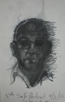
- charcoal 2
-

- Charcoal
-

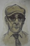
- conte pencil next to kids conte
-

- oil pastel 1
-

- pen next to kids pen
-

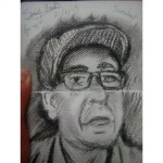
- self portrait on kids drawing 2
I’m lucky to still have some sketches in other sketch books, all of which are very quick sketches using different mediums. Although they do not all look like me there is a reoccurring resemblance.
-

- watercolour
-
- Stabilo pen and water
-

- Stabilo and Pen
-

- soft pencil no eraser
-
- Pen and Sepia Ink
-

- Conte Pencil
This exercise
The brief for this exercise: Make a self portrait of just your head and shoulders. You can choose to work with either natural light but natural light is best. Set up your equipment so that you can see yourself and your work surface clearly. Make sure that your face is lit from one side with the other side in shadow. Any additional light that you need should not shine into your face.
Choose a light, dark or mid-toned fabric background if you can fasten it behind you. Try out the effects of each and assess which of them gives the greatest interest in terms of tonal contrast or visual impact.
I set up a backdrop of an orange monk cloth that I draped over my largest drawing board and propped it up behind me on the sofa with a small round mirror. They only portable mirror I have out in front of me on a small coffee table. I closed the bathroom door and closed the curtain on the Juliet balcony so the only light that was entering the room was coming through the kitchen door.
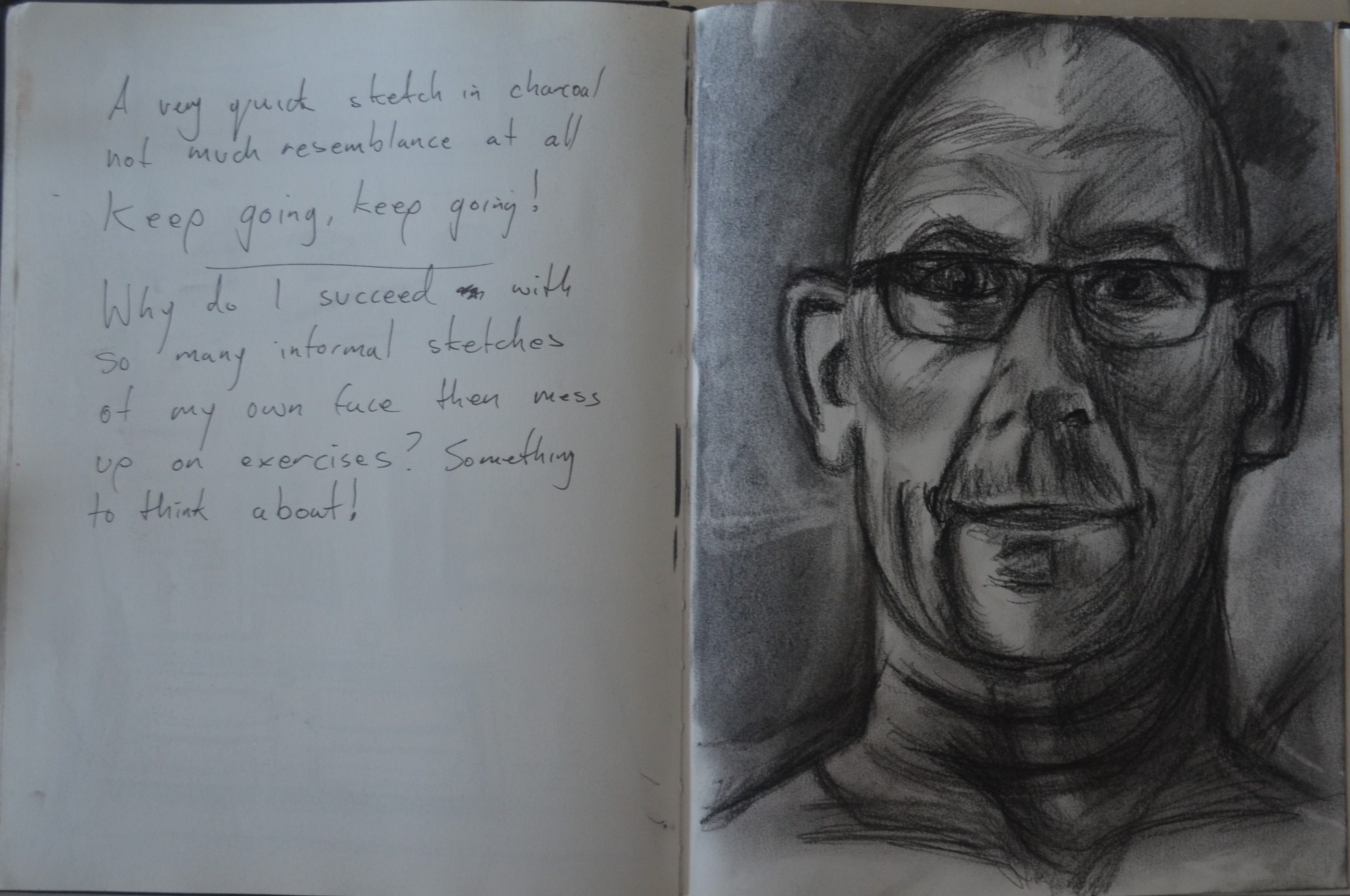
1st Drawing Charcoal
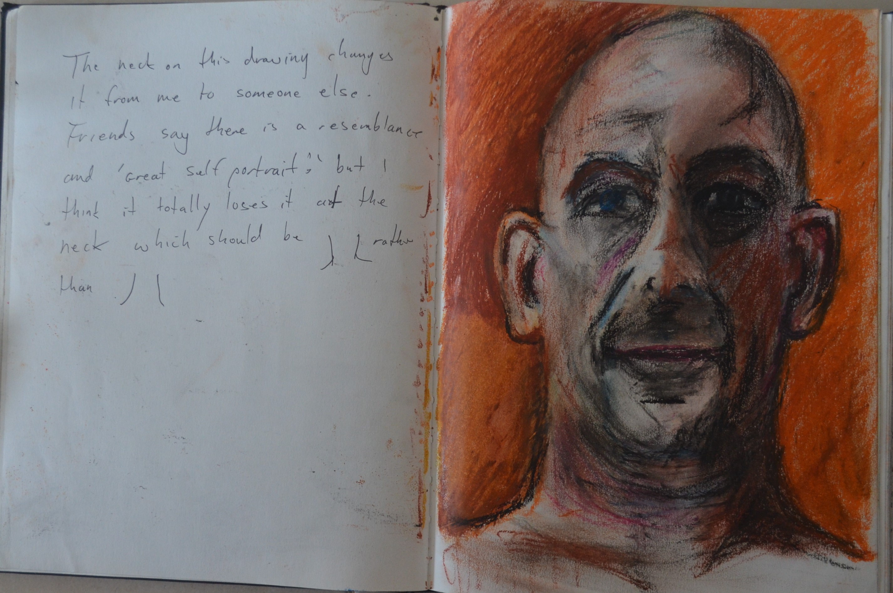
2nd Drawing OilPastel
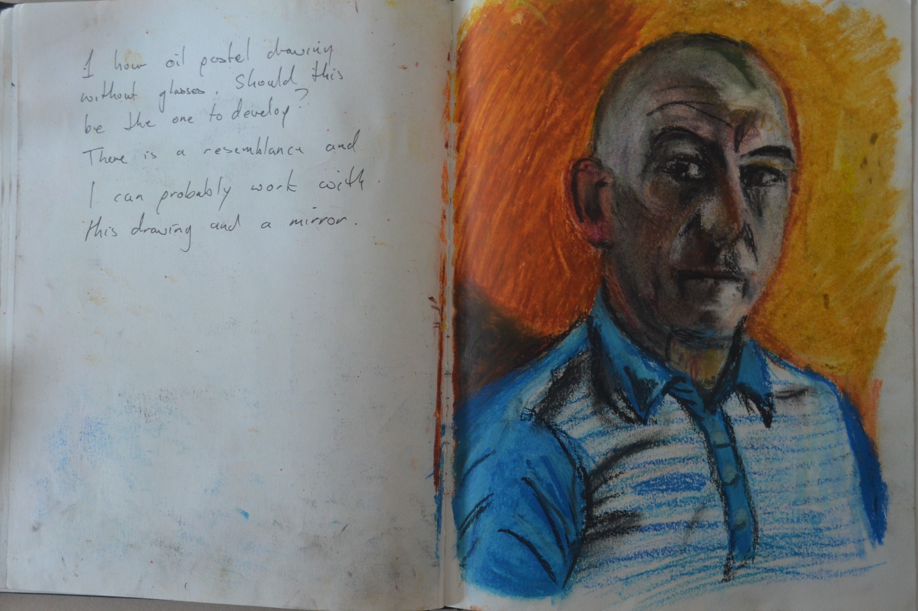
3rd Drawing Oil Pastel in the Bathroom
I completed the first drawing in charcoal with my glasses on. I was trying to smile while drawing it and I think I managed to capture some of that. Unfortunately I didn’t capture any likeness of me whatsoever apart from maybe an ear, the shape of the head and maybe an eyebrow. All the studies I had done were so far not paying off.
In the second drawing in oil pastel I managed to capture a bit more likeness and some of the smile I was cracking was even there although the eyes didn’t show this. Focusing on the mouth I could draw a smirk but when I drew the eyes my expression went serious again.
The orange backdrop was working though, it created a nice effect and I though I could continue with this but I needed a larger mirror. I was just too far away from the subject to be able to focus. I’ve been wearing my glasses so often lately that even tho I’m longsighted my eyes aren’t focusing right without them and I didn’t want to paint myself with them on.
I put a blue polo shirt on which gave a bit of contrast to the orange backdrop which I now taped to the bathroom door behind me. This drawing was a lot better than the first two but t did take a lot longer to complete and by the time I had finished my eyes were very blur. I wasn’t sure how I would cope painting myself in the bathroom or for any length of time without my glasses on for that matter but I was going to have a go.

Drawing with Paint on multi-Coloured was background
I prepared the support with two different semi-transparent washes from opposite corners and let them bleed into each other. Once it was dry I painted the outline of my face head and shoulders in a dilute yellow ochre.

2 Building up Layers of Paint
Then my idea was to paint the lightest tones and work darker. This is probably where I started to go wrong, thinking about it now it may have been better to start with the darkest colours and then build up the lightest colours on top rather than the other way round.
I had drawn the primary sketches during the daytime but for the painting I was painting at night with two light sources. The light in the shower as the one above the sink luckily was not working and a bendy lamp shining through the door on one half of my face.
3 Looking Old and Already Hating it
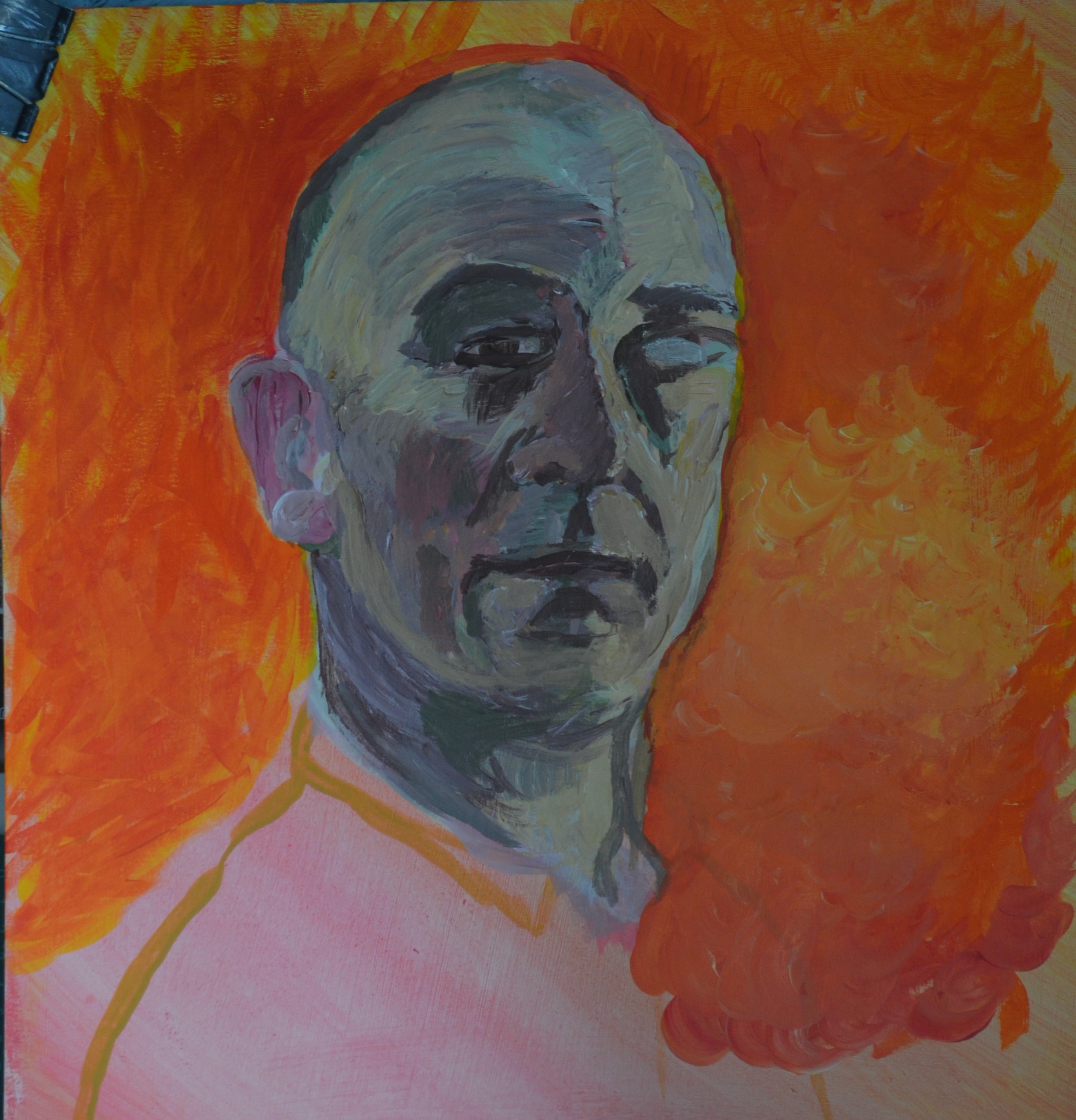
I moved on to the background to build up the colour there to give me some idea to how the painting would look. It was at this stage that I started to get annoyed with myself. The painting started to look like me but it just wasn’t me, this wasn’t my style and I really did not want to continue with it. The orange background didn’t help.
The photo of the painting right, was about where I left it for the first day and I hated it. I wasn’t use to painting myself from that angle. I usually attempted self portraits from the front and not having a clear all round vision I found it difficult to get it right.

Giving up Point
After painting, repainting and eventually messing up and painting a silly pair of glasses on it, I gave up, it was time to start a fresh.The painting right is now on the back of the new painting.
Fresh attempt at a Self Portrait
Remembering a self portrait that I had success with in the earlier drawing course I sat in the bedroom looking at the mirror on the wardrobe door, switched on the light and pointed it at the side of my face. It was easy to imagine my face as a painting as the light highlighted some really nice shapes and it wasn’t too dark that I couldn’t see the right side of my face.
Preparation
I prepared the back of the existing self portrait with a layer of burnt umber mixed with black and then once that had dried went over it again with another layer of Payne’s grey, shaved my head and waited to start the painting the next night.

Second Attempt at Self Portrait
This time I decided to work with the board on my knee rather than on the easel as I didn’t want it to cast any unwanted shadows plus it was easier as I could move it around freely which was great for working on the details of the eyes. I’m not to worried about getting the details or shape of the face wrong but I’ve found that if you get the eyes wrong people automatically say it doesn’t look like you.
I worked in various mixes of white and Payne’s grey rather than colour and this low level light I would have probably only used one or two colours anyway but it was quite dark and the board was dark so I needed to be able to see what I was painting so these two mixed together where ideal.
I used one brush a small flat brush and painted as if I was drawing starting on the left side of my face painting in the darker tones and then slowly building up the lighter tones. Once the right hand side of the face was complete from the neck to the crown I started on the right hand side by painting in the background with Payne’s grey and just a tiny pit of white modelling the light around my head to for the shape of my face and head then painted in the subtle highlights to form the shadows on my face and ear. The problem was the bedroom was too dark to see the slight difference in the shade of paint so I had to turn the big light on from time to time so that I could see what I was doing.
I managed to finish most of the painting in one sitting and with the main shapes and features painted I could work on some details in natural light the next day which allowed me to see any details that didn’t look right, these were easily be corrected by reshaping.
Overall thoughts on this exercise
I feel that I let myself down giving up on a painting which I had never done before but sometimes you have to start a fresh. I realise that the first painting may have had more character if completed with imperfections but I am really happy with the final painting and how I chose to complete it. I think impatience got the better of me here, being too impatient to mix paint and to deal with what seamed to be ever changing detail working at an awkward angle.
Thoughts on final piece
The length of the head is slightly long but this is from working with the board on my knee. The painting shows a real likeness but is let down by having little or no character. On a positive note this is the first time I have completed a painting with full brushstrokes rather than the scrumbling technique that I seem to keep reverting to in previous paintings.