The brief for this research point was to find out more about Chevreul’s colour theories. And make notes on how particular artists have used Chevreul’s theories to expand the possibilities of painting.
Law of simultaneous contrasts of colours
New to Chevreul’s theories I began scanning the internet for more information, I came across a really interesting paper written by philosopher and art historian Georges Roque in which he describes Chevreul’s ‘law of simultaneous contrast of colours’ and how particular artist’s such as Delacroix, Claude Monet, Paul Signac and even van Gogh have used his theories.
Chevreul was appointed Director of the Dyeing department of Gobelins manufacture and after 4 years of colour research he wrote a memoir to be read at the Academy of Sciences about the influence two colours can have on each other when seen simultaneously. Due to lack of reliable colour plates his main book on the subject “On the law of simultaneous contrast of colours and on its applications to…”, was delayed 11 years and wasn’t published until 1839. Published with the book was a striking list of all the areas to which is law could be applied including tapestry, clothing, horticulture, stained glass windows as well as painting.
His research into the laws of simultaneous contrast came about when the weavers at Gobelins made a complaint against the dyers in the Department of Dyeing which Chevreul directed. The complaint was that they were not producing the required depth of colours in the black dyes. Chevreul realised that the fault lay not with chemistry but it was a problem of psychophysiology; the brains perception of colour when the black was seen next to other colours.
In the case where the eye sees at the same time two contiguous colours, they will appear as dissimilar as possible, both in their optical composition and in the strength of their colour.– M.-E. Chevreul.
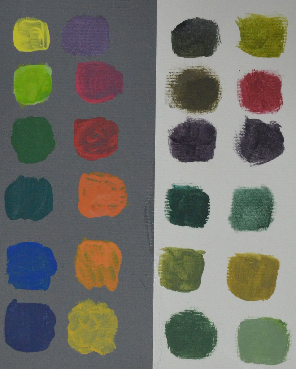
Meaning in order to perceive two colours better, the brain has a tendancy to exaggerate differences. Chevreul’s law works for lightness as well as hues which can be seen in the next exercise Mixing Grey’s – anachromatic scale.
Chevreul’s law of contrast came together through his awareness of the existence of complimentary colours. If the brain exaggerated the two juxtaposed colours this meant they would be perceived to be more different than they actually are with the brain adding to the juxtaposed hue a little of the complimentary colour to that hue and vice versa.
Neutralizing the complimenting effect
Chevreul was asked testify in a trial between a wallpaper manufacturer and a customer who complained that the grey pattern in the wallpaper grey looked reddish whilst the manufacturer claimed it was perfectly grey. Chevreul proved both to be right by isolating the grey, then to neutralize the complimenting effect he suggested adding a small part of the colour of the background to the grey.
Chevreul concluded that when the two hues that are juxtaposed together are complimentary such as a green and a red, the two complementary colours enhance each, the red will look redder and the green will look greener. This law was critical for painters who wished to predict the intensity and harmony of colours when juxtaposed together.
Chevreul’s influence on artists
The only painters interested in Chevreul’s theories up until the 1880s were those looking to enhance their colour. Looking for a recipe to give more intensity to their colours, these artists ‘adopted accordingly what they called erroneously “the law of complementary colours”.’Georges Roque.
One of the first of these was Eugene Delacroix who made the following mnemonic which he would use would use for his painting.

Chromatic triangle of Eugène Delacroix, 1834,
A prime example of this is Delacroix’s ‘The Entry of the Crusaders into Constantinople. 1840 in which he used his colour triangle, structured by three pairs of complimentary colours and this can be especially seen in the flags, one of which is blue with orange motifs, another is yellow on a violet ground and the two on the ground on top of each other are of juxtaposed complimentary colours, red and green.

Eugene Delacroix , The Entry of the Crusaders into Constantinople. 1840. Oil on canvas
The influence Chevreul’s theories had on impressionist painter Pissaro could be seen in the way he framed his paintings, applying ‘the law of complementary colours’ at a 1877 exhibition by choosing white frames so that they did not interfere with the exact tonal values of the colours in his paintings. A few years later when he wanted to enhance the colours, he opted for slightly colouring the stretches with the complementary hue of the dominating colour in his paintings.
Monet claimed he was not one to ‘theorise’ in his paintings but in an interview hewas quoted as saying “primary colours look brightest when they are brought into contrast with their complementaries”, is awareness of the laws of simultaneous contrasts of colour can be seen in ‘Poppies at Argenteuil, 1873’ in which he took the opportunity to place spots of pure read against the more dominant green.
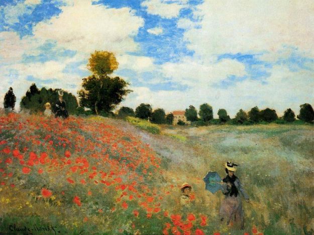
Claude Monet, Poppies at Argenteuil, 1873
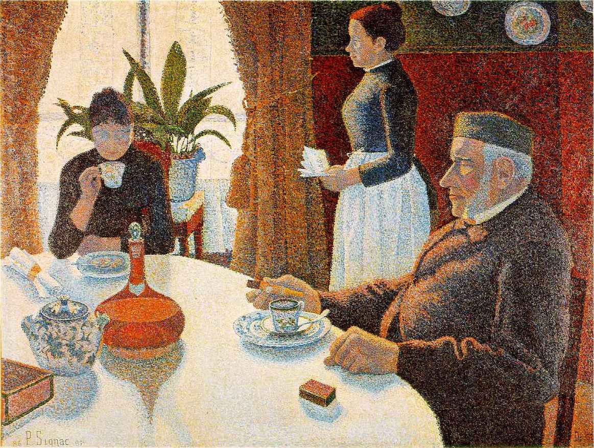
Unlike the impressionists who claimed they weren’t colour theorists the neo-impressionists from the 1880s onward realised how much of an important role colour science played in their paintings. Artist and theoretician of neo-impressionist movement, Paul Signac visited Chevreul in 1884, and in 1885 returned to visit Chevreul’s assistant at Goeblin’s, Emile David, who he is thought to have visited with George Seurat. as like other neo-impressionist painters who have acknowledged Chevreul, Seurat himself mentioned Chevreul amongst his sources.
Both Signac and Seurat As for Signac, ‘optical mixture’ where instead of being mixed on the pallete, dots of complementary colours are interposed directly on the canvas in order to applied the principle of frequently interposed small dots of complementary colours in order to increase
the luminance in their paintings, these dots of colour are meant to be fused by the eye when seen from a distance which produces a third colour, different from the
two juxtaposed hues.

Paul Signac, The Breakfast, 1886-87
Van Gogh got aquainted with ‘the theory of simultaneous contrast’ through art critic, Charles Blanc’s interpretation of Chevreul’s colour theories. He was so enthusiastic after reading Blanc that he copied out a passage of his book in a letter to his brother.
However because of van Gogh’s supposed madness, his use of colour in his paintings has been analysed by doctors rather than by art historians and he was diagnosed as having ‘xanthopsia’ or yellow vision due to his apparent overuse of yellow, but when his paintings are examined carefully the yellow never stands alone and his always along other colours usually against violet, it’s complimentary colour.
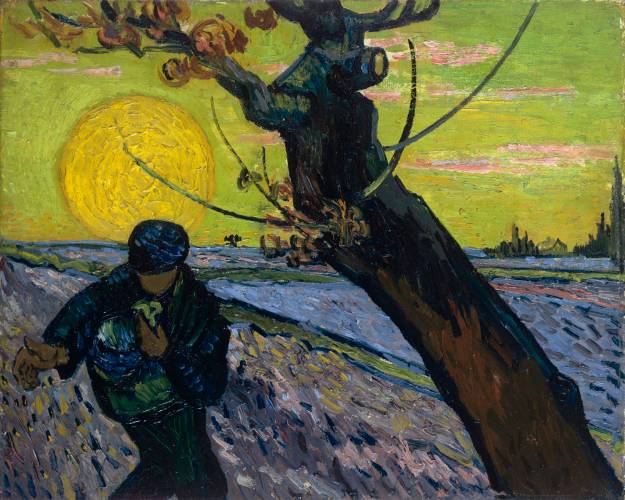
Vincent van Gogh, The Sower, 1888
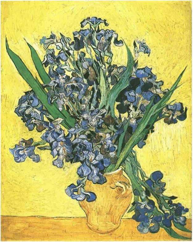
Vincent van Gogh, Vase with Irises against a Yellow background
Click to access Chevreuls%20Law%20F1%20web%20good.pdf