Finished Painting with Natural Forms
The brief for this exercise: Assemble a group of natural objects such as fruit or vegetables, more subtle coloured vegetables or highly structured objects that are almost monochrome such as shells, skulls, rock crystals or seed heads. If you chose to work with tertiary colours and subtle lines and tonal variations you could include an element that is highly coloured such as a red fabric background or a brightly coloured piece of fruit such as an apple, orange or lemon. It’s best to chose simple forms rather than complex ones for this exercise, just two or three objects will give you enough subject matter.
Subjects for this exercise
I already had some objects for this exercise, leaves which I picked up at the beginning of the year from the park just outside the school where I work. While visiting England last month I picked up some more objects that I thought would go with them, baby pine cones attached to twigs from a walk around Newmillerdam near my hometown Wakefield, plus a large pine cone that my mother gave me which she brought from Italy.
Subjects:
- 2 leaves
- 1 large pine cone
- 4 baby pine cones attached to a twig
- A piece of Thai Buddhist monk robe material
Inspiration for painting leaves
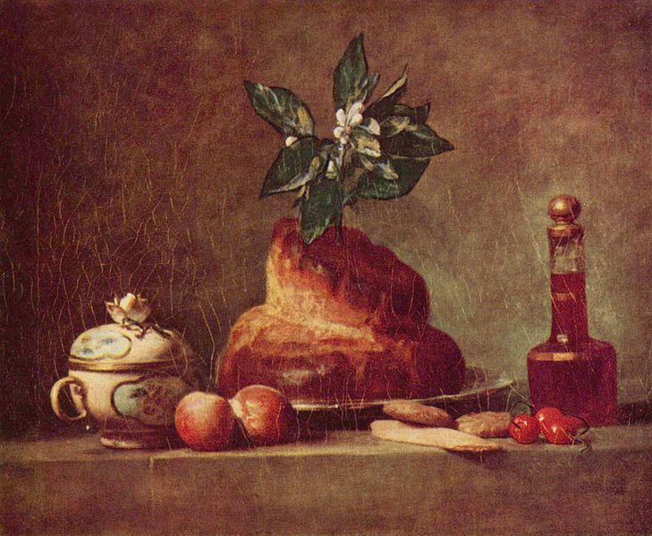
Looking for new artists while studying the Drawing 1 – Drawing Skills course I came across Eliot Hodgkin who painted leaves, vegetables and other natural objects with Tempera, one of my favourite paintings by Eliot Hodgkin is this one Large Dead Leaf 2:

Large Dead Leaf 2 – Eliot Hodgkin
In this painting he manages to breathe life into the dead leaf and it’s twisted form becomes a ballet of light and shadow allowing you to see every detail, stalk, veins and surface texture. It’s a painting that inspired my leaf drawing with stipples and dots in the drawing course and will probably keep influencing my work with natural forms.
Process
I started by making sketches of the subjects in my sketchbook and notes on the best composition and the best technique to use for the exercise. Decided that it would be better to tackle the leafs full on to see all their detail and colours and to do this a stippling technique would probably be the best technique to use for the chosen subjects.

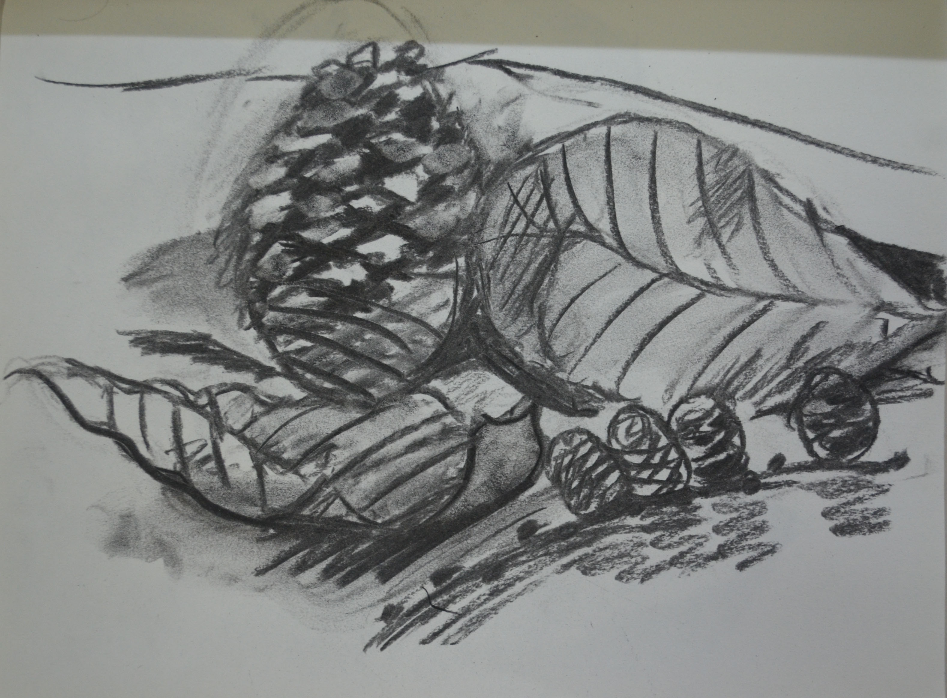
1st Sketch in Charcoal
1st Sketch in Charcoal – Notes
2nd Sketch in Charcoal
2nd Sketch in Charcoal – Notes

3rd Sketch in Charcoal
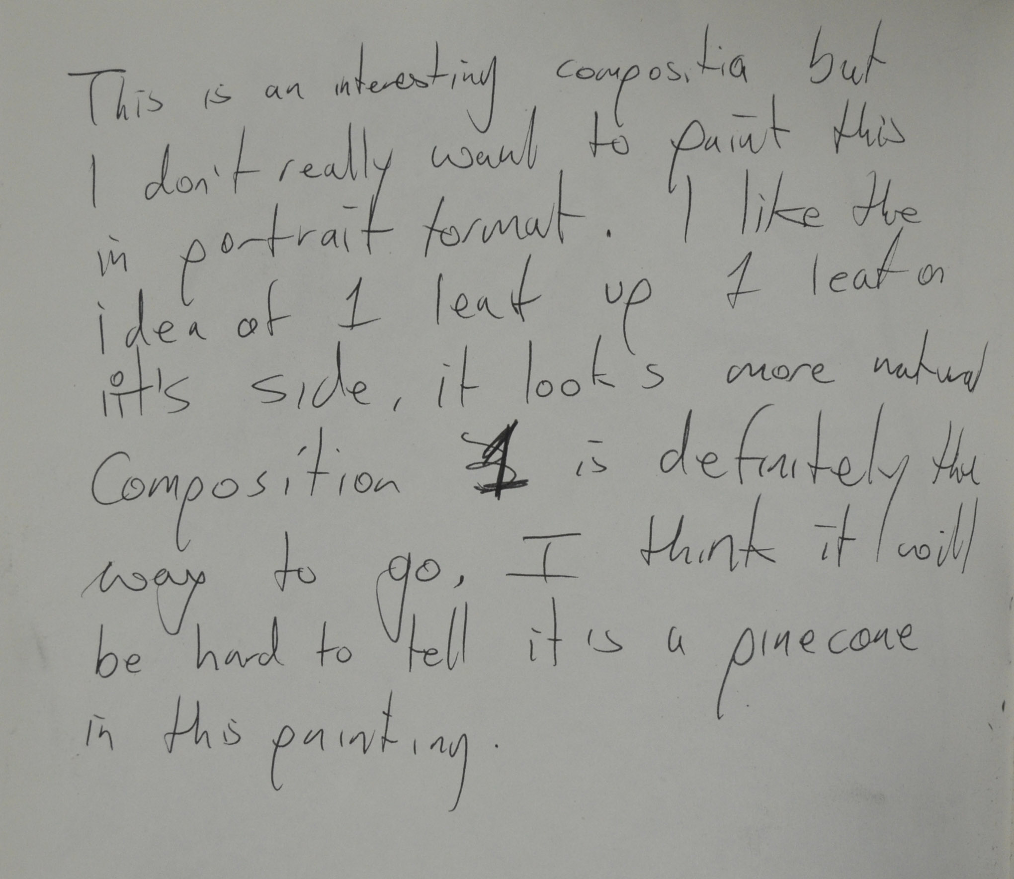
3rd Sketch in Charcoal – Notes
After making three charcoal sketches to find the best composition I made a watercolour sketch to see which colours I would be using for the final piece. With the lamp shining on the composition I could see just how complex the objects that I chose were. I was half tempted to make a sketchy painting rather than detailed as I did well to depict the objects in both the charcoal sketches and the watercolour sketch below but the detail and the so many different colours that I could see in all the objects with the light shining on them the way it was it would have been a shame not to try and capture as much detail and colour that I could in the finished piece. Stippling was perfect for this painting, not just for the leaves and cones but for the white background as I could see several different colours through the light reflecting off the wall.
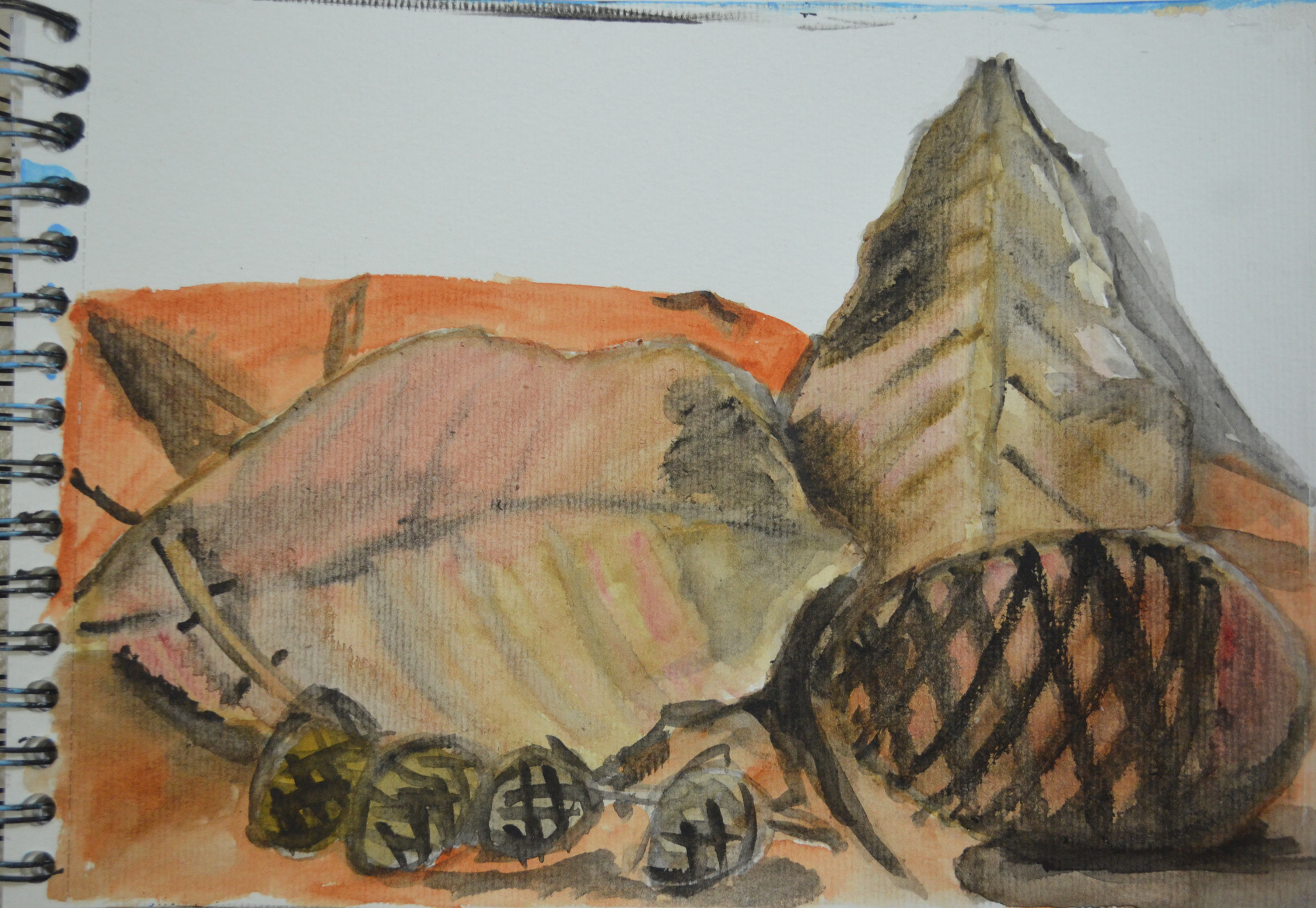
4th Sketch in Watercolour
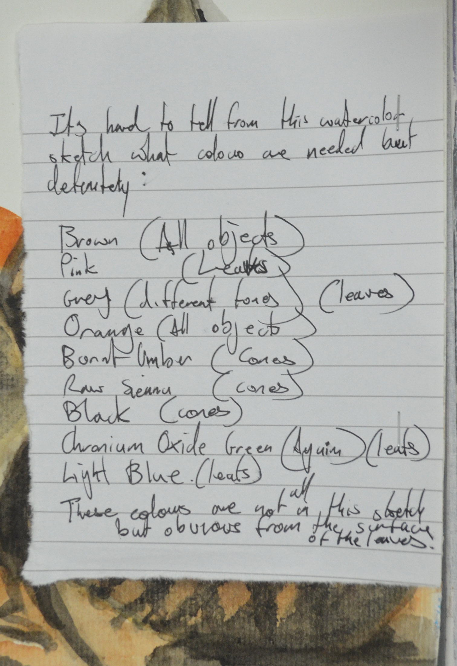
I made a note of the colours that I was confident I would be using, even though it was difficult to depict half of the colours in the watercolour sketch. These were:
Brown
Pink
- Grey
- Orange
- Burnt Umber
- Raw Sienna
- Black
- Light Blue
- Chronium Oxide Green
4th Sketch in Watercolour – Notes
The painting took four evenings to complete, 1 evening for each leaf, 1 for the background orange cloth and 1 for the pine cones which were the most difficult to paint. i started with grey on the leafs over an orange wash and then started to build up the colour from dark to light and and then back to dark for the shadows and darker tones such as for those in the veins of the leaves.
The process was pretty much the same for the large cone which shared similar hues and tones to the upright leaf but when it came to painting in the shadows for the centre of the cone the whole thing pretty much had to be painted again rethinking the process on how I was to get things just right. The cone was a pretty complex shape and the needles fit together life a jig saw and so finally I treat them as such painting in the darker tones ti give each of the needles a similar shape which I highlighted in white.
From there I painted white background, again with a stippling technique so I could depict the different colours I noticed with the light reflecting off the white surface then the orange cloth which I didn’t want to spend too much time on as this was not the main focus. Finally I painted the twig of the smaller cones with various shades of green and white stippled over a dark reddish- brown undercoat and then for the small cones various tones of light grey and orange for applied the needles applied with a medium size filbert over dark reddish-brown undercoats.
5 Finished Painting with Natural Forms
Noticeable Progression
I am pretty pleased with the finished piece, I am not sure if the quality of this painting is better than my first still life, still life with flowers but I do seem to have loosened up, which is what I am hoping to do, as well as gained a lot more brush control.
Problems with painting natural objects
The biggest problems I encountered painting these subjects were, firstly, depicting the texture and secondly trying not to tighten up so they did indeed look like natural objects and not made objects. The stippling technique I used helped me to depict texture in the subjects but I am far from where I need to be with loosening up when I paint.
What I learnt from this exercise
Probably to have more props at hand and not to bight off more than I can chew working on complex forms and textures at this stage, however leaves were something I have wanted to paint for a while and so I am glad I got this chance to do so.