
I begun this exercise looking at faces of my colleagues. This would help me to decide:
- How much shoulder to include in the painting.
- Which Angle to paint the face at.
- The best way to paint the hair.
- Whether to paint with eyes open or close
My tutor recommended three artists to my in my last tutor report and one that I thought about for this exercise was an artist called Gwen John. The artist was recommended for her subtle use of tone but it wasn’t this that came to mind when I started working on this exercise.
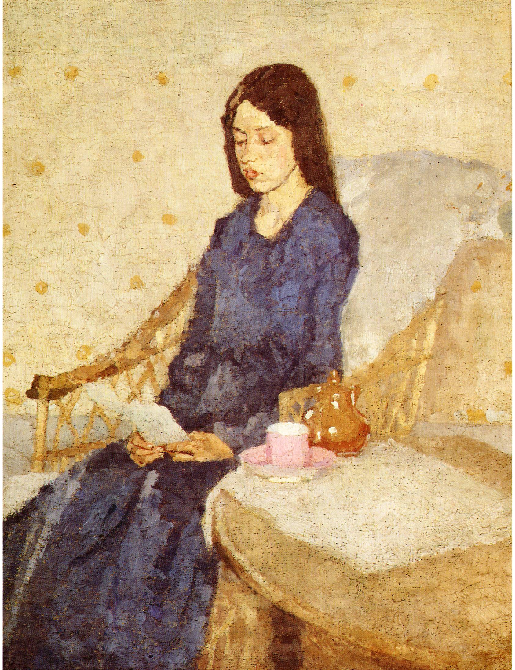
Gewn John – The Convalescent 1924
Among the works of Gwen John were a couple of paintings that I thought would really help me cope with a head and shoulders portrait, these were ‘The Convalescent’ and ‘The Precious Book’.
In these two paintings the artist painted her subjects with eyes facing down, reading. With Thai girls it is hard to keep them posed for long lengths of time without them wanting to browse at their Facebook profile or Line Messenges. So what better way to get them seated still than actually give them their smartphone.
With eyes facing down I don’t have to spend too much time painting the details in their eyes and the South East Asian eye lids are also quite beautiful.
The subtle tones Gwen John employs in her paintings are also quite interesting and very different from my work so far that has been quite bold,I’ve noticed other students have created some really soft tones in their paintings but so far I just haven’t been able to. Hopefully my brush skills will improve and soft tones will be something I will be able to achieve.
Drawings of Colleagues
2nd Sketch – Looking at Faces and Best Angle
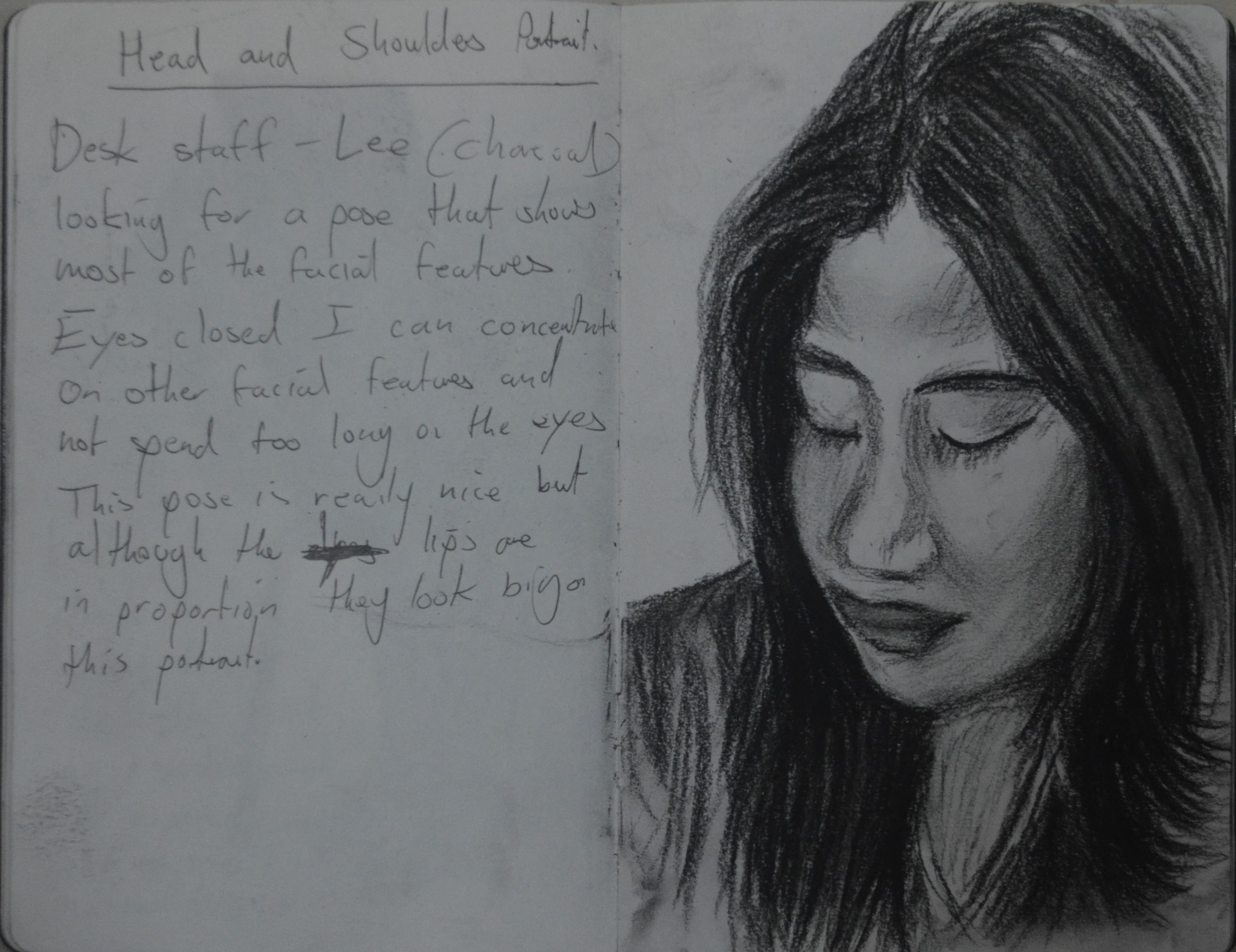
Thai’s have big lips and if you draw them at an angle that is only slightly out they can look too big although the size of the lips to the rest of the face is correct. You can see this in the first portrait drawing in charcoal of Lee, one of the beautiful Thai desk staff at our language centre.
Thai hair can be either dark brown or jet black but they do like to have highlights put in their hair which really helps when drawing them and helped me to create a sense of body to her hair.
Hair can also be used to frame the face, here I have used it to define her cheek bones on a usually rounded face.

1st Sketch – Looking at Faces and Best Angle
For this second sketch of the other girl on the desk, Nah, I was asked to ‘make her beautiful’ which can be translated to ‘make me white’Thais are over concerned about skin colour. Nah has a darker complexion than Lee but here I have managed to capture all her features without using too much shading on the face. Again the hair played a big part of shaping the face and defining the cheek bones.
Thais have unusually shaped heads and quite often the back of the head is flat so this drawing as with the previous sketch of Lee I stuck to drawing the front of the face and by doing this was only able to add a little bit of shoulder due to the size of the face on the paper.
There was a lot of blinking going on while working on her eyes so I didn’t manage to depict much life in them so at this stage I was thinking that eyes down or even closed was a better option.
3rd Sketch – Looking at Faces and Best Angle
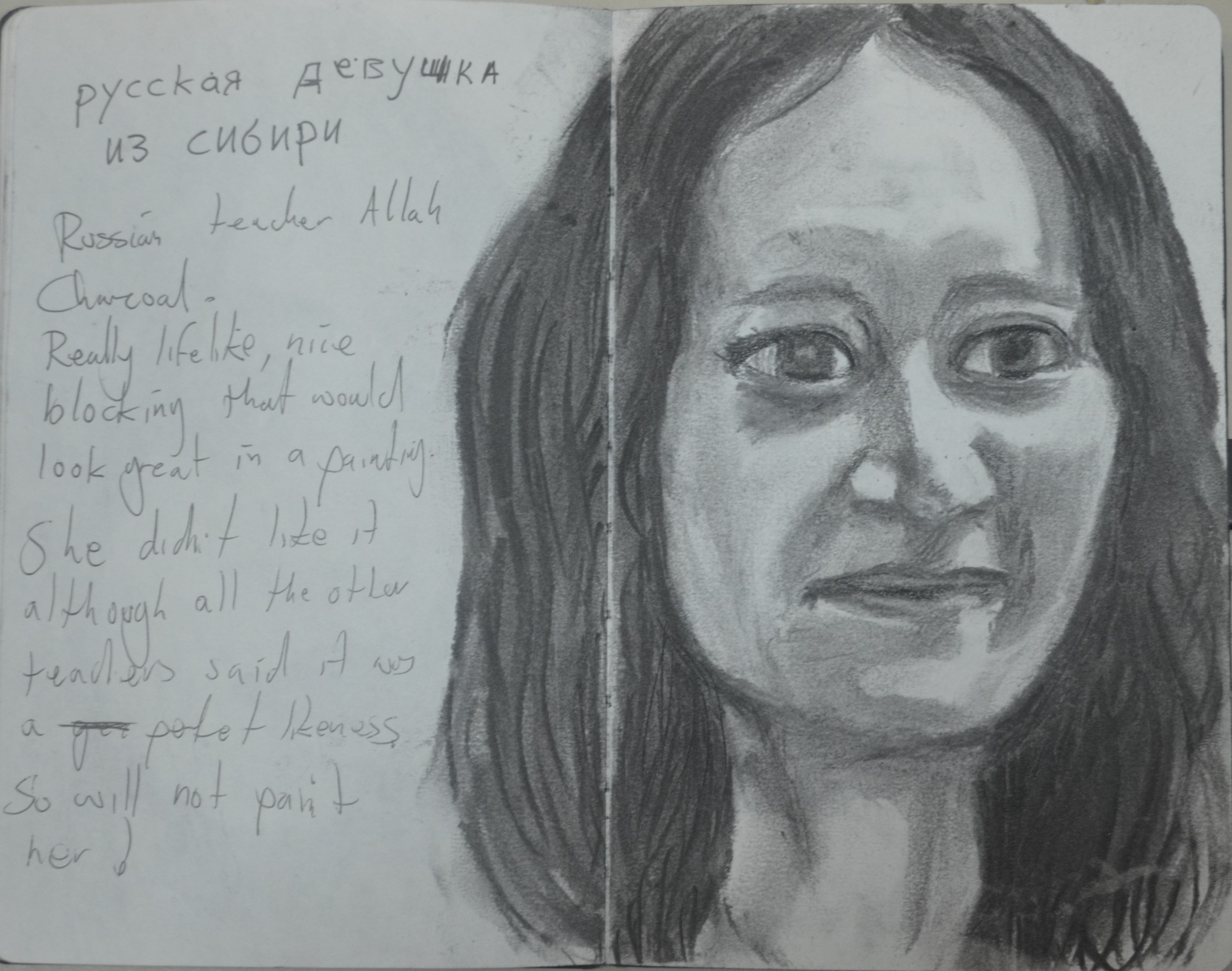
For the third drawing I chose the only teacher in the staff-room that was willing to let me draw her face but she wishes she hadn’t. Allah is Russian and what I have noticed with a lot of Russian’s is that they have what I would call prominent eyelids which when open can make the eyes look slightly googly.
There is a lot more detail on Caucasian faces than South East Asian and so for this portrait I used a softer less compressed charcoal so I wouldn’t make her look too old while drawing these details such as dimples on cheek, creases on forehead and creases under the eyes.
I would have quite liked to have painted her for this exercise but she wasn’t impressed by the drawing and said that it didn’t look like her, even though others shouted her name and pointed at her as soon as they saw the drawing.
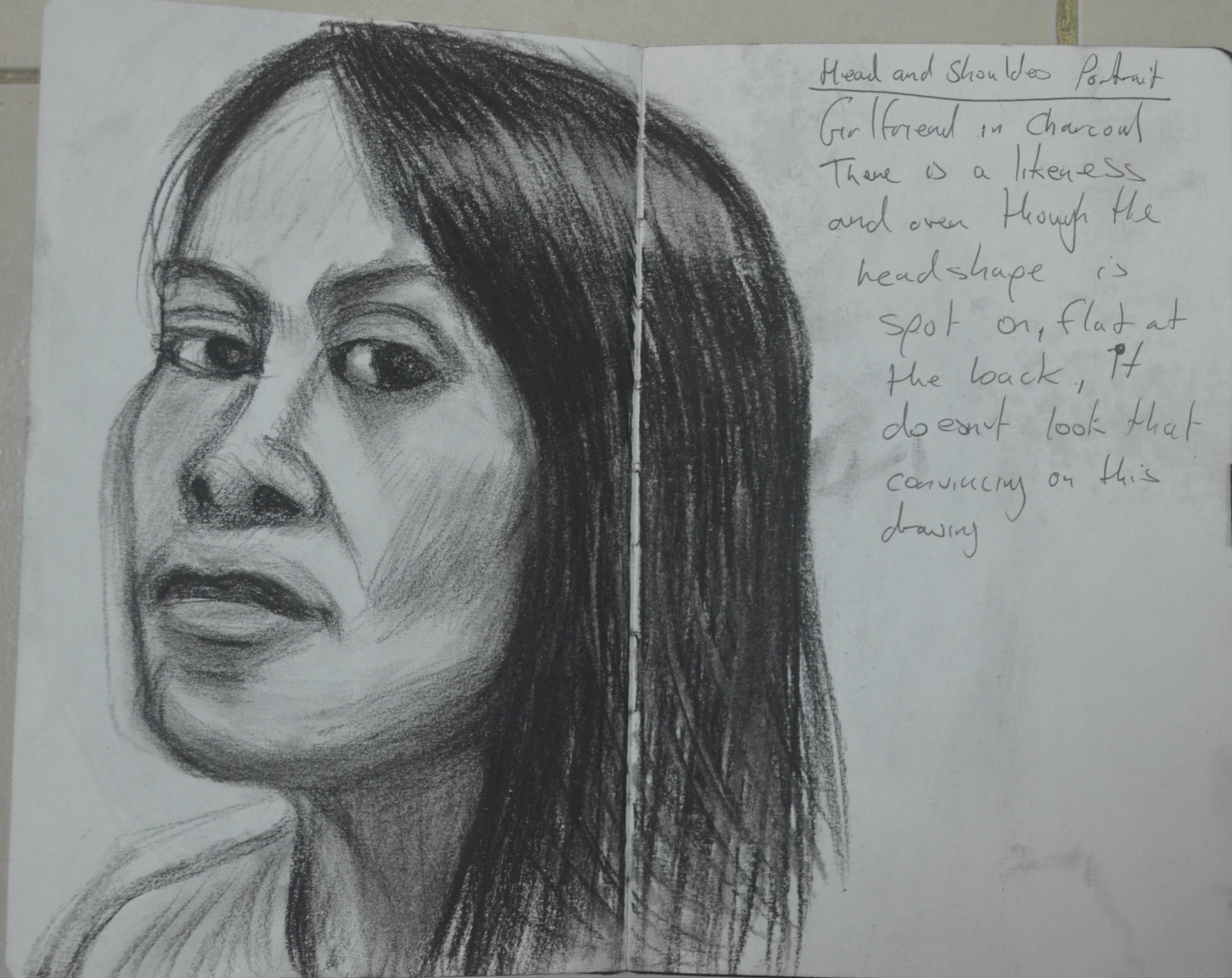
4th Sketch – Looking at Faces and Best Angle
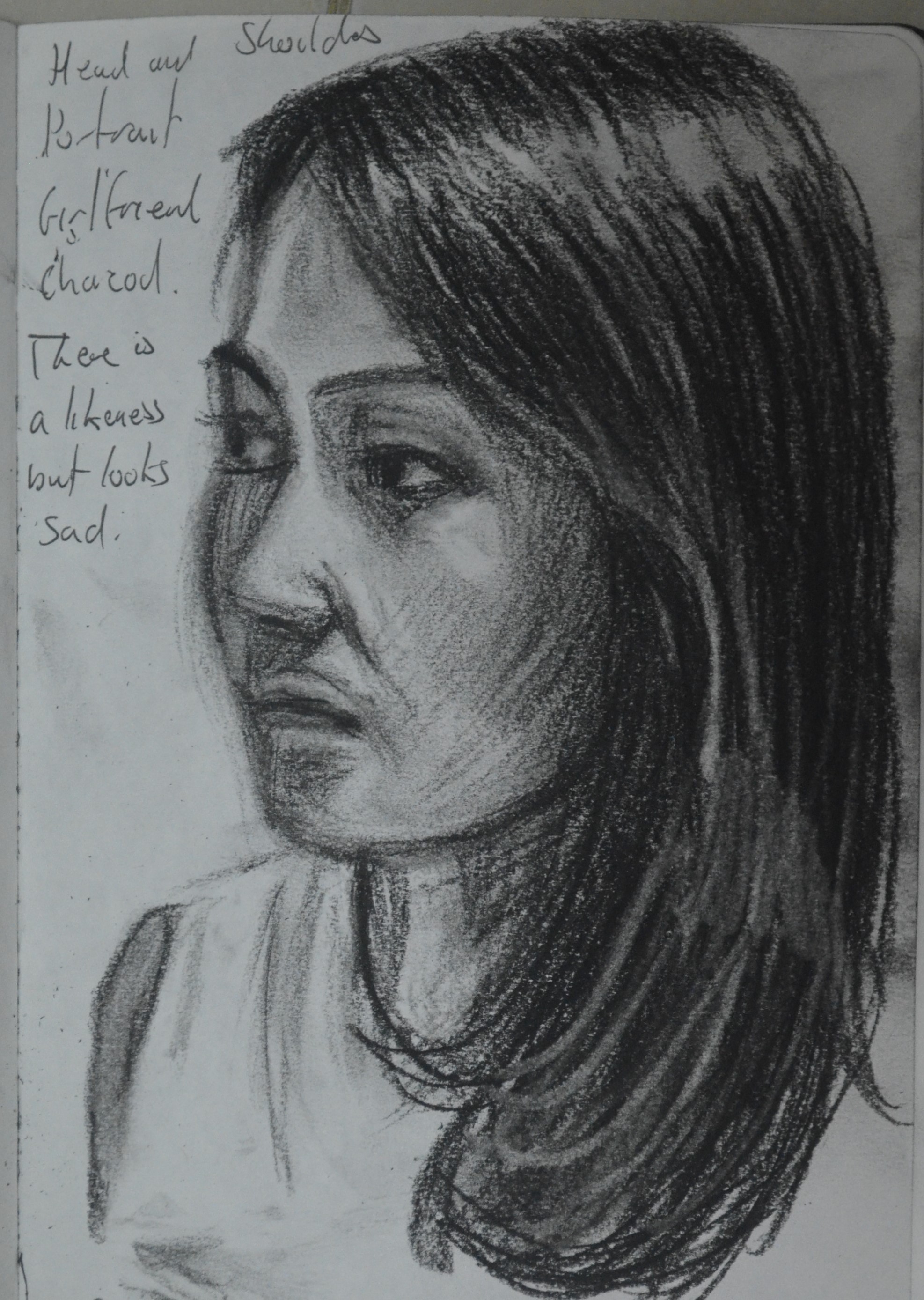
The next drawing was of my girlfriend at home, I have always found her very difficult to draw for some reason. Probably because I know she is my second worse critic, next to myself.
This time was no different, there is a likeness but not much. Her hair however is lovely and I think I managed to capture some of this in the drawing.
This drawing helped me decide on amount of shoulder to paint in the finished piece, deciding that more was better and I thought at the right angle I can make the shape of the head look okay.
5th Sketch – Looking at Faces and Best Angle
With my subject chosen and to be honest it was always going to be my girlfriend as the Thais get a bit suspicious with other women coming into your apartment I went on to look at different head positions. This next one wasn’t brilliant, it might have been me getting bored of the charcoal so I went onto draw this pose again in oil pastel.

6th Sketch Oil Pastel – Experimenting
Working in oil pastel for the next drawing of the same pose I thought it was rather bland so chose to do a bit of experimenting running my finger down the the completed drawing which had a rain down a window effect.

7th Sketch Oil Pastel – Looking at Colour
This was a quick drawing in oil pastel, The likeness wasn’t great, in fact there was nothing much about this drawing that resembled my girlfriend but I liked the way the colours I used made it look like her face was reflecting the colour of her yellow top. This reminded me of Monet’s ‘Women with a Parasol’ where the bottom of her sleeve reflected the yellow flowers. This gave e an idea, to try and depict her in an outdoor scene or at least paint her on a blue background so it would help the viewer come to this conclusion.
The Final painting

8 – Drawing with Paint
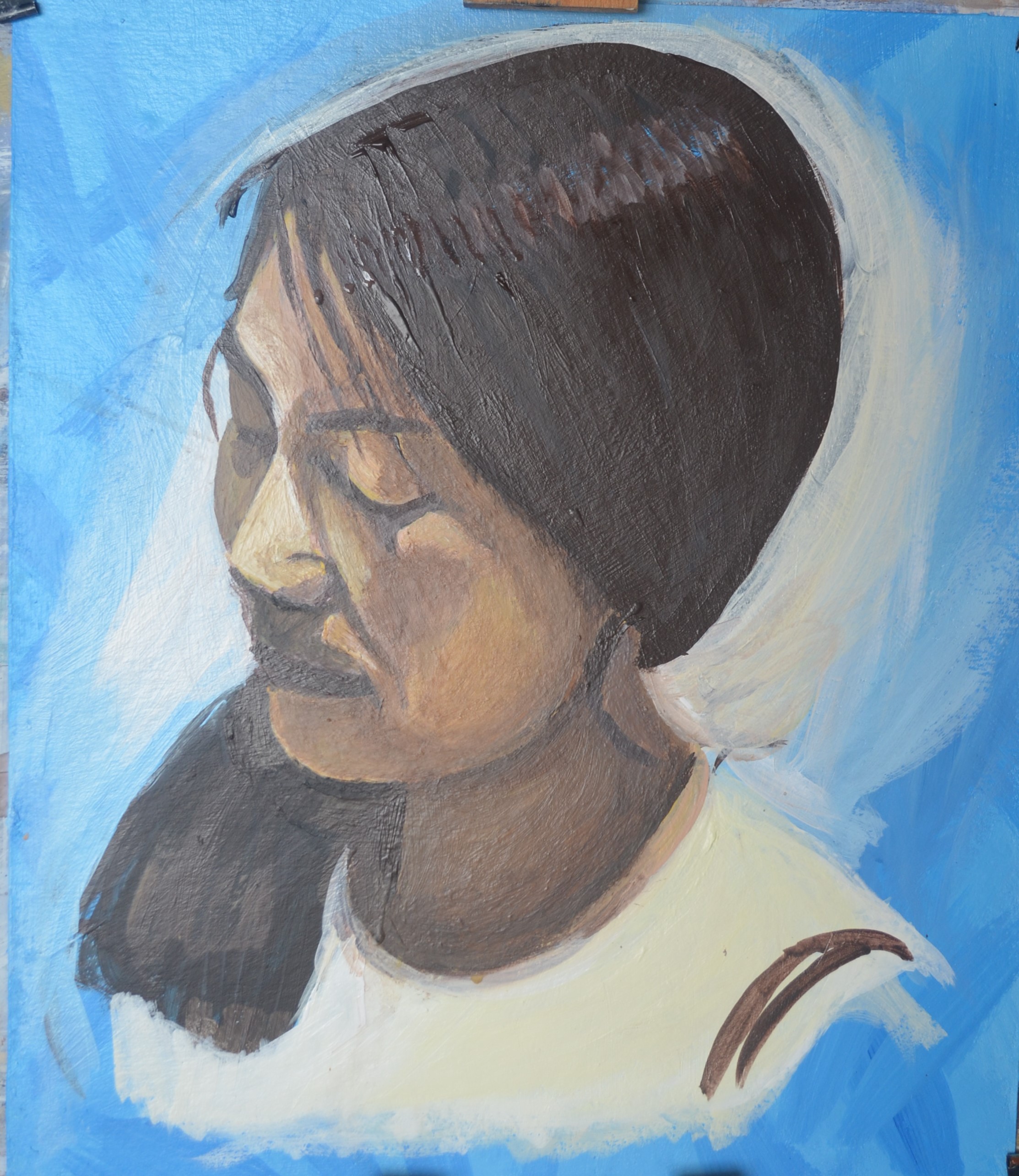
1. I laid down uneven mixes of primary blue and white on the card with random brushstrokes. I was hoping that this would give a nice background to the painting but then when I came to sketch the shape of her head and face I used a paint that was just too dark which may have been okay but then I realised the face was just too large and I had to correct it.

9 – Correcting the Shape of the Face
2. In order to correct the shape of the face I had to paint in some of her features. This was a valuable lesson. When drawing in paint on to a prepared background it was better to start off smaller and work bigger if needed.
3. The shape of the hair was a major part of this painting so I left off the face to paint in the hair with various colours such as pale blue, yellow ocre, burnt umber and black, this gave the hair some body. As I noticed earlier the hair framed the face and so it was a good idea to to paint the hair at this early stage.
10 – Painting overLines
4. Painting the hair really helped. From this I managed to get the shape of the forehead, profile and jaw line just right.
I then moved on to the shoulders painting in the basic shape followed by her hair over her right shoulder.
My next action would change the feeling of the whole painting. First I painted over the dark erroneous lines with a pale blue then a pale yellow to see how the portrait looked with each colour as a background. Both colours made it look that it had been painted outside but I still wasn’t sure which I would choose for the background.
The pale yellow on the blue looked like the sun was shining behind her but the light on the face told a different story.

11 – New Background
5. Once I had painted the hair over her shoulder I decided that I would finish the painting without the model. This was so that i wouldn’t be influenced when it came to adding shadow and other details.
6. I began to play with the background, uneven mixes of blue and white in a swirling motion around the figure. It was the swirl of yellow that was there previously that gave me this idea.
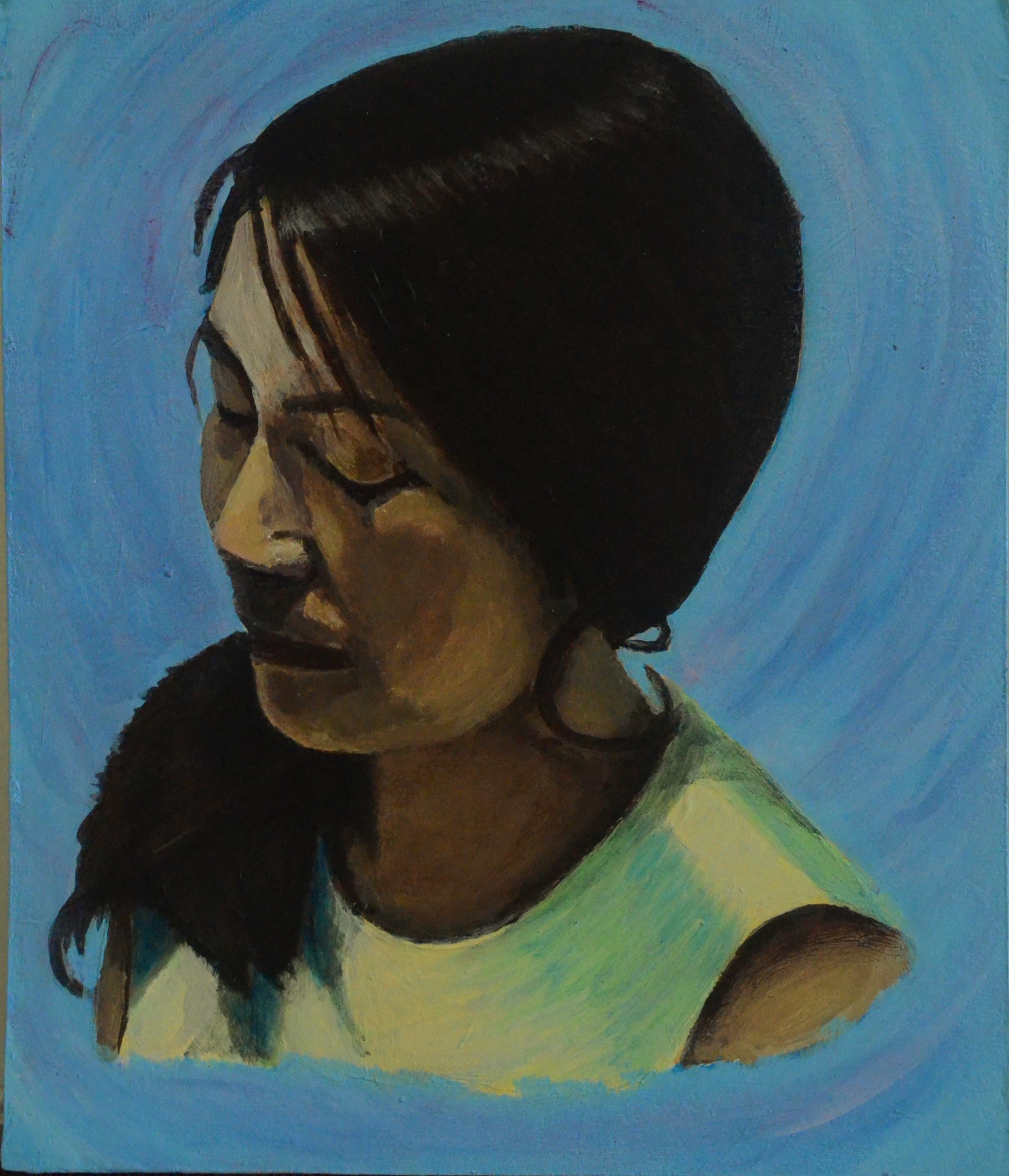
12 – Adding More Shadow and Complimentary Colour
7. After studying the painting for two or three weeks thinking about what was wrong with it and wondering why she looked like, what I would describe as a Spanish senorita. I realised that it was the background that made the painting look flat.
Studying the yellow tones on the face and the models top I went over the background with very thin layers of rose paint following the brushstrokes. The pink mixed with the blue gave me light purplish tones, purple being the complimentary colour of yellow, really helped the portrait in the foreground to pop out.
This was a really hard painting to take a photo of due to the colours used and that’s why the colours look different in every photo which don’t really do the painting justice.
My thoughts on the final drawing
I am quite happy with the the finished painting although the background would may have looked even better with clouds depicted in the background. I did think about this but I painted on a small format and there wasn’t much space around the background to add this detail.
