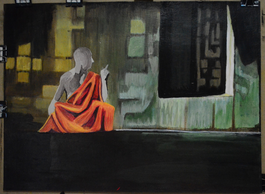
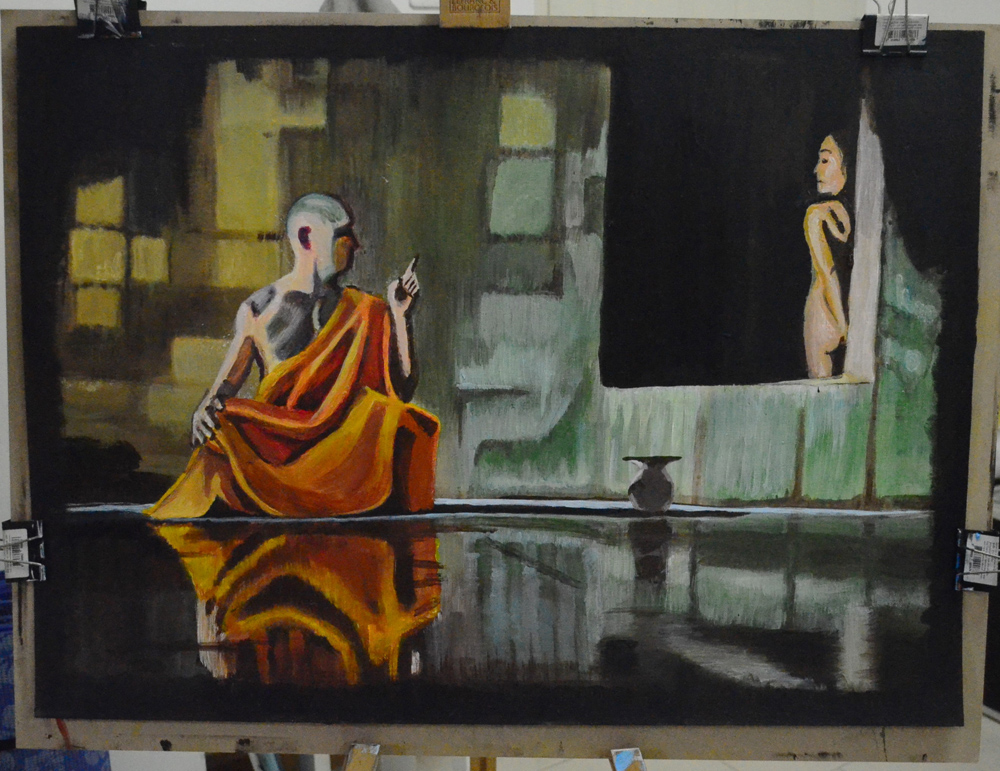
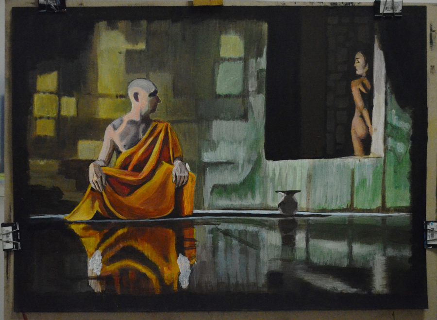
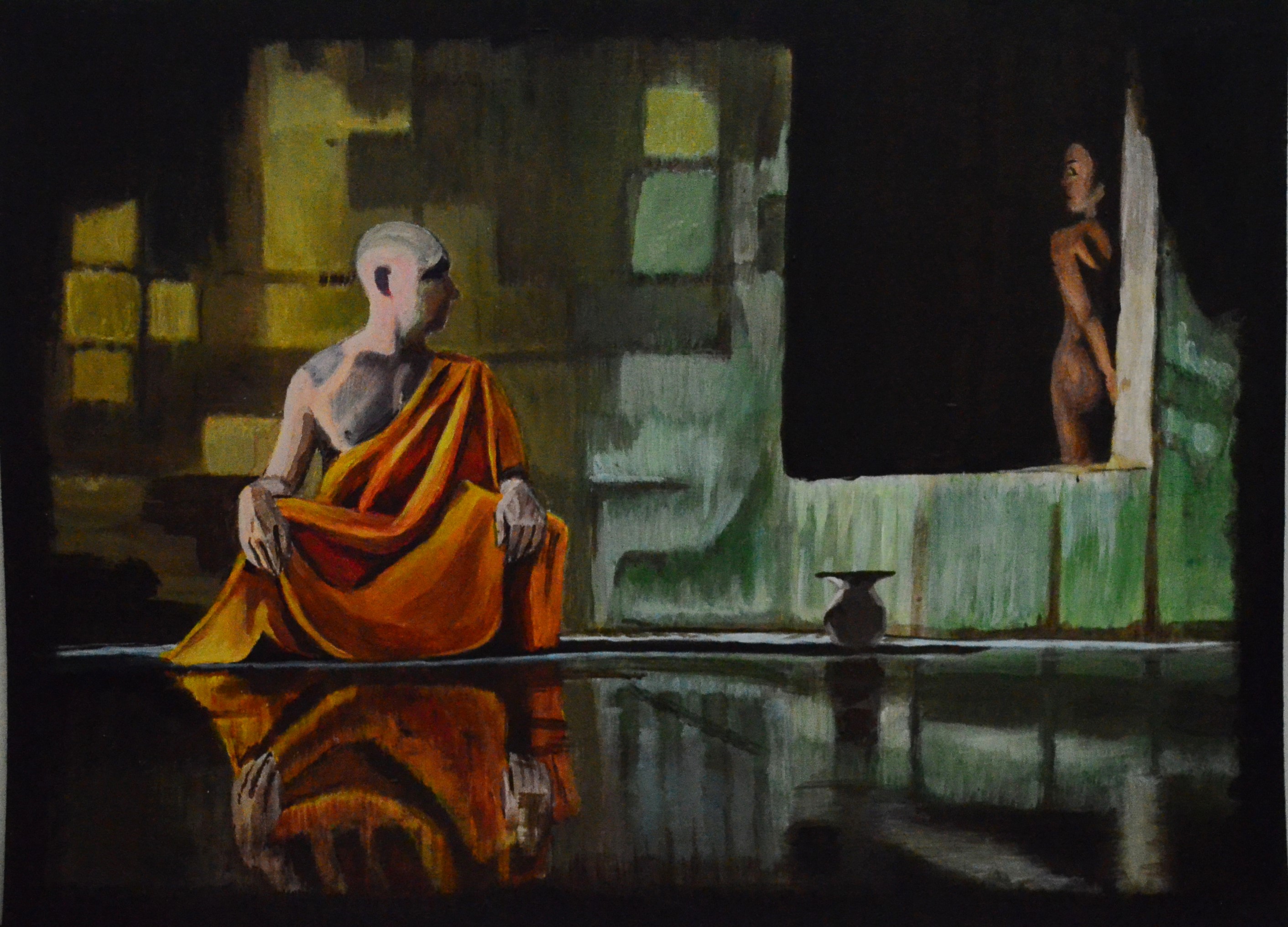
For this exercise I wanted to create a completely new painting from one of the photos I took while up in Chiang Rai rather than re-work one of my existing paintings. I had made several sketches while in the northern province but there was a couple of photos that I thought would be good for this exercise taking into consideration the different artists I had looked at in the research point for this project.

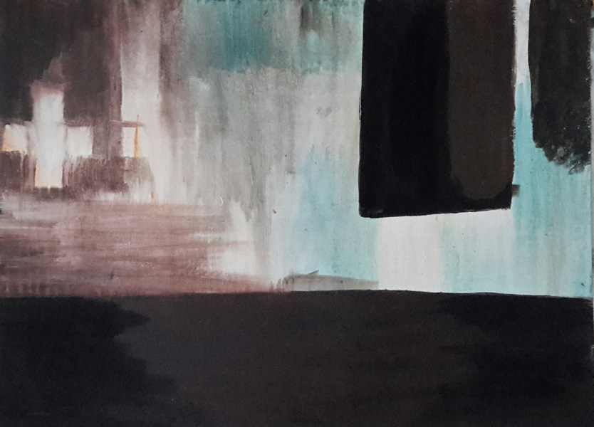
1 Dark Landscape
The first drawing in water-soluble oil pastels in my sketchbook was a sketch looking onto to the mountain range where my girlfriend’s village is located. What I tried to do here was to try and draw something using similar colours to van Gogh’s darkest paintings such as ‘the Sower’ but from memory rather than look at his works. What messed it up was trying to draw the clouds using the dark tones, the original photograph was taken in the afternoon with a blue sky and white clouds.

2 Surrealist Landscape
This second sketch was drawn from the same photograph but this time I attempted to create a more surrealistic feel by lightening the sky and creating a more early evening feel to the drawing. The long shadows in the early evening reflecting the work of two of the artists I covered in the research point, Dali and de Chrico.

2 Inspired by Paul Nash
This third sketch was drawn not from the photograph but from the sketch above. There are slight differences but these were made deliberately for the colours that I were using softer colours softer edges. The colours that I used here were supposed to be a nod to the ‘Wire 1918’ by Paul Nash. Again this turned out to be a surrealist style landscape and both would look great developed into a painting. However, I don’t know what type of mood or atmosphere I would be trying to create here.
One other thing about these last two drawings that I took into consideration was the effect made by the dimples in the paper, which can’t really be seen here in these photographs but it would be time consuming to try and recreate that with a pointillism technique.

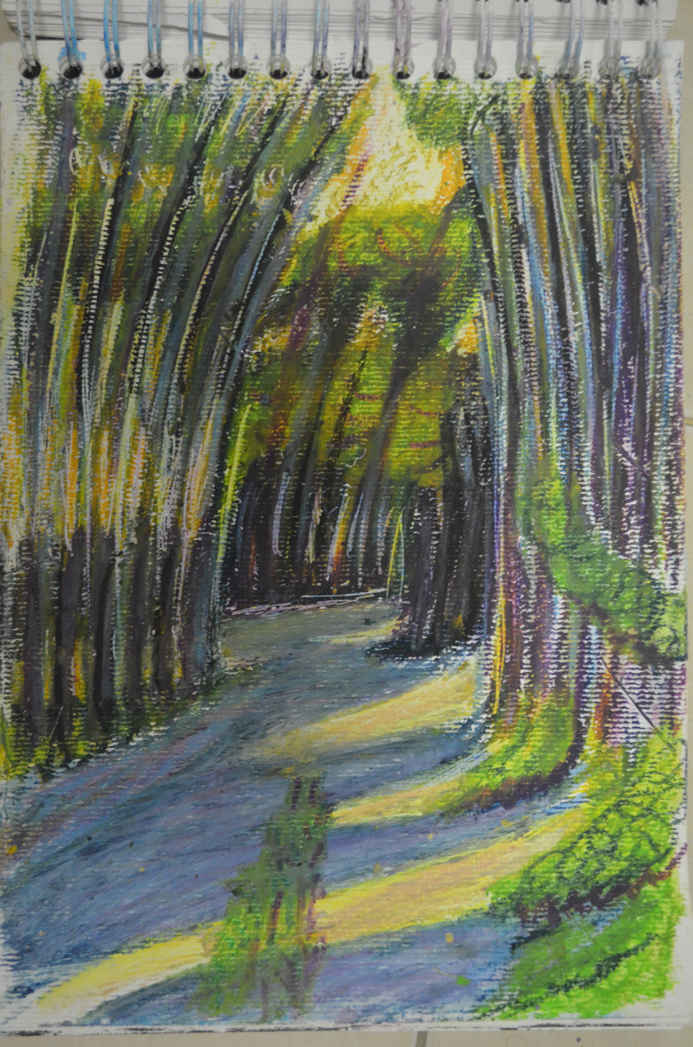
4 Bamboo in Sketchbook
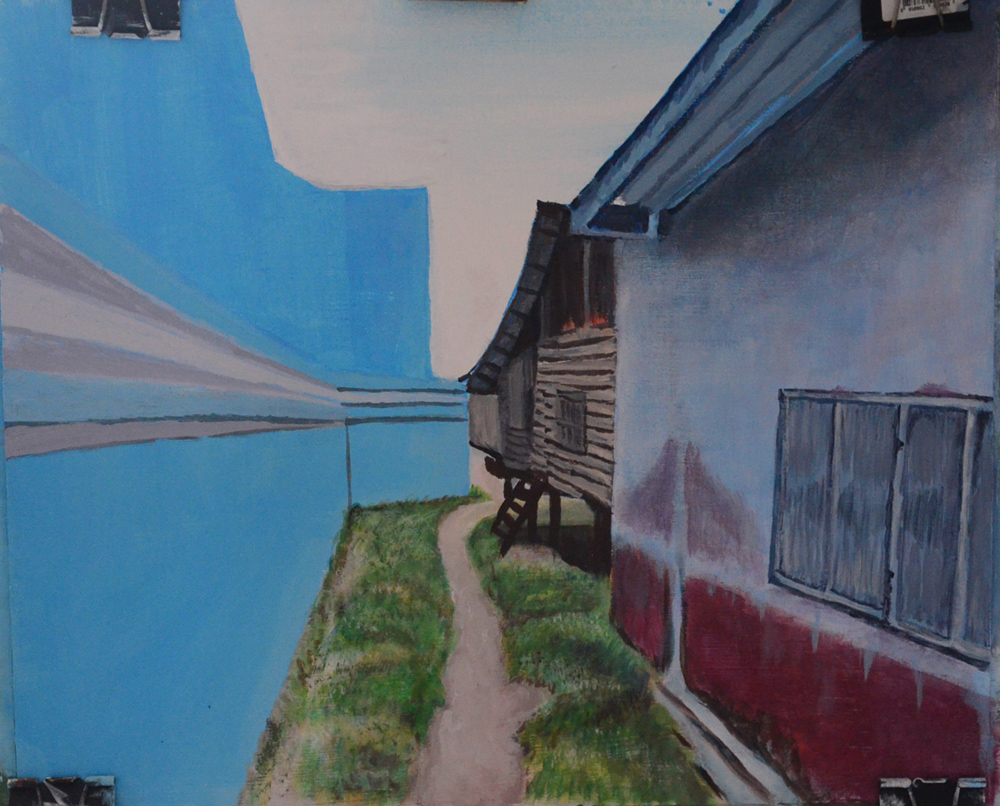
I went on to look at developing a different scene, a close section landscape. This landscape with bamboo trees on either side reminded me of several paintings in Vincent’s Trees, such as Avenue of Poplars at Sunset pg. 49 and Couple Walking Between Rows of Poplars pg. 24.

5 Expressive Bamboo with Sunlight in Large Sketchbok
The photo was taken early evening and this first drawing in my large sketchbook captures that time of the day with the sun shining through the trees on that sunny day when I took the photo. It’s a nice bright drawing but i wanted it darker, my idea was to use similar colours to what van Gogh used in several of his paintings Prussian Blue and Lemon, juxtaposing them side by side.

6 Bamboo at Dusk
So in this next drawing I went darker, I didn’t have prussian blue in the oil pastels but I did have navy and purple which gave me an idea of how they would look. I changed the sky to yellow and orange which changed the feeling of the painting and also the time of day as this change of colours made it feel later.
These last two drawings made my mind up for me to which of these scenes I would be painting but I still wasn’t sure which colours or what kind of mood I wanted to depict.
Showing these two drawings to my students in class I asked them which of the two they preferred, all apart from one student said the second one. When I asked that one student why he preferred the first one, he pointed to the second drawing and said I wouldn’t walk down there. to which I said ‘The second one it is then’.
The Final Painting
In the sketches above I had basically experimented with colours rather than techniques, scribbling the leaves of the trees in, dragging the pastels up and down the paper. I had no idea how I would depict this in the final painting. I had no ideas what would work or if I could make my painting anything like the sketches above or if I wanted to keep it the same.
Influence from other artists

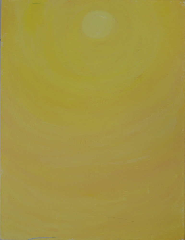
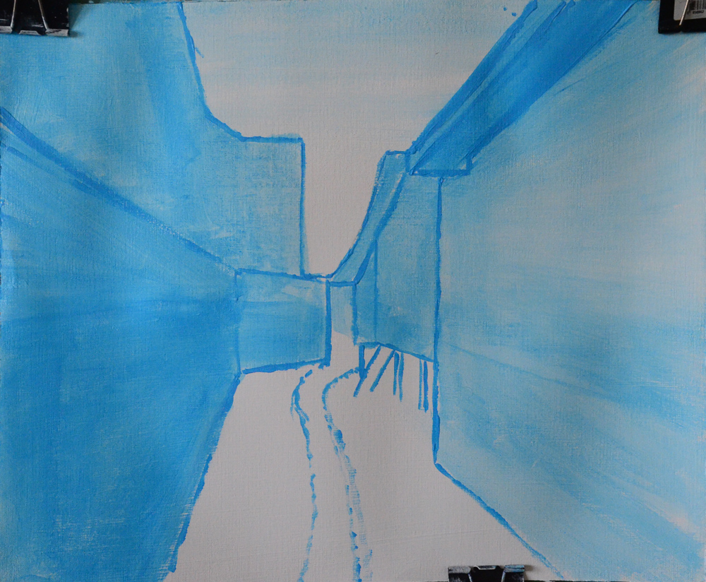
7 Preparing the Background
I had some ideas of what techniques I were going to use in the painting, for the leaves of the leaves of the trees etc. I wasn’t even sure if the colours would work in the developed painting. What I decided to do was to throw my hat to the wind and let the painting take on a mind of it’s own, letting any influence from other artists take over in the different parts of the painting.
I started of with a van Gogh sun, lemon yellow on a darker yellow background moving out from the sun in circles.

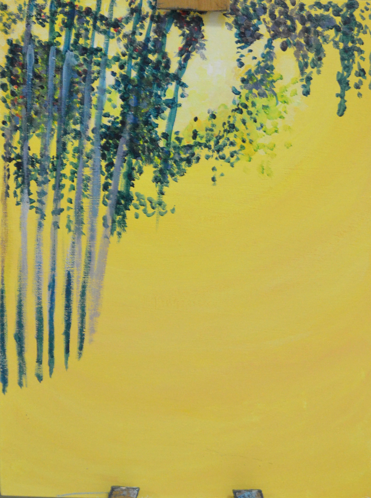
8 Painting the Leaves
The next choice I had was whether to paint the leaves first or the bamboo first, I settled on working on the leaves or at least making a start on them as it would be more difficult to paint them afterwards. At this stage I also started to lighten up the sky so that the leaves would stand out more. I made a start on the bamboo, to see what it would look like over the top of the leaves.

9 Creating Perspective
At this stage I was just practising the long strokes of the brush and seeing which brushes were better for the job and to also see if the leaves looked anything like bamboo leaves. After a while I wasn’t too bothered about that.
I actually thought about making the leaves more dense or even painting them in van Gogh style with heavy swirls layered on top of each other.
I must admit that the bamboo did actually look like bamboo at this stage, that was to change.

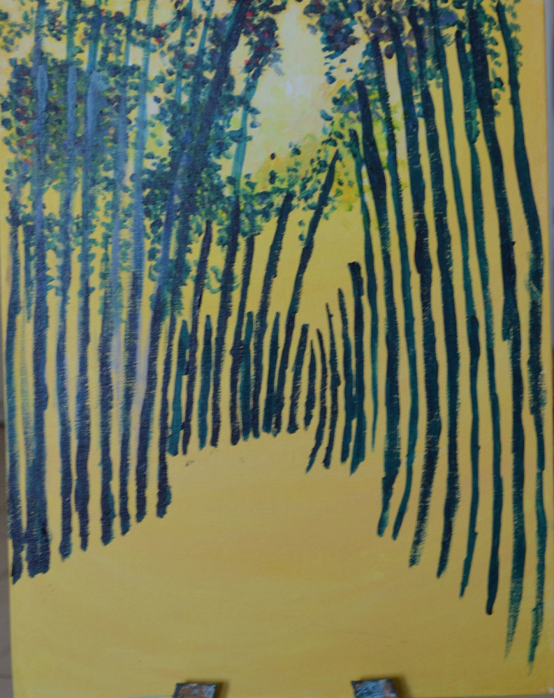
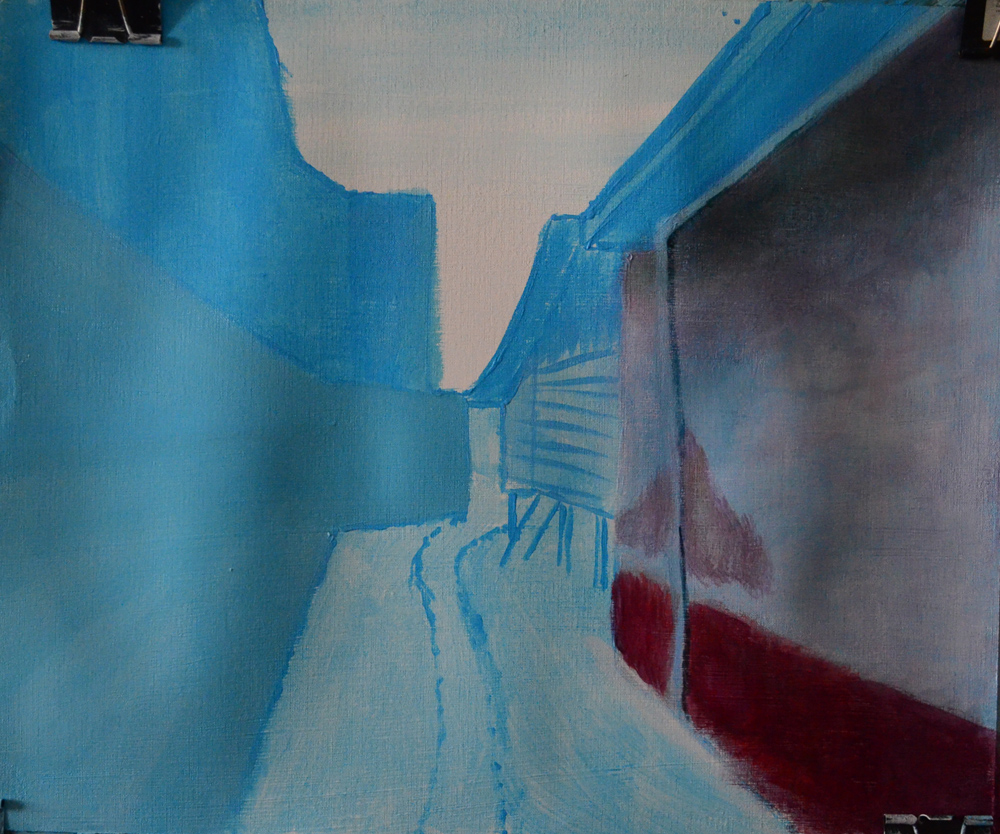
10 Working on the Trees
From here I began to layer the colour on running my brush up and down the bamboo poles and also painting in the shadows. It’s a good job I hadn’t kept the lemon sun in the background as the shadows suggested the sunshine was coming in from a different direction.
The Prussian blue over the yellow turned to green so that was something I had to work on with more layers and that was probably the turning point. It now started to look more like a thick forest than a bamboo lined trail.

11 Photo taken on my tablet
At the next stage painting in layers of Purple and Prussian blue with Lemon to add light it actually started to look like the style of van Gogh.
I had the crazy idea to add leaves to the bottom of the bamboo on the right, applying the paint with the end of a pencil, it seemed like a good idea at the time but I was hoping for too much thinking that it would give me perfect hexagon shapes and it didn’t. What it did do though was give the painting texture.
The leaves were too dark so I begun to lighten them up with yellow and red which gave me the same tones as the leaves of the trees above. As I did this I realised that I had created a really nice 3D texture rather like that of Max Ernst and the mood of the painting was changing rapidly. It was becoming more of an enchanted, cartoon-like forest rather than a scary, dark path between bamboo trees and I was willing to roll with that as I liked what it was turning into.

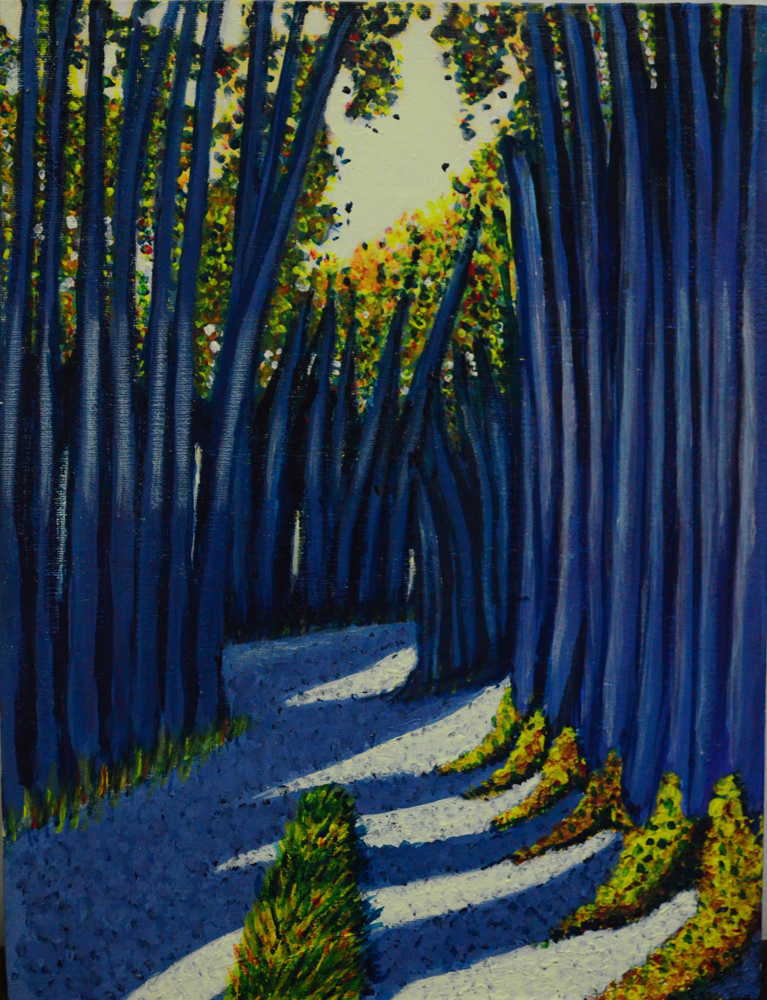
11 Finished Painting
I begun to add more texture to it the path was too smooth, nothing like pebbles and so I painted over the whole thing with Prussian blue then going back over it with mixes of blue and purple and lemon and white for the light patches.
Then with a small detail brush I patiently began building up the layers of the hair like bushy grass with up strokes of blue, yellow and red, letting the colours blend together in the same way I did with the leaves above.
If I was describe the finished painting I would sum it up as unnatural, maybe even surreal. As the painting neared the end it was like I could see both the influence of Max Ernst and van Gogh coming together on the canvas and so I went with it.
Thoughts on the Finished Painting
- The finished painting turned out to be nothing like the studies, in a way I wish it had but it doesn’t have to be the end of it, I still have them and I can use them again later.
- The colours in the painting go together well but I did intend it to be darker.
- I was hoping the painting would feel more natural but I like the overall feeling of it so I am not going to change anything. I did try painting leaves down the side of the trees but they didn’t look right.
- There are definite signs of influence from 2 or more of the artists I looked at in the research point.
- If I was to do it again I would paint it quicker with more random brushstrokes for a more natural feeling.