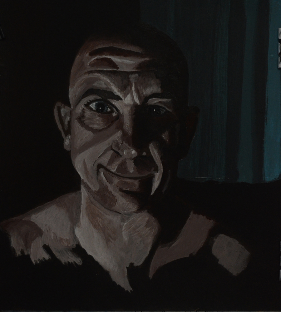
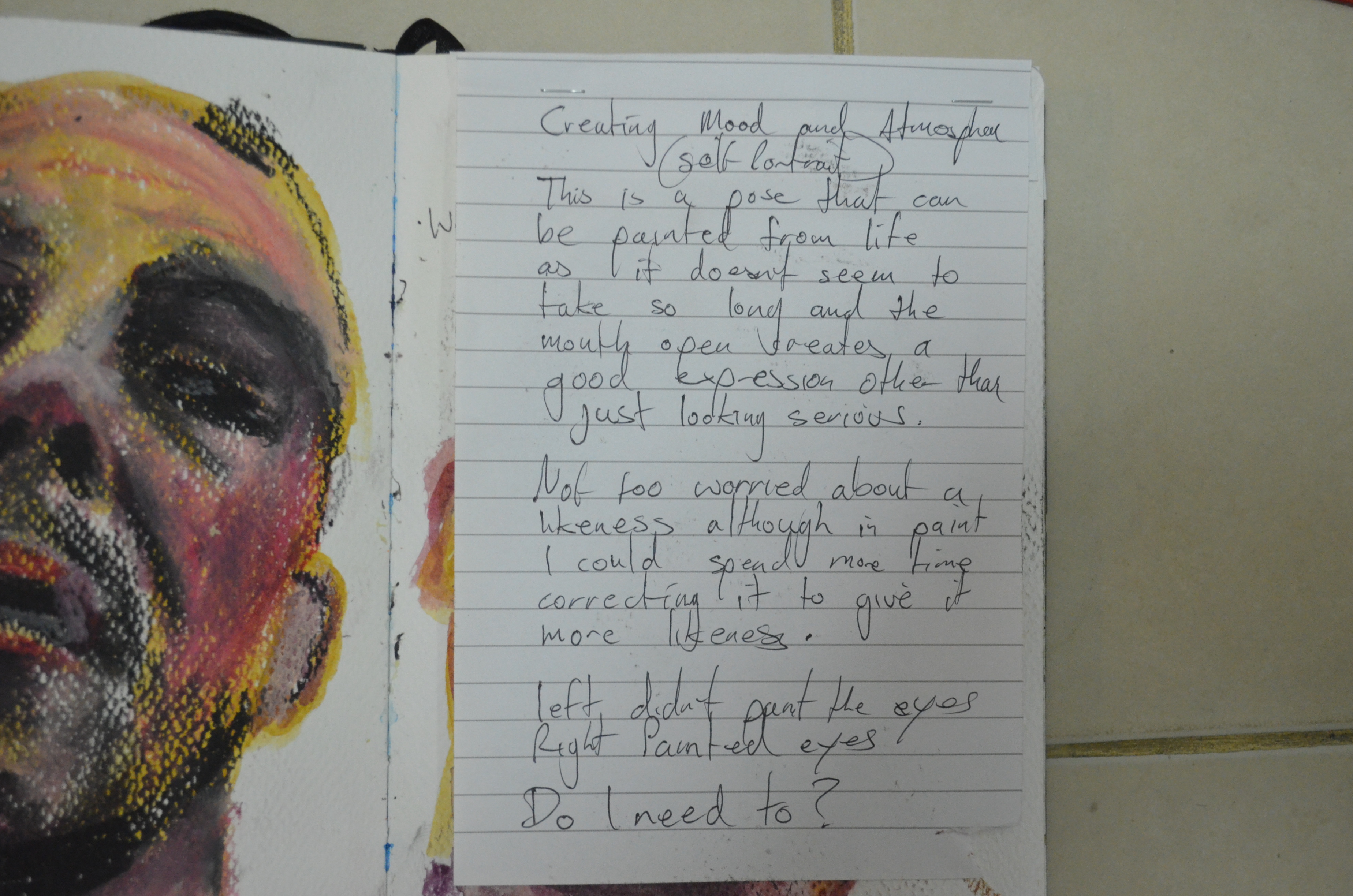
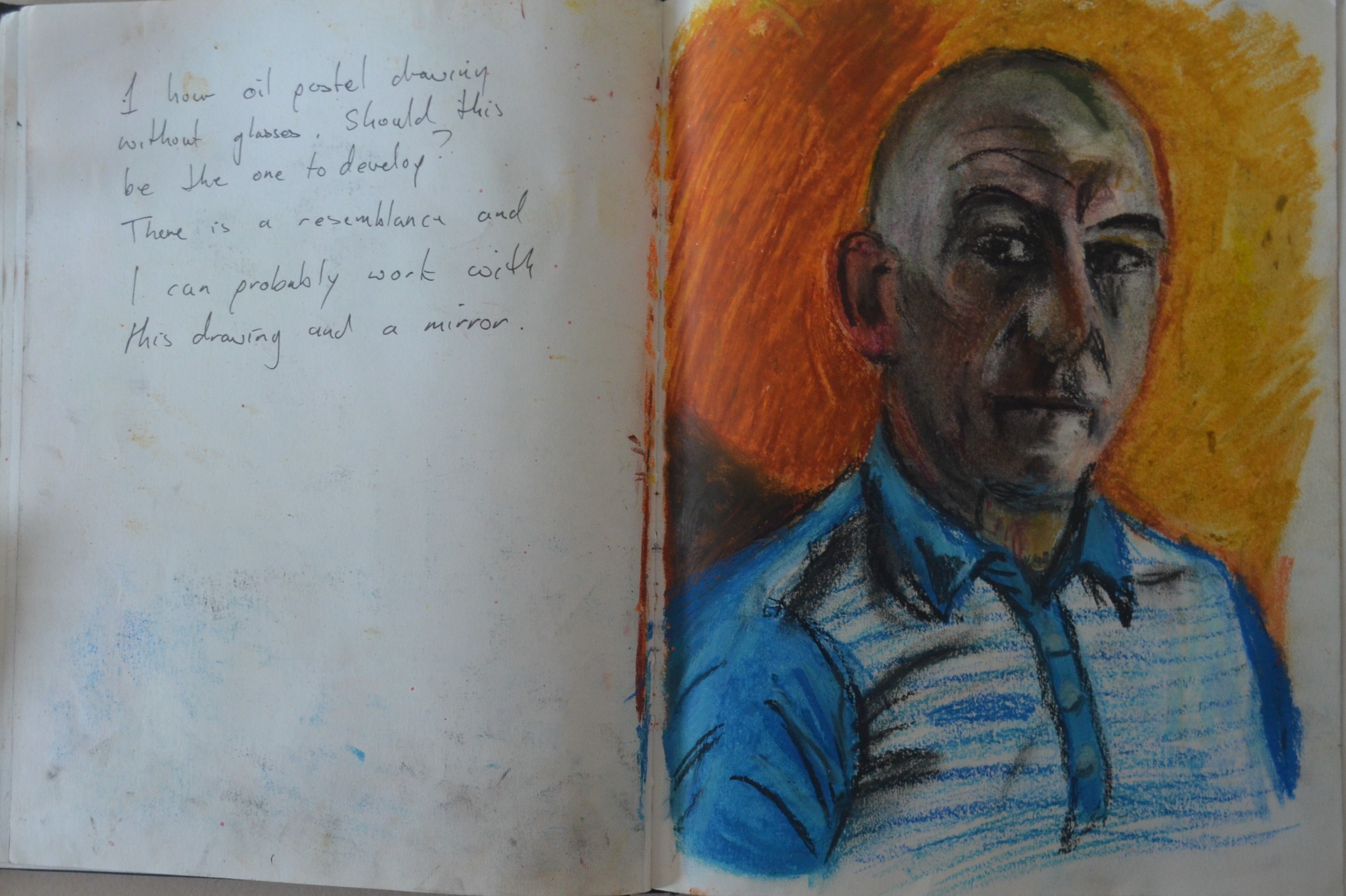
For this exercise I chose to do a self portrait and with the heavy atmosphere that we have experienced in Bangkok over the last couple of years, especially with the recent bombings, I already had a mood for the painting in mind I just wasn’t sure how I was going to get there.
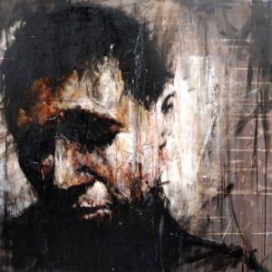
Guy Denning September Dossier
I recently became interested in the work of Guy Denning a British urban artist who creates very expressive portraits using thick brushstrokes as well as scratching the paint to convey emotion. He also employs a variety of other techniques such as stencils, painting over newspaper and dripping paint. Looking at his work did give me some ideas and I was hoping that it would have an influence in this exercise.
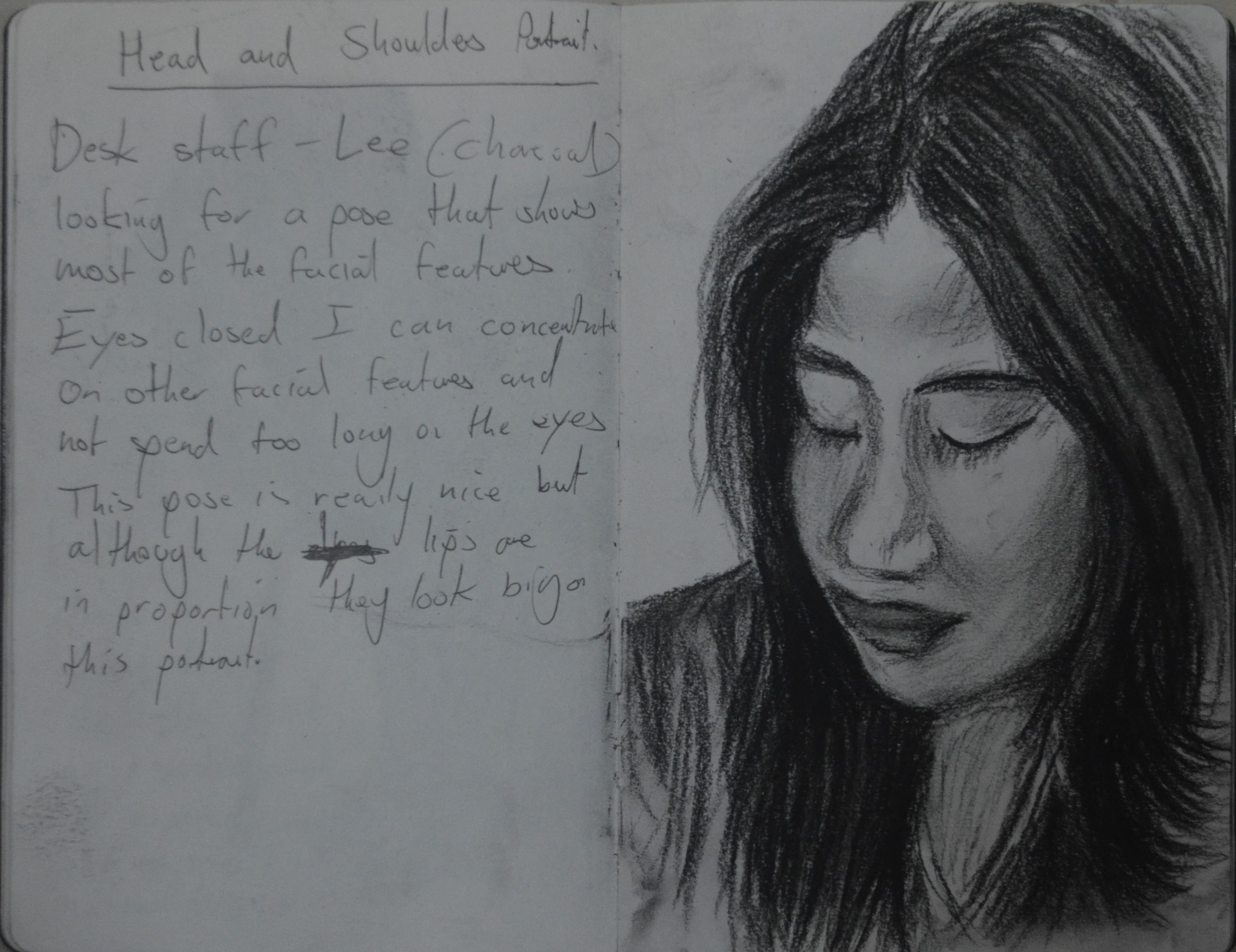
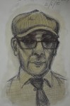
I wasn’t too worried about the light source at this point in the exercise, what I wanted to look at first was head position. I noticed that the head in certain positions played a big part in the mood of a painting, so I began by making a few sketches in my notebook with my head in positions that I could still see the mirror and the screen of the tablet which I was also using as a mirror via the camera.
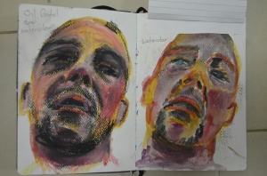
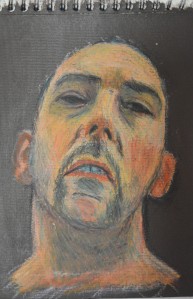
1 Watercolour and Oil Pastel
My first study was in watercolour (right) followed by another with my head in the same position which I drew in oil pastels over the watercolour paint this gave it a detailed sketchy look reminiscent of urban art portraits. By blacking out the eyes I gave the sketches a rather dead look (bomb victim?..maybe) as well as making the sketch look like I wasn’t looking down at a mirror.
1 Notes
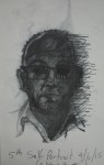
With my head in this position it was also quite easy to paint and see the sketch book. They weren’t a brilliant likeness of me as I was working very fast as to achieve expressive studies.

2 Watercolour and Oil Pastel
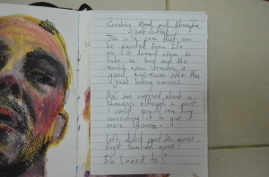
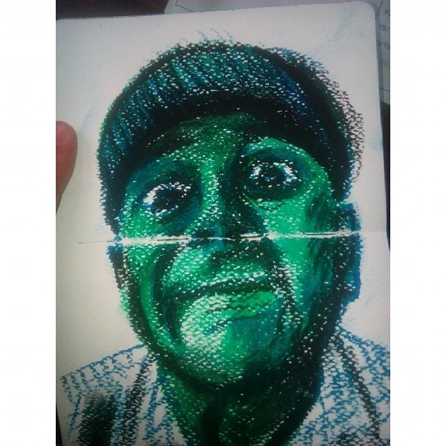
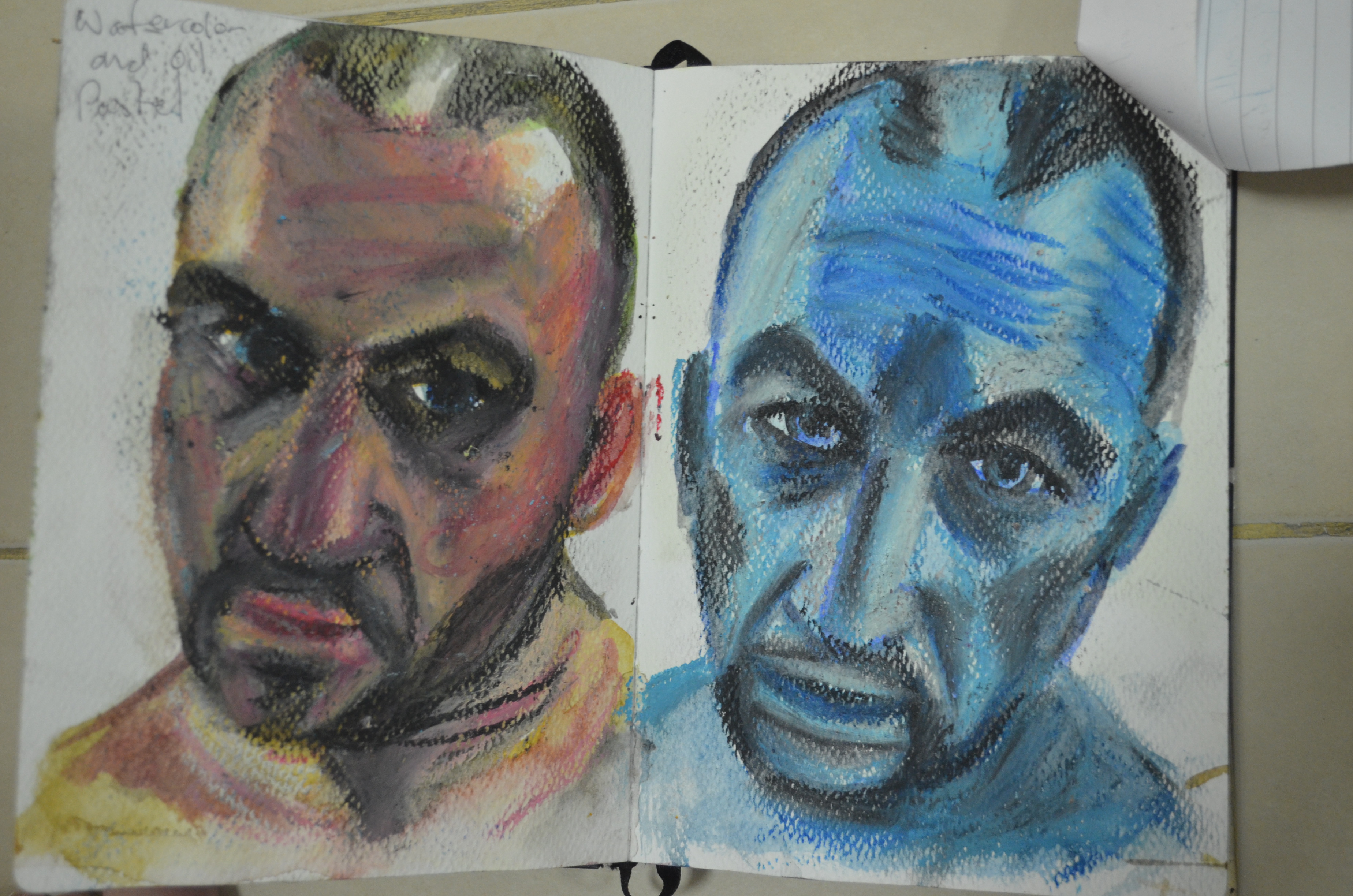
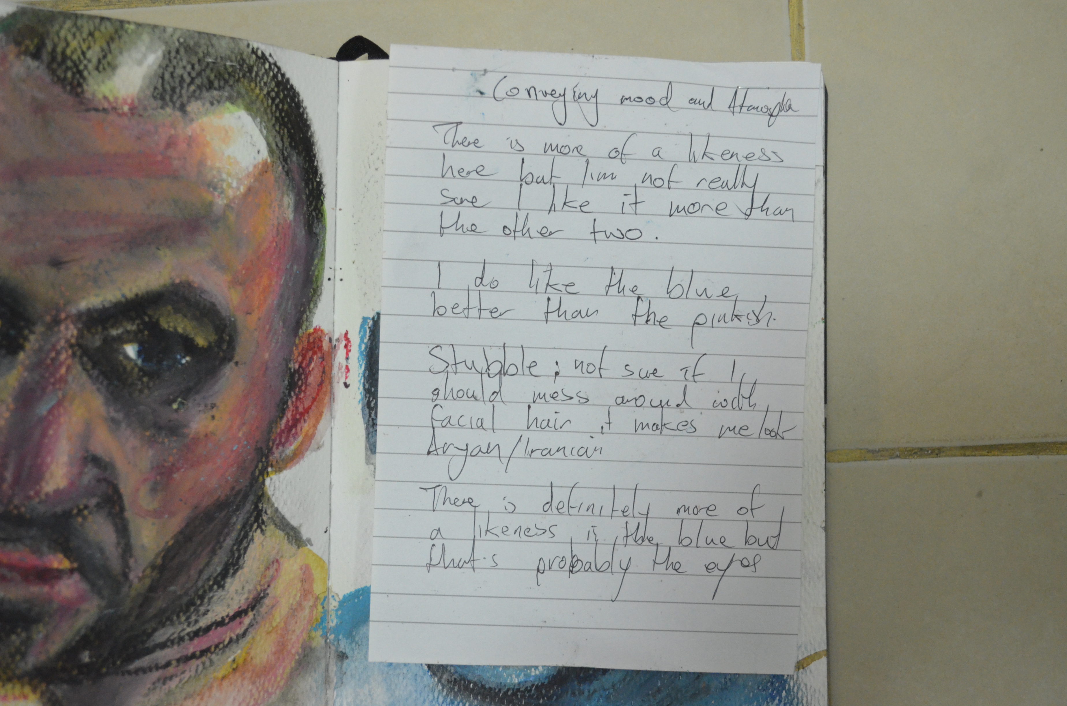
The dead look got me thinking about the colours I would use, I always associated corpses with pale bluish skin and so I did two more drawings in similar poses but using to different colour schemes; one in warm colours and the other in blues to see how the colour would effect the mood of the painting.
The cold colours made a massive difference and if it wasn’t for the strong blue of the eyes the portrait would have probably looked
2 Notes
corpse like. If that was the effect I wanted to create in the final painting. One thing that I was concerned about was the stubble wich made me look Aryan/Iranian. A clean shave and maybe even a shaved head would probably be better.

3 Watercolour and Oil Pastel
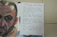
I then made two sketches side by side, one with the head cocked back and one with the head tilted forward. The sketch with the head cocked back seemed to be more expressive. The left looked like a ‘Fauve’ painting with the green under the eyes juxtaposed against the reddish complexion, this did look great but it wasn’t a look that I had in mind.
I decided to go with the head cocked back but I still wasn’t sure about the colours, I did have something in mind but I would have to do more experimenting.
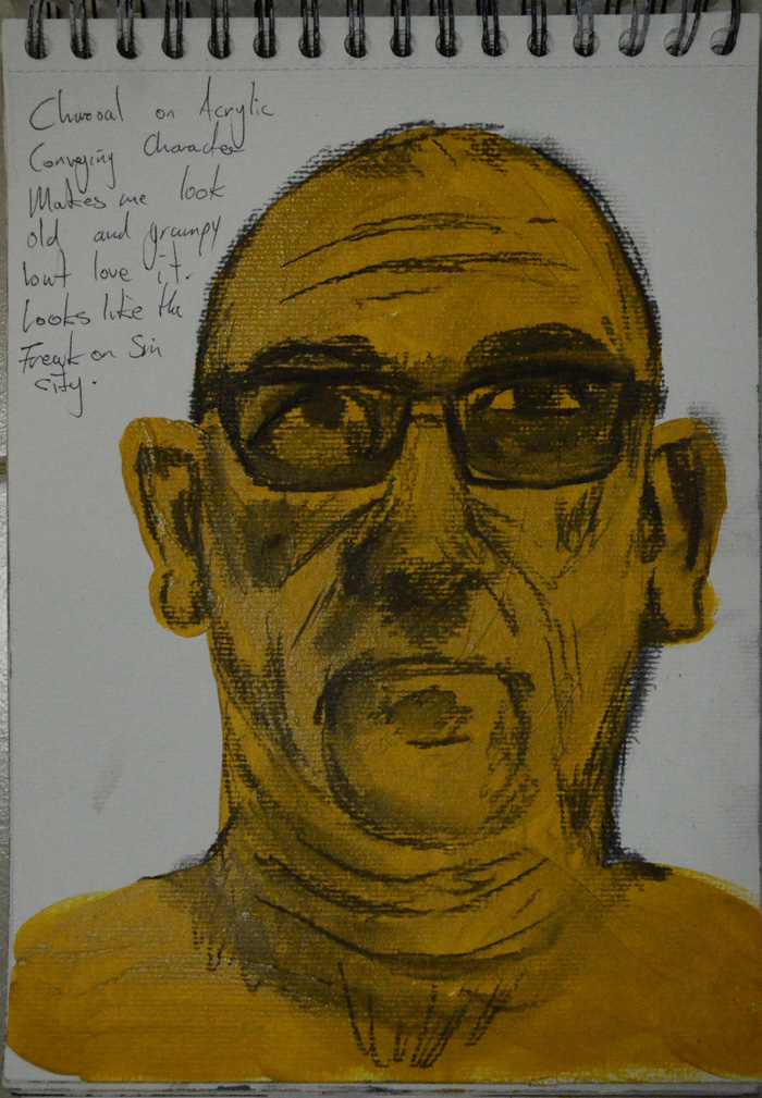
4 Watersoluble Oil Pastels on Acrylic
From here I did some more experimenting looking for how I could exploit the pose and experimenting with techniques and mediums. The first drawing here was water soluble oil pastels over acrylic paint. I bought the water soluble oil pastels as a solution for drawing over prepared backgrounds so I could erase the lines if i went wrong, rather than having to paint the background again. I also thought that I could experiment scribbling over acrylics to create an expressive piece later.
I drew in the eyes here but tried to keep the whites to a minimum, I think I did create some kind of mood here but Im not sure if it was ‘rebellious’ or a look of despair, the latter is what I was really trying to achieve here.

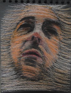
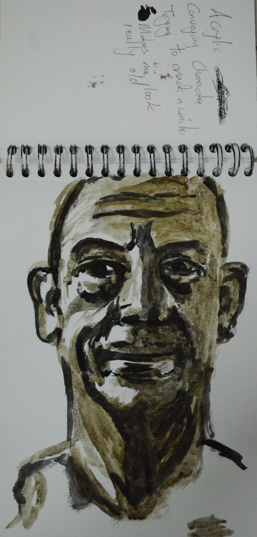
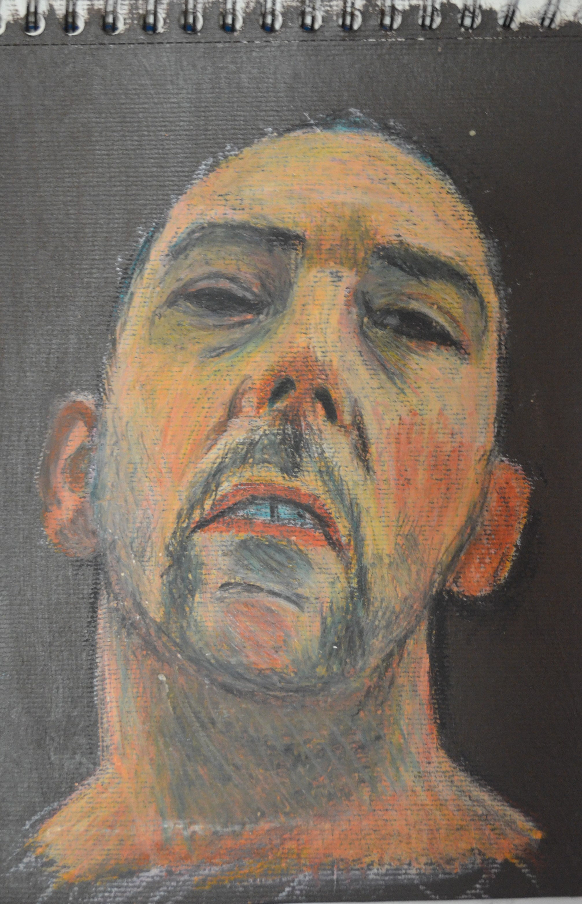
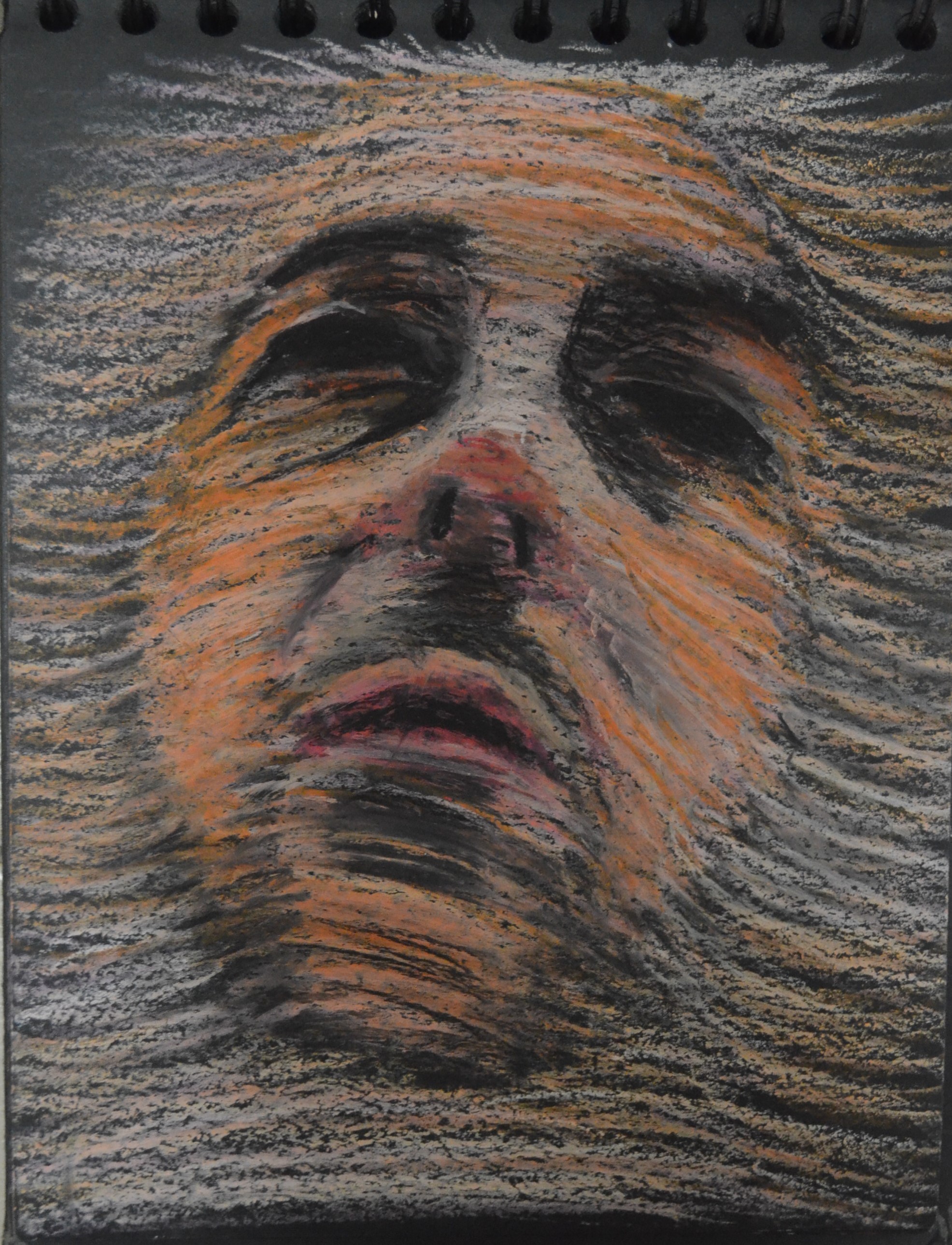
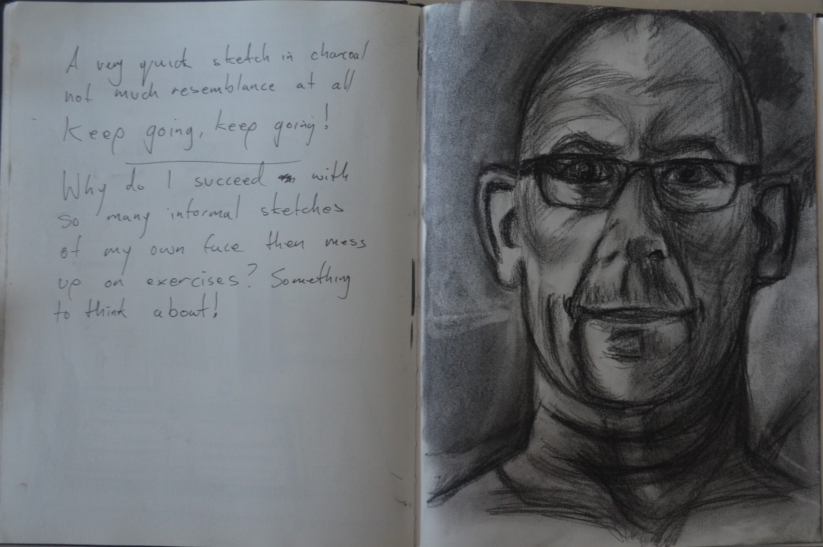
5 Oil Pastel on Black Pad
The next sketch was done in oil pastels in my black pad. With this one I kept drawing line over line until it made a shape and then built up the tone the photo here doesn’t do it justice, it looks nothing like me but it does look like it could have been edited from a photo, if that makes sense.
The idea came from Guy Denning’s sketches where he has built faces up from line, a technique I would love to develop although here it turned out to be nothing like I had intended.
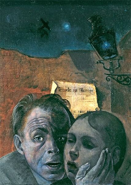
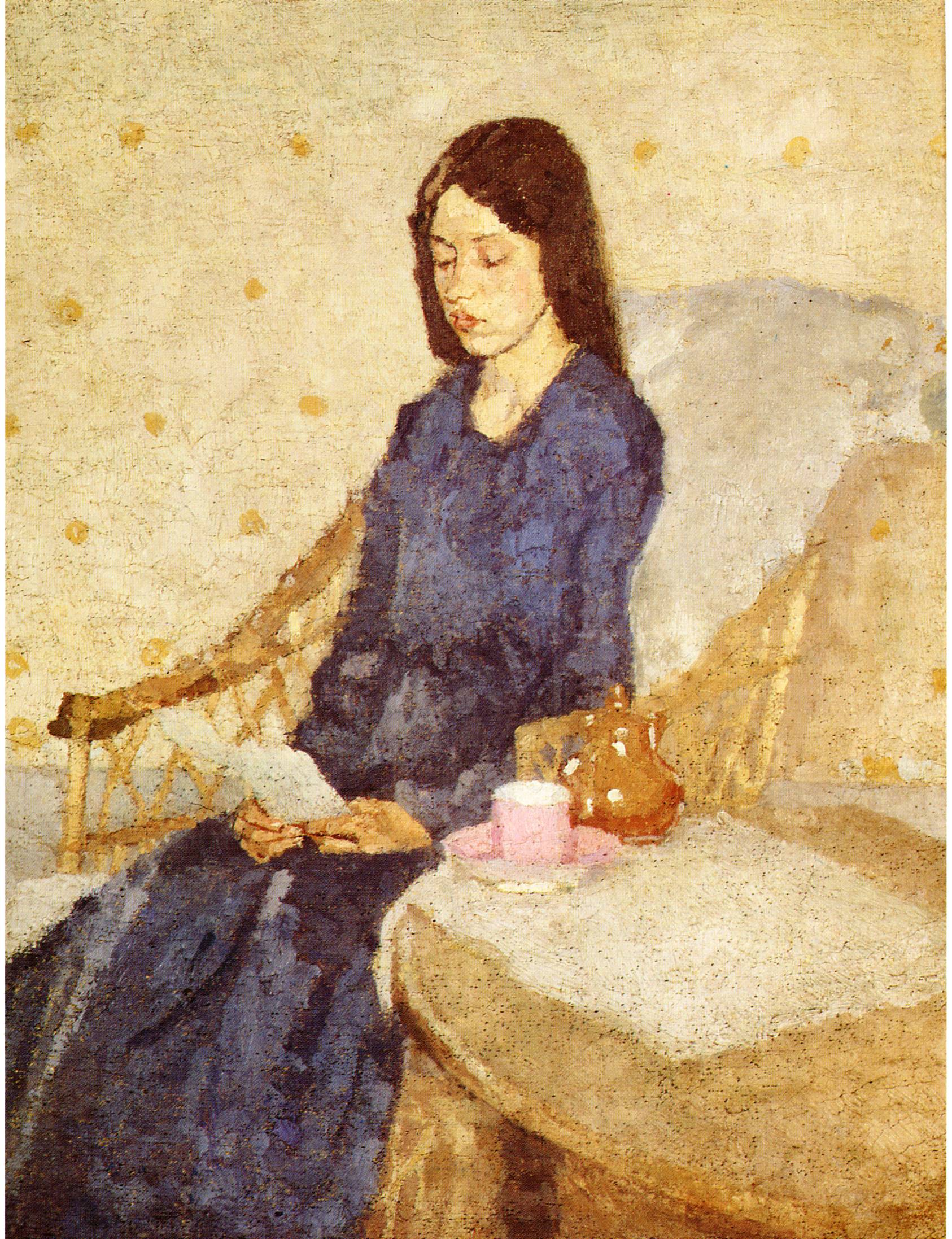
Gerhard Richter
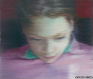
Ella by Gerhard Richter
In my last tutor report my tutor suggested checking out the unconventional portraits of Gerhard Richter. Too be honest his work didn’t really create a good impression on me but there were a couple that caught my eye, particularly ‘Ella’ and ‘Basel 2’. These two paintings made use of horizontal line to create a blurred effect, an effect that I had previously thought about trying to create myself but had never had the opportunity until now, this exercise was perfect for ‘giving it a go’.
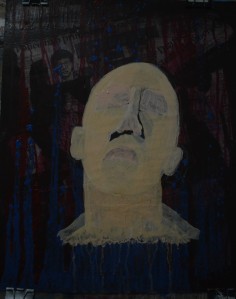
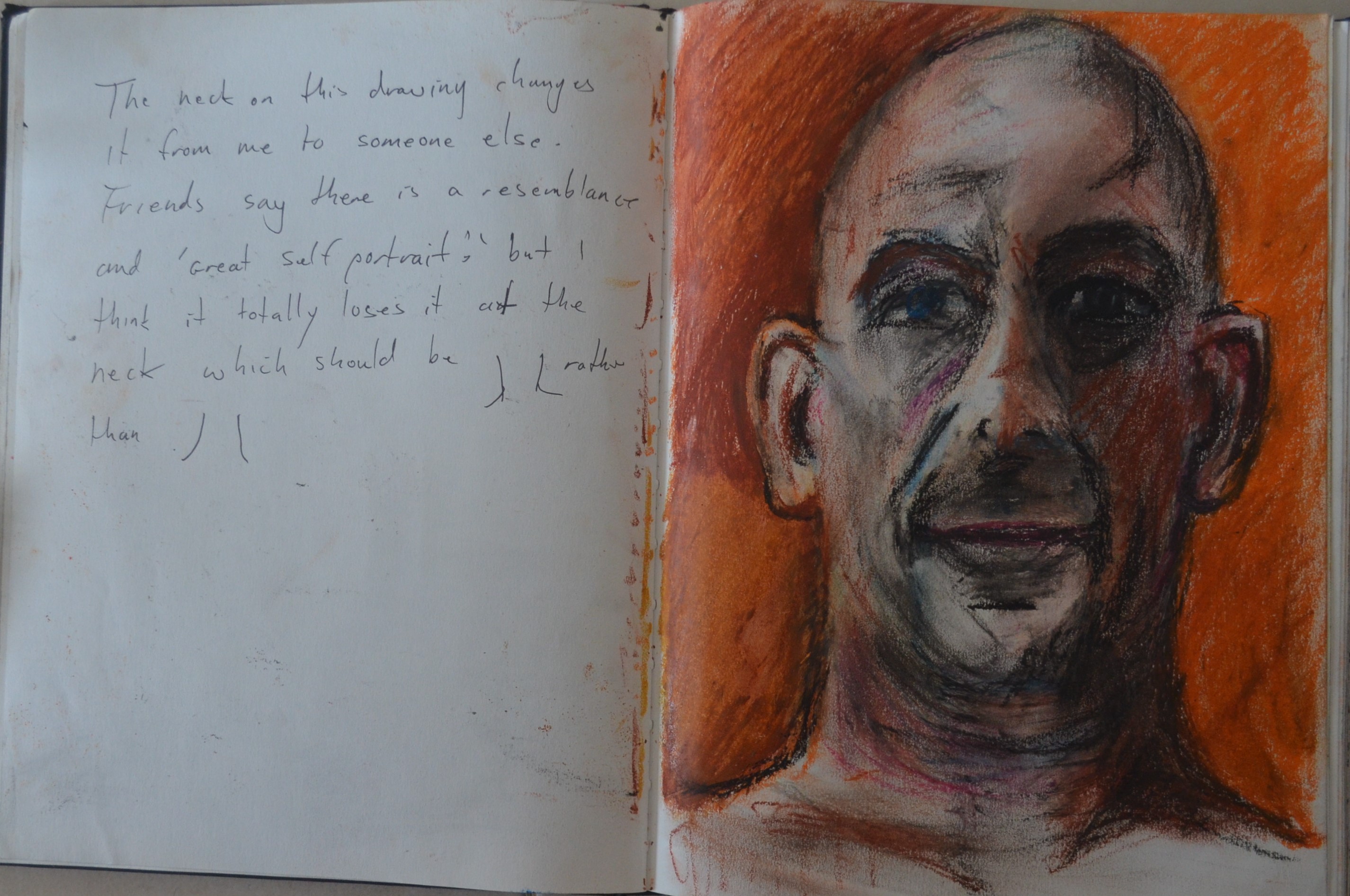
6 Oil Pastel on Black Pad
With this technique in mind I started work on what would become my final study, yet once I had built up the shape of the face using line other ideas started to flood in. The face started to look like it was facing upwards rather than just cocked back and with the lighter lines across the face it started to look like a transparent cloth over the surface of the skin.
I continued with this look by bringing the lines down off the side off the face until it began to resemble a veil or thin lace material draped across the face. With the eyes and mouth being blacked out it almost looks like a veil draped over a dead man’s face. Although others have said that it looks like a face coming up through the material.
This final study was probably the best and if I had to call it something I would probably call it ‘Veil of Death’. I took a photo of this and uploaded it to Facebook and Twitter and it has had the best reception out of all my drawings and even an inquiry, I am considering this for the assignment but could I recreate it in paint? I’m not sure, I think maybe my painting skills haven’t developed enough yet.
Although this was the best study yet I wasn’t sure I could recreate the look in acrylic and so I decided to go with an urban art style painting this way the painting would take on a life of it’s own.
The Final Piece
Choice of Background

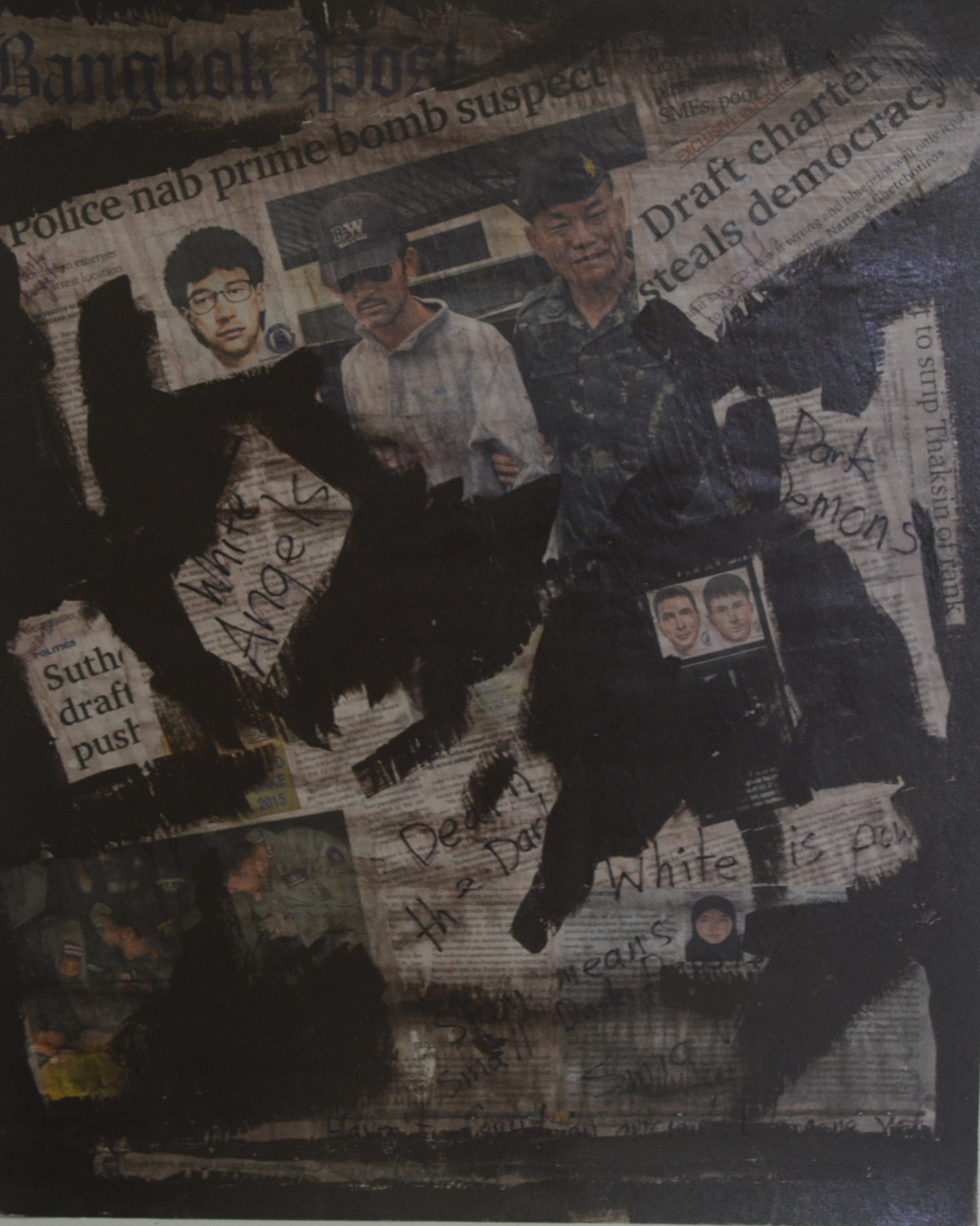
7 Creating a Collage on Card
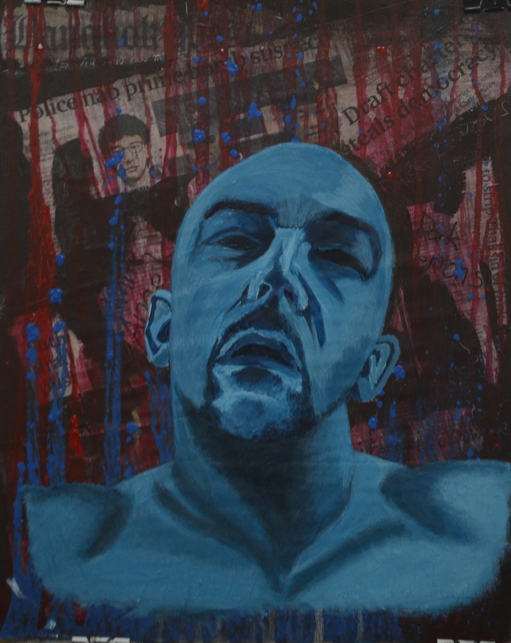
I wanted to start with an expressive background and I did look at different artists and even thought about trying to recreate a similar background to Elizabeth Magill’s paintings that I covered in my Tutor Recommendations 1 Post. In the end I settled for something that I had wanted to do for a long time and inspired by Guy Denning’s drawings over newspaper I began to put together a collage background from the Bangkok post. It has been eventful 2 years with a Military Coupe and bomb blasts signalling the end of democracy and a military clamp down here in Thailand and we have all felt it from Farang (westerners) to Thai people and if anything was going to create a trigger for my release of emotion while working on this painting, then local newspapers would be it.

8 Covering the White Spaces
Once I had glued all the newspaper clips that wound me up to the backing board and wrote a few comments on it to how Thais perceived race and skin colour over the top pf the newspaper clippings to try and get my emotions stirring even more , I painted out the white space of the board below.

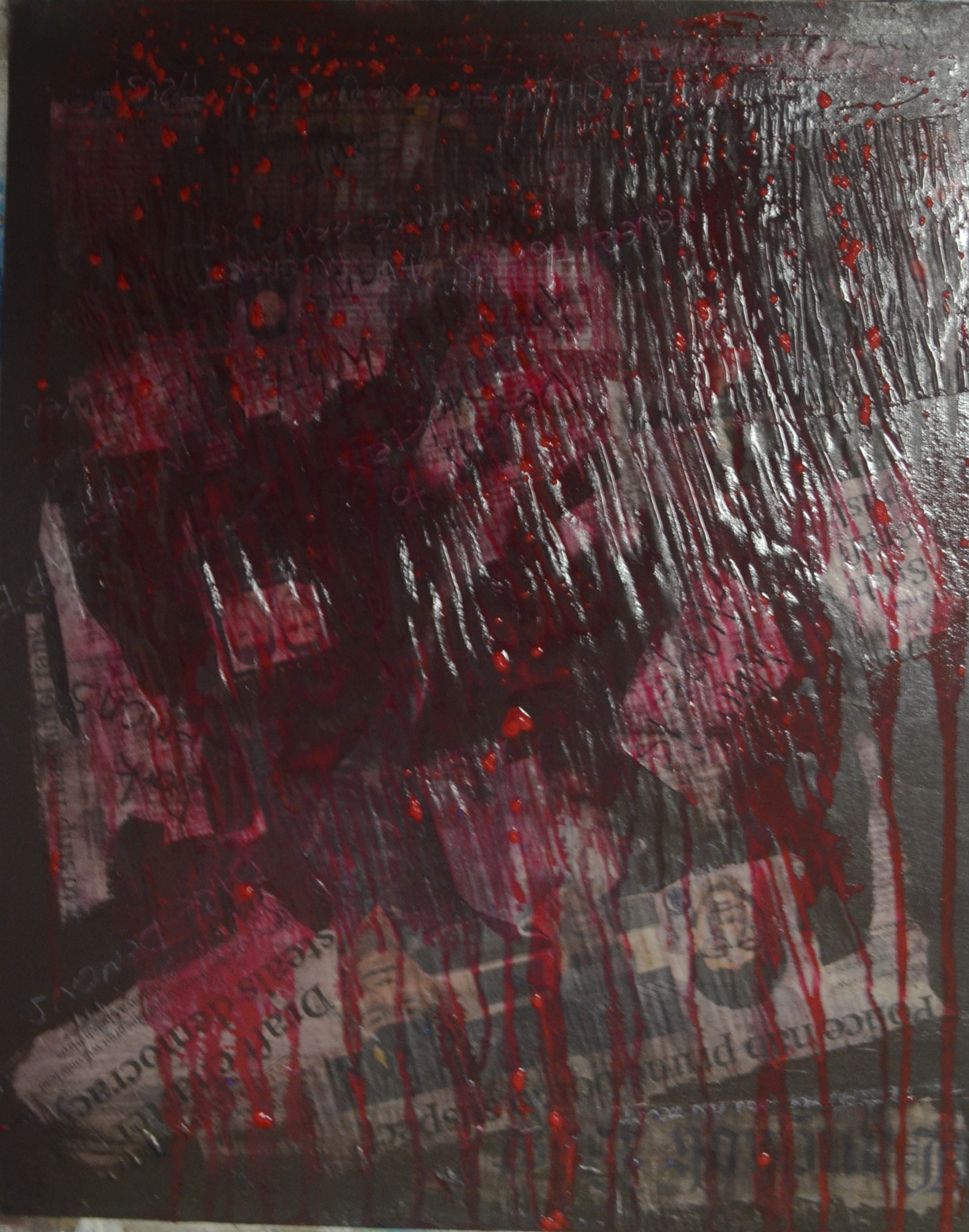
9 Dripping Technique
Before i started painting I wanted to ‘mess’ it up even more but in a way that it would add feeling to the painting so it had to be in a semi orderly fashion so I decided to create a dripping effect over the top of the collage.
To do this I added thick dollops of acrylic paint at the top of the support and then began to spray them with a spray gun then when they had run right down to the bottom I turned the board on the other end and let it run back as it was too runny.
Once the drips were dry I did the same with blue but this time I used a thicker mixture so I only had to run it one way.
10 Testing Colour
Once that was done I drew in the shape of my head working from studies with water soluble oil pastels so I could paint over the top or erase the lines easy enough if I was way out.
As I hadn’t really decided whether to use skin tones or cooler blue tones here I painted in the shape of my face neck and traps with a skin colour and then sprayed it to let it run down below to see how it would work with the background and other colours.
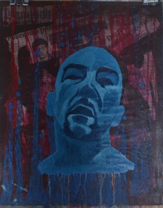
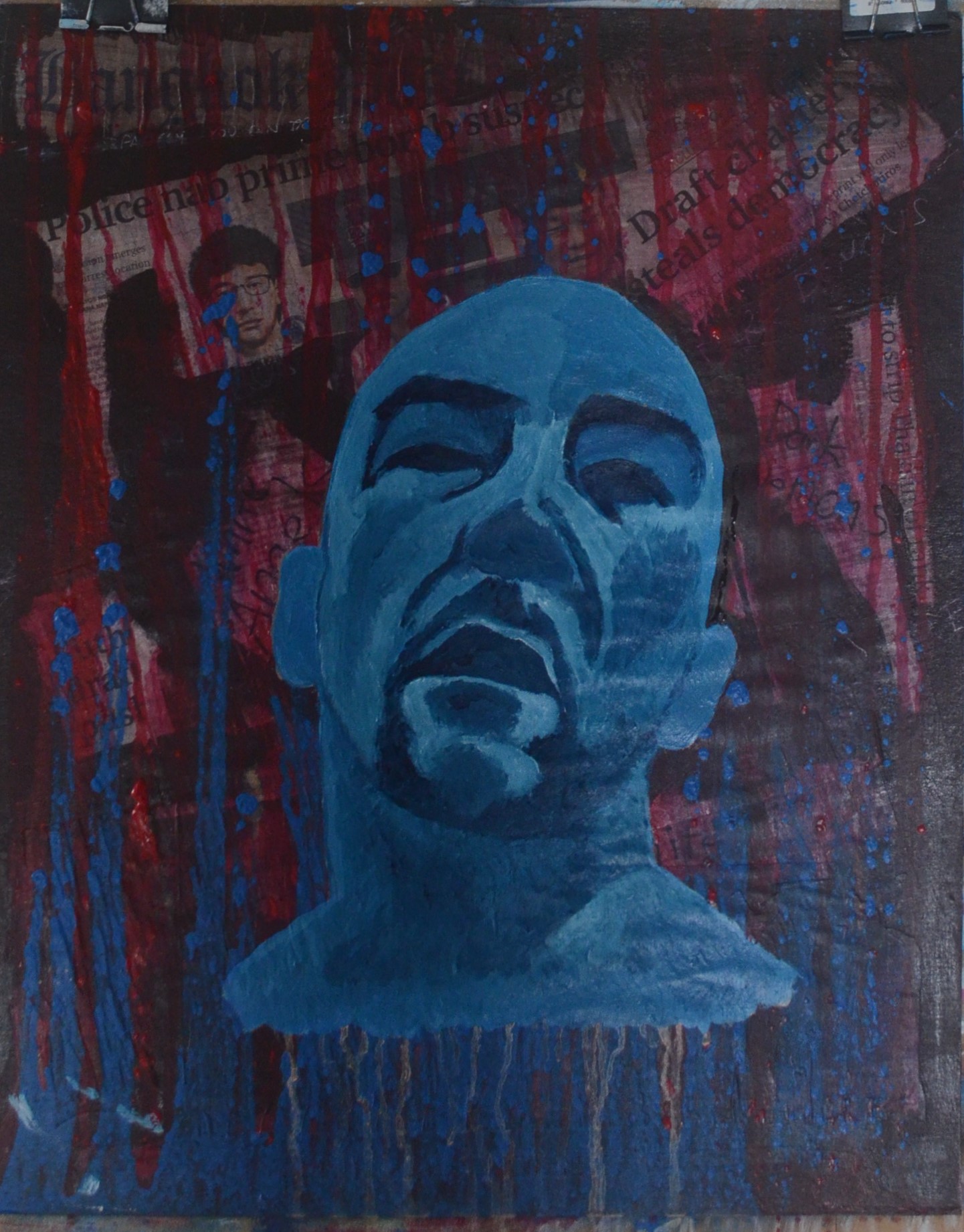
11 Building up Tone
After realizing that the lighter skin tones wouldn’t work with the background and other colours I decided on blue. I began by building up the tone with Prussian blue and white but I was left with the dilemma of the lighter colour drips below the neck and so began to ponder on how to correct this.
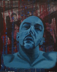
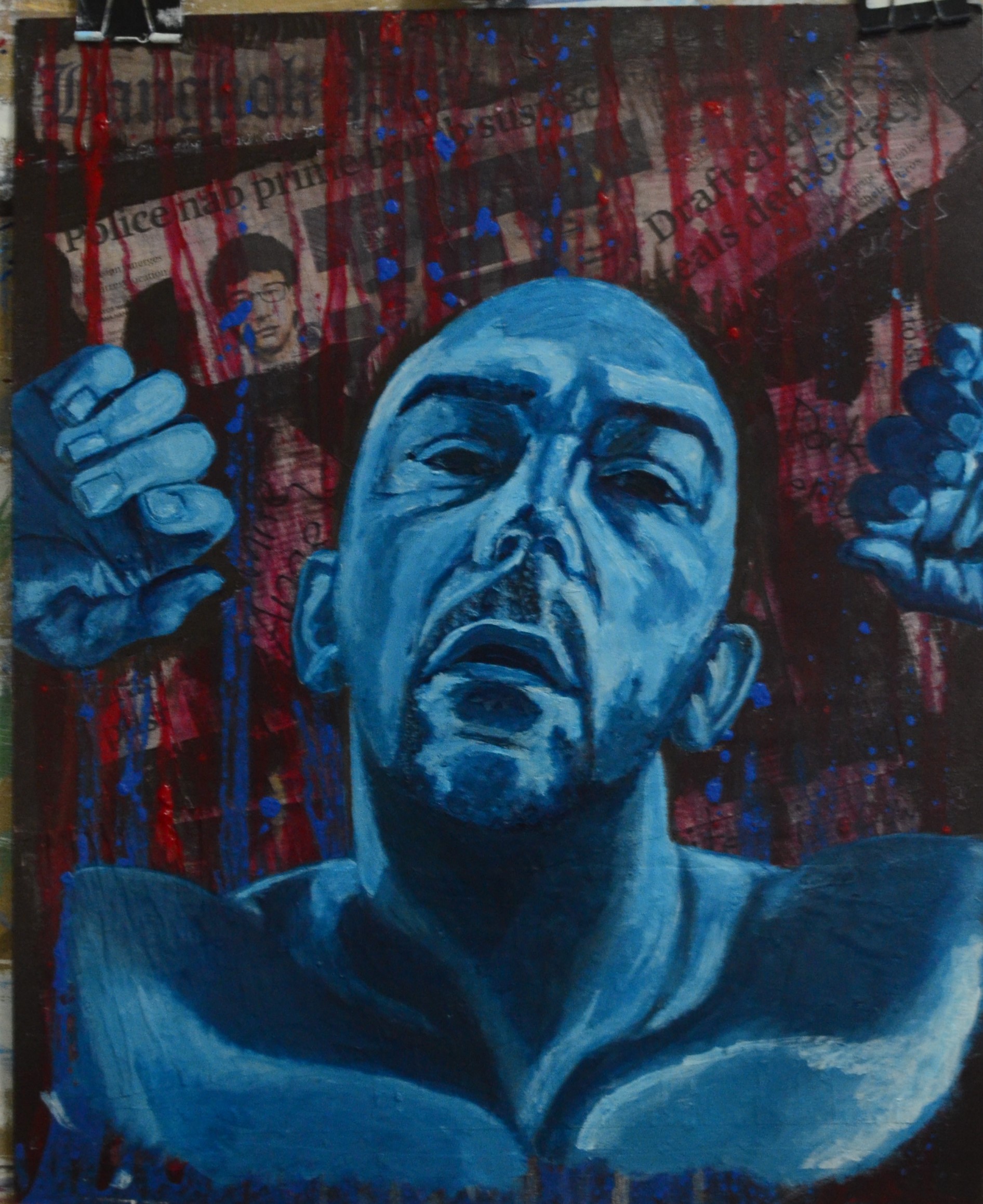
13 Painting Shoulders
My solution was to paint the shoulders but in an expressive way that made it look as if the arms were lifting up. Because I hadn’t made any studies of my shoulders and it wass quite spontaneous I lifted one side up and then the other in the mirror doing my best to try to make them look as anatomically correct as possible. The light source was overhead coming from a ceiling light directly above but the shadows in my studies fell to the left in the painting so I had to try build up the shadows on the shoulders on that side.

14 Adding More Feeling
I could have left it there but I thought that if I added hands to the painting I could probably create more emotion but to add the hands I had to lift the shoulders up even more in their natural positions and so instead of looking in the mirror this time I worked with my gained knowledge of anatomy to paint the shoulders, lifting them up and giving them more shape and feeling.
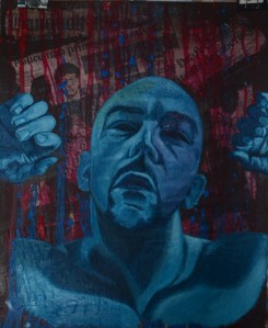
15 Painting Hands
With the hands I cheated and took photos and then painted directly on to the background without any drawing studies, I figured this would give me the same results as working from life ass I couldn’t correct them after. With the hands I painted in the the dark solid shapes and then used an almost impasto technique for the whiter tones.

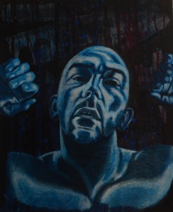
16 Adding Light
At this point it looked like I was drowning and the blue lumpy drips were like bubbles floating upwards while I sank to the murky . I showed a friend at this stage who said that the hands made me look like I was trapped inside myself trying to get out, at least I had created some kind of mood and emotion.
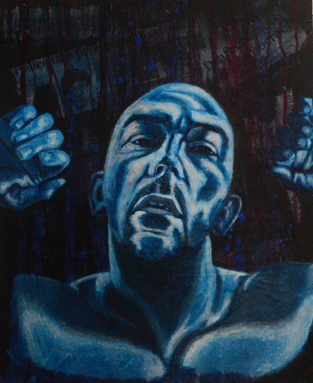
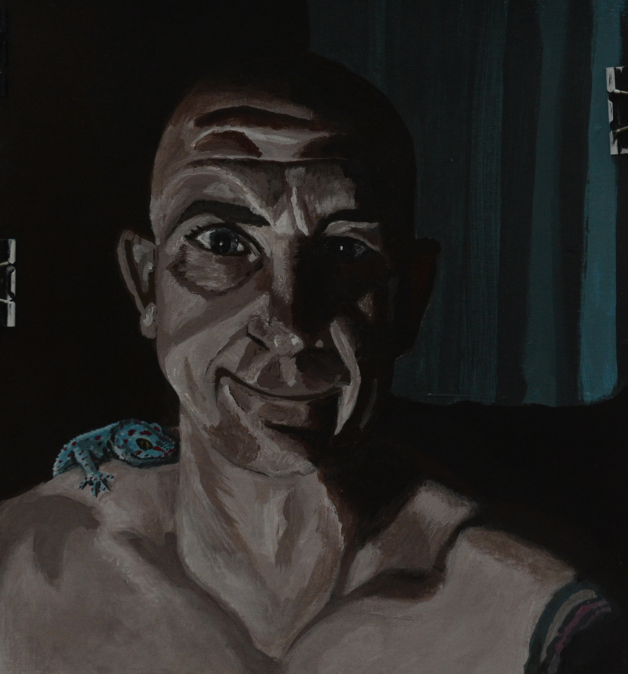
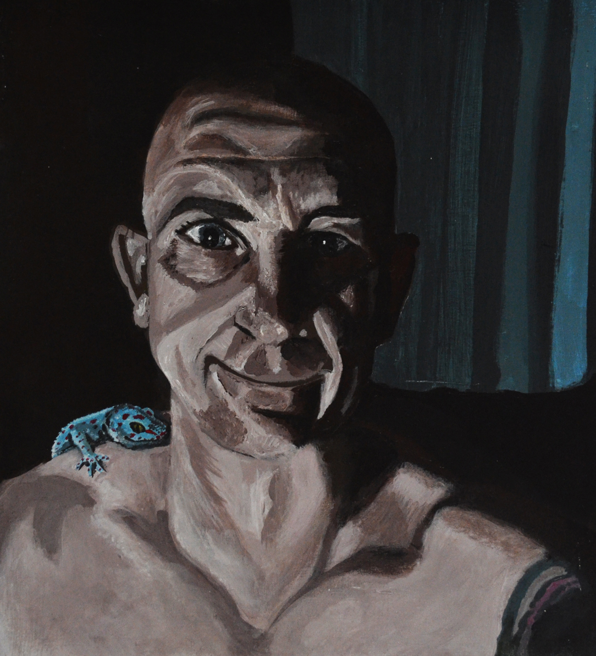
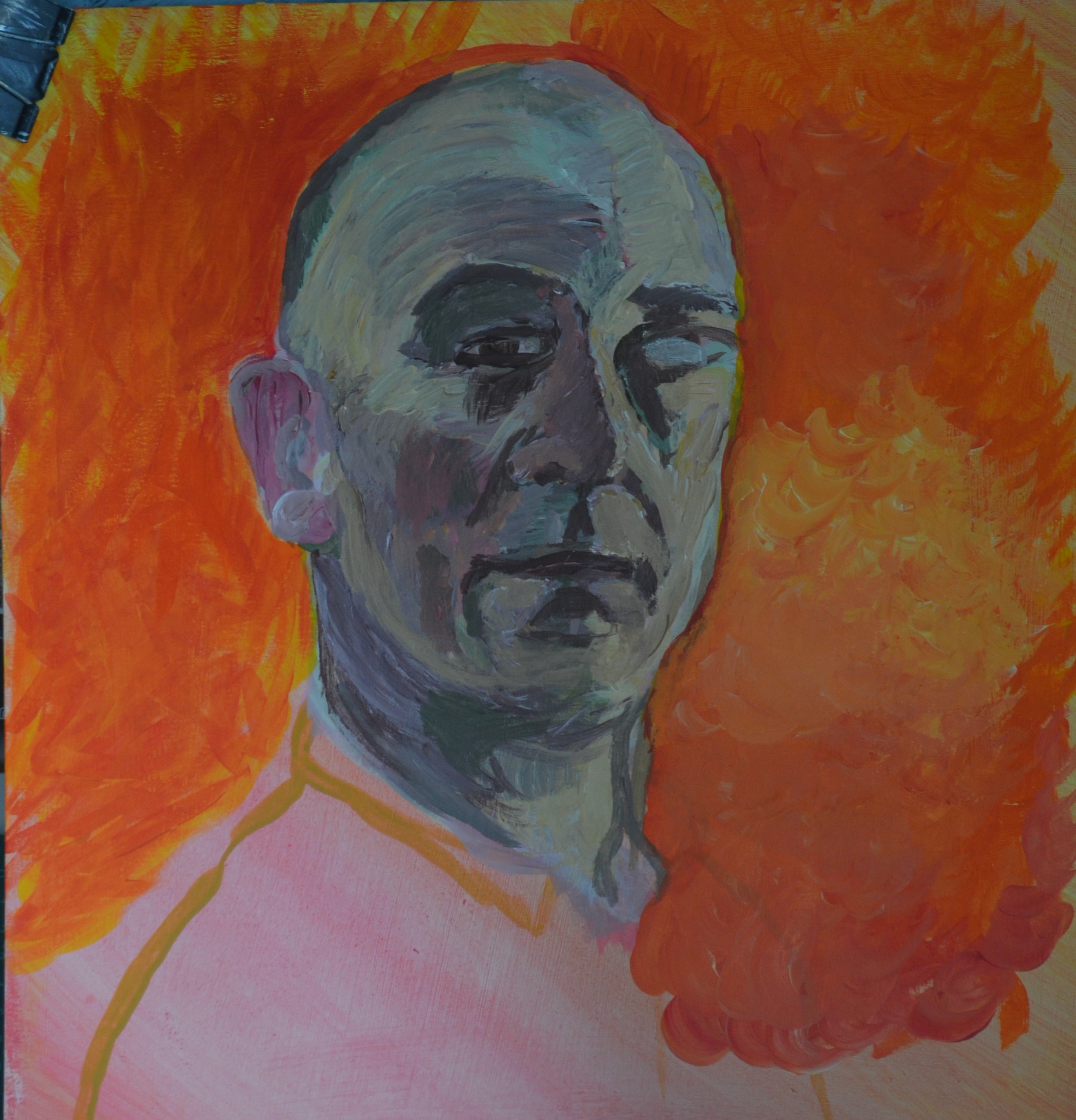
17 Finished Painting
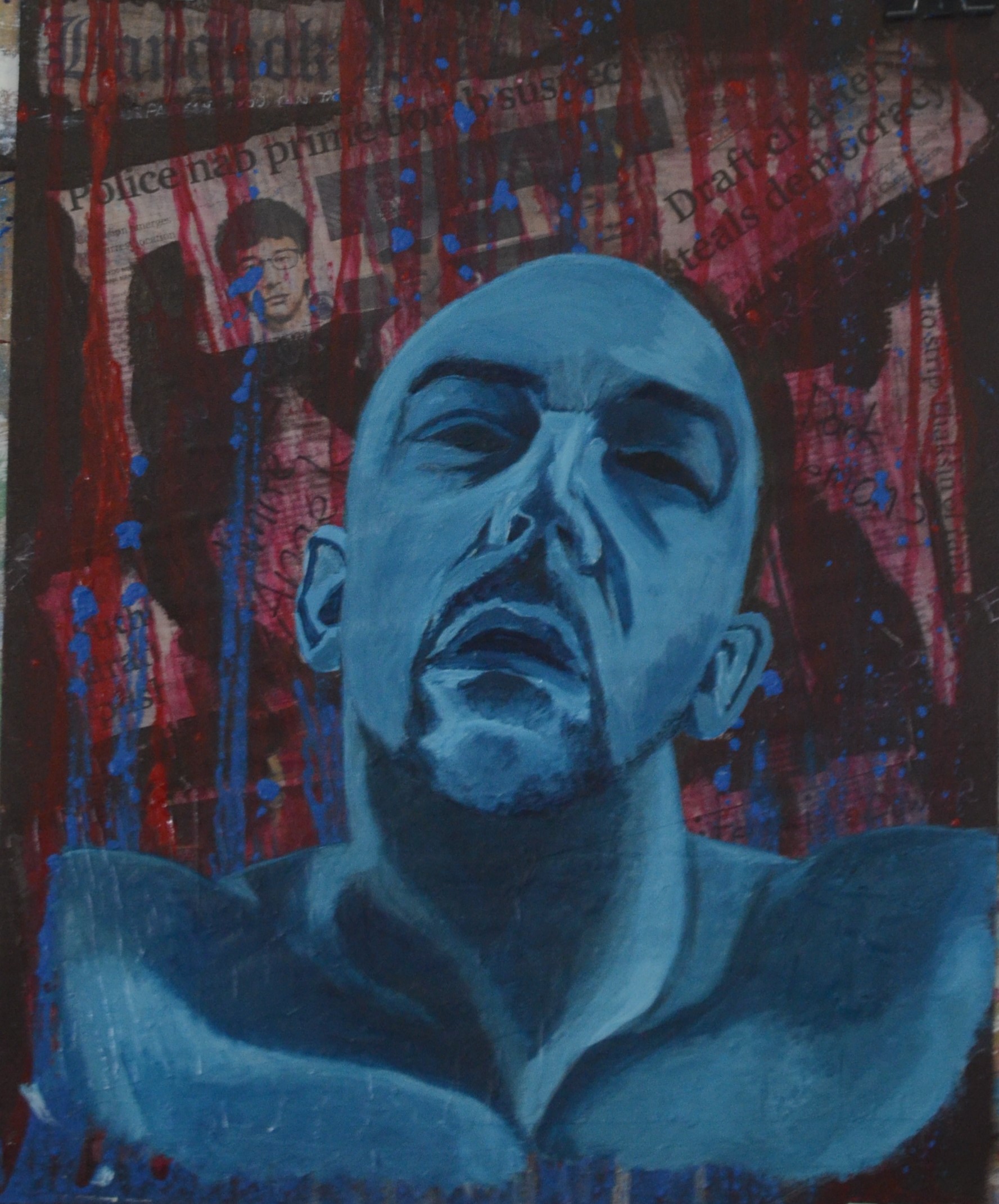
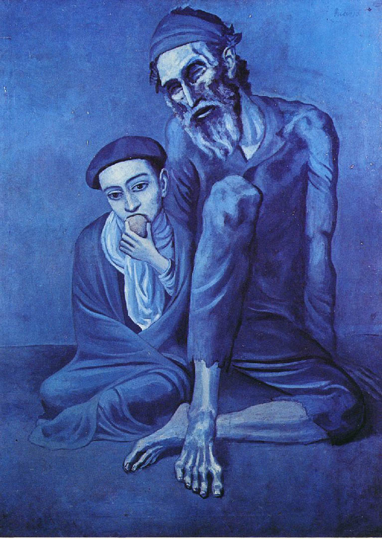
I wasn’t happy withe clash of colours, not that I didn’t want a clash of colour but because the red and clashing blues made it look like some kind of superhero cartoon and so reflecting on what I had learnt from Picasso’s Blue Period paintings in the previous research point I went over the background with a thin (but maybe not as thin as I’d liked) wash of blue which did look better although the newspaper clips aren’t as visible.
From there I continued to let myself be influenced by Picasso and started to add rose to the face and thin layers of red to the lips as well as painting in the teeth and a very small amount of the whites of the eyes. This really brought the painting to life and I felt that I had succeeded not just in creating mood and atmosphere to the painting but in recreating a similar technique used by Picasso in his blue period paintings.
17 Finished Painting


.jpg)