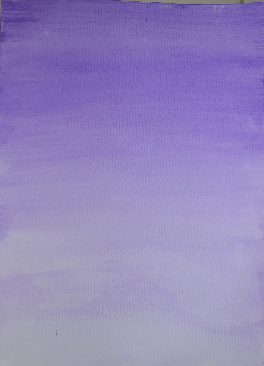
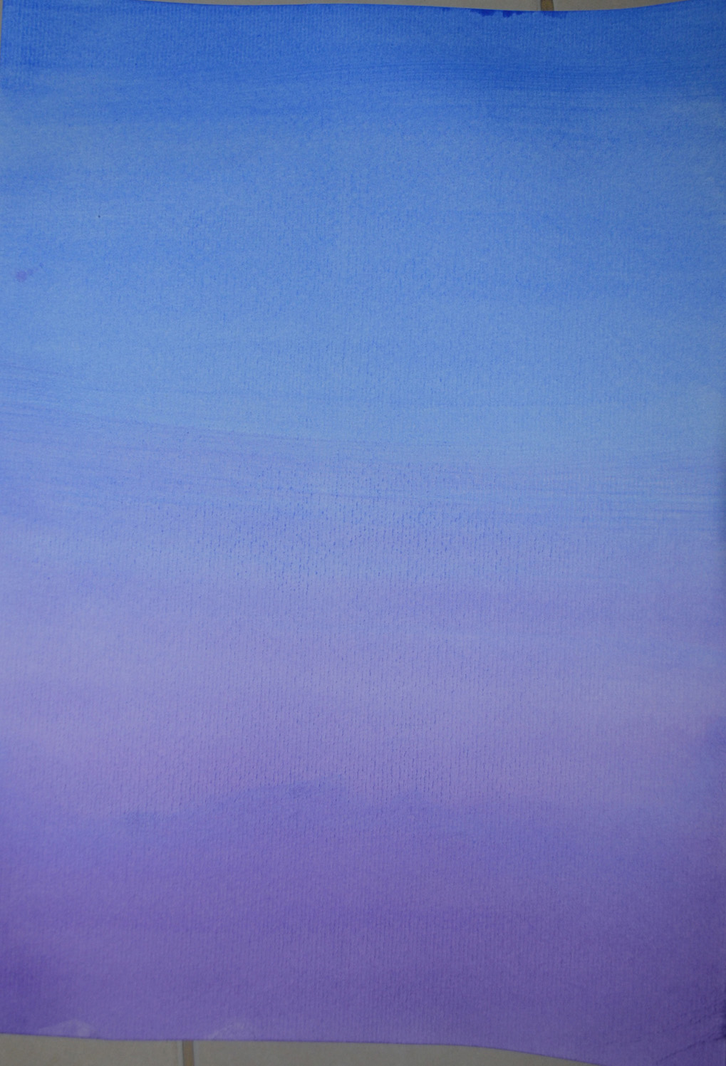
Look at the paintings of Mark Rothko, in particularly the huge Seagram Building Paintings, now in the Tate Modern, which form a solemn kind of tone poem all in shades of crimson.
Rothko was an American Abstract Impressionist painter, born in Russia and emigrated with his family to the U.S.A. in 1913. As a young buy Rothko was interested in literature, music and social studies and won a scholarship to Yale University where he studied liberal arts but left without graduating in his third year.
In 1925 Rothko moved to New York where he was he made irregular attendances at the Art Students League, one of the classes there was a painting class buy Max Weber, which remained his only formal art training. Mostly self taught, he educated himself by attending exhibitions and visits to artists’ studios such as that of Milton Avery, whose work influenced Rothko along with that of Matisse with their simple compositions and flat areas of colour.

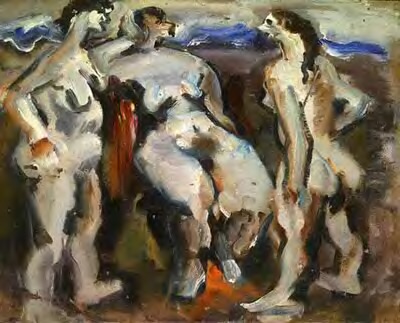
Bathers or Beach Scene Untitled 1933-4 by Mark Rothko
Rothko’s earliest pictures comprised of Expressionist landscapes, genre scenes, still-lifes, and bathers and were somewhat muddy in tone while his watercolours of the same period, demonstrate an expert approach to thin washes of pigment. His paintings throughout the 1930s invoked a feeling of mystery and dread with tragic figures set in claustrophobic apartments, lonely city streets and subway platforms.

Mark Rothko – Entrance to Subway – Subway Scene – 1938
In the lates 30s Rothko and Gottlieb as well as other Jewish artists with similar interests formed ‘the Ten’ together they mounted exhibitions in New York and Paris Until 1940.
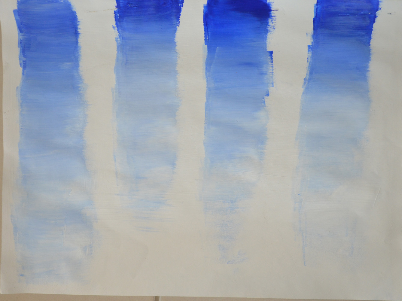
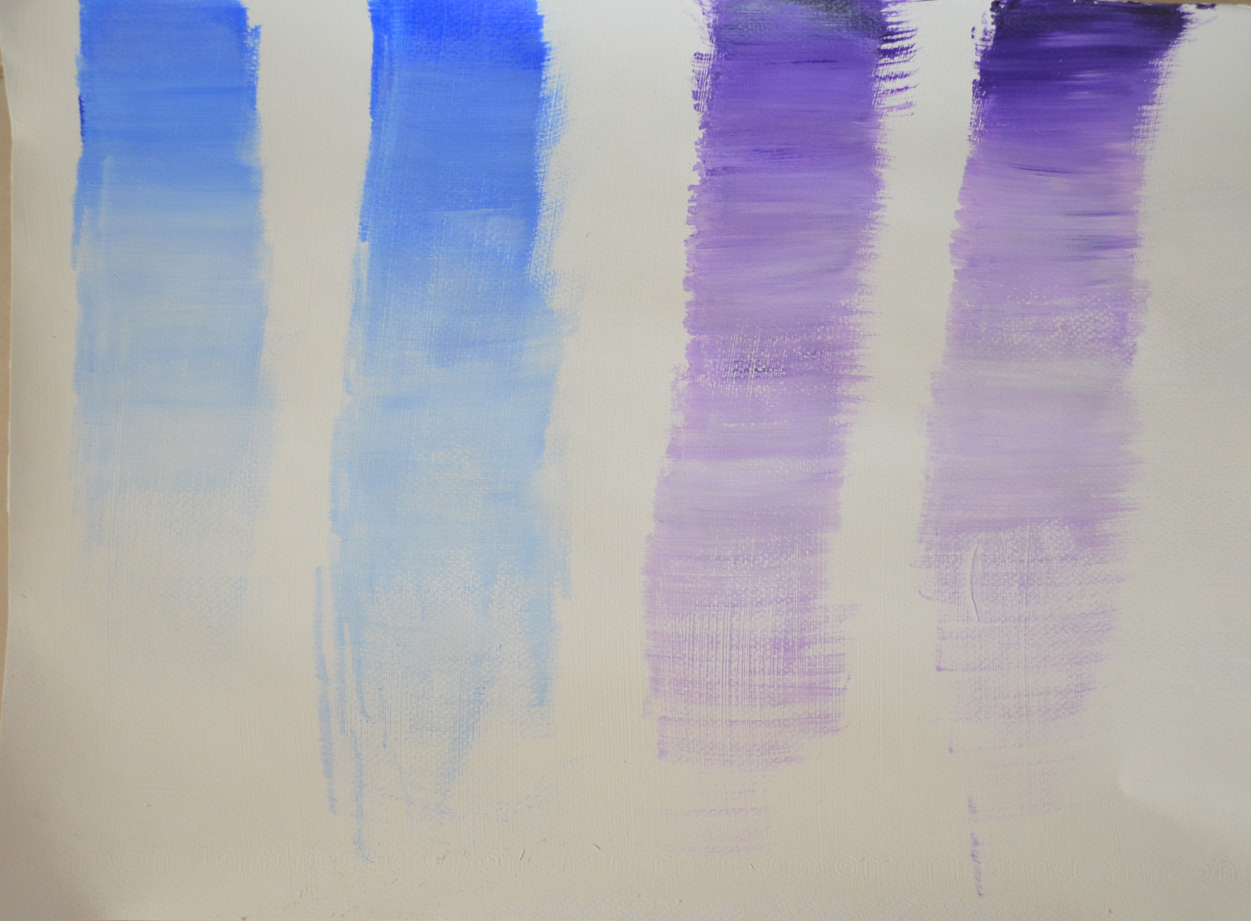
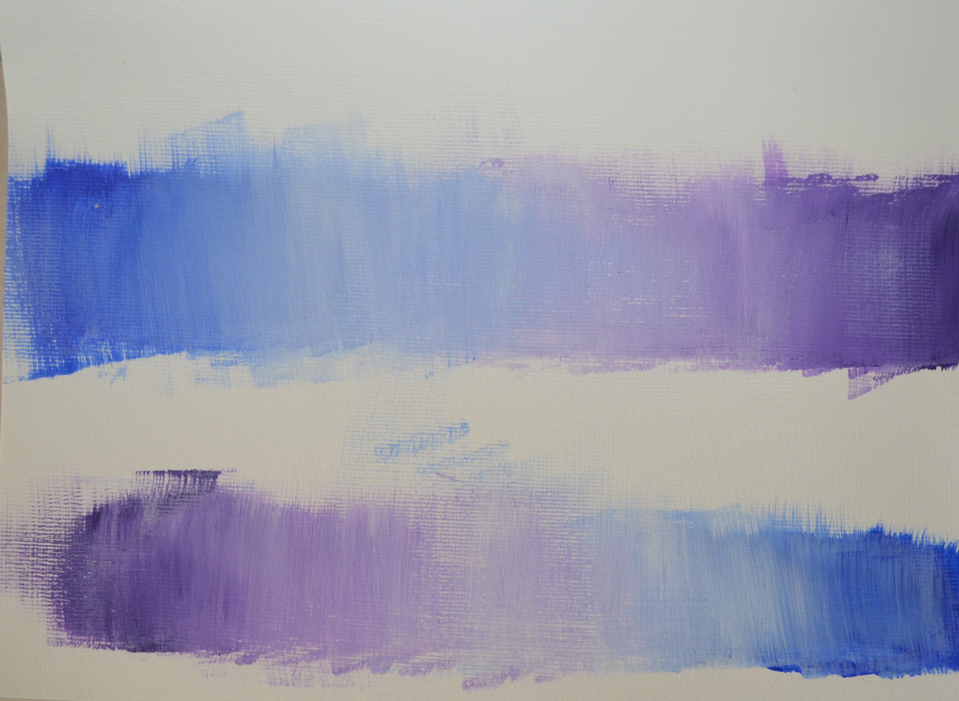
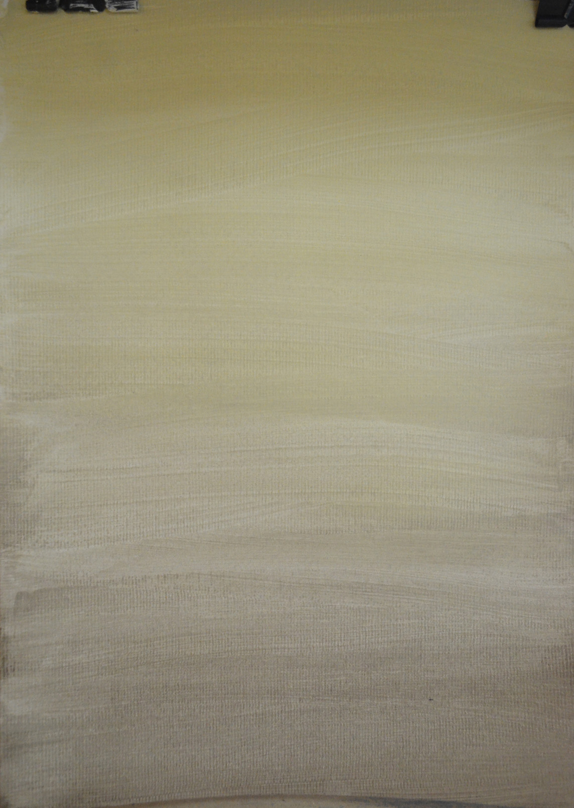
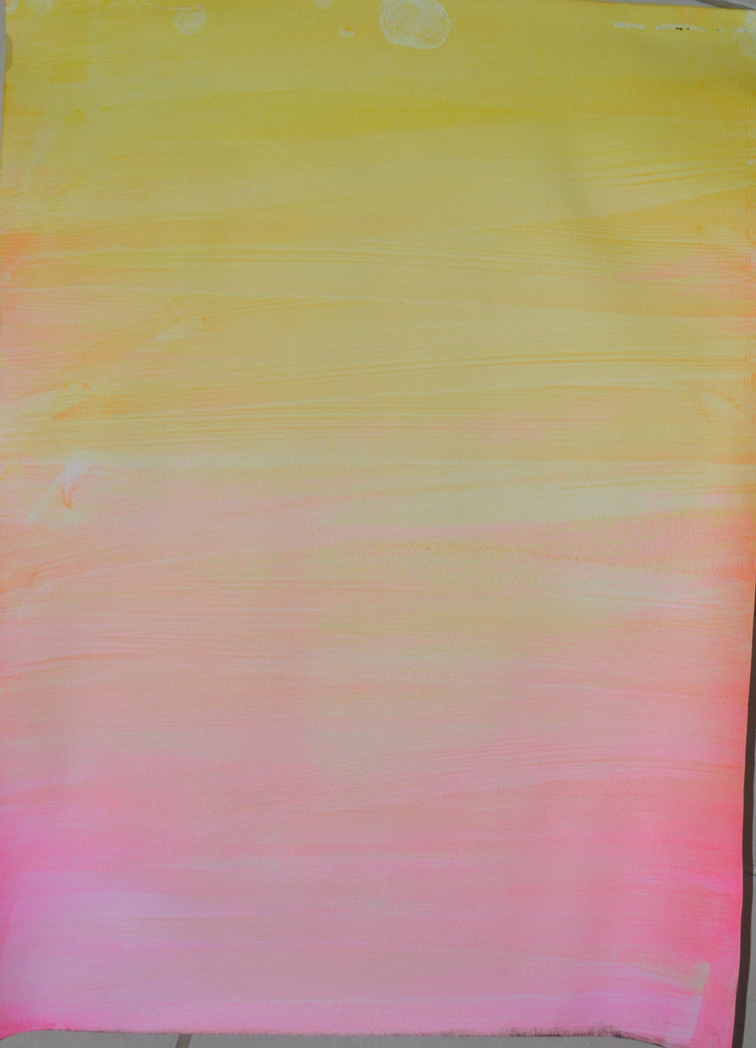
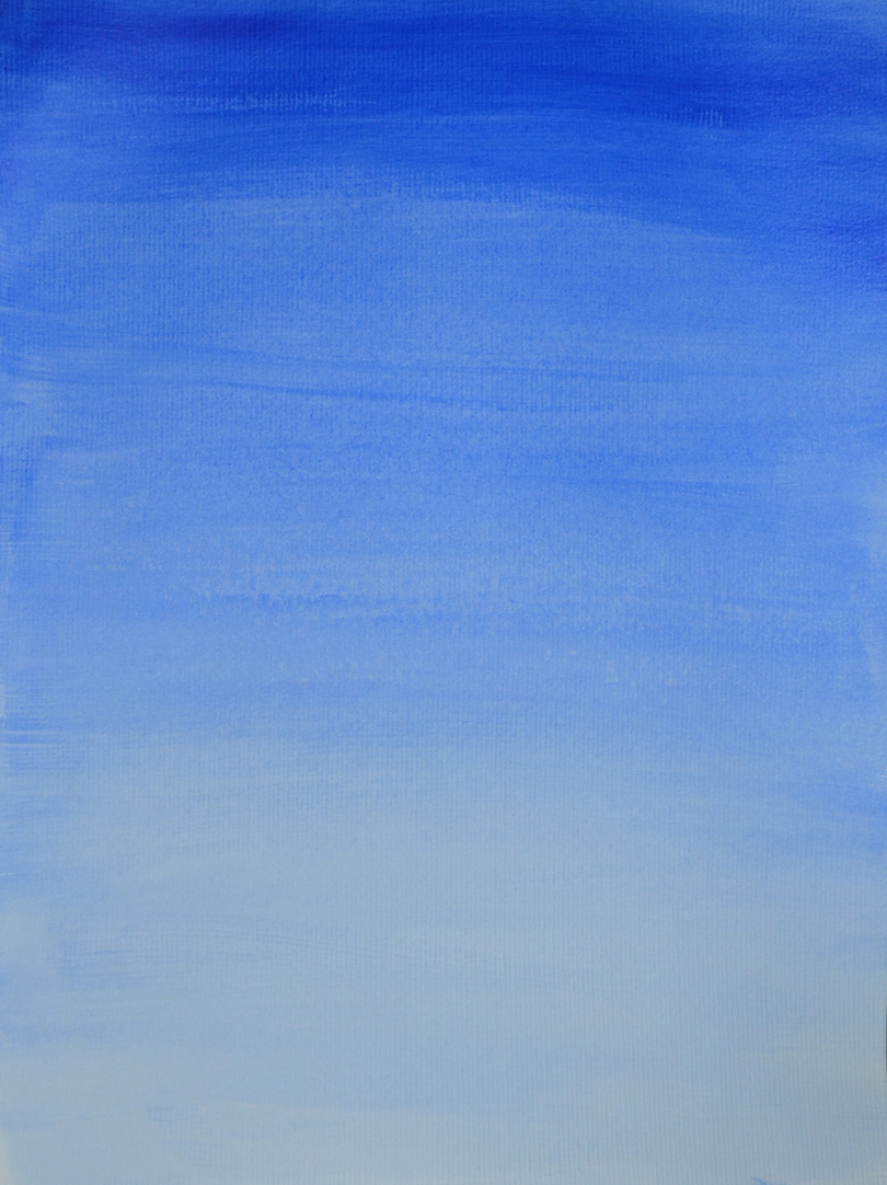
During the mid-1940s Rothko evolved a personal watercolour technique. he applied watercolour, gouache, and tempera to heavyweight paper, then before the paint had time to dry, he used black ink to define forms. The ink would bleed when introduced to areas that were still wet and resulted in the black burst often found in his works from this period. These watercolour techniques seemed to have influenced the technique which he developed for his oil paintings.

Mark Rothko – Untitled oil on canvas 1945
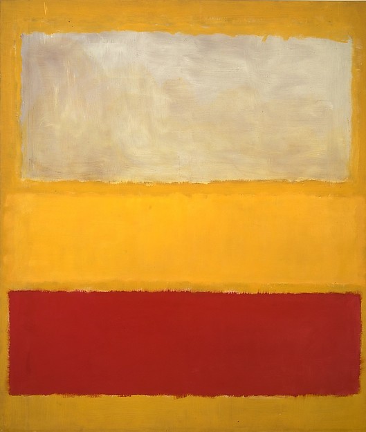
Rothko felt that his new work was consistent with the subject matter of his earlier paintings, he stressed he had not removed the human figure but had replaced it’s form with symbols and later shapes. In his opinion paintings like No.13(White, Red and Yellow) below had developed out of his hopes to express human emotions.

Mark Rothko Number 13 -White Red on Yellow
‘The progression of a painter’s work…will be toward clarity…..I’m interested only in expressing basic human emotions—tragedy, ecstasy, doom…and if you…are moved only by their color relationships, then you miss the point.’ Mark Rothko.
The Seagram Murals

Mark Rothko untitled Mural for End Wall
Rothko was received one of the biggest commissions of his life in 1958, to paint a series of murals for the fashionable Four Seasons restaurant located in the Seagram Building on Park Avenue New York.

This set a new challenge for Rothko as it was the first time he had been asked to produce a coordinated series of paintings as well as producce an artwork space concept. To do this the artist constructed a scaffold in his studio, the same dimensions of the restaurant. Over the next three months he completed 40 paintings. A total of three series in maroon, dark red and black rather than the intense bright colours in his earlier paintings. He also altered his the usual horizontal format to vertical so that they would complement the restaurant’s vertical features: columns, walls, doors and windows.

Rothko was influenced by Michelangelo’s Laurentian Library in Florence, with its blind windows and deliberately oppressive atmosphere, he commented that Michelangelo ‘achieved just the kind of feeling I’m after – he makes the viewers feel that they are trapped in a room where all the doors and windows are bricked up, so that all they can do is butt their heads forever against the wall.’ While on the SS Independence Rothko disclosed to Harper’s Magazine publisher John Fischer, that his true intention for the Seagram murals was to paint “something that will ruin the appetite of every son-of-a-bitch who ever eats in that room….”

Eventually he realised that the worldly setting of a restaurant was no ideal location for such a work, Rothko withdrew from the Seagram Mural commission. He kept the commissioned paintings in storage until 1968 before presenting the series to the Tate Gallery, expressing his deep affection for England and for British artists such as J.M.W. Turner.

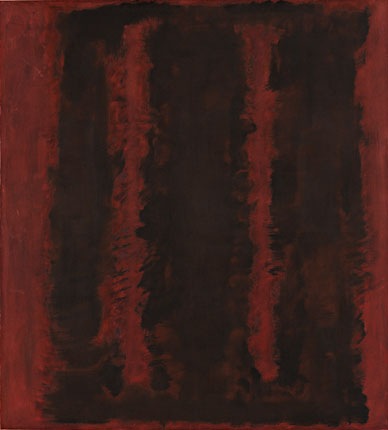
Mark Rothko Red on Maroon mural, section 5
The Seagram Murals arrived in London for display at the Tate Gallery on the very day of his suicide, February 25, 1970. His assistant Oliver Steindecker, found him lying dead on the floor in front of the sink. Rothko was covered in blood with slices down his arms inflicted by a razor that was found lying at his side. The autopsy revealed that he had also overdosed on anti-depressants. ‘Mark Rothko was always incredibly depressed’ – Matthew Collings, This is Modern Art.

Mark Rothko Black on Maroon 1958
I used to have a reoccurring nightmare when I was a kid which was more of an intense feeling of anxiety than anything else. There were no figures in the dream just vertical blocks of dark greys and blacks pushing together and as they did the pressure that I felt would force me awake. This could have been from temporary damage due to lack of oxygen to the brain from pneumonia or asthma and I haven’t really thought about it for years but looking at the images above brings it all back and that’s just on the computer.
I’m not keen on the paintings, although I do understand the concept and respect the artist and I would like to get right up close and personal with Rothko’s paintings to feel just what the artist intended you to feel “tragedy, ecstasy, doom”
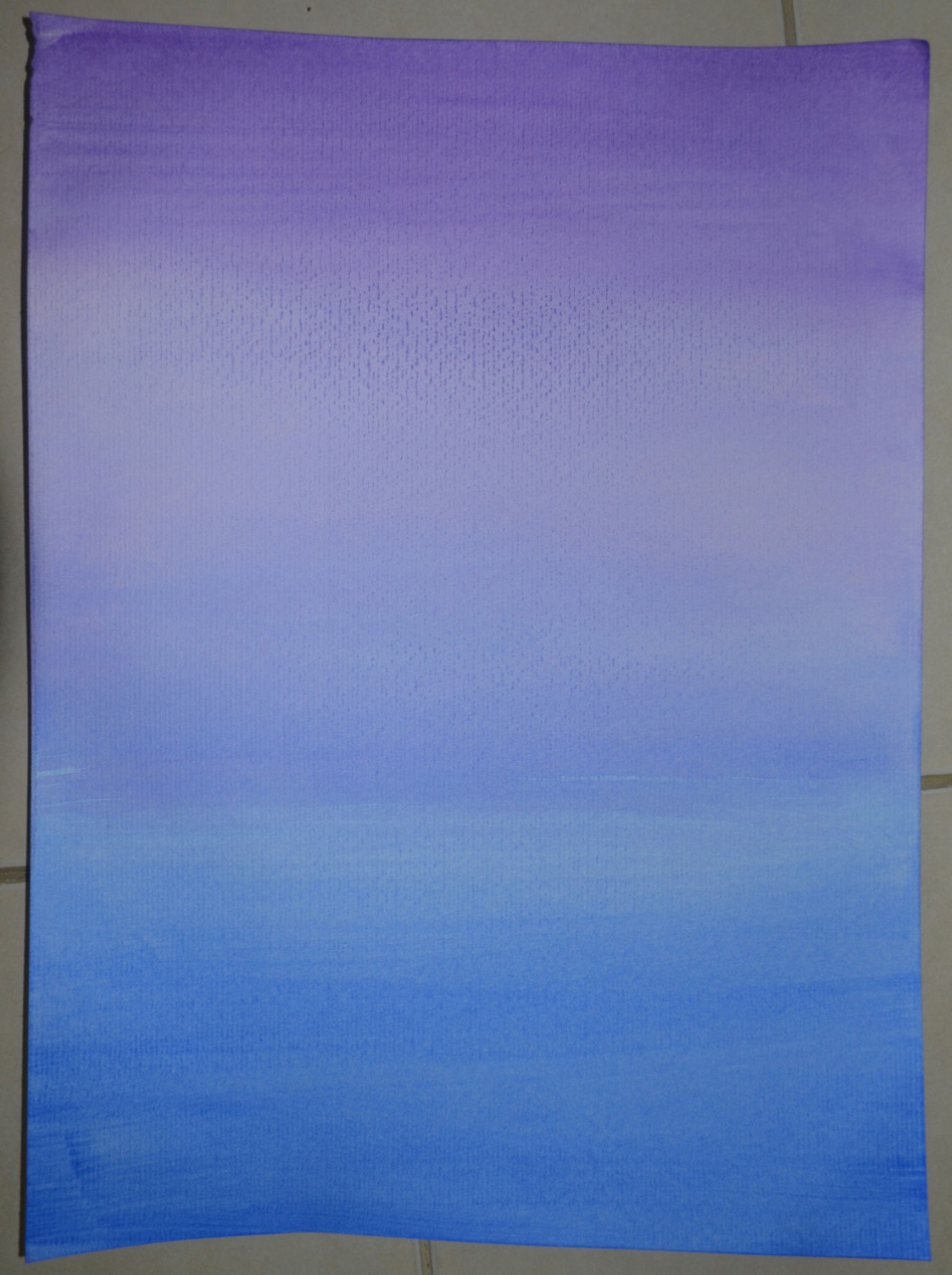
Although there is some emotion there for me looking at the murals above on a computer do not them justice at all, I have seen how two colours bleed into each other when wet and can only really guess how the darker colours of the black shape on ‘Black and Maroon’ for example have bled into the lighter maroon. To see that on a grand scale would be something else.
If according to the Greek historian Plutarch ‘Painting is silent poetry, and poetry is painting that speaks.’ Then yes the poetry that these paintings offer us is very solemn indeed.
http://www.the-art-minute.com/
http://www.tate.org.uk/whats-on/tate-modern/display/mark-rothko
http://en.wikipedia.org/wiki/Mark_Rothko
http://www.oxfordartonline.com/