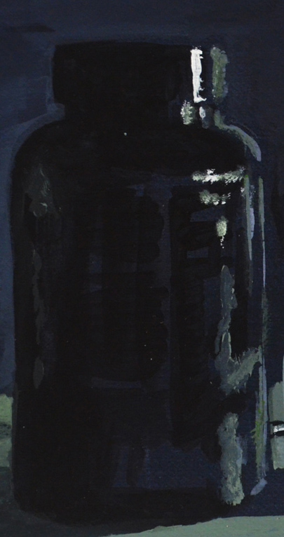
Finished Painting in Acrylic on Board
Brief for the assignment
Your painting for this assignment should demonstrate your understanding of colour, tone, composition and the development of your technique in your chosen medium.
Set up a still life in the corner of a room or table. Alternatively, you may want to develop one of the sketches or exercises that you have done in this part of the course.
Choose your painting medium and decide on the format and scale of your painting. Work on treated paper, card or canvas (at least A3) in either portrait or landscape format. Choose the background colour that you will use.
Draw the main shapes with a brush paying particular attention to:
- your viewpoint
- the direction of the light source
- highlights and shadow (tone)
- the relationship between objects and the background
- the mood you wish to convey
My Subject

1 – Original Sketch from Drawing in Paint
I wanted to develop an earlier sketch, which I did note in an earlier exercise. The sketch was of the basket in which I keep my acrylics and the tubes of paint inside. In that particular sketch I had used line, I wasn’t sure I would use it in the finished painting but it was definitely something to think about.
There was a problem with developing this sketch though and that was I had drawn it in the day I had drawn shadows but I wasn’t particularly paying much attention to the light source direction and so I thought it may be wise to start a fresh but using the same subject.
Colour Studies and Development

3 – Rough Study Influenced by Glenn Brown
I wanted to demonstrate my understanding of most of what I had learnt through this part of the course in this piece so this time I decided to paint some of the surroundings as well for perspective set up the subject again on the monks cloth and set several more random items at the side of it that I could consider putting in the assignment piece which included a glue-stick, a small striped box and the remote control for the air-conditioning.

Glenn Brown Ride with the Devil, Sympathy for the Poor
The weave of the basket gave me an idea, I had been looking through vitamin P2 and came across work by the artist Glenn Brown and liked the way he seemed to use layers of thick paint to give his paintings texture and sense of three dimension and thought that this could be something that might work in my assignment piece.
After my not so brilliant attempt at a colour study influenced by the artist (see figure 3) I realized that it was probably not an ideal technique for acrylic paint which is what I would be using for this assignment.
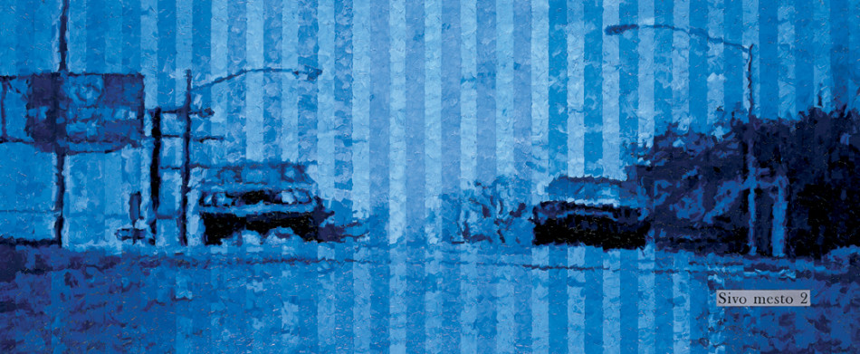
Grey City 2 – Ziga Kariz
Another painting that really caught my eye was Grey City 2 by Ziga Kariz, not really because of the style of his painting but because of his choice of colour blue, I wasn’t sure if I had really been successful in what the brief of the Still life with colour used to evoke mood exercise and this was probably a chance to have another go at that at least in a study if not the final piece.

4 – Study Inflenced by Ziga Kariz Grey City 2
This led to my next drawing in watercolour in my mixed media sketchbook over two pages something I hadn’t yet tried out. The drawing was really rough and didn’t take me long to complete but what I did learn from it was that firstly, I would use be using mainly blue as ‘blue’ was the mood I wanted to depict in my painting. I saw the tubes of paint inside the basket as being trapped inside the basket and the tube in front as escaping but not yet free and that is what I wanted to put across.
Secondly I wanted to make use of line, I really thought that outline would be something worth experimenting with in this painting and the original drawing and the first two studies told me to stick with it.

6 – Acrylic Paint Colours Closest to Watercolours
The water colour study in my sketchbook was painted with a field set and only had one blue so I squeezed several blues out from watercolour tubes and painted squares of each colour. I tried to stick to colours as close to the Grey City painting as I like the mood they portrayed. The colours I thought I would be using at this stage were Ultramarine (which I ticked in the image on the right), mineral blue (not sure if they had this in acrylic colour) and Prussian blue (which is directly under ultramarine in the photo).

5 – Watercolour Developed From Sketchbook Study
With the colours identified I went on to see how these colours would look in a painting by doing another watercolour study on A3 paper with the chosen hues. The result was that I tried ultramarine in a small part of the painting but then decided not to use it and to omit from the final piece.
At this stage I still wasn’t sure whether I would be including the other items from the still life composition in the final painting.
Working on the Final Painting
Materials used:
- A1 Card
- Acrylic Paint, Ivory Black, Titanium white, Primary Blue, Prussian Blue
- Brushes, a range of brushes in different sizes both synthetic and hogs bristle
- Medium Acrylic Gel
I chose to do the final painting on board as I had plenty of it left from backing my wwork for my Drawing 1 course formal assessment. In the last watercolour study I left a white border which I really liked plus there was a lot of white showing through from the background which helped depict the light reflecting off the paint tops and the basket and so unlike my last assignment and previous paintings for this one I decided to use a white background and so treated the card with gezzo and then a coat of white.
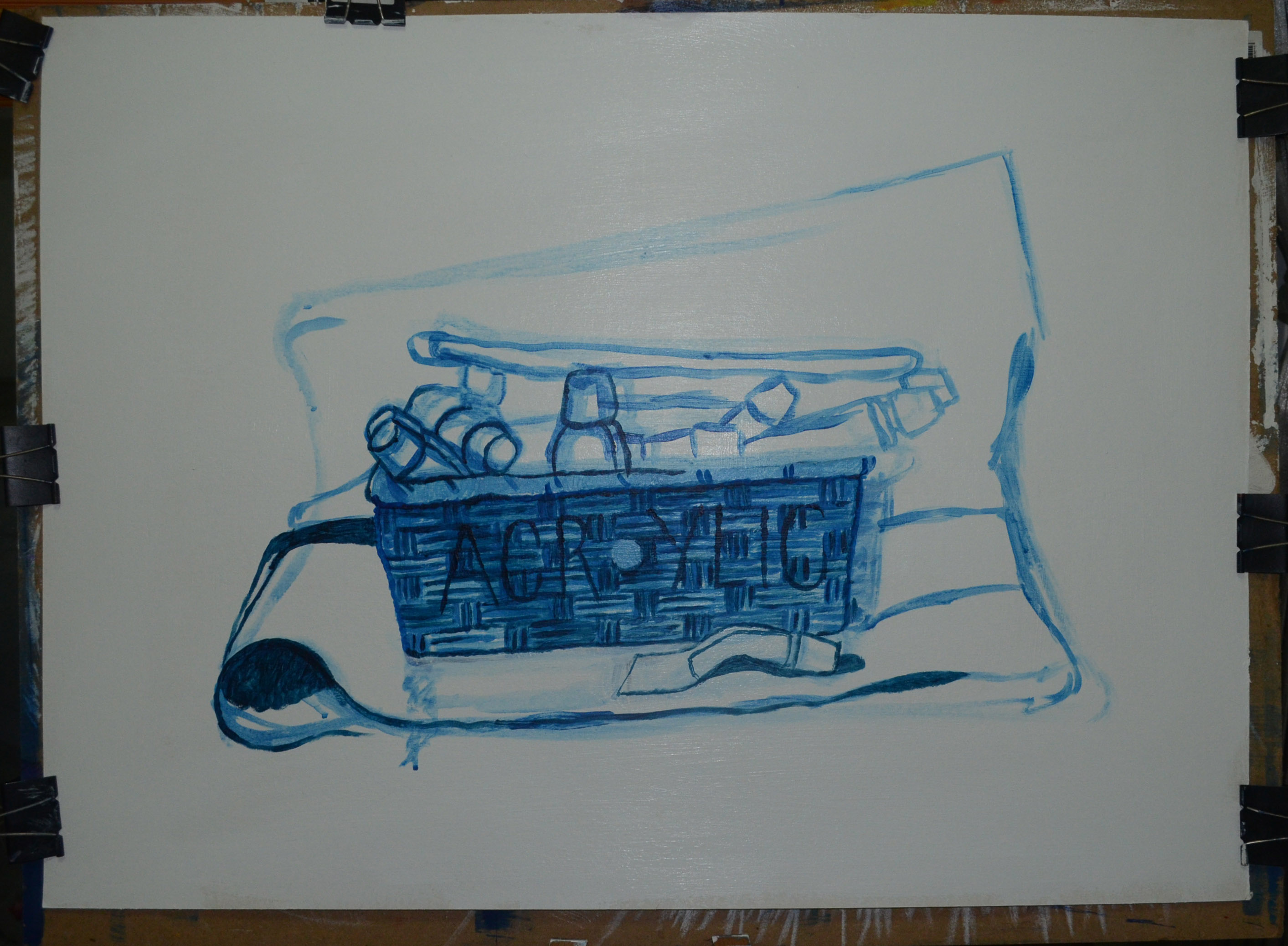
7 – Drawing in Paint
When it came to painting in acrylic there was no mineral blue but primary blue mixed with a certain amount of white had the same hue, so that wasn’t a problem. I began the painting by drawing the main shapes with a dilute mix of primary blue. There were plenty of errors and I would soon find that the position of the tubes of paint (and they were positioned, not just thrown in) made them unconvincing as tubes of paint so I had to think of how I would make their forms more visible.
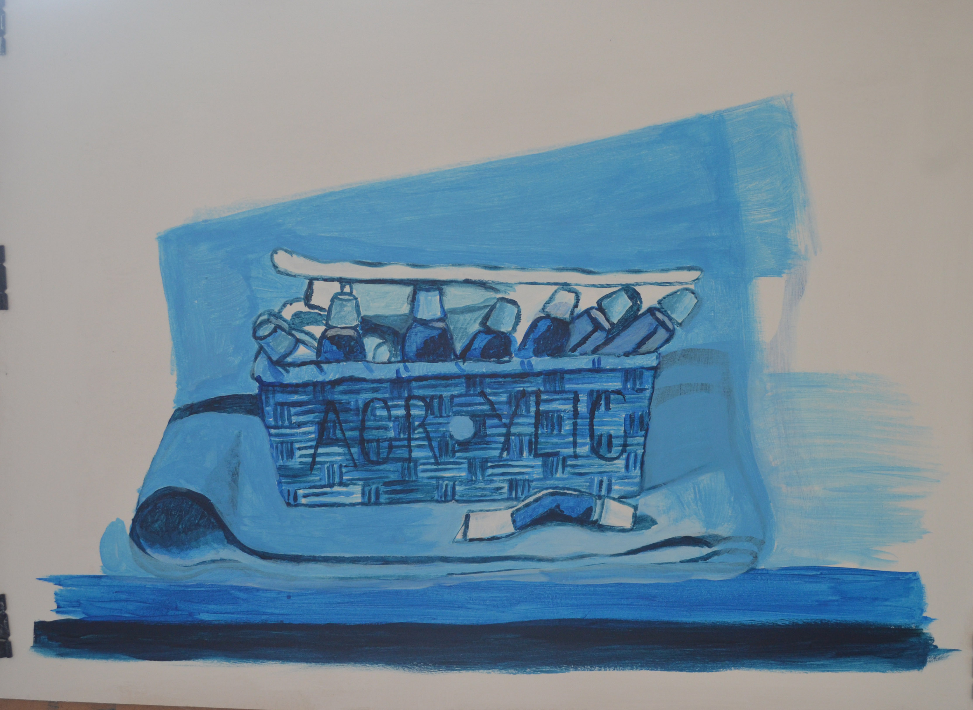
8 – Developing background and contents
On the second day I painted over the basket and this time repainted the basket with paint mixed with a medium gel, this helped to depict the texture of the woven basket. Then I began to experiment by painting duplicates of the upright bottle in the centre to see if it improved the look of the contents on the inside of the basket. It made it worse, this time the contents looked to organised, to artificial and too overcrowded.
I continued to work on the cloth, shelf and basket so I could see the whole picture this helped me to decide on how to tackle the contents of the basket.
Contrary to what my colour studies told me I used more primary blue than any other colour. I found that by using a neutral primary blue and white mix and then going over it with white on a try brush using a scrumbling technique gave me better tones than using different colour mixes, it also ensured that I could get the exact colour that I wanted from the blue and white. I could then use layers of primary or Prussian blue for the darker areas where needed such as on the folds of the cloth.
Working on the contents of the basket again I decided that it was best to paint just a few of the upright tubes with the others laying down in the background. I painted the darker shapes first with a mix of primary and Prussian blue and then then highlighted with lighter mixes using white this gave me the outlines.
I could now see that the painting was developing into something completely different to what I had planned and I really liked the way it was coming along. The paint tubes gave the painting an almost three dimensional cartoon feel, with soft but bold shapes and so I carried on with this continuing the same kind of technique with the cloth. I then added more light to the folds of the cloth to make the folds look bolder the result of which reminded me of the hills in Grant Wood’s paintings.

Still Life with Remote Control
I then painted in the tube of paint to the right and the remote control but then decided to paint it out. The reasons for me doing this were one that I could not get the perspective of the remote control right and two I saw no point painting the glue-stick and box on the other side so the best way to level out the still life was to remove everything other than the main subjects.
Finished Painting in Acrylic on Board
Lastly I worked on the shadows to the right of the subjects and for me this was the most difficult part. The reason for this was that in the painting I had exaggerated the light in order to give me bolder forms as well as to emphasize the mood of the painting. In the actual still life the shadows were quite short and fell just past the tube of paint to the right of the cloth but because I had ‘stretched’ the light to the right of the basket I wanted to stick this by making the shadows longer as I did with my final piece for Assignment 5 for Drawing 1 where I found that accentuating the shadows made the mood stronger.
I painted the shadows with a mix of primary blue and black applied in thin glazes with a flat brush and shaped the shadow on the back wall so that it would depict the light being blocked out by both the cloth and the basket in a continuous shape. I think I managed to pull it off but I don’t know if it will be convincing to viewers as it is to me.
Things I like about the finished painting
It’s different to anything I have done before. I have never made use of line in a painting or drawing before and I like the way it turned out. It didn’t turn out as I expected but I was experimenting throughout the assignment from initial studies to the final piece, not just with line but also with colour and form. I feel that I have managed to evoke the mood that I intended to and the white boarder adds to this.
Things that I am not sure about
I am still in two minds to whether I should crop the painting as maybe I zoomed out a bit two much. If i had zoomed in more and painted the basket bigger like in the original sketch I could have spent more time on the detail and the subjects would probably look a lot looser. I’m still not sure whether there is enough shadow on the painting.