
Some pigments have greater opacity than others without the addition of white and some can be laid on thickly to cover layers underneath, but white is essential for building body colour and is the vital ingredient for most opaque painting techniques. In this exercise, you’ll paint graded tones by mixing in white. Look carefully at your tonal mixes and put some white on your palette or saucer. Choose at least three of the washes you’ve painted (including the single colour ones) and attempt to recreate exactly the same colour, shade and tone of each of these in turn. This time, though, you’ll be mixing colours by adding in white, making the paints opaque.
Over-painting with acrylic works well because it dries so quickly. However, subtle, smooth colour blending is harder to achieve and that is the aim of this exercise. You’ll have to work fast at blending the graded tones of each colour by adding more white progressively or you could go from light to dark. Acrylic paints tend to dry darker than when they are applied so this exercise will help you to see how they behave. If you’re working with oil paints, you should be able to blend the colours with ease.
One way to blend colours is to lay out broad bands of colours to be mixed and gradually feather the tones across each other so that they blend smoothly and evenly. When you’ve completed this exercise, compare the effects of the transparent colour mixes (from previous exercises) and the opaque ones. Think about ways in which both methods could work together. Make notes in your learning log.
Due to the fact that I live in a one-bedroom apartment and will be doing most of this course using acrylics I decided to go with acrylics for now, but I am hoping I can get to use some oil paint in the same way later on in this course.
My first attempt was pretty good although my first band of blending went totally to pot as I grabbed a Titanium buff by accident in a hurry going home from work, I am not sure what a buff is for, I will look into later but I will make a wild guess at toning down bright colours…
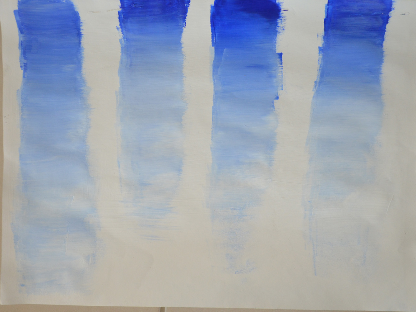
In this first attempt which was on one of only two of the only 300 gsm sheets of watercolour paper I had left I attempted to was intending to recreate the tones of the first single colour blend, ultramarine.
I couldn’t really see much difference between the transparent wash in the Tonally Graded wash Exercise, except maybe the transparent washes were probably smoother. However, the colours in this exercise were probably more vibrant.

1stTry with Wrong White
The next attempt was on a thinner sheet of watercolour paper on the back of one of the existing washes treated with Gesso but still the bands of colour blends were a success. This time even better than the first go. I have had previous experience at this on one of my own paintings from years ago where the ultramarine towards the top of the sky was very dark as though it was almost touching space, but the colour wasn’t blended as well as these. With the white space between the bands I can imagine the trail of fighter jets against the blue sky.
2nd Attempt Getting Better – Warped Paper due to Gesso on Thin Paper
I felt that I had got where I needed to be as far as blending the ultramarine so my next attempt was to try and recreate the Violet wash, again the colours were more intense than in the Tonally Graded Washes exercise but not as smooth. Next to the blue bands the Violet seems alot more opaque. I used the other side of the same brush so there is a hint of Ultramarine at the top of the colour bands, this actually looks quite good.
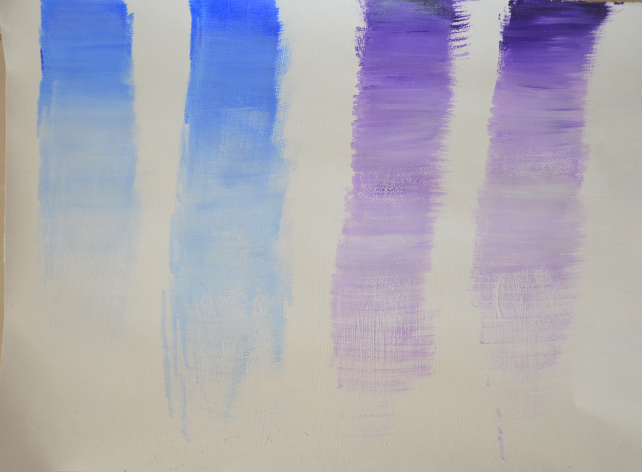
3rd Attempt with Ultramarine and Violet
From there I worked length-ways across the paper to blend the two colours together althought the ends are quite messy the blend of colour which I achieved by feathering one colour over the other is not too bad, I can work at this but I feel that the Overlaying Washes were a lot smoother and easier to achieve as to blending these two opaque colours.
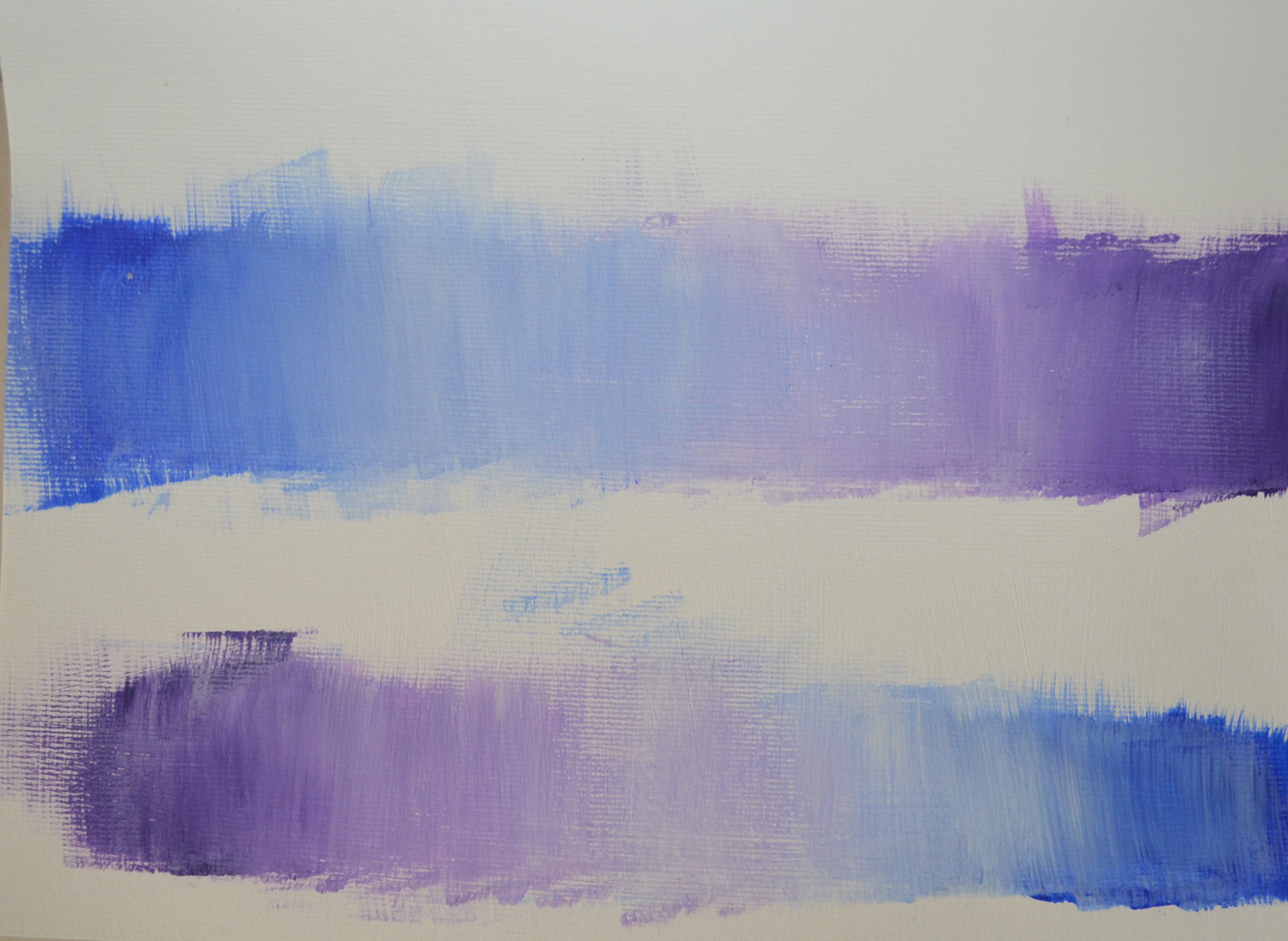
4th Attempt Blending Ultramarine into Violet
Thesecond attempt working down the paper in landscape was a lot better maybe because the paint at less time to try, it was 30+ degrees heat here and the acrylic was drying quickly.
From there I loaded my palette up with lots of ultramarine an attempted to recreate the spherical wash of the base of the Vase in the Painting Monochrome Vessel Assemblage by Brian Irving Shown in the Coursework.
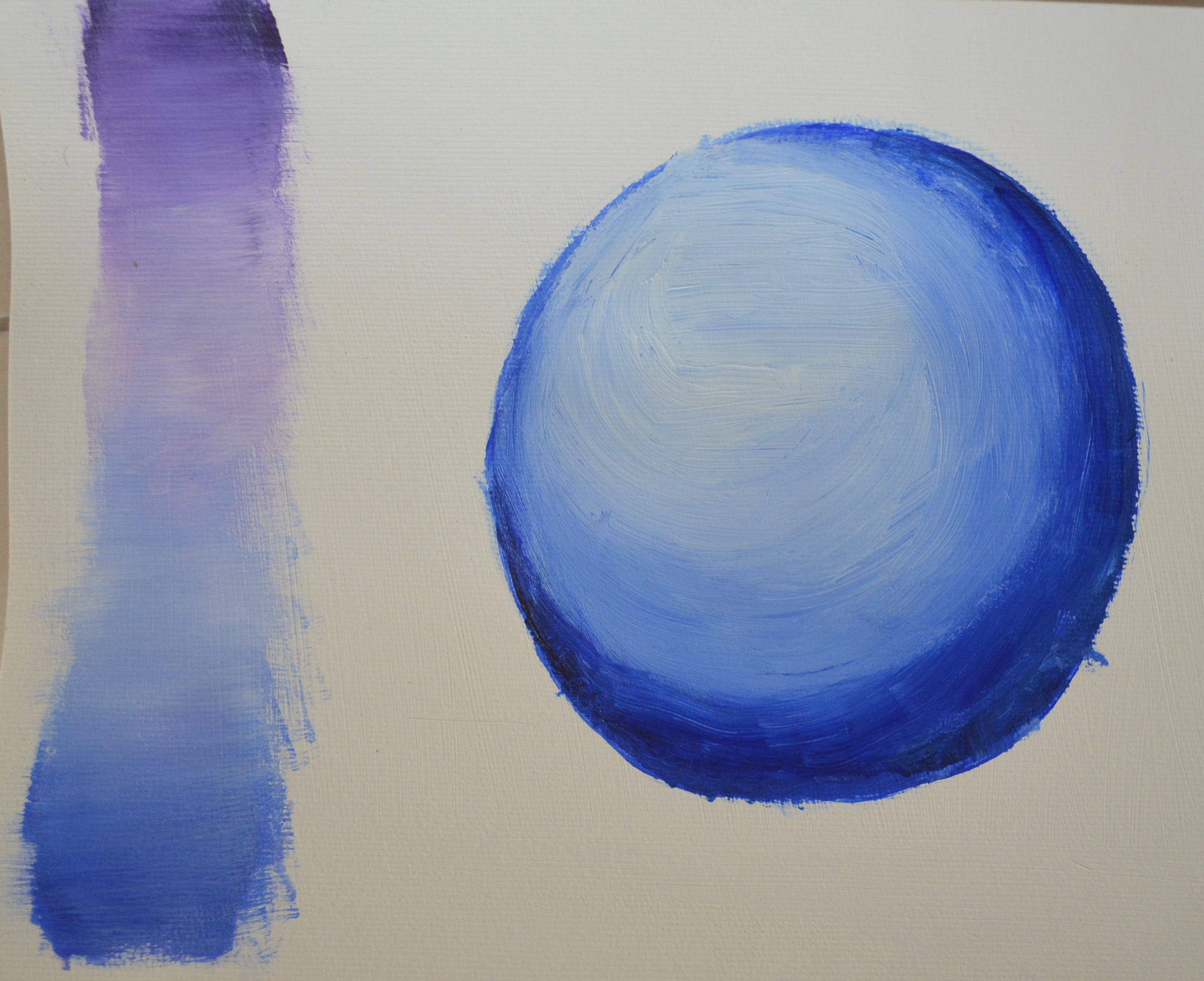
5th Try with Spherical Blend
After researching Mark Rothko I really wanted to try painting something in the style of but I realised that I would have to make two very dilute mixes of colour to cover the quite large sheets of acrylic paper that I had at hand and so keeping to opaque colour mixing I attempted to blend as many different colours together as possible, I then separated the colour bands with Payne’s Gray to see what emotions I could evoke with this against the bright colous.

6 – Blending Different Colours
