
I began this exercise with my watercolour field set, XL sketchbook and a medium sized tank watercolour brush (if that’s what you call them). I have used this brush for sketching quite a while now and I am really comfortable with it.
For the first few studies I sat down with my model as I messed up a lot in the drawing 1 course due to being sat on a high chair which made her head look bigger in the drawings.

1 – Watercolour with Backround

1 – Watercolour with Background Notes
Drawing the background of the above study wasn’t planned, it just happened. Once I had drawn the figure I decided to add some shadow and then with not wanting to waste paper I took the chance to draw the background which worked out quite well as it contained everything that I had been painting so far in this course,
The drawing of the figure itself was not brilliant, the light came from different light sources such as a lamp, the kitchen and the bathroom so I found it quite difficult to depict the shadows using line. The figure is in proportion but the eye does get lost in a confusion of lines in the legs and arms. The face bares no resemblance, although it does look Asian.
I started to experiment with drips here but soon stopped it was a nice clean drawing and it was a shape to ruin it.

2 – Second Watercolour Sketch

2 – Second Watercolour Sketch Notes
For the second watercolour study I sat at the front of the model with her in another comfortable position, one leg behind her with the other in front and her right hand gripping her ankle. As with the first study I painted the lines with a lighter colour first and then went over the outline with black. This time I only painted in simple shadows rather than a complex background. The body is in proportion but I was unable to depict the foreshortening on her right arm especially from her elbow to her hand which looks straight and therefor to short.
3 – Third Watercolour Sketch
3 – Third Watercolour Sketch Notes
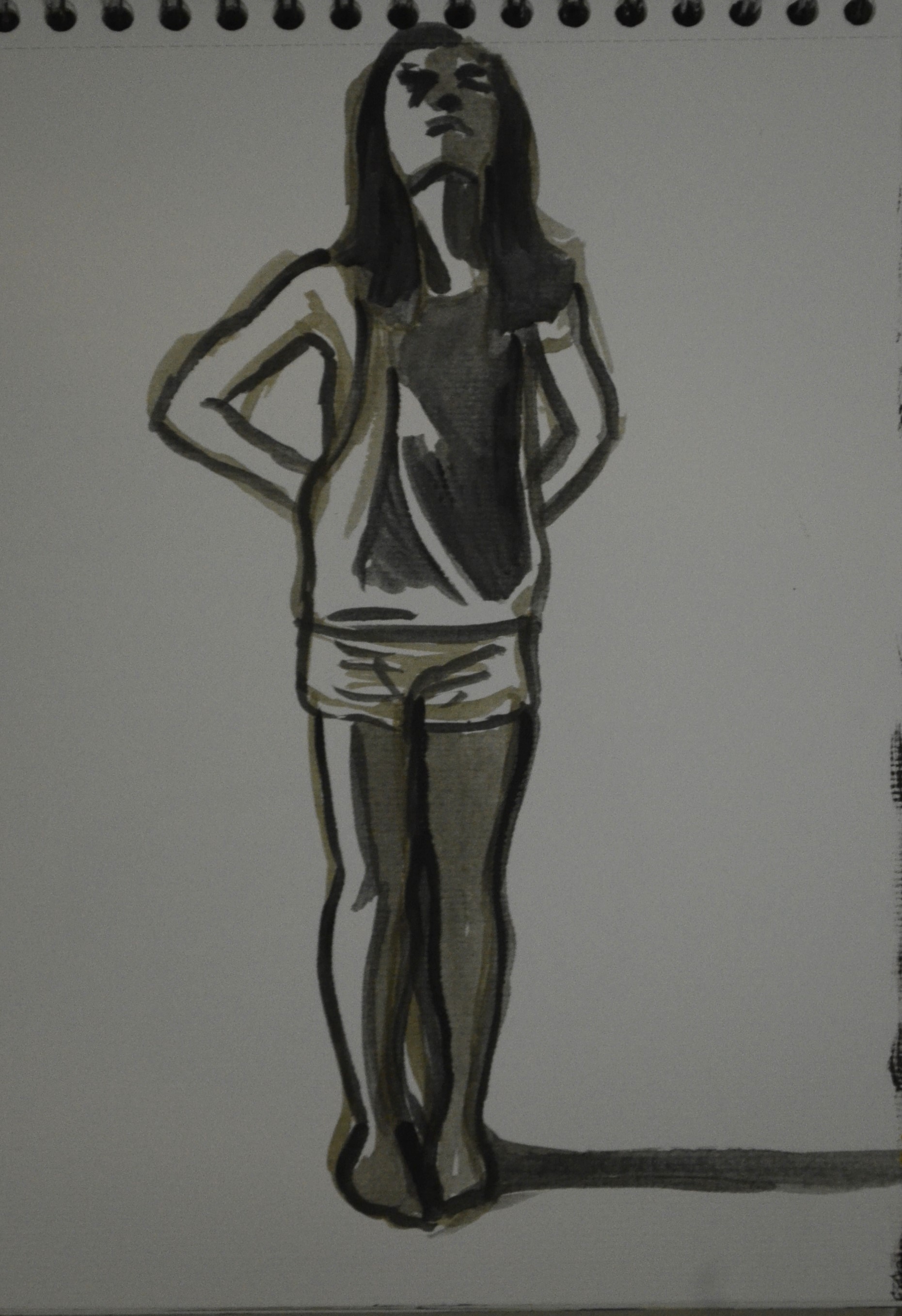
The third sketch was my favourite, it was a standing pose and I sat on a low chair to draw her so she was taller than me so as not to depict her as a midget (she is only five foot). The piece gave man idea to maybe do a piece with several poses my the same model on a long support wearing these simple clothes that made her look quite cute and I think I managed to capture that in this drawing with her knees and feet together. At this stage I planned to do a larger painting from this in acrylic but I don’t have a great track record of enlarging smaller studies freehand.

4 – Fourth Watercolour Sketch

6 – Sixth Watercolour Sketch

5 – Fifth atercolour Sketch
The next three went brilliant especially the fourth which made her look like a witch the body on all three however were in proportion and I even coped alright with the foreshortening on the reclining poses, something that I do manage to have a problem with most of the time when drawing from life.
One thing that I am happy with is that in all the watercolour studies so far I have managed to get the models legs looking quite nice and in linear figure studies from what i can see so far, that really helps.

7 – Experimenting with Lino Ballpoint
9 – Linear Study in Ballpoint

8 – More Ballpoint Sketches
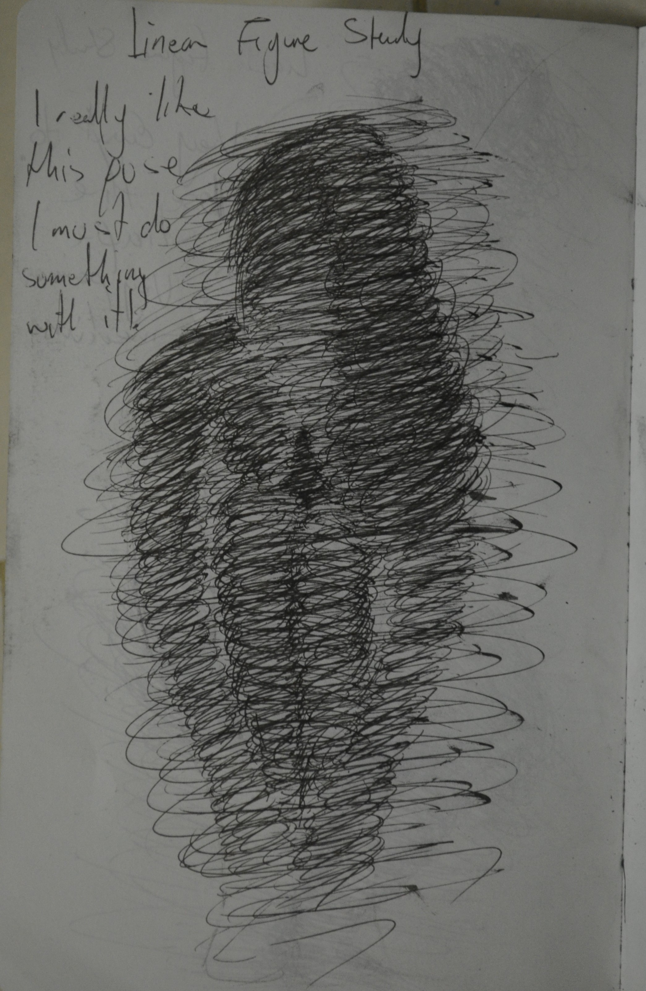
From there I decided to experiment with line in a completely different way with ballpoint inspired by an earlier sketch that I did in the style of Alberto Giacometti In these 4 drawings I decided to build up the three dimensional form of the figure by using a spiraling/squirkling technique.
The first drawing was fine but was too tight for my liking so I worked on another three, none to perfection although I can see that with a bit of practise this would be a really effective technique but could it be used with a painting medium?

9 – Linear Study in Ballpoint
I wanted to find out if I could recreate the earlier standing pose on a larger scale and still keep the feminine qualities that I depicted in the watercolour skretch. I began by painting a piece of card with a semi-opaque wash of light blue then once it was dry used a more opaque mix of the same blue to draw the outline before painting over it again with black then I depicted the light and shade with Mouse Grey and Burnt Umber. The result wasn’t brilliant as I messed up on the face and there was more length in the body but it wasn’t that bad either.
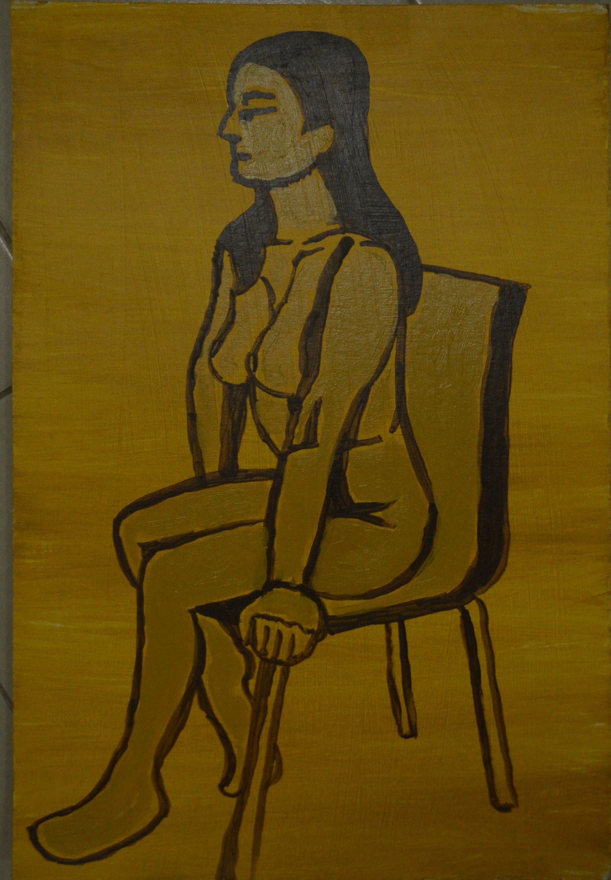
11 – Acrylic Linear Study – Messing Up
This next study was painted on a semi-opaque wash of Yellow Ochre. I thought it would be a really simple pose but when I came to paint the outline, this time in Burnt Umber I messed up really badly. I thought I would be able to correct it by painting over the messed up lines with the same colour as the base coat but messed up even more as the top layer was opaque. I probably shouldn’t have stopped there but by this time I was totally put off this pose but I will try it again in the next exercise, Tonal study.
The final piece for this exercise was a linear study painted from the watercolour drawing in the previous exercise Drawing the Human Figure. I used the Mouse Grey again to paint the outline onto a semi-opaque wash of Burnt Umber which gave the board a wood grain look. I wasn’t sure what I was going to do next but then imagined a darker line over the top of the light grey and so went with that. The result was that the painting had an almost tiger feel to it, I included some shadow but it looks like she has peed herself.

13 – Going over LInes in a Darker Paint

12 – Axcrylic Linear Study on Transparent Wash
