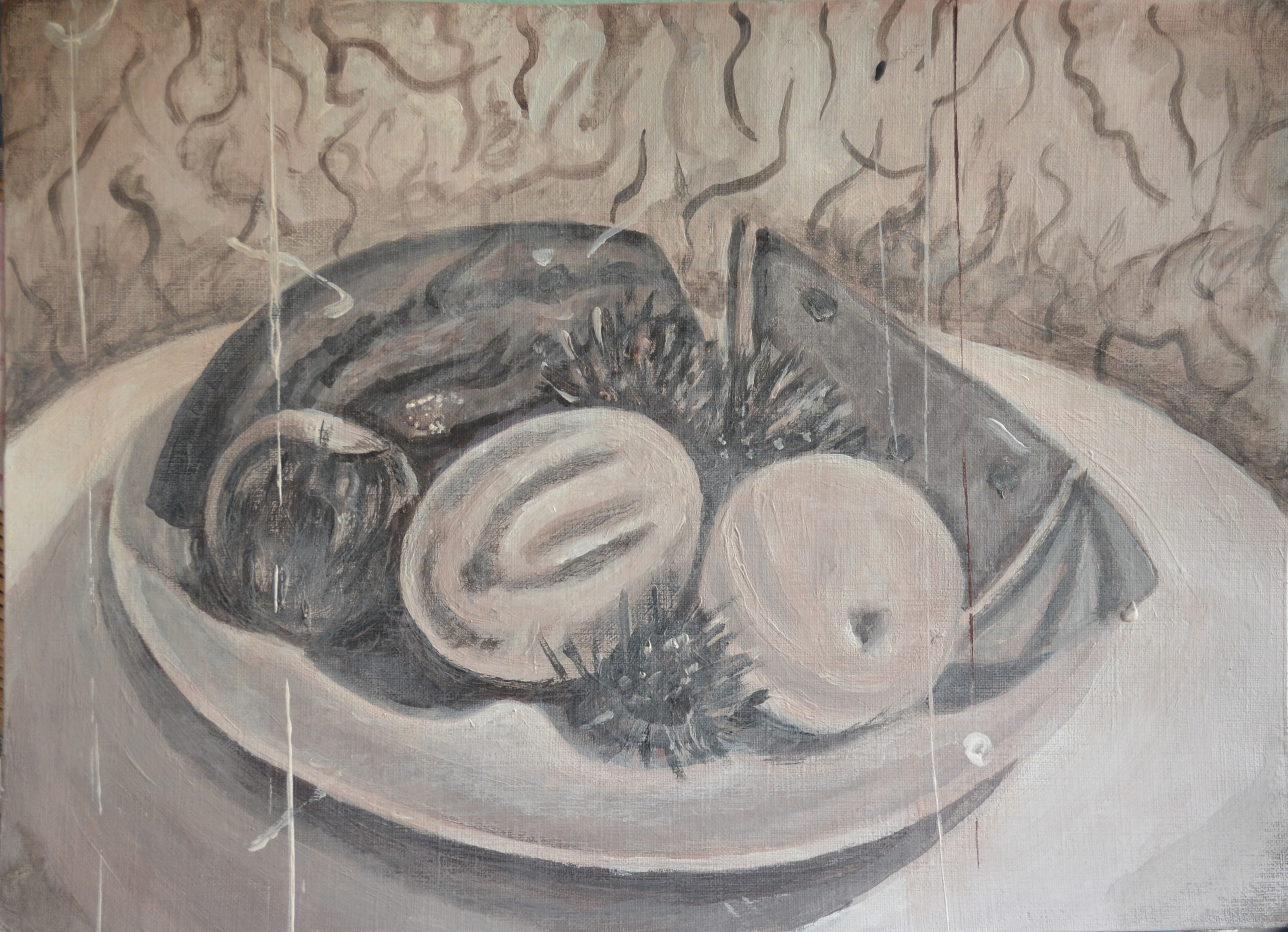
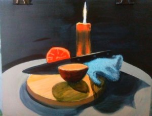
Finished Piece with brown tinted Background
The Subject
It wasn’t difficult to think of a subject to paint for this assignment, I really enjoyed painting on the dark ground for the last tonal study and I managed to pull the chiaroscuro effects off quite well, I really needed to see if I could do it again with different subjects. Maybe in the style of Caravaggio.

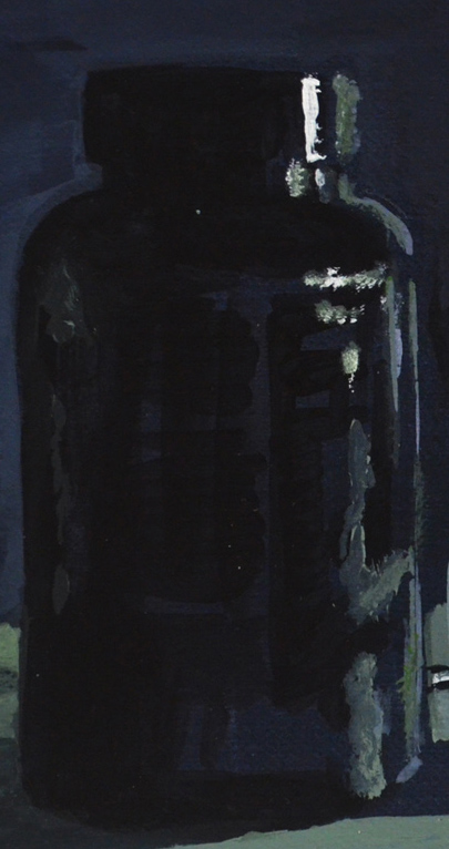
Tonal Study on a dark ground
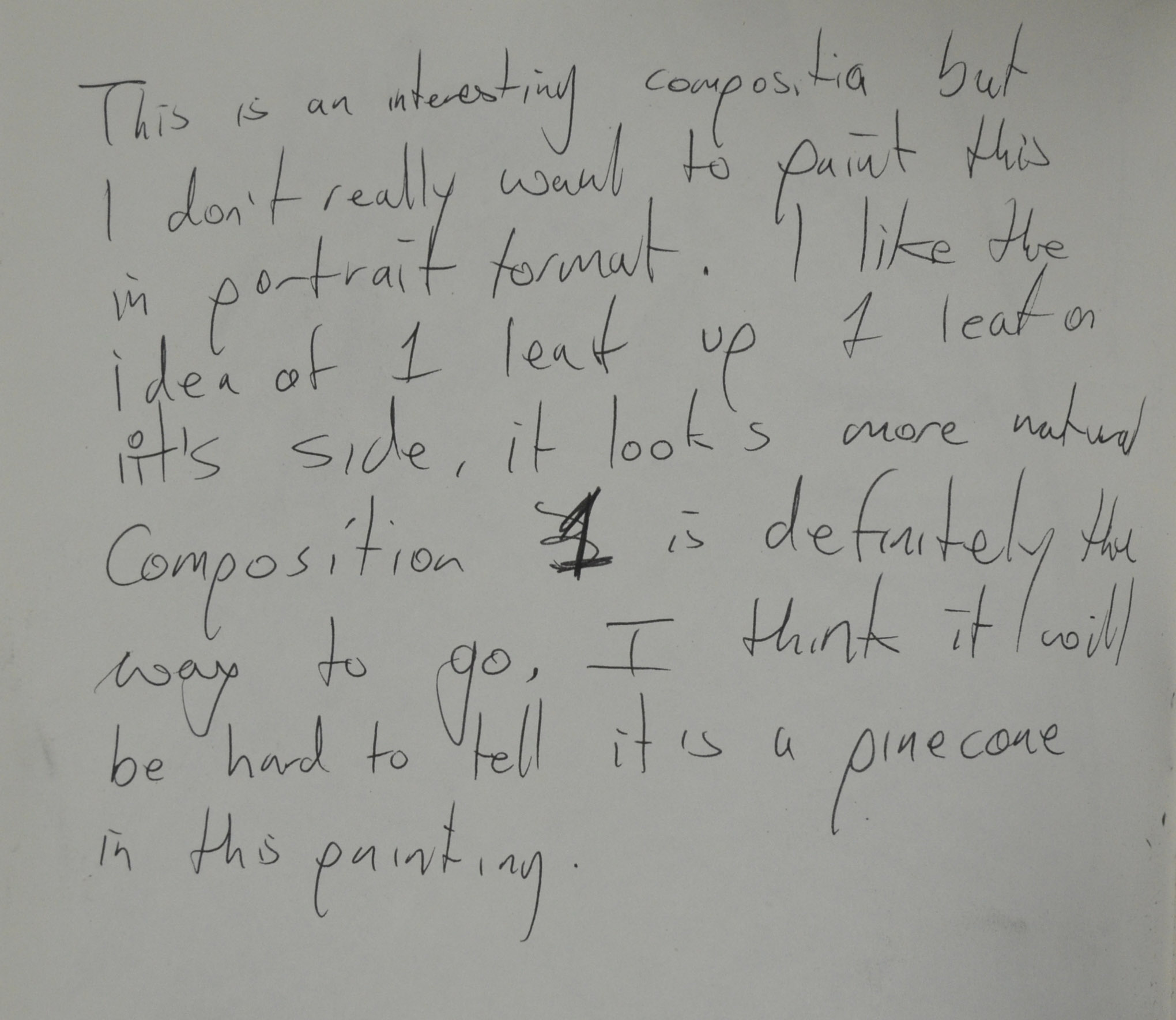
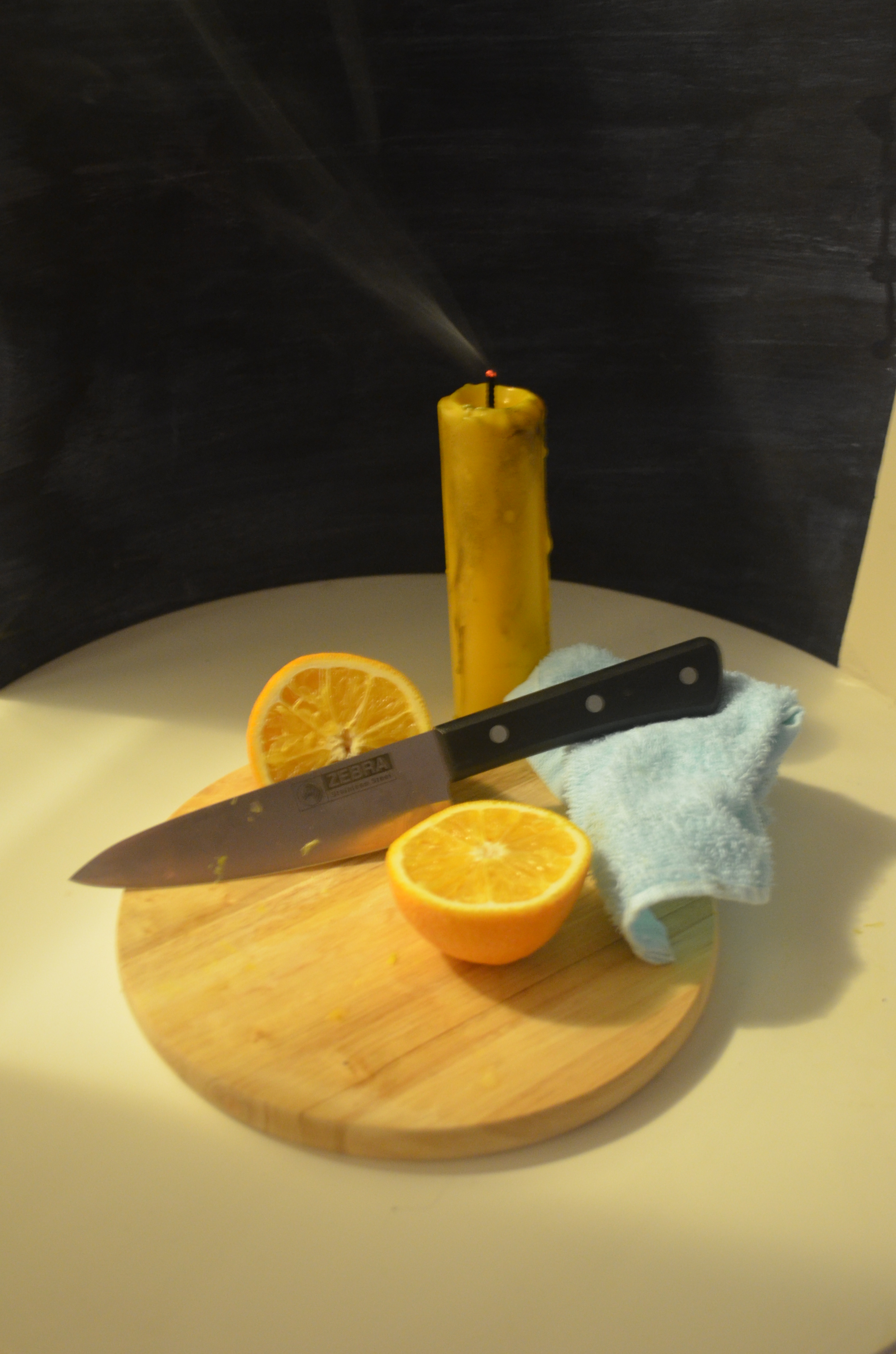
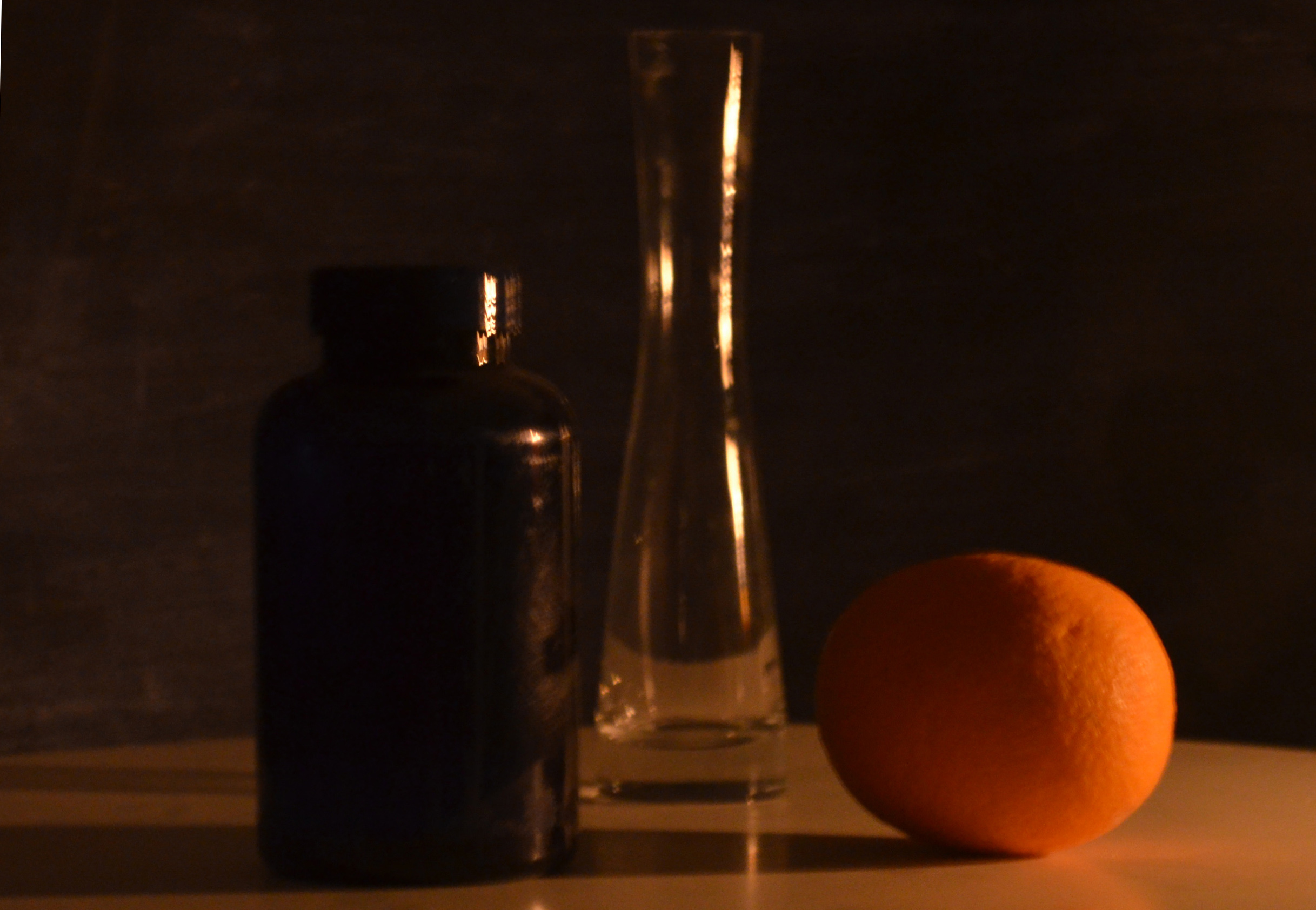
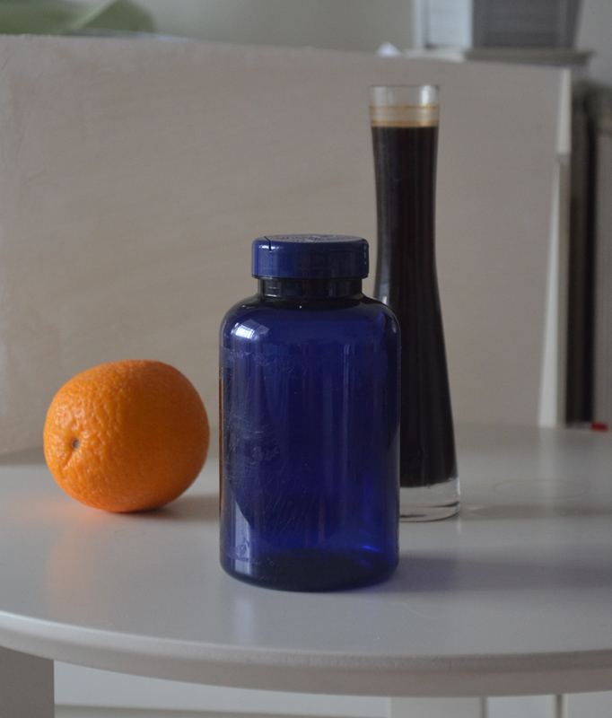
While working through the drawing 1 course, one or more students had drawn still life’s that included a chopping board and a knife, this gave me a great idea, I had used an orange in the last two tonal studies, Tonal study on a white ground and Tonal study on a dark ground so why not finish this part of the course with a still life of that orange been sliced in half on a cutting board. It would not just be the last in a series of paintings but it would be symbolic of the end of part 1.

chosen subjects
I also wanted to include the candle that I had used to light the second tonal study in my assignment piece so I was only lacking two subjects a large knife and a chopping board, I tried getting a natural chopping board, I usually see people selling them on the streets but when it came to buying 1 they were no where insight so a machined board and carving knife from Tesco had to do. Because i wanted to use as much as the dark ground as i possibly could I chose a black handled knife with three rivets.
After cutting the candle in half to bring it lower to the other objects, it was apparent that I needed an extra object, a small towel, to prop up the knife.
Preliminary Studies
Materials used:
- Canson A4 sketchbook
- Derwent Charcoal Pencil
- Compressed Charcoal
- Graphite stick
- Putty rubber

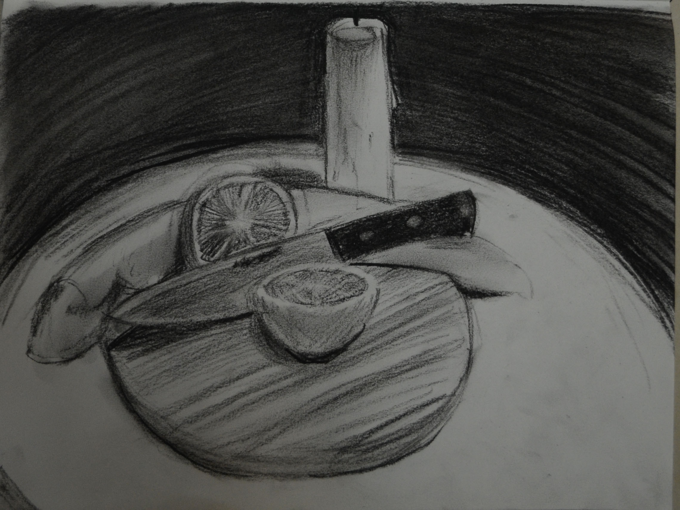
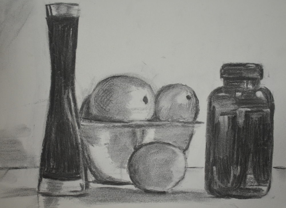
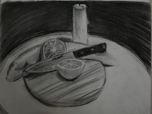
First study in Charcoal pencil
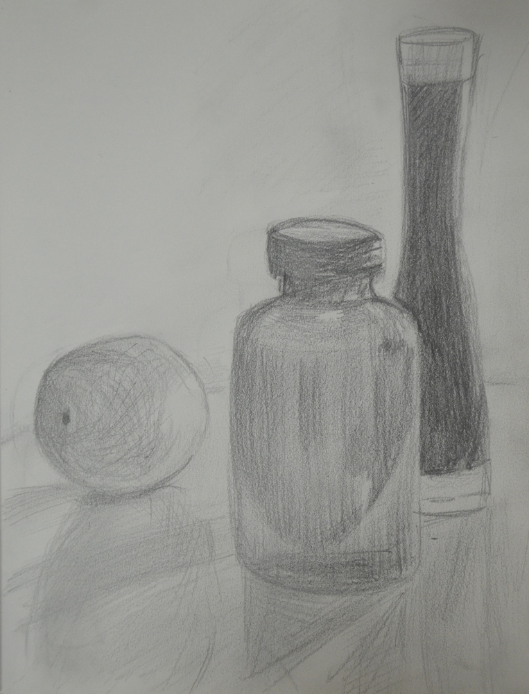
The first study I did was of all the objects together but with the orange in 1 piece, I did the first studies with the light on and candle unlit but took notes of how the composition looked in electric light and daylight. It was pretty hard to choose as both lighting looked good and the compositions looked great from all angles.
The tonal studies helped me to group the objects and specific parts of the objects into groups that shared the same colour properties and tonal properties e.g. the orange, the cutting board and the candle shared similar tones and colour, the handle and the background and the towel, blade and rivets; in candlelight the groups changed.

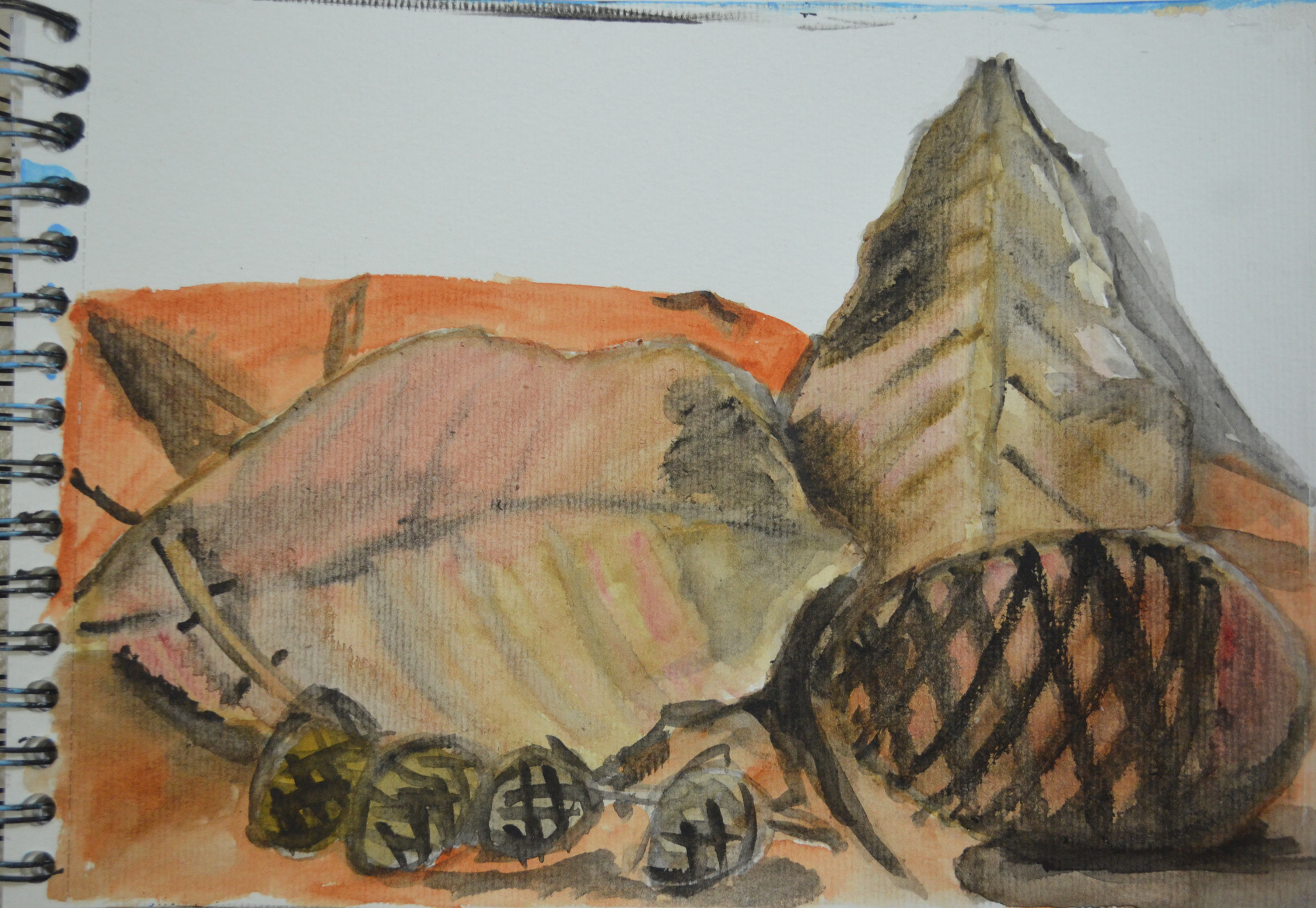
2nd charcoal pencil sketch notes
2nd charcoal pencil sketch
After the first study I decided to go ahead, be brave and cut the orange, the composition then went from a simple composition with 4 objects to a more technical composition with five. It also created more groups with the light off the candle and orange on its side sharing similar colour and tonal properties and the board and other half of the orange having similar properties.
In the third study I decided to omit the towel but there wasn’t enough contrast in the composition for my liking plus i didn’t know if the knife would stay up for long. The blue towel was a nice contrast between the yellows, orange and beige and other natural tones of the cutting board.
3rd Study – Notes

3rd Study in graphite stick and charcoal pencil
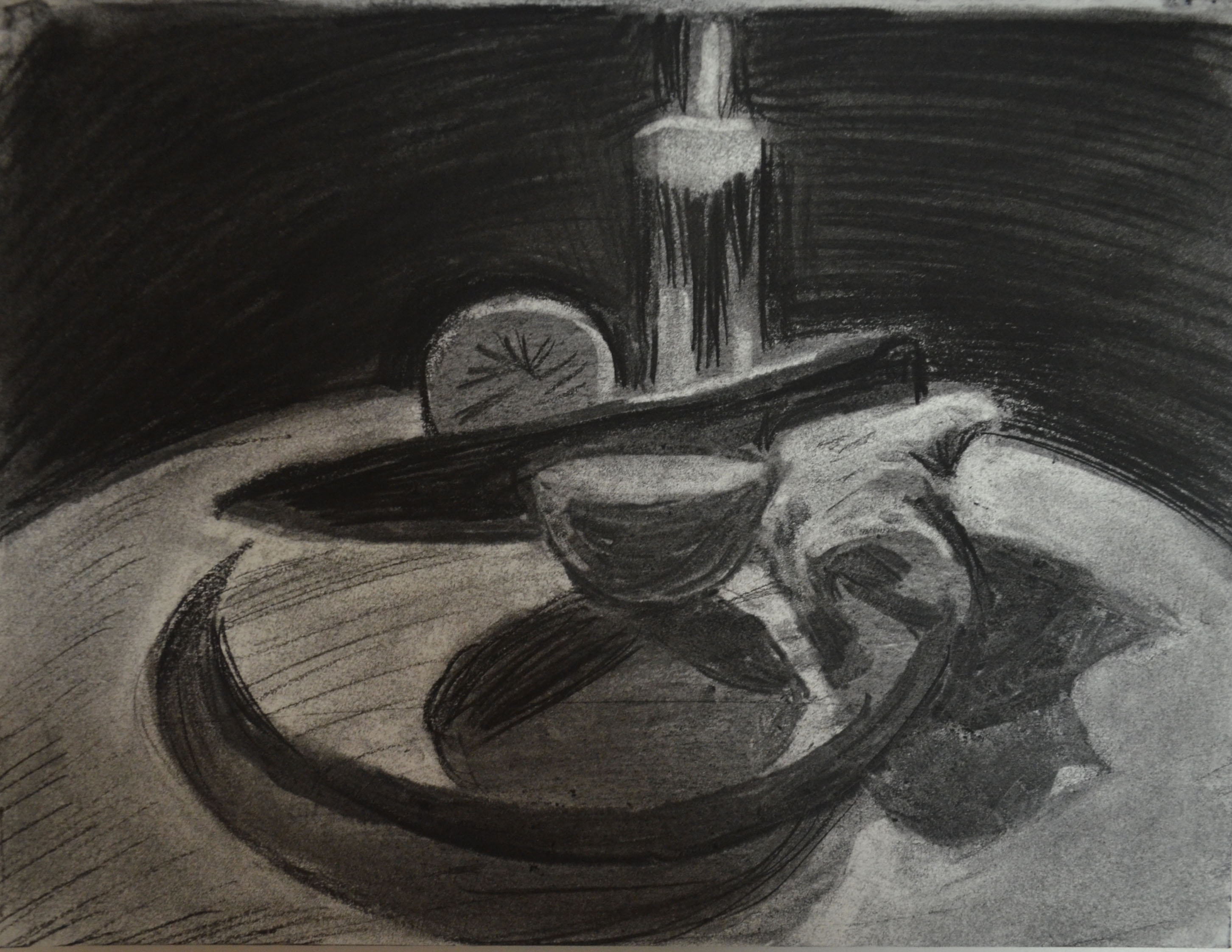
After making three studies with the light on I decided to try something different, as I would be painting this most likely with the light on to try and to further experimentation with chiaroscuro which was what I had initially intended to do I would make the next sketch in candlelight. This gave me an idea to make the next drawing using an entirely different technique. Lifting off the charcoal rather than drawing with it.

4th Study Charcoal lift off

4th Study – notes
This time I drew from a different angle with my head closer to the level of the table, this added to a more dramatic effect and the knife rather than reflecting the orange and light like I had tried for in the first few sketches was completely dark with only a slight tonal difference between the handle and the blade; this meant that I could use more of the dark ground and could ‘model light’ defining the knife with a few simple details and highlights, this appealed to me. The shadow cast by the orange in front of the knife was also very appealing it meant that I could create a good sense of depth in the painting. I just wasn’t sure how well I would be able to paint the candle, flame and the light the glow around it.
Colour study
Materials used:
- Canson watercolour paper painted with a dark wash
- Oil pastels

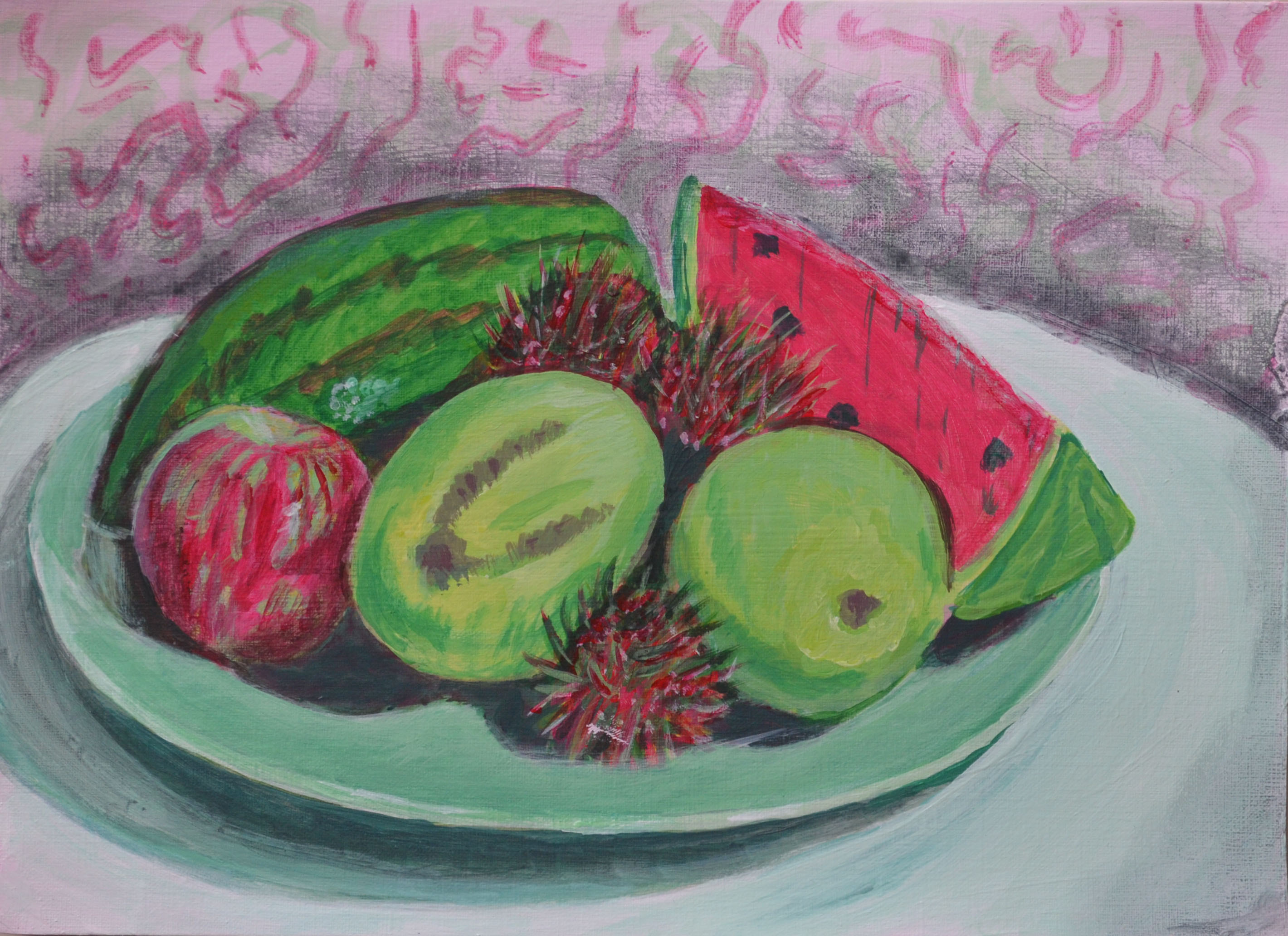
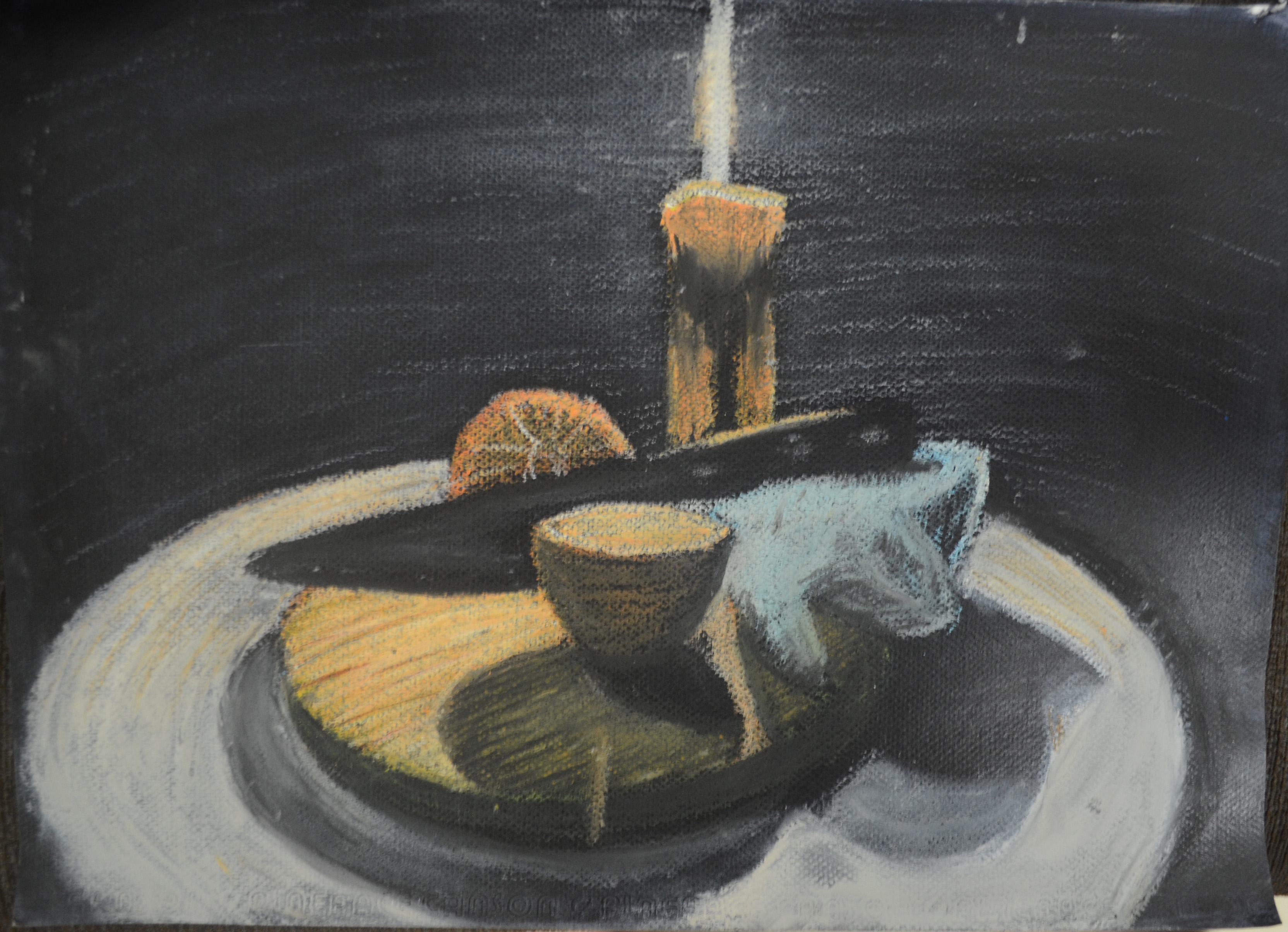
5 Colour Study in Oil Pastel
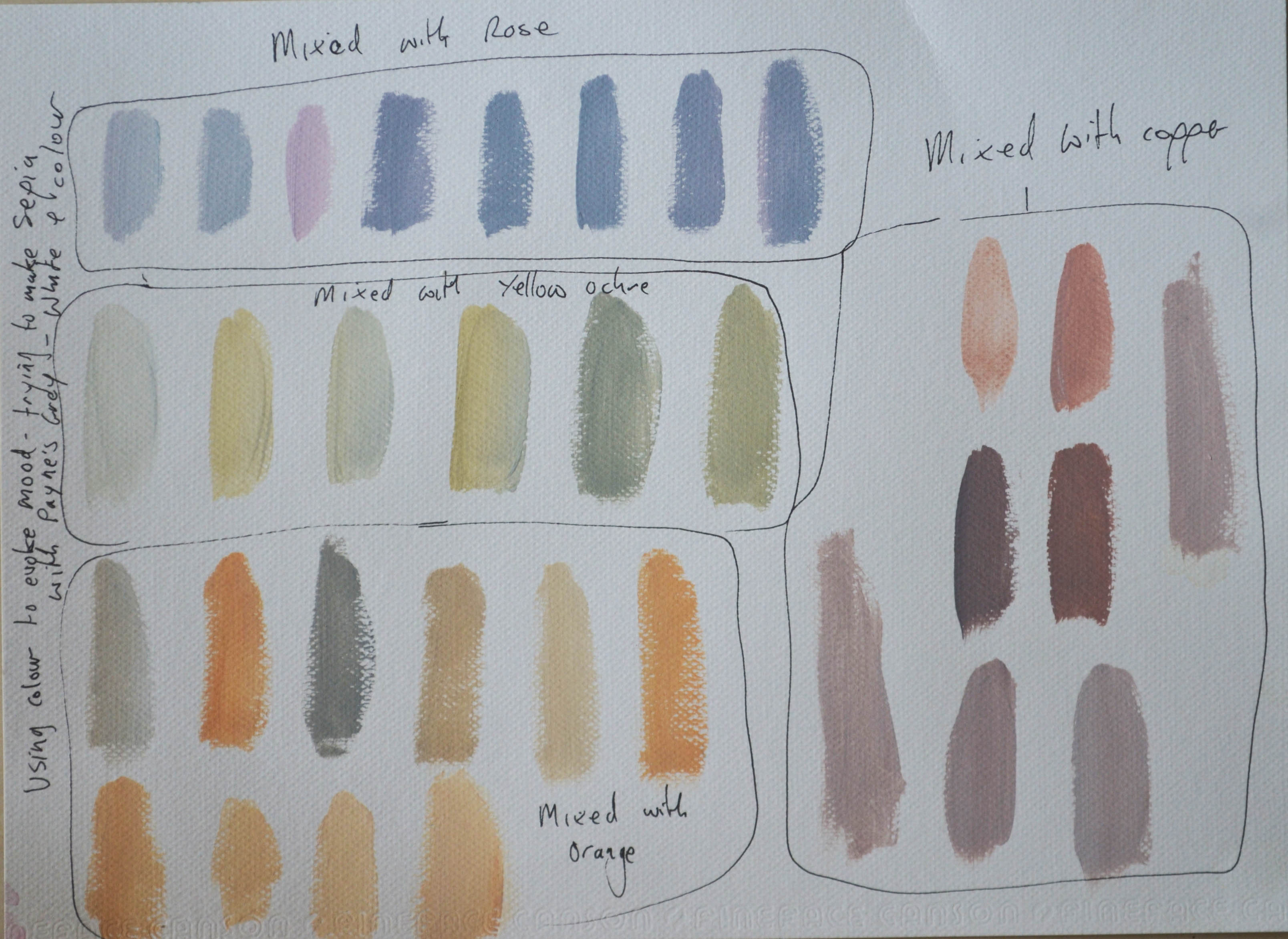
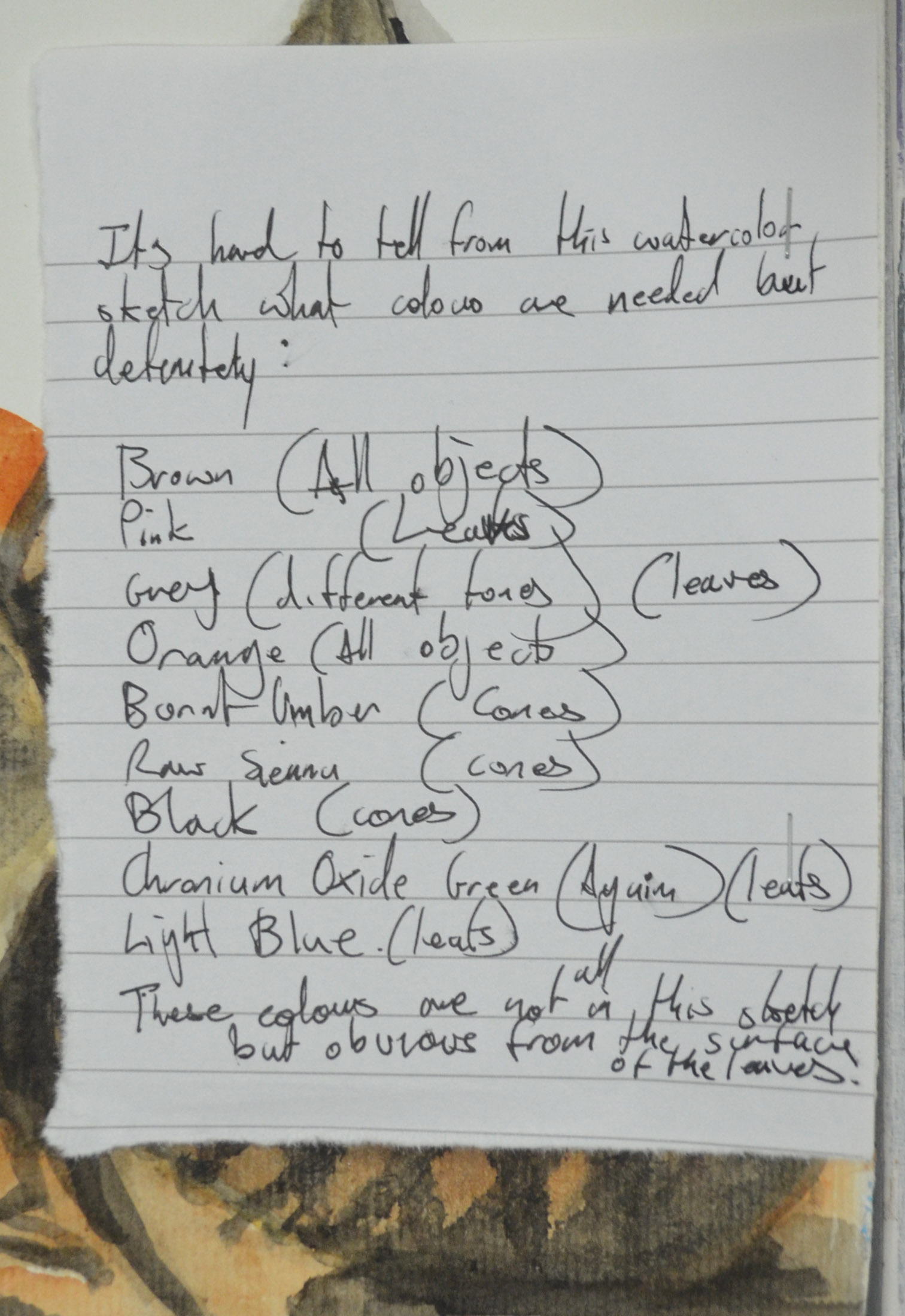
At this stage it was a toss up between the mediums I felt comfortable with for the finished assignment piece, either acrylic or oil pastel and so decided to a colour study in oil pastel on an A3 sheet of watercolour paper prepared with an imprimatura of Payne’s grey. The colour study helped me to determine which colours I would use for the final drawing, these were:
- titanium white
- payne’s grey
- light blue
- cadmium orange
- pearl orange
- chromium green
- yellow ochre
- lemon yellow
- burnt umber
Finished Piece
materials used:
- Canson A2 Acrylic paper 15 x 18 inch
- Acrylic paint (colours as above)
- Paint brushes – medium wide, filbert (2 sizes), round pointed (2 sizes), angular flat
Drawing shapes on dark background with white conte
After preparing the acrylic paper with a dark ground (Payne’s grey I drew in the shapes with a white conte stick using my paint brush to help as a measuring tool. The shapes weren’t precise but that wasn’t too important at this stage just as long as I had something to work from. As it turned out the shapes were well out and did need a lot of editing while I was painting.
From there I painted the highlights on the top of the knife so that I knew it was at the correct angle and painted in the candle and both halves of the orange in cadmium orange (highlights in yellow), I could have done this differently. The best way would have been to model light by building the colour gradually on top of the dark ground rather than blocking in the shapes then painting the shadows over the colour like I did.
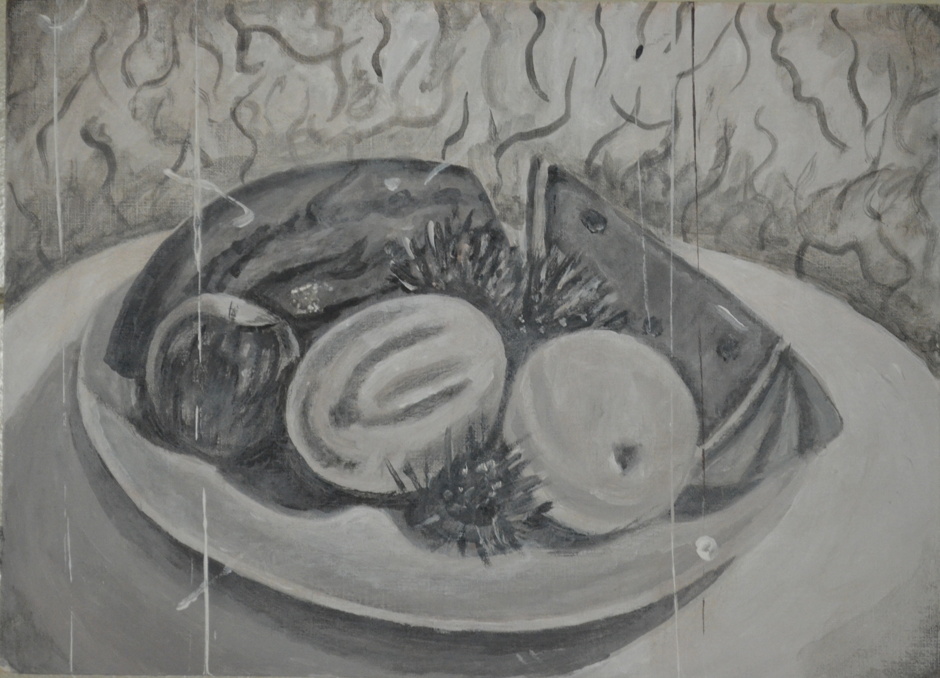
Half way point
From there I painted the chopping block with the same cadmium orange but used a lot more white and the darker parts in yellow ochre. The towel was painted in different mixes of light blue, Payne’s grey and white using a stippling effect with a small flat brush to create texture. Shadows on the board and orange were painted in a mix of Payne’s grey and chromium green in thin glazes. while the shadows on the table were painted in thin glazes of white and payne’s grey over the top of the dark ground.
It got interesting round about the half way point with objects painted but still very rough and very bright I had to think about the techniques and colours that I would use to tone down the painting as well as give the painting a dramatic feel as seen in Caravaggio’s paintings. It was here that I stopped looking at the still life composition and any photos I had taken just glimpsing from time to time, as painting as I saw it had negative effects, when I came to take a photo the colours were to bright or didn’t look right so I started to paint how I felt it should look. Burnt umber, Payne’s grey, pearl orange, yellow ochre and white became the key players.

Finished Piece for assignment 1 – Before Burnt Umber background wash
Very thin washes of Payne’s grey helped me to tone down the orange of the candle and upright orange slice while yellow and white followed by a very thin glaze of the grey were used to make the orange pointing upwards look more like an orange. I used a scrumbling technique with very thin seperate layers of white, pearl orange and burnt umber to make the blue of the towel more subtle.
The board was probably the most challenging it was just too bright and I knew that it was the board that would make the painting if the board looked bad the rest of the picture would too. The brief said not to get wrapped up in any one object and too look at the painting as a whole but the board was a major part of the painting and so it needed to be right. I added thin layers of burnt umber over the orange mix and then used thicker layers to paint in the grain. I painted over the shadow with a layer close to the original orange/white mix, then a layer of green followed by washes of burnt umber and Payne’s grey. This was a vast improvement.
While sat here writing this entry and thinking that the painting is finished I have started looking at the photos I have been posting to this log again and realising something is not quite right. I have stayed as close to the original tone of the background as possible. The dark painted paper that I used for a background reflected light from the candle and that’s what I have tried to show here and I think that’s where I’ve gone wrong. Rather than depicting any background at all I should be depicting an absence of one to allow the viewer to make up their own mind to where the painting is set, whether it’s in a small room, large room or even a cave.

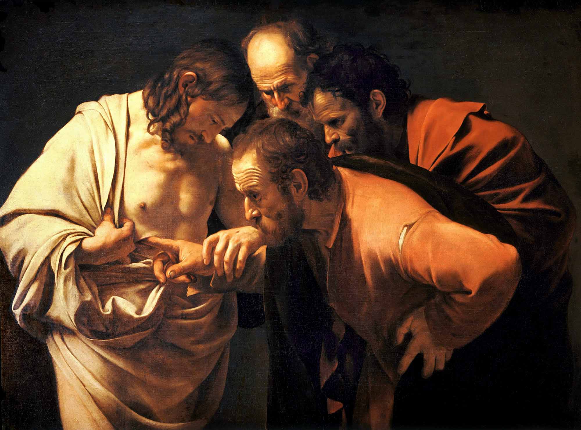
Caravaggio – Doubting Thomas
Caravaggio seems to use a brown tint in his background which allows the viewer to do this and so I have painted over the Payne’s grey background with a glaze of burnt umber and payne’s grey leaving the original colour around the candle to hopefully make it look like it is emitting light. Feedback from my tutor will hopefully let me know if I have been successful or not.
Things I am pleased with:
Method and technique
- I managed to use most of the techniques I have learnt from starting the course plus a bunch of techniques from the drawing 1 course.
- I didn’t rely on my eyes as I have done with most other exercises and assignments instead I went with how I felt it should look. Maybe this is the start of me developing a personal voice.
- I particularly liked the way an oil pastel study gave me a good insight into which colours I would be using for acrylics. I didn’t question this and I’m glad because it worked.
- Using washes and glazes in the painting was very interesting, years ago i would have repainted the subject if it was too bright, understanding how to use glazes has given me a push in the right direction.
The final piece:
- I am very happy with the overall painting especially at this stage, it does have which I hoped it would a dramatic feel to it, even if it’s just a knife cutting an orange.
- I feel that the painting does show influences of the artists I researched for the Chiaroscuro particularly Caravaggio.
- There are parts of the painting that I do feel exemplify the chiaroscuro technique really well particularly the knife handle resting on the blue towel. This is probably the best part of the picture.
- The shadows particularly from the orange help to create a nice depth to the painting.
- The texture of the hand towel could not be improved on to me this is perfect.
- The brown tinted background – This really finishes the painting nicely. I may have been able to improve on the glow around the flame but I didn’t want it to strong but for now the tint of burnt umber helps to create a halo around the grey.
Things I am not happy with:
Method and Technique
- For the life in me I couldn’t get the wax under the flame of the candle like it did.
The final piece
- I couldn’t get the wax under the flame to glow like it did this would have probably really improved the look of the painting.
- The colours are a bit dull but any brighter didn’t look right at all so they had to be toned down.
- The knife blade is out of shape but I couldn’t keep messing around with it for the objects around it.
- Not sure if the blade looks twisted or not from the handle.
- Too me the candle looks flat. I’m not sure what technique I should use to improve on this.
- Not sure if the shadows of the board should be darker. I had a problem with the mix of greys and adding colour tints to them.