

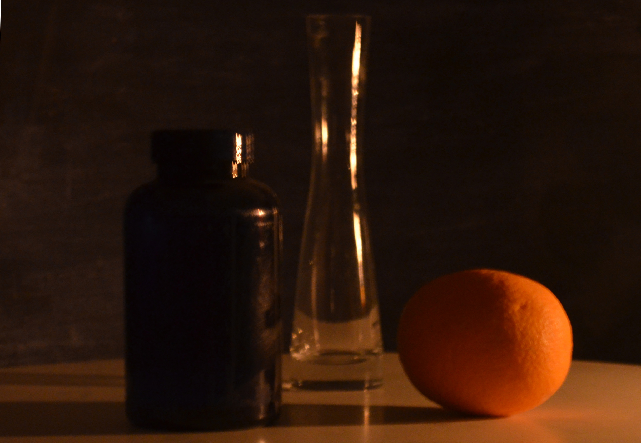
Finished Tonal Study
As briefed I prepared a dark ground with a dark wash of payne’s grey, this I did on A3 size watercolour paper. I had gone larger with the first painting but this time I stuck to the guidelines in the last exercise, Tonal study on a white ground, having now plucked up a bit of courage and got more confident with the brushes.
Chosen Composition
As in the last exercise I used acrylic paint for both the ‘imprimatura’ and the actual painting, I still haven’t plucked up enough confidence to use oils, I think this is because I am very worried about the drying time in my small condominium.
Having just researched ‘chiaroscuro‘ in the last research point, the works of Joseph Wight of Derby and the candlelit studies of Rembrandt really appealed to me and so I chose to do this study by candle light (from a large Buddhist candle that I bought for drawing 1) rather than it being lit from the side with the bendy lamp that I have used in the past.
Because I wanted to employ chiaroscuro effects in this painting the best way to do this was to create a composition that reflected the light best, so I played around with the three subjects that I used for the last exercise until I found a composition that worked well, reflecting light in a dramatic way.
Materials Used for this painting
- Canson Watercolour Paper (A3)
- Acryic Paint: Titanium White, Payne’s Grey, Chromium Oxide Green
- Brushes: Medium Wide (synthetic), Fan, Pointed Round (synthetic), Flat (synthetic) Detail Flat (hog’s bristle)
- An old bank card
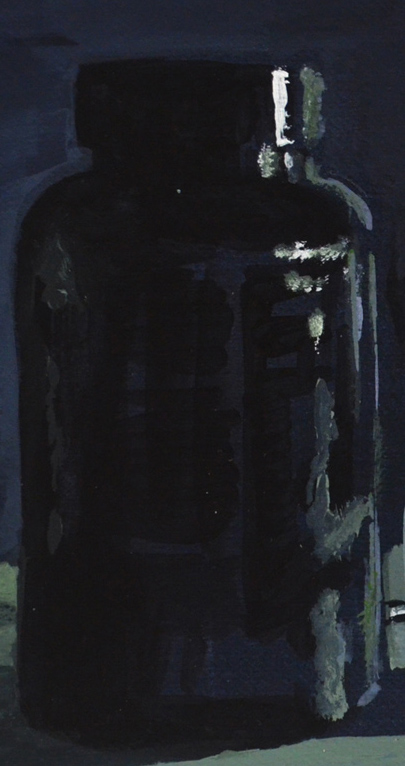
Empty Calcium Container
I sat facing the objects with the bendy lamp behind me switching it on as I needed as it was quite difficult to paint the objects in the dark.
For the first object, the empty calcium container I used payne’s grey (undiluted) for the darker shadows leaving the colour of the ground showing through in places for the reflections. I then painted the lighter reflections in a diluted mix of payne’s grey, white and green with highlights in titanium white which I later dulled down in a very dilute mix of green and grey. I then painted a thin line of reflection on the edge of the container by applying paint with an old bank card.

Reflection inside jar
From there I painted the broad band of light reflected inside the vase which was empty for this painting rather than filled with coffee as it was for the last exercise. The reason for painting this part of the jar was so that I knew how far the orange needed to be as i would be painting that next and coming back to the jar as this would be the most difficult part of the painting.
Painting the orange helped me to decide on the tones I would be using for the rest of the painting as up until now I wasn’t sure if I should be putting more of the green in the mixes but as I

Orange
started painting the orange I saw that the balance of green grey and white was really nice and so I continued as I was. There is a white line on the bottom of the orange that I can see now as I am typing this that I will have to blend in before it’s finished.
After completing the orange I went back to completing the jar which took a create deal of effort as I messed up with the reflections and highlights a couple of times and had to paint in and around it and trying to find the right mix of Payne’s grey and white was a difficult task.

Completed jar
I do realize that the aim of these exercises is to focus on tone rather than precision but I do like the objects to be the right shape and if the shape is out I do tend to correct them and with the jar it took some effort.
I think for my first attempt at using (if that’s the correct term) chiaroscuro effects I did quite well. The painting took me less time to complete than the Tonal study on a white ground as i was modeling light rather than painting whole objects, apart from the orange which I actually thought I could leave some of the ground coming through for the darker shadows.
On modeling light: Again for a first attempt I think I did quite well, there is still a lot of the ground showing through so I did use the ground to the best of my ability at this point, painting the reflections and shadows helped me to create the shape of the objects as to just painting them and adding the reflections later.
Comparison: Looking at the two studies I have to say that I prefer this one, it was not only easier and quicker but I think it does look much better and composition as a much more dramatic appearance.

Tonal Study on a White Ground
Finished Tonal Study
Technical Difficulties:
- Painting in low light: This was extremely awkward and I had to keep turning the lamp behind me on and off.
- Matching up paint with the coloured ground: There were times when I had to correct mistakes by painting on the ground, by doing this I had to match up the tones, I still haven’t perfected this but I realised I had to go with a very dilute mix and then thicken it up to match up the colours.
- Painting very thin lines of light/highlights: There were times when I used the edge of a bank card, there were times when I went to thick and then thinned them down by painting against them with a darker colour.
- Getting the colour mixes right: I used a second sheet of the same dark wash to try out the mixes if I was unsure.

They’re both very successful Mark – something for me to aspire to!
LikeLiked by 1 person
I think it will be the other way round when u have taken over me. Your final assignment piece for drawing 1 was amazing,
LikeLike
Ha ha that’s very kind but we’ll see 😉
LikeLike
Pingback: Part 1 – Introduction to Painting, Assignment 1 | Mark Smith OCA Painting 1 : The Practice of Painting