Tag Archives: Bachelor in painting

Drawing and Painting Interiors 3 – Simple Perspective in Interior Studies

3 - Finished Painting

Simple Perspective in Interior Studies – Finished Painting

Depicting perspective was always a task in which I had succeeded in my drawing course but not so much when it came to this exercise. I was sat at my table going through the drawings from the last exercise when I noticed there was a part of the living room which I hadn’t drawn and it was probably the best part of the apartment to paint for this exercise. The window to the Juliette balcony flanked by the bedroom and the bathroom door.

Materials used:

  • Acrylic paint, Primary Blue, White and Ivory Black
  • Paper, Canson Huile-Acrylic 24 x 33 cm
  • Brushes Small flat, Medium Flat, Medium Round and Detail

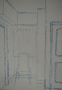
As the brief for the exercise said I started off drawing the lines with a detail brush in a watered down mix of primary blue. At this stage everything seemed perfect.

1 - Drawing in Paint

1 – Drawing in Paint

From there I went on to use washes in various strengths of primary blue to further define the positive and negative shapes. The painting was simple and at this stage everything looked perfectly in proportion.

2 - Using Washes to Describe Shapes

2 – Using Washes to Describe Shapes

I wanted this to be a painting with a limited palette so I could keep it simple and because I wanted to keep thinks simple when I came to painting the detail I opened the bathroom door so I wouldn’t have to mess about painting the molded panels in the door.

I painted the walls blue and because of this I painted over the chair with a dark wash in a smaller brush leaving the blue to show through which not only made it look like the chair was reflecting the blue of the walls but it helped give it a wooden grainy feel. I then painted the door frames door and curtains in a grey mix adding detail in black.

3 - Finished Painting

3 – Finished Painting

Thoughts on the final painting

In the finished painting the perspective looks fine but the chair does look somewhat out of proportion, I’m not sure why because when I drew it in paint everything looks spot on. Because of this the doors look shorter than what they actually are, or at least the door on the leftto the bedroom.

Colour Relationships 4 – Still Life with Complimentary Colours

Make a colour study of your still life using only a narrow range of colours. This will require great concentration and discipline in observation and interpretation. Make the most of using colour in an inventive way.

Still Life with Complimentary Colours

Still Life with Complimentary Colours

I should have probably used my Chromium green with primary red for this exercise but I decided to mix my own green from primary yellow and primary blue. Some would call that cheating as even though I did make a nice dark green out of the two colours some of the lighter tones looked blueish with others a yellowy green.

I could have been a bit more inventive with the subjects I used for the still life maybe choosing subjects of all different colours and I regret not doing that instead of choosing subjects of similar colour properties like I did but I still feel satisfied with the end result.

Materials used:

  • Oil/Acrylic Paper 24 x 33 cm
  • Acrylic Paint: Primary Yellow, Primary Blue and Primary Red
  • Brushes: Small Filbert, Large Round and Large Flat

This was the first time using  small sheets of paper although it was only a study I still intended to use it not only to develop my understanding of colour relationships but to further develop my brush skills and painting on a small scale I decided, would help me to do that.

I begun with a very light wash of green mixed with white followed by a very light wash of red. As the green was mixed with a lot of white and went on unevenly the red wash settled around it creating a prime coat of light red and green, which reminded me of rhubarb.

Chosen Subjects

  • Mango x 2
  • Rambutan (gno) x 3
  • 2 slices of watermelon
  • Red Apple
  • Plate

Although the subjects I chose were mainly red and green there were other colours as well which were omitted by using only the complimentary colours these were, yellow, orange and light brown. For the grey details such as the bruising on the mangoes, the watermelon seeds and the dark stripes on the skin of the watermelon on the left of the plate I mixed the colours together and and allowed them to cancel each other out. This was also a technique I used for the darker parts of the rambutan, painting wet red over wet green to get the darker strands.

I also allowed the pigments to cancel each other out for the shadows although I made the result of this biased towards red in most places so that the green of the mango would really stand out.

Being Inventive

I find it hard to use my imagination when painting still lifes and to me there wasn’t really much I could do here to make this stand out all I know is that I was bored of using the same old round table with the plain backgrounds and so if I were try and get inventive wouldn’t this be the best place to start. I applied a light coat of white/red to the background with a scrumbling technique followed by fine drip like streaks then painted the shadows with a muddy green applied with the same scrumbling technique. It may not be genius but it makes the still life composition stand out,however it wouldn’t be until the next exercise Still Life with Colour used to Evoke Mood that the background would really come alive.


Colour Relationships 2 – Successive Contrast

Successive Contrast

Successive Contrast

This is something that we encounter a lot but we don’t think about how it happens. The first part of the brief tells us to find or paint a large area of bright colour, stare at it for 30 seconds and then close your eyes and wait for an after image to appear. Because I chose red the after image that appeared was the complimentary colour green.

Successive Contrast - Flourescent Pink

Successive Contrast – Flourescent Pink

From there I painted an isolated square of my most vivid and intense pigment, which happened to be fluorescent pink, I did the same with this then after 30 seconds I shifted my gaze to a white space on the same paper, the after image that appeared was an intense turquoise, Its complimentary colour.

These effects are caused by the stimulation and exhaustion of the receptors in the retina. By Exhausting the receptors for red, for example, only the remaining combinations of colours that mix to produce blue green are seen when you turn from looking at red to looking at white.

White light, as Newton showed, is made up of all the colours of the spectrum. The human eye has full colour discrimination through the rod and cone cells. The rod cells in the Retina distinguish light and dark, while the three types of cone cells respond to red, green and violet which make up colours.