
The brief for this exercise:
Find a few simple objects that are ready to hand are plain and un-patterned. A jug, vase and/or some fruit would be ideal. Place them so that they are lit from the side, either by natural light from a window or by lamplight.
Using a tonal drawing medium such as a soft pencil, pastel or charcoal, do some simple studies of your chosen objects in your sketchbook. Make several studies from different angles and then decide which viewpoint and angle you will use for your tonal painting.
I didn’t have many jugs jars or a good choice of fruit at hand, my girlfriend had just brought some oranges down from up north so I decided to try and make a composition using them along with an aluminium bowl a glass vase filled with liquefied coffee and a jar of calcium tablets which I emptied and peeled off the label. I made some sketches in my sketchbook in charcoal.
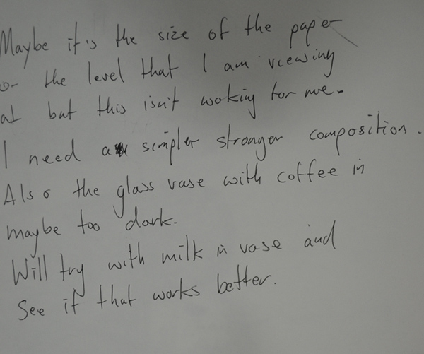
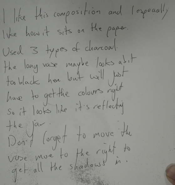
For the first two sketches I placed the objects on the top of the fitted unit at just under eye level lit by a bendy lamp. I decided that the top of the fitted unit was too high and I also wasn’t satisfied with the oranges in the bowl, I thought that less objects would make a simpler but stronger composition.
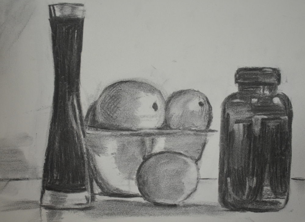
1st Sketch

1st Sketch Notes

2nd Sketch
2nd Sketch Notes
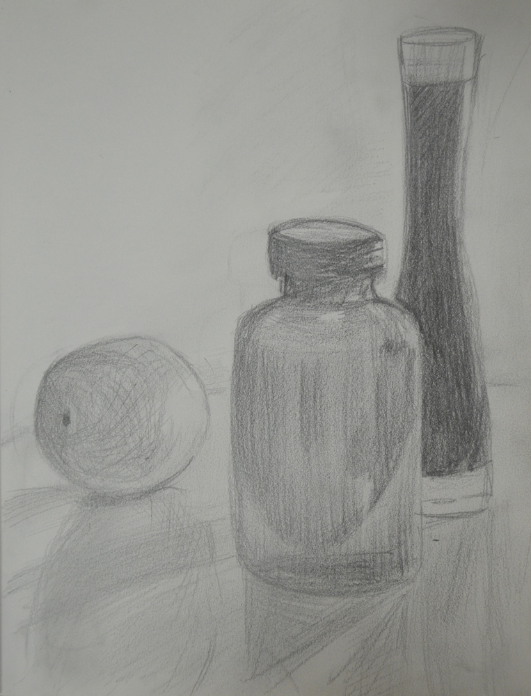
For the third sketch in charcoal I removed the bowl of oranges from the composition leaving 1 large orange plus the jar and vase and placed the objects on a round table at a lower level then I taped a sheet of paper to the back of the table to give it a plane background (always get distracted drawing backgrounds). The bendy light lit the composition from the right hand side. I did one more drawing with a 5B pencil to analyse the tones using a different monochrome media, between the two mediums they helped me to ‘weigh up tonal variation without the distraction of different colours and hues‘.

3rd Sketch
3rd Sketch Notes
4th Sketch
I have been working later than usual so all the sketches were done in electric light but the next day was an early finish for me and for the first time I got to see the composition with natural light shining through the window from the left and it looked a lot better and the highlights on the jar and vase were very attractive and so I decided to paint the tonal study in daylight which would take me the next 5 days, due to late finishes at short nights.
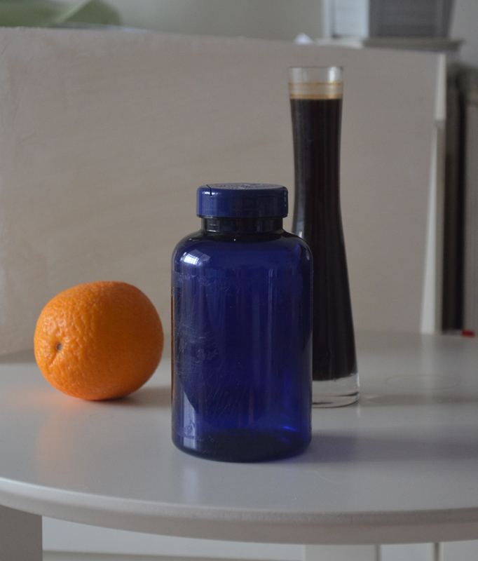
Chosen Composition in Natural Light
Materials Used for Painting
- Canson paper for Acrylic and Oil
- Acryic Paint: Titanium White, Payne’s Grey, Chromium Oxide Green
- Brushes: Flat Brush, Pointed Round, Medium Wide (synthetic), Fan, Medium Wide, Detail Round, Pointed Round (hog’s bristle)
The brief recommended that we paint small on A3 or A4 paper or card, the best acrylic paper I had was 15 x 18 inch and because this was going to be my first painting I wanted to use a quality prepared paper rather than Gesso on watercolour paper which was the only other paper I had.

Tonal Study on a White Ground
I made a first thin off white acrylic wash with a very dilute wash of yellow ochre thinking that there was an element of warmth in the composition in front of me, this was pretty silly of me I should have probably started with a grey wash, this was my first mistake. My second mistake was using a charcoal that was difficult to brush off and left quite heavy marks and so after I completed painting the objects I had to paint the background.
I started on the calcium pill jar first blocking in the form with the un-mixed chromium oxide green then painting in the lighter shades with a glaze of white mixed with green followed by the dark shadows and then the highlights in a very dilute mix of grey and then white for the lightest reflections.
With the vase I made the mistake of using Payne’s Grey straight which was too dark and so I went over with a mix of green and grey with the darker reflections with a green glaze before painting in the highlights in white.
To give the orange a bit of texture I stippled a base layer of paint and then once the paint was dry I depicted the various tones by blending the grey green and white with an almost scrumbling-like technique.
For parts of the painting I used water to moisture the paint and in the glazes but I also bought a bottle of Liquitex flow aid that I used for the first time in this painting. For me this painting was not just a tonal study but the first painting that I had used a number of techniques, brushes and materials that I have never used in a painting before.
Notes:
I am not completely satisfied with the finished painting but I am happy that I learnt a lot here about how the acrylic paint behaves, making the following observations.
- Acrylic paint looks darker on the palette than it does it does on the paper.
- A diluted glaze of acrylic paint over the top of another layer of paint gets darker as it dries.
- It’s best to start off lighter and then work darker when trying to match hues with a previous layer of paint. (There were times when I had to stop what I was doing and then came back to painting but had to clean the palette because the paint had dried).
- Diluted paint is more likely to run when applied over the top of a dry layer of paint.
- Washes are great for shadows.

I really like this painting – interesting read too
LikeLiked by 1 person
Thank you Gina. I am happy with it but it does fee a bit bare, I should have really painted on a smaller size paper and left less background but I liked the shadows and reflections.
LikeLike
Pingback: Working on Different Coloured Grounds 2 – Tonal Study on a Dark Ground | Mark Smith OCA Painting 1 : The Practice of Painting
Pingback: Part 1 – Introduction to Painting, Assignment 1 | Mark Smith OCA Painting 1 : The Practice of Painting