
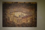
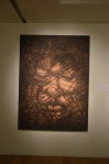
Caravaggio – John the Baptist
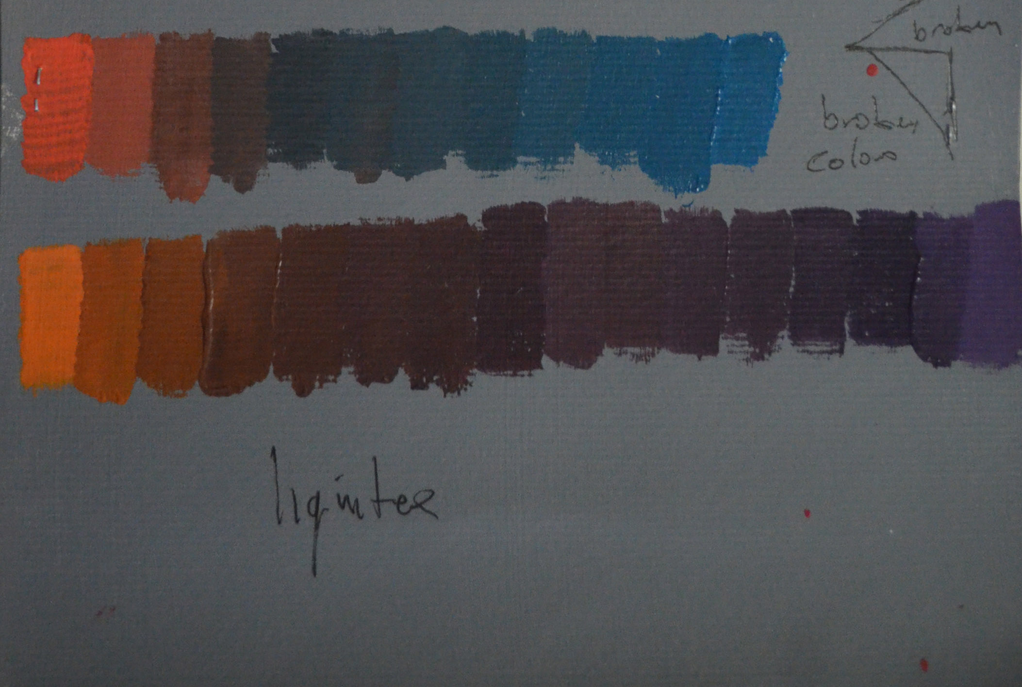
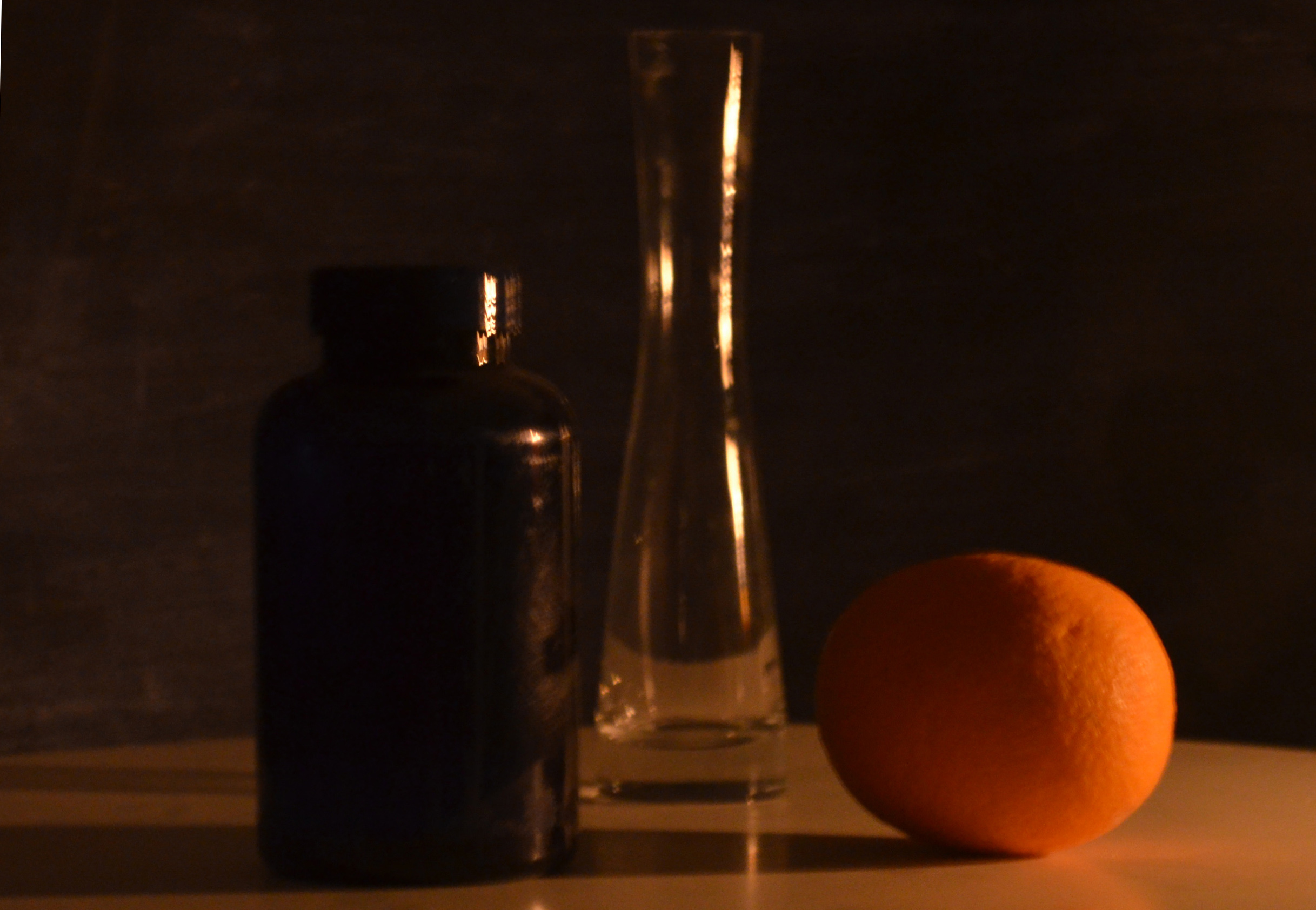
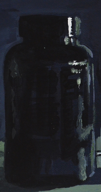
‘The term chiaroscuro (chiaro meaning light, scuro meaning dark) originated in the Renaissance when it referred to a technique .of drawing on coloured paper by building light tones with gouache and working down to dark tones with ink. It later came to refer to modeling of light in paintings, drawings and prints. The extreme contrast between dark and light areas allowed subtle graduations of tone to create illusions of volume, most notably that of the human form. Chiaroscuro became a common composition device in religious paintings such as those of Caravaggio.
‘Explore the works of some of the artists whose work exemplifies chiaroscuro effects such as Tintoretto, Caravaggio and Rubens. Look at the candlelit studies of some of the northern European artists, most especially Rembrandt and Joseph Wright of Derby. (Remember that until relatively recent, life was lived in pools of candlelight or firelight after the sun went down.) Make notes in your learning log.’

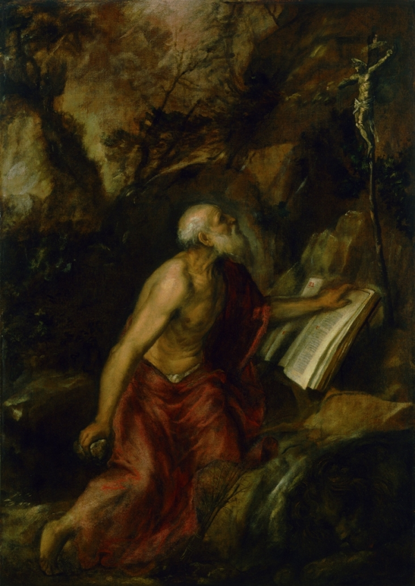
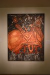
Titian Saint Jerome in the Desert
Towards the end of the 1500’s, with the new religious appreciations due to the Catholic Reformation, night scenes depicting the life and Passion of Christ became increasingly popular. The artist Titian embarked on a new technique which involved the disintegration of matter in light, particularly in night settings. He would continue to explore the dissolution of light through matter until the end of his days. The Next generation of artists would take over and perfect these dramatic effects of light and colour.
Night scenes would later become known as Nocturnes (a phrase coined by James Abbott McNeill Whistler). It describes a painting style that depicts reminiscent of the night or subjects as they appear in a veil of light, candlelight, twilight, or in the absence of direct light.

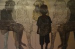
Tintoretto – Lamentation over the Dead Christ
Jacopo Tintoretto
Throughout his long career Jacopo Tintoretto dramatised his nocturnes by drenching them in heavenly lighting, with colours distorted by bold contrasts of light. These lively effects of lighting added drama to his stunning compositions.

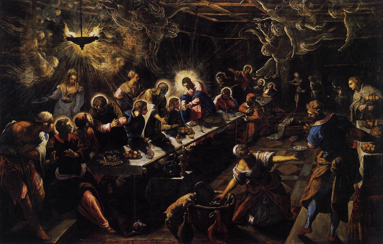
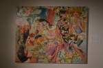
Jacopo Tintoretto – The last Supper
Examples of this ‘supernatural lighting’ can be seen in both the Lamentation over the Dead Christ and the last supper where light is depicted coming from a source other than a natural one as to Titian’s St Jerome above which depicts natural moonlight.
Caravaggio
Before moving to Rome, Milanese painter Caravaggio trained as a painter in Milan under Simone Peterzano, a former student of Titian.

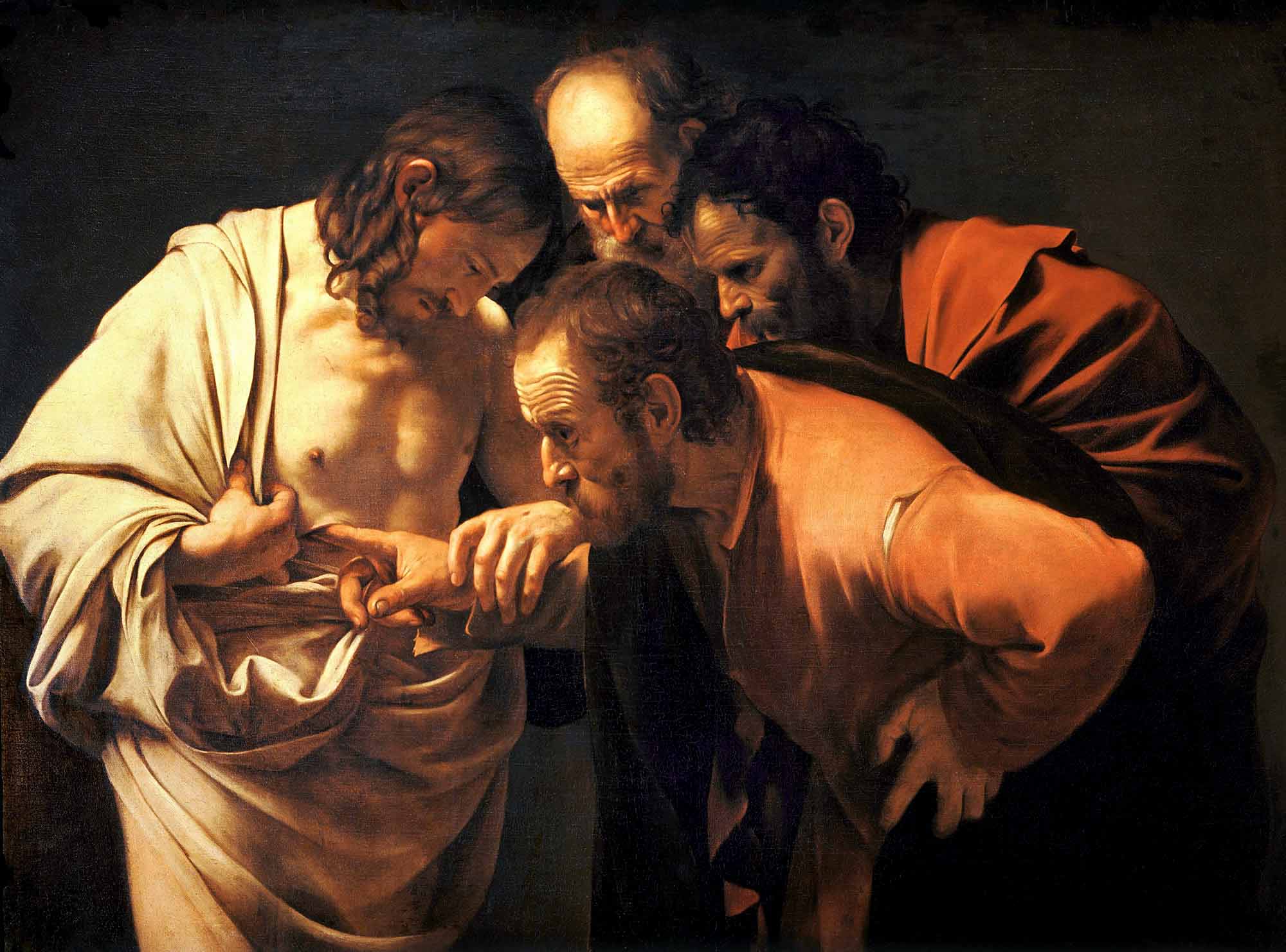
Caravaggio – Doubting Thomas
In Rome the Catholic church were in need of a stylish replacement to Mannerism in religious art, a move that they thought would help counter the threat of Protestantism (the counter-reformation), and so there was a demand for paintings to fill the many new churches and palatial buildings being built there.
Caravaggio revolutionized chiaroscuro with a radical form of naturalism combining close physical observations with a dramatic, somewhat theatrical, use of chiaroscuro this came to be known as ‘tenebrism’.

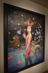
Caravaggio – Saint Jerome Writing
Looking at the paintings of the three artists above you can see the evolution of nocturnes and of course chiaroscuro as a major technique in night paintings. From works of Titian that used the background as an important part of the painting with figures whose forms didn’t wholly employ the technique that it would later become; to the paintings of Caravaggio who had pretty much perfected the technique, at least to where he need to be depicting up-close three dimensional compositions with a clear message that appear to almost leave the canvas.
Peter Paul Rubens
If the paintings of Caravaggio were a Drama then the paintings of Flemish Baroque painter, Rubens would be a musical. Originally from Cologne in Germany, he was as a catholic by his mother in Antwerp, Belgium.

Peter Paul Rubens – The Fall of Phaeton
His paintings featured religious scenes in complicated and very dramatic compositions. Rubens became one of the leading voices for the Counter-Reformation style of painting and standing behind what he had worked so hard to ‘promote’ he stated, “My passion comes from the heavens, not from earthly musings”.
It is clear from his paintings that he was a man of faith, something was clearly moving him through these paintings, if not just belief.

Peter Paul Rubens – Adoration of the Magi
Where Caravaggio painted close-up dramatic scenes of a biblical theme with detailed expressions and drapery Rubens’ painted religious scenes in action, depicting flowing drapery and strong movement in his figures, with complicated compositions with several main figures and even horses.
In a lot Rubens paintings it is very clear to me that he started on a dark background particularly in the two paintings that I chose here, ‘Adoration of the Magi’ and

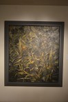
Peter Paul Rubens – Night Scene
‘Night Scene’ but then again I now know what I am looking for, to others that don’t, they see every bit of the composition as if everything in the painting was completed in detail, what the eye doesn’t see, the brain fills in.
Rembrandt Harmenszoon van Rijn (Rembrandt)
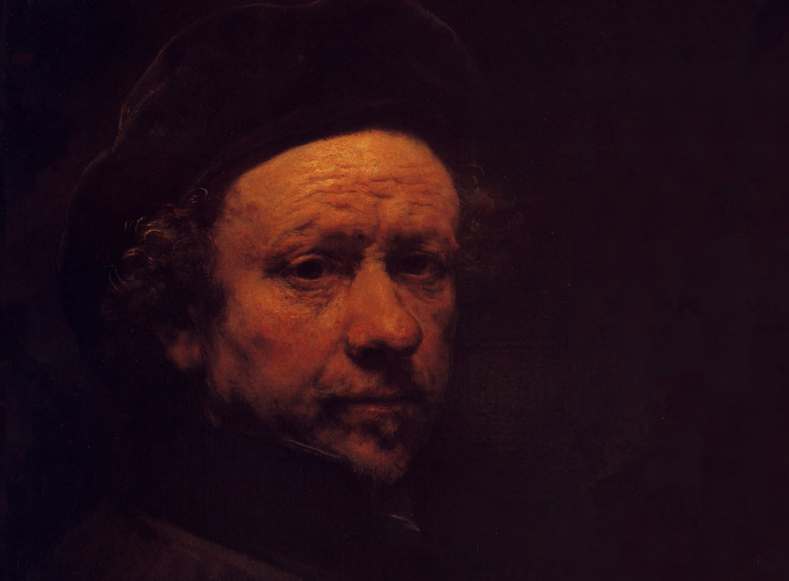
For the best examples of chiaroscuro in Rembrandt’s paintings one needs to look no further than his self-portraits. Rembrandt created nearly one hundred self portraits in his lifetime. Of those one hundred self-portraits seven were drawings, thirty two were etchings and fifty were paintings. Included in those were candelit studies, painting by candle light.

Rembrandt – Self portrait 1657
Rembrandt’s candlelit studies are great examples of the use of chiaroscuro, I looked at several of his self portraits the technique but ‘Self Portrait 1657’ was one that really stood out, the reasons for this being that you can see how the face and highlights in the hair and hat have been painted building up the light tones on the dark background. I can imagine him painting it, where he started and can even guess some of the brush techniques that he used.
Joseph Wight of Derby
The artist Joseph Wright of Derby was unknown to me, as an artist that is but is name was famiiar and when I did a search fore information about the artist I came across the Joseph Wright college and it clicked.

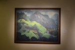
Joseph Wright of Deby – An Experiment on a Bird in an Air Pump
Wright is notable for his use of Chiaroscuro, and for his paintings of candle-lit subjects. His paintings of the birth of science out of alchemy, often based on the meetings of the Lunar Society, a group of very influential scientists and industrialists living in the English Midlands, are a significant record of the struggle of science against religious values in the period known as the Age of Enlightenment. – Wikipedia
Joseph Wright did for the industrial revolution and science as Titian, Tintoretto and Caravaggio did for the counter-reformation, ‘using their own tool against them’ comes to mind. It’s ironic that using chiaroscuro effect was the best way he could describe the candlelit scenes of the ‘Age of Enlightenment’ when the chiaroscuro effect had been employed by so many earlier artists who had described religious scenes through their art. His style was very similar to Caravaggio but using more detailed, technical compositions and painting them from a distance. What makes his paintings different from earlier works however, his is exceptional use of shadows.
Bibliography:
http://mini-site.louvre.fr/venise/en/exhibition/holy_nights.html
http://www.wikipedia.com


