
For this exercise I was to set up a still life with flowers that could remain in place for a day or two, keep the arrangement simple. Notice the outlines between things – Negative shapes – and try to create interesting and varied spaces and interesting intervals between the objects in my arrangement.
Subjects and Composition
Due to the shopping mall where I work being shut down for refurbishing I was a bit stumped on where I could find some flowers for this exercise but while having a stroll around my apartment complex looking for interesting flora to make a flower arrangement I came across a white flower with a yellow centre growing on a tree in the grounds of the next apartment which I know know to be a type of Plumeria called Frangipani so I went out when it was dark with a pair of scissors and clipped a few off.
When I got them back to the room I realised they weren’t enough by themselves so I went out and found another flower, Heliconia that when closed reminded me of a crab claw to add to the arrangement, These in a vase together with my christening silver and placemats that we brought back from England with us were all I needed to make an interesting composition.
Subjects used in the composition:
- Silver serviette ring
- Silver egg cup
- Silver Spoon
- 2 Simple floral placemats
- Vase with Flowers
- 1 Egg
By using the subjects I chose was to set up a fresh and simple narrative of flowers with breakfast.
Working in my small 1 bedroom flat I am limited to where I set up a composition and what I set it up on as I don’t have many shelves or units. I chose to set the objects down on a black chair which gave me a black background. I played with the subjects trying them in different positions and looking at them from different angles but there seemed to be only 1 composition and one angle from which this still life would work from and for me the first charcoal sketch confirmed this for me.
I wanted the silverware to look bold not delicate, and at the angle that I chose with the light illuminating the composition from the right hand side the eggcup looked goblet-like and the serviette ring almost regal. I deliberately placed the eggcup at an egg-cup’s distance away from the vase with the serviette ring between them both to create the most interesting negative shapes.

1 – Charcoal Sketch – Notes
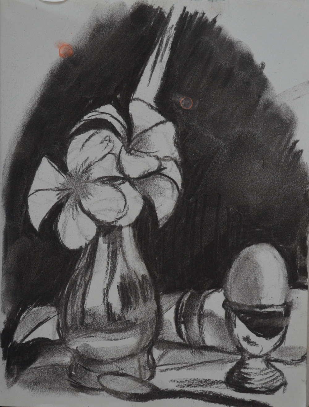
1 – Charcoal Sketch
I had painted my assignment piece in landscape so for this one I really wanted to paint in portrait, adding the Heliconia behind the Frangipani meant that I could paint the eggcup and the vase on a large scale in portrait format while making the best use of the paper in this format.
Because I was using a black background but wanted to paint a fresh-looking still life I placed the light source very close to the composition facing down from the right, this gave me less shadows with light bouncing off everything.
Choice of Colours
There are certain colours that I associate with breakfast, light blue, salmon pink, yellow and light green and this composition seemed to have all of them but I wasn’t sure how the black background would affect the outcome. Thinking about the yellow-orange in the flowers and what I would describe as pink-orange tones of the egg I felt that a primary coat of light blue under the black would bring those colours out, making them a lot brighter. I tried this out in a quick acrylic sketch of the composition and I felt that the result was a positive one.

2 – Drawing in Paint
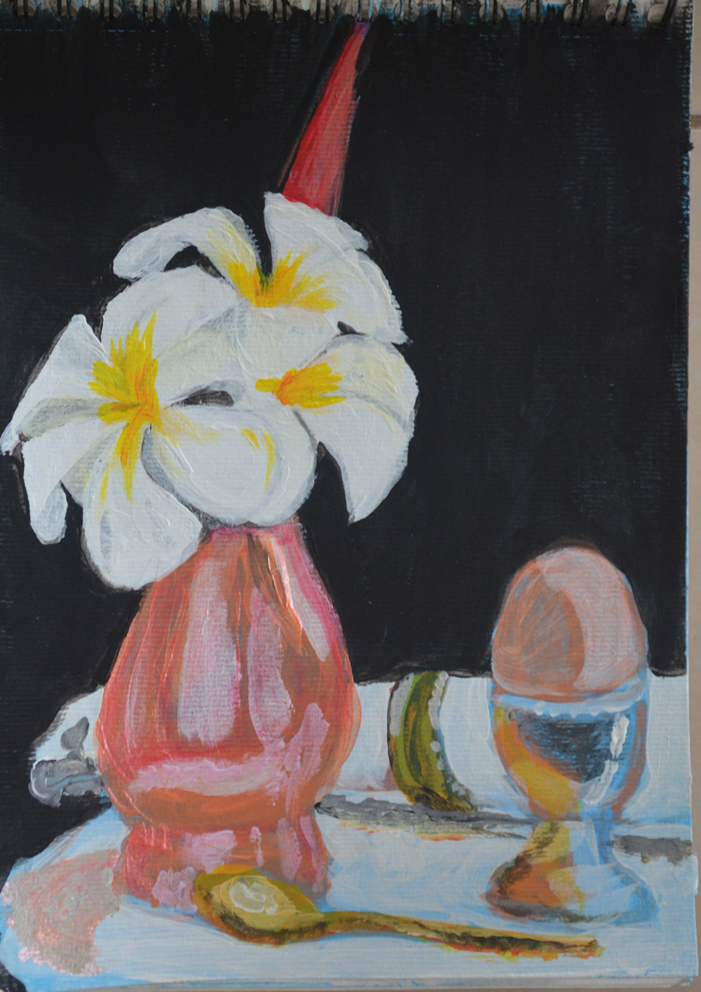
3 – Acrylic Sketch
From the quick acrylic sketch I managed to put together a list of colours which I used in the quick sketch and I stayed true to this in the finished piece. These were:
- Primary Blue/White (Light Blue)
- Titanium white (although I either mixed this with blue or c finished drawing to tone it down)
- Titanium white buff
- Orange pearl
- Payne’s Grey
- Ivory Black
- Primary Red/White (pink)
- Lemon Yellow
- Orange Cadmium
- Yellow Ocher
- Burnt Umber
Scale
I thought about painting this on a small scale as that would have probably helped to develop my painting skills more but after working on the acrylic sketch I decided that it would be better to paint a larger than life piece so that I could capture all the detail.

4 – Acryic Sketch – Notes on Colours
Like the acrylic sketch I began the final piece by drawing in acrylic paint rather than pencil as I used to do before the Drawing in Paint exercise. It did take a bit of reworking but not much. This final piece took me about four days to complete starting with the flowers as I knew they wouldn’t last me long as they started dying as soon as I removed them from the tree, this was a wise decision as the rest of the painting with the reflected light took the longest time to paint.
I worked mostly with large brushes, painting thick layers this helped me too loosen up as I have so far been too worried about getting my paintings to look exactly like the subjects that I am painting, to me this looks more like an impressionist still life and that was the look that I was going for.

4 – Finished Still Life in Acrylic
